
Noted: New Logo and Identity for Flacon by Shuka

“South by Southnorth”
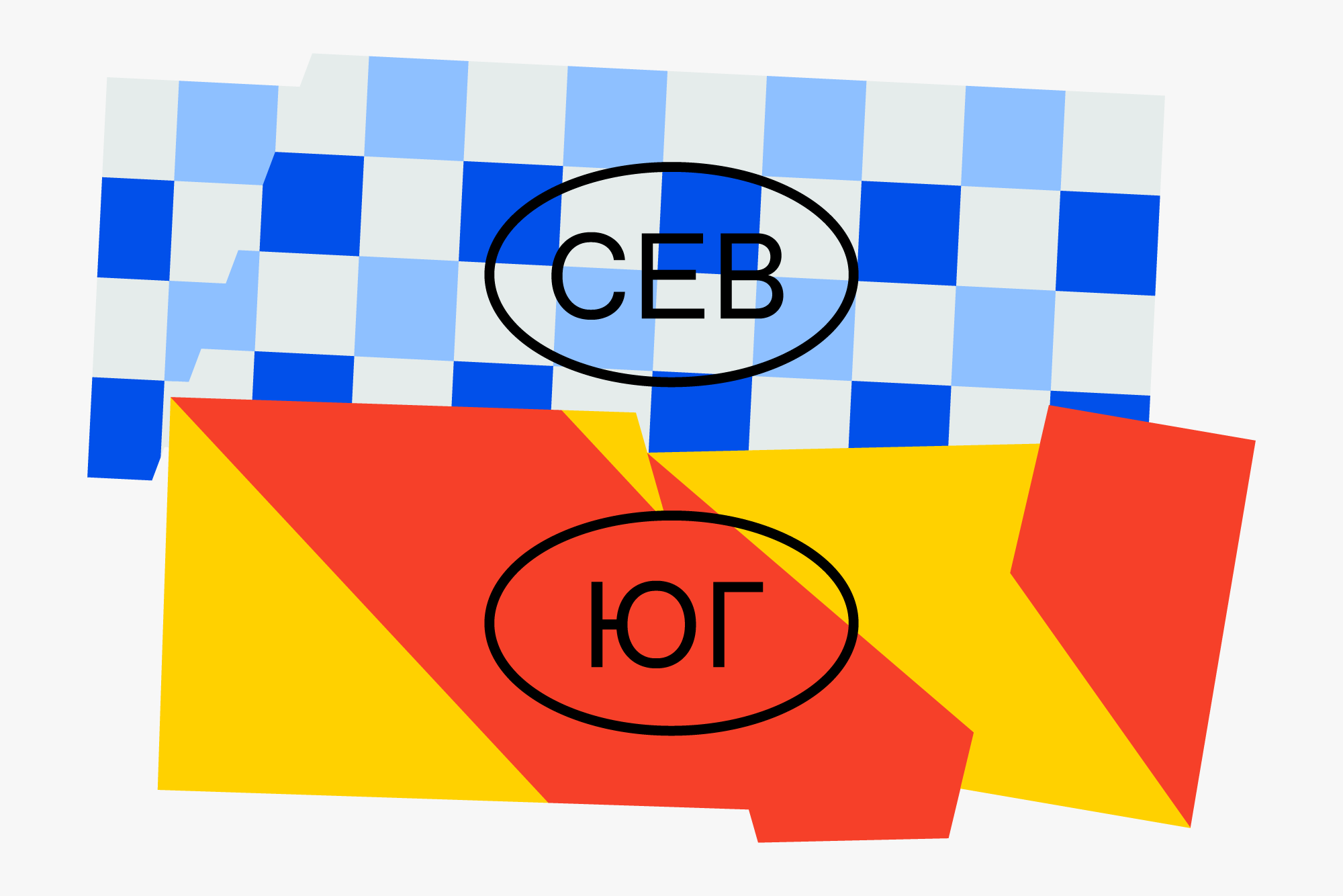
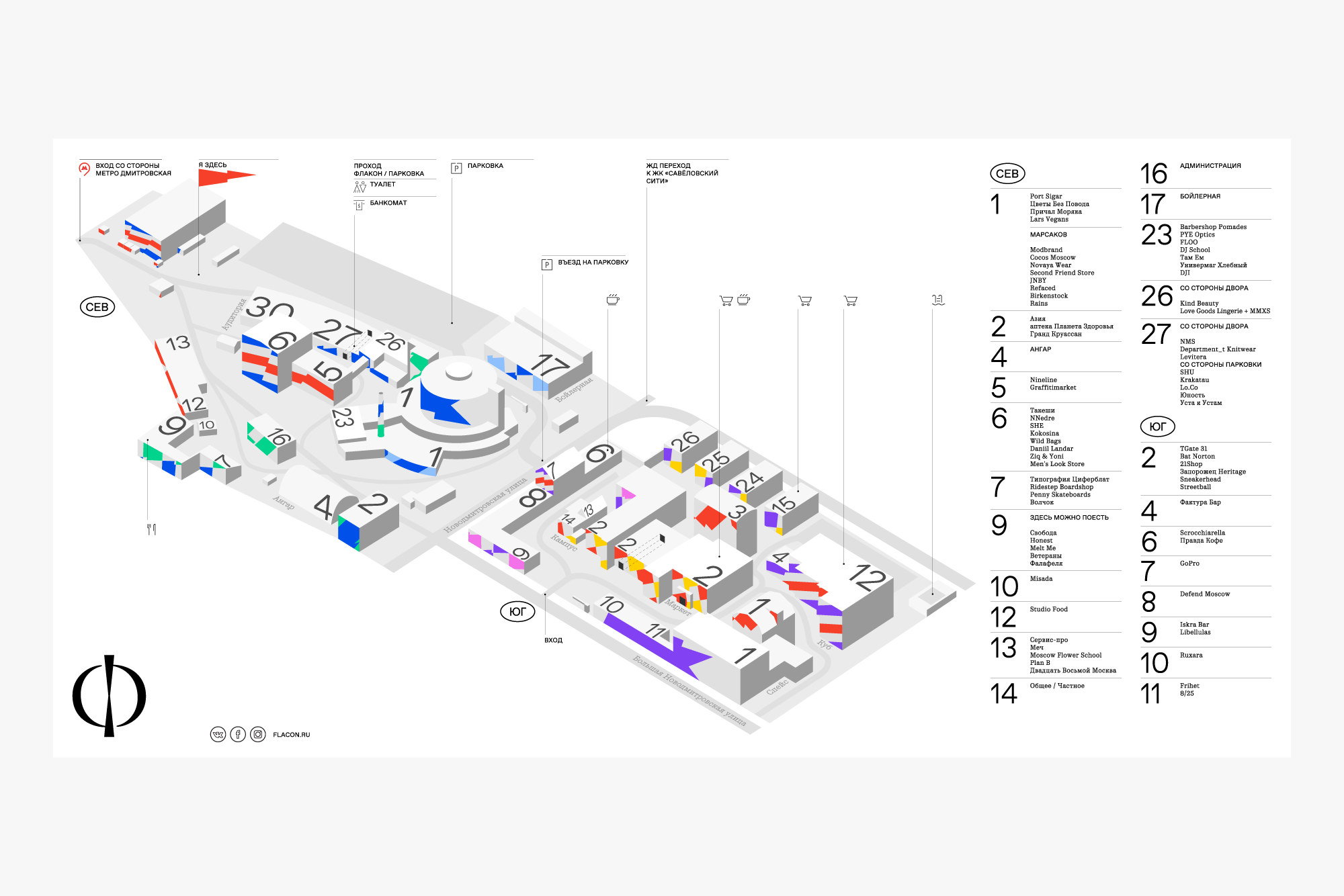
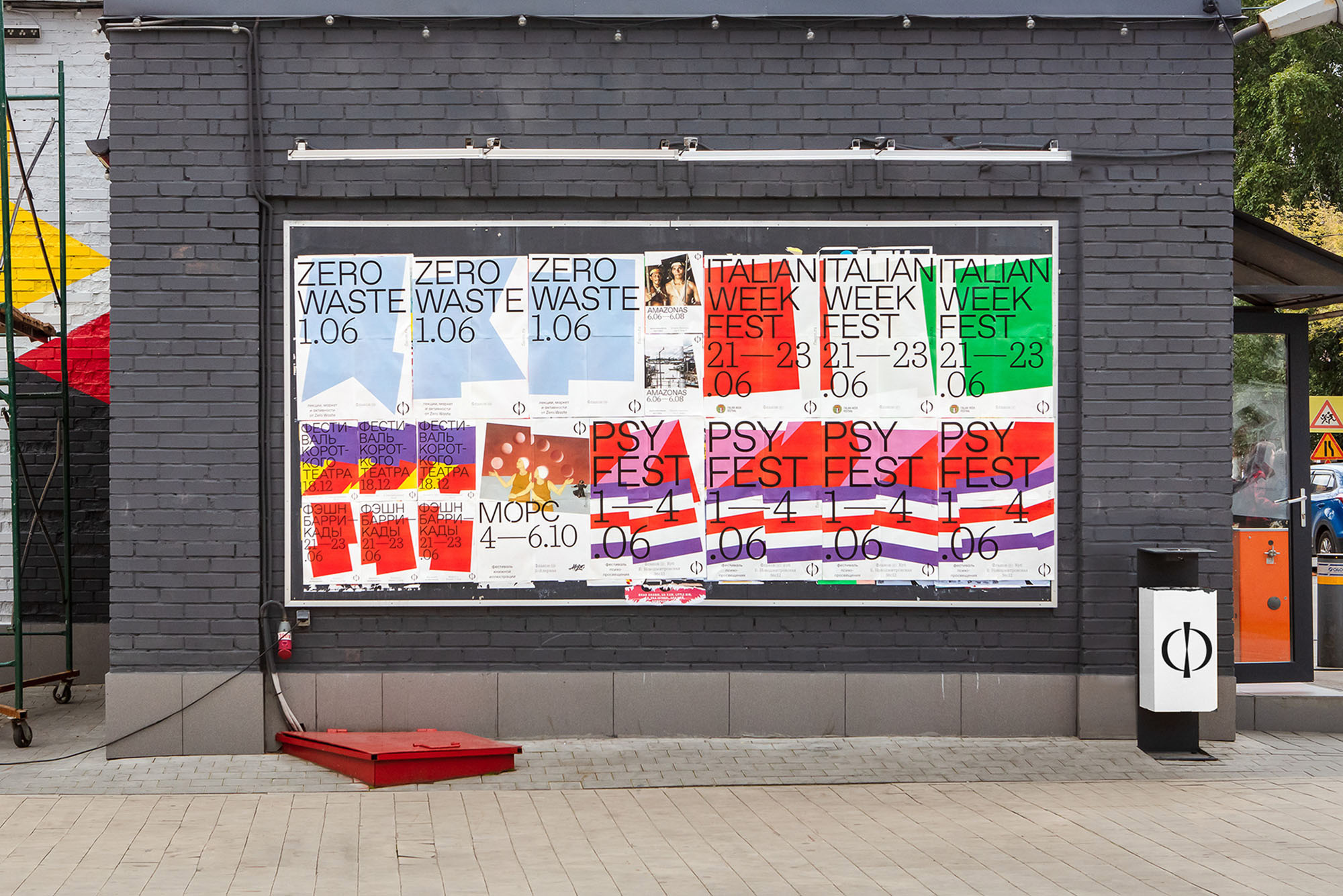
(Est. 2009) Flacon is an old, huge glass factory that was renovated into a cluster of creativity with creative studios, craft shops, artisan cafes, and galleries and many events are held throughout the year -- including country-specific celebrations like Big English Dinner, Day of Italy, Day of Paris, and Day of Madrid. Recently, a bread factory across the street has also been renovated and as the buildings around Flacon have also become part of the transformation, a new, bigger creative district has emerged, with "North" (new bread factory area) and "South" (original glass factory area) components.
Design by
Shuka (Moscow, Russia)
Related links
Shuka project page
Relevant quote
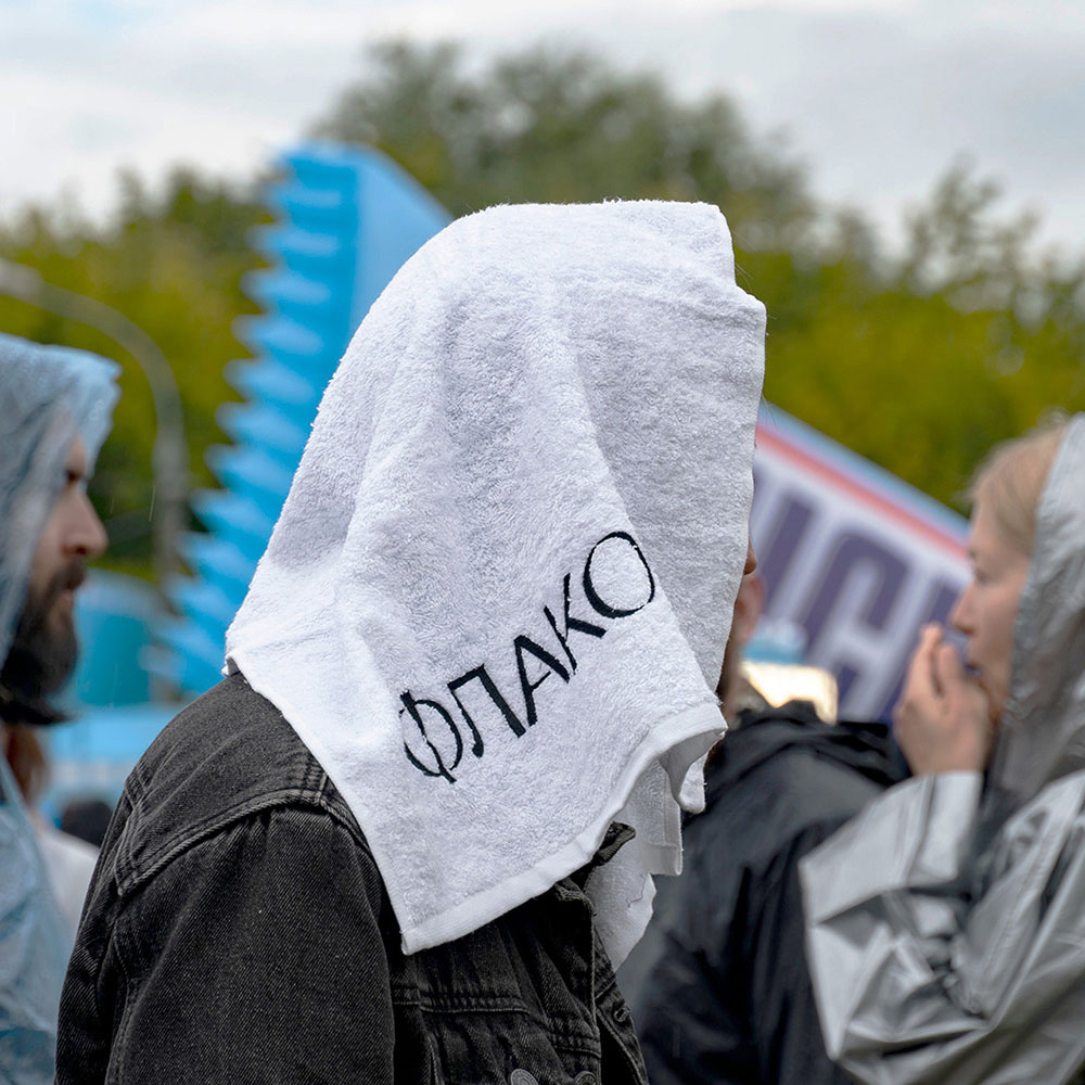
Moscow is a post-industrial metropolis. The driver of its economic development is not industry. It’s ideas — the most valuable result of human’s thinking. We proposed the concept, where “Flacon” («Флакон») is no longer a “design factory”, but a city disctrict — north (“Khlebozavod”) and south (“Flacon”). It reflects the morphology of the united territory and expresses its cheerful character names.
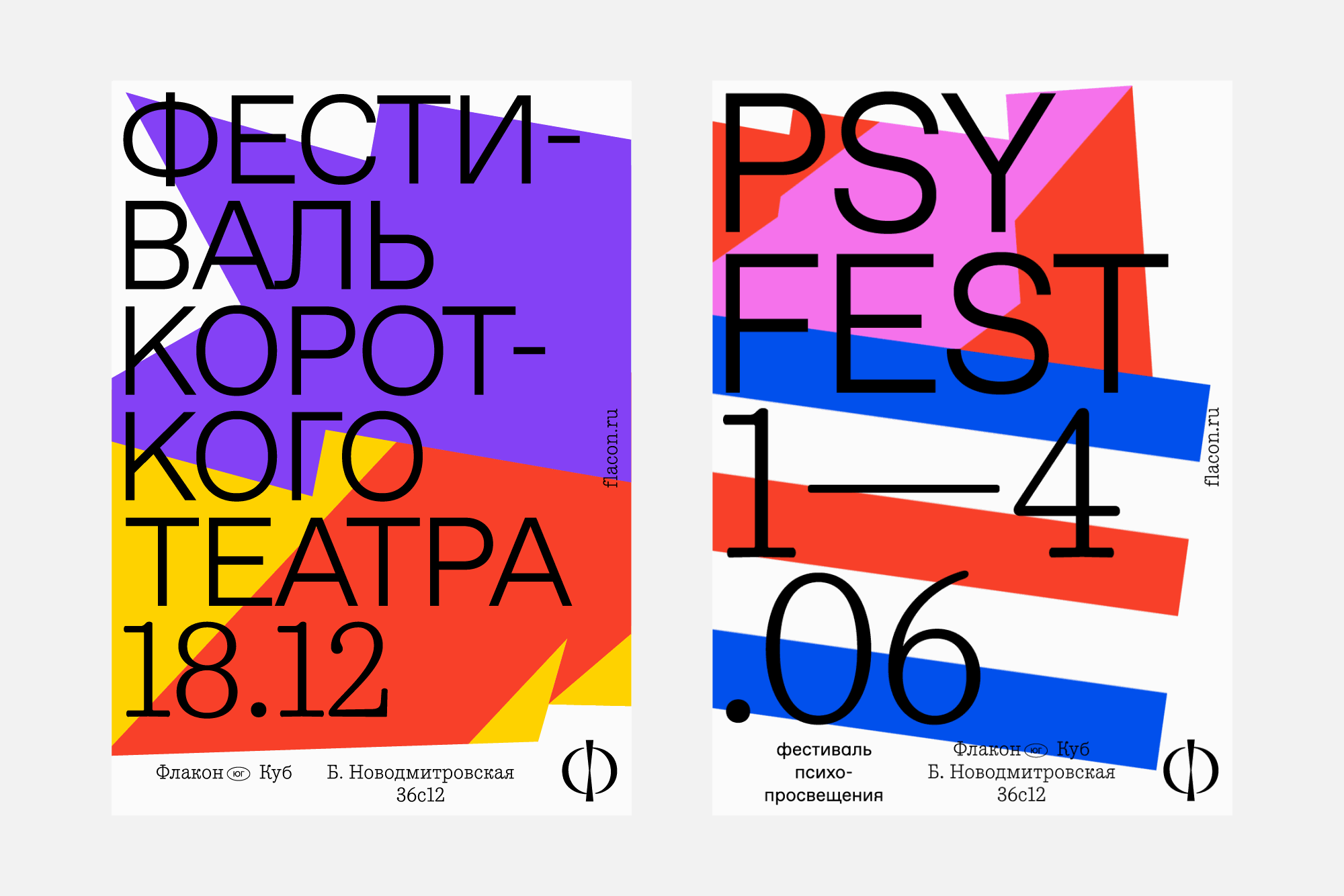
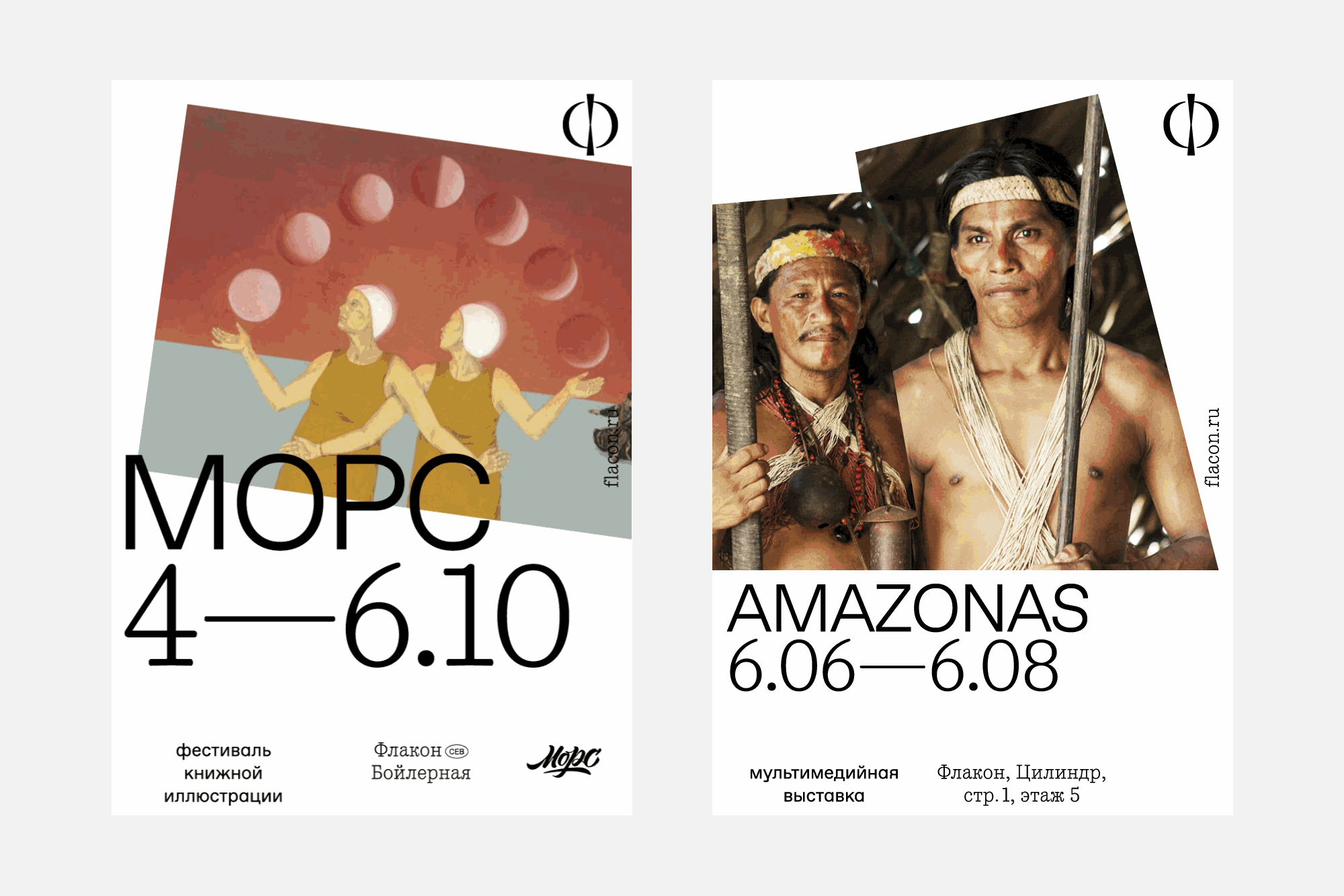
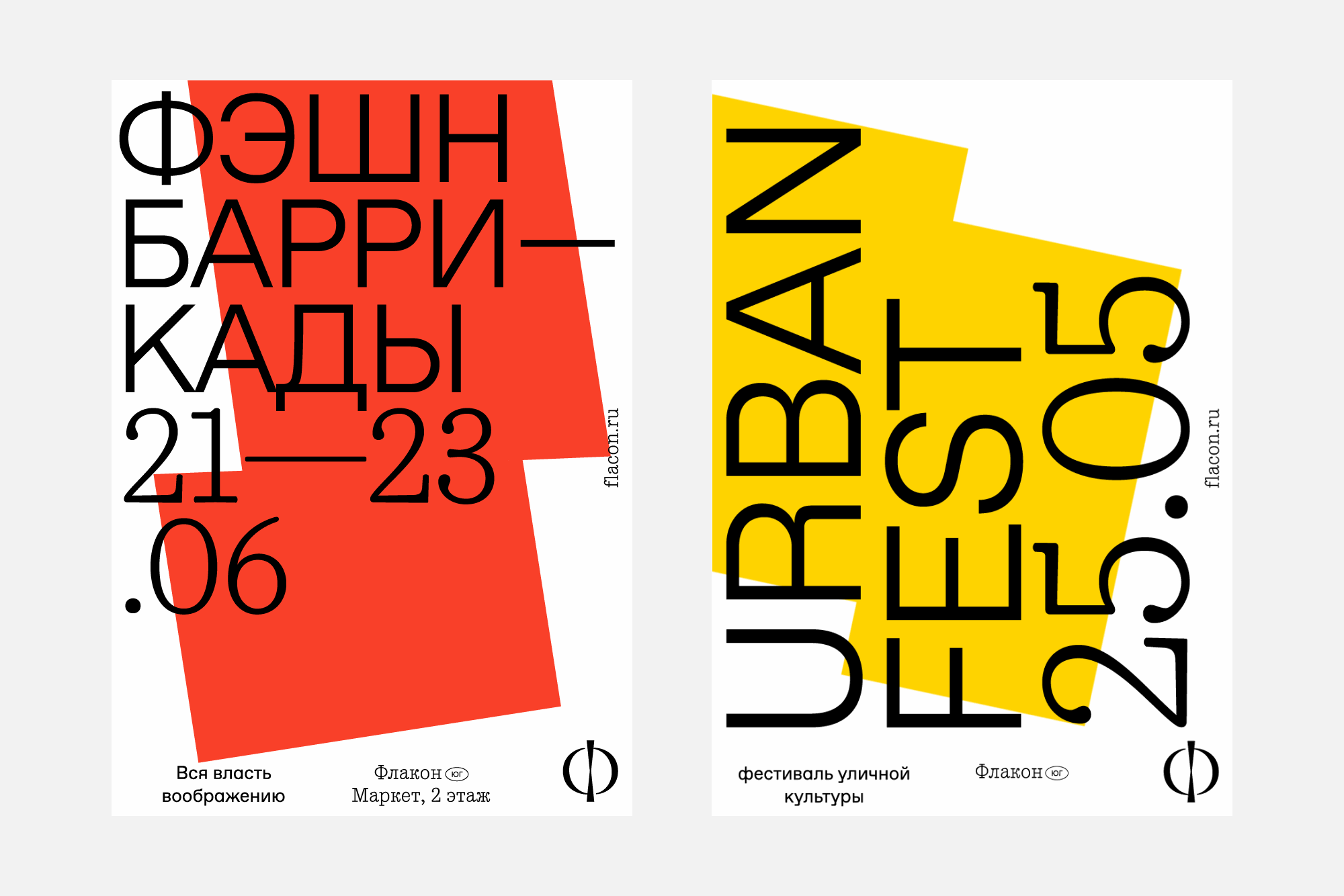
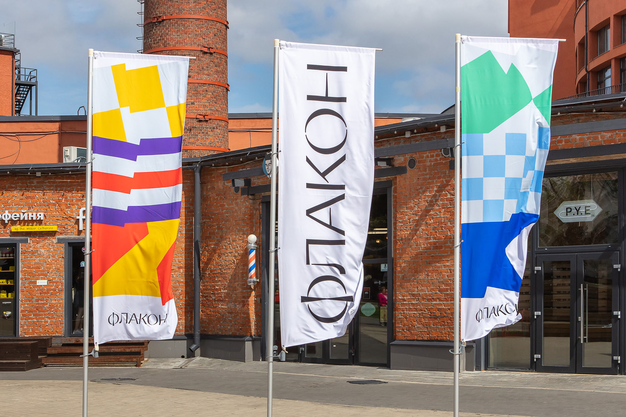
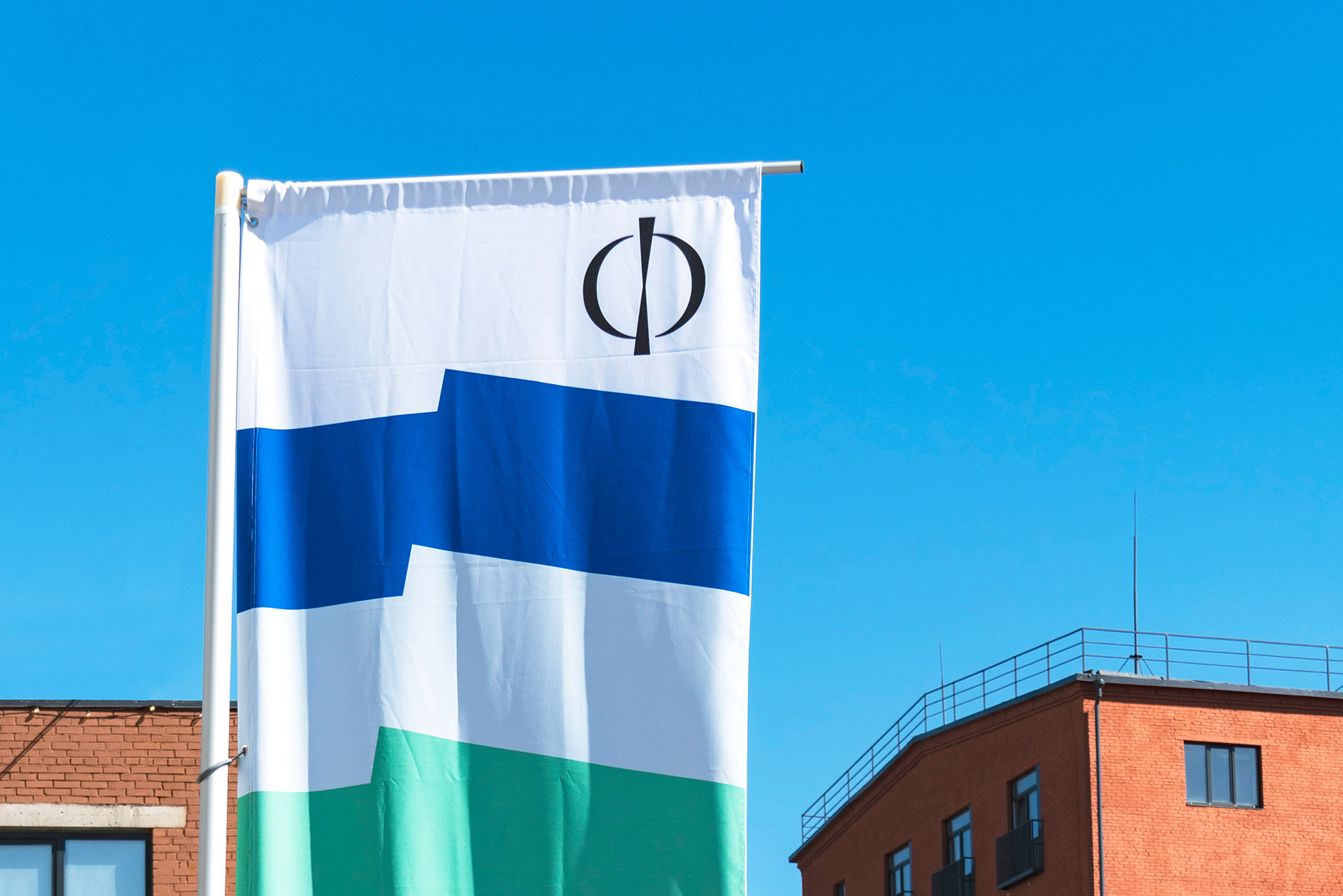
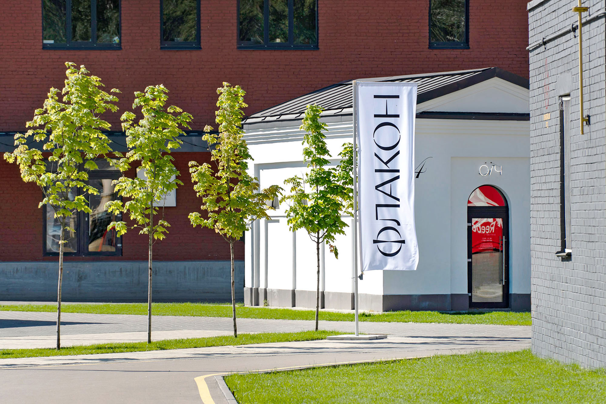
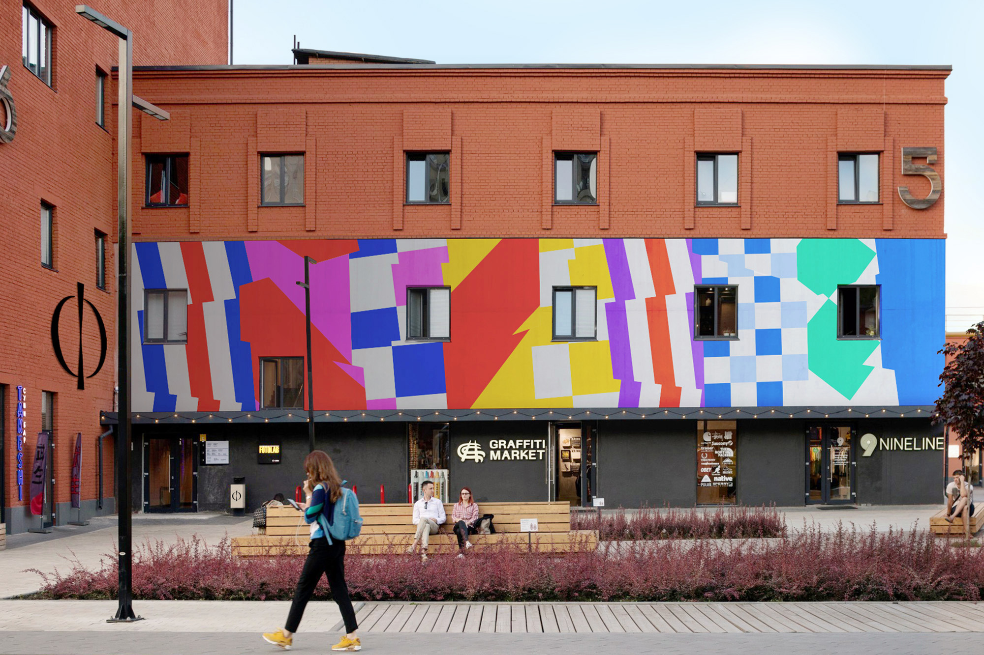
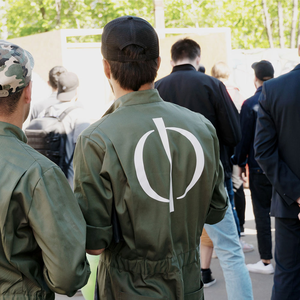
Festival flags, flags of neighborhoods draw the image of freedom, lightness and the difference of communication. The icon is a rhyme for a union: open strokes convey the dynamics of rotation. The logo is mixed with an antique lettering style and light stencil in the spirit of street fashion. “Flacon” is a power, place, a center of attraction. A 24-hour festival and an endless market. Moscow Williamsburg at the north of Savelovsky station.
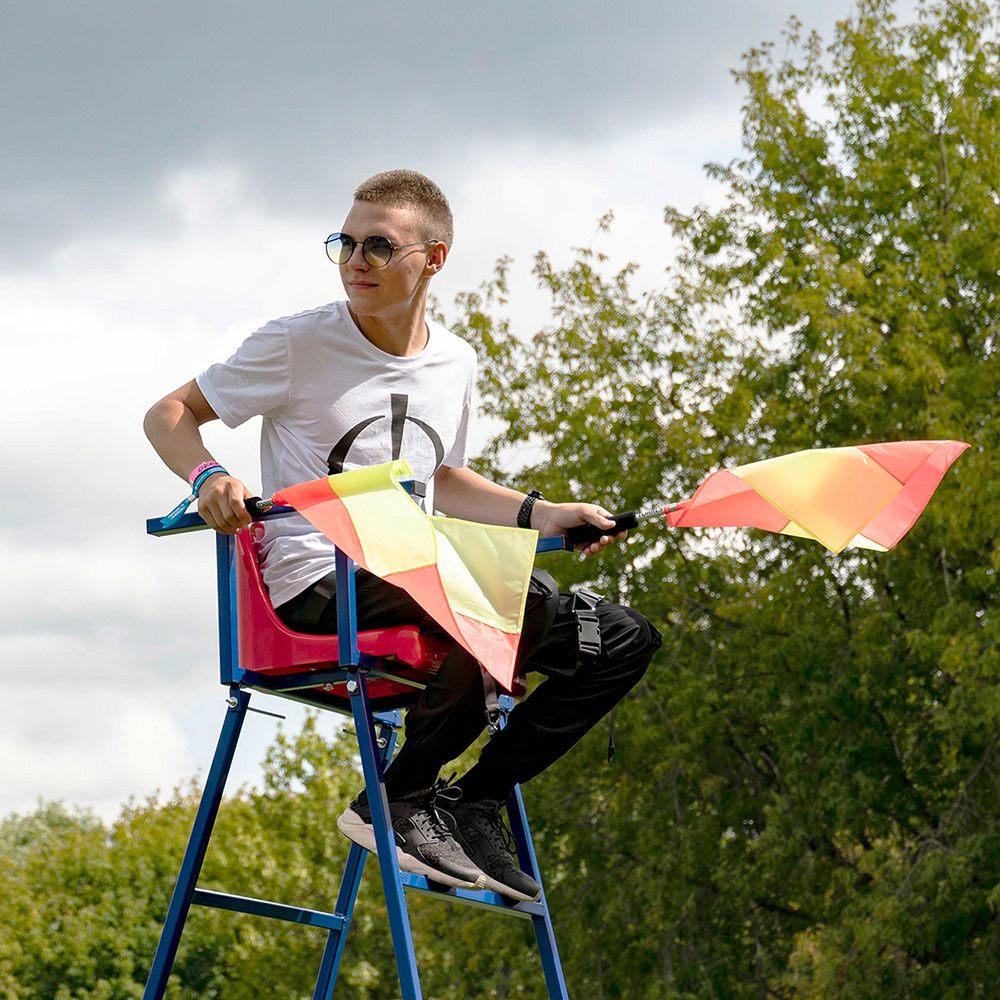
Images (opinion after)
Opinion
The old logo (and accompanying identity) were quite funky and without the weird condensed “F” and “N” would have been an overall solid job. The new logo is a much more upscale and refined approach with an abstract icon meant to represent unity and coming together at a creative epicenter. It’s a lovely mark and its aesthetic is well matched with a custom wordmark that tapers in the areas that create the stencil structure. The applications are a little on the trendy-Brutalist side with the big deadpan sans serif mixed with serif numerals but they are definitely colorful and attention-grabbing. My only question would be if this feels too much like a fashion brand (or a high-end shopping district) and not enough like a cultural, creative hub? Still, a great update from what was before as well as being more inviting to a wider audience.