
Noted: New Logo and Identity for Overview by Ben Bloom

“It’s a Big World After All”
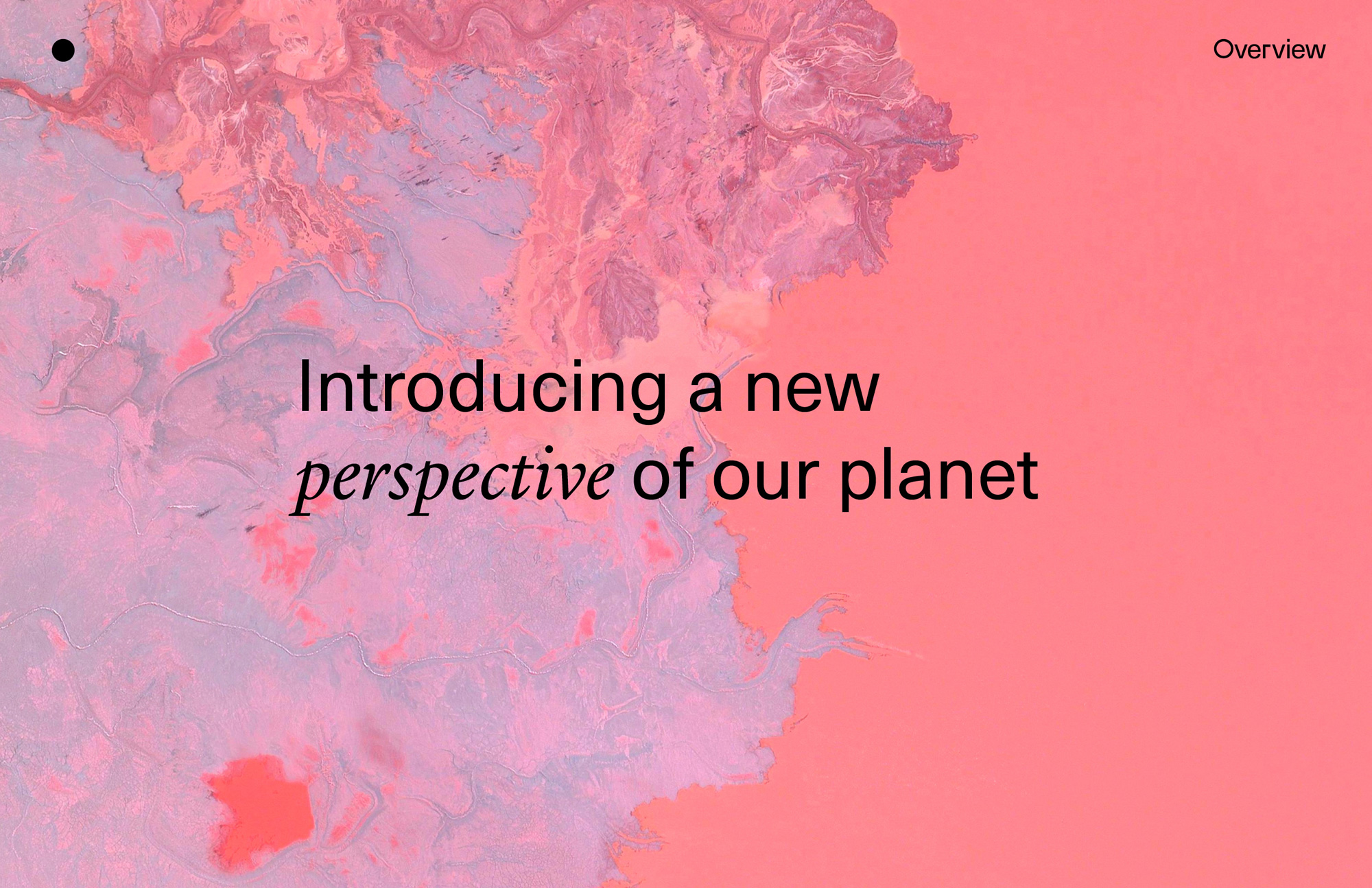
(Est. 2013) "Overview uses satellite and aerial imagery to demonstrate how human activity and natural forces shape our Earth. This perspective provides a powerful look at the planet where we live and the civilization we are creating. Through our imagery, shop, and collaborations we aim to inspire the Overview Effect.Our daily feature - Daily Overview - is one of the most popular blogs on social media, garnering one of the largest followings on Instagram (currently 753,000+ followers) of brands with an environmental focus. Images from the project have been featured in hundreds of publications around the world including the New York Times, Washington Post, WIRED, The Economist, VICE and more. Lastly, large-format prints from have project have been exhibited at numerous exhibitions around the world with noteworthy installations in Barcelona, Munich, San Francisco, Tel Aviv, Los Angeles and Hjo, Sweden."
Design by
Ben Bloom (San Francisco, CA)
Related links
2015 Brand New Noted
Images (opinion after)
Opinion
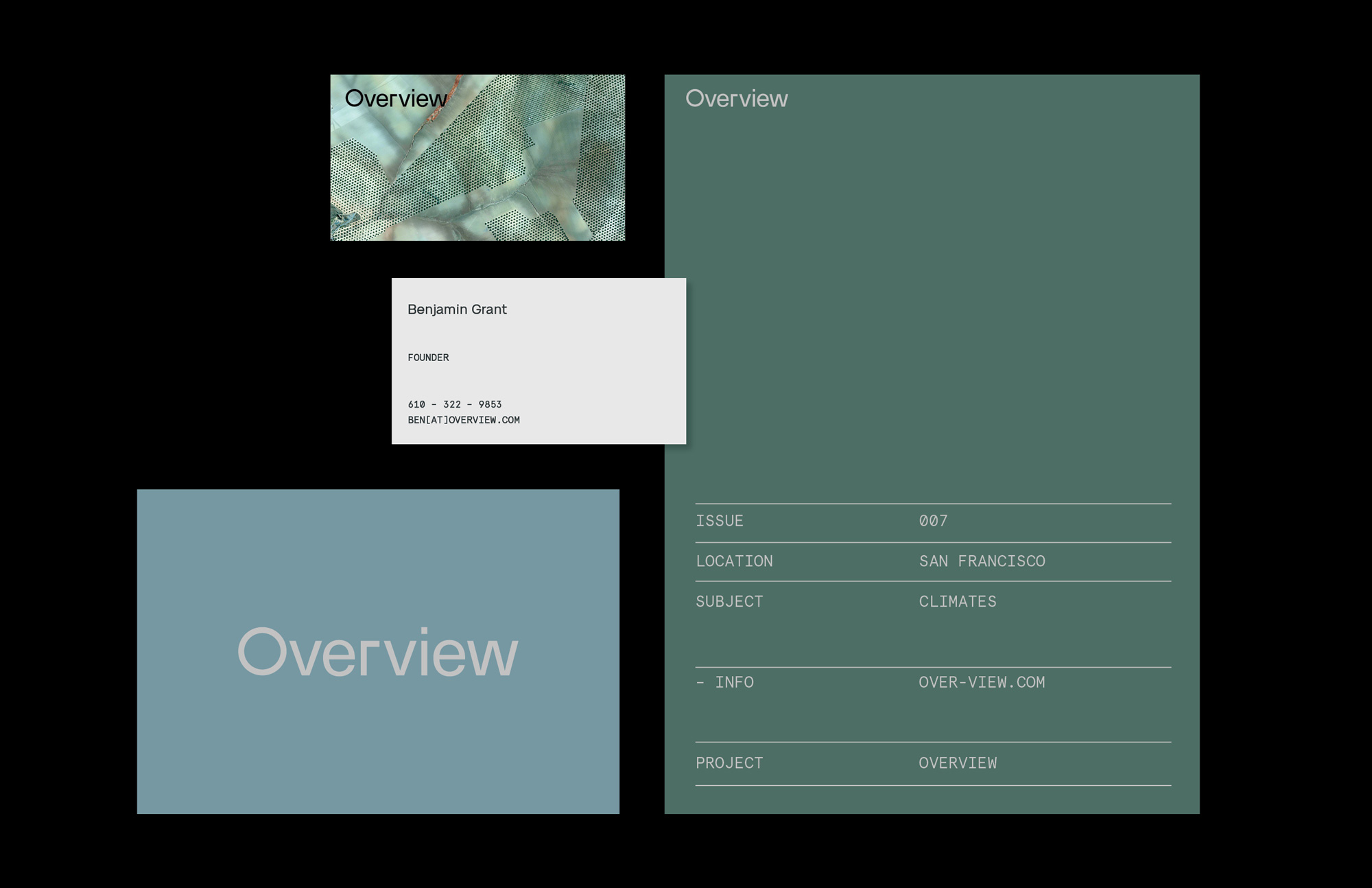
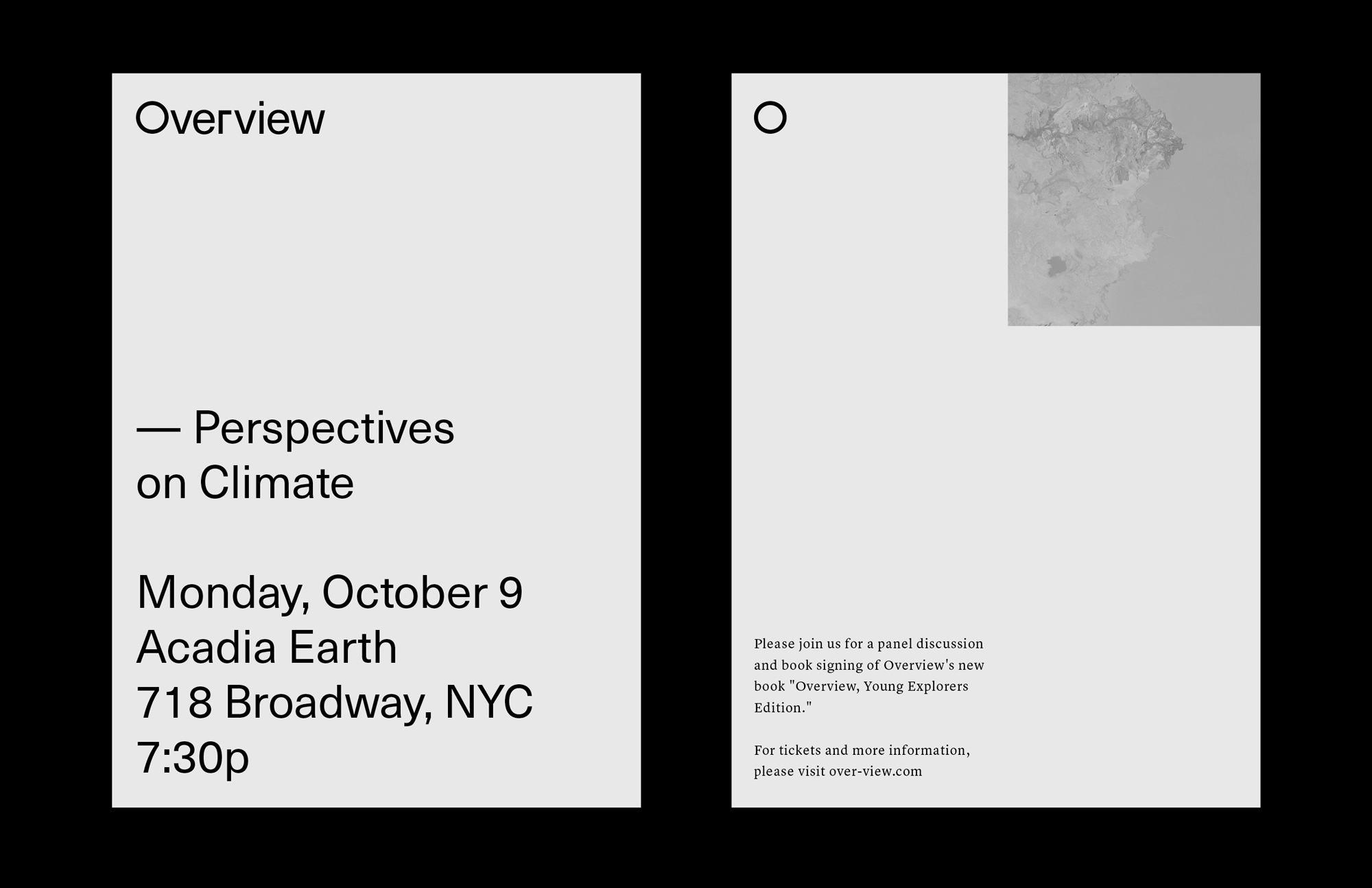
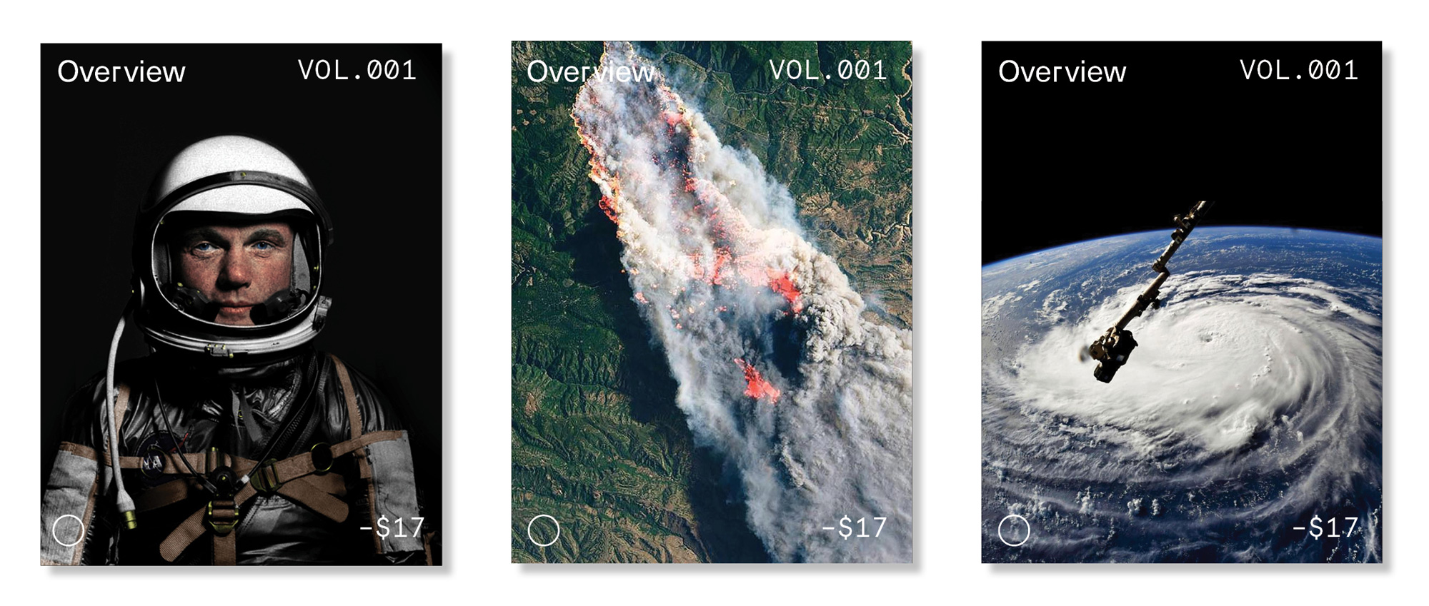
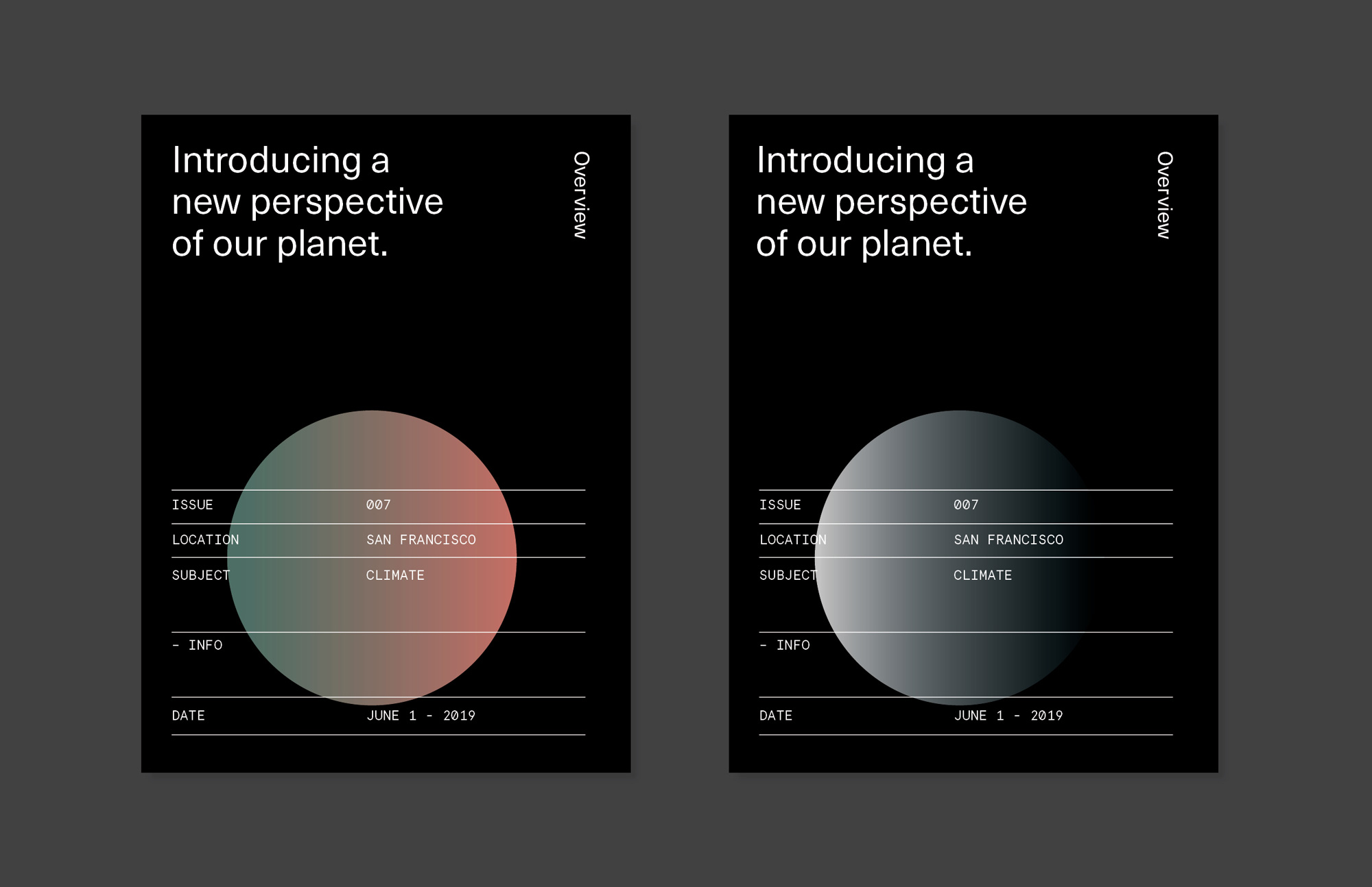
The old logo — which will still be used for the Instagram account as the “Daily” segment of the newly named Overview — was good, with a “D” orbiting around an “O” as if it were taking pictures from above. The new logo is a reflection of the growth of what started as one of the most addictive and satisfying Instagram accounts to date that has evolved into additional publications and collaborations. The new wordmark may not be the most exciting but it is still quite nice to look at as it’s flawlessly done. The full-circle “O” obviously alludes to Earth and is used on its own confidently on the website — which, by the way, is absolutely stunning in its simplicity. The applications are very straightforward and I think that’s fine because when you have imagery as amazing as what Overview creates, the identity should get out of the way. Overall, a good thing just got good-er and if you don’t follow Overview (or have their book), I highly recommend it.