
Noted: New Logo and Identity for Eyebeam by Mother Design

“Not A Sight for Sore Eyes”
(Est. 1998) "Technology's effect on our future is always changing and difficult to understand. Through exploratory process and emotionally compelling output, Eyebeam believes that artists can help us visualize and realize a more just future. Eyebeam provides both space and support for a community of diverse, justice-driven artists. Our annual residency program, highly engaged community of alumni, advanced tools and resources, and shows and events help our artists bring their work to life and out into the world. Eyebeam enables people to think creatively and critically about technology's effect on society, with the mission of revealing new paths toward a more just future for all."
Design by
Mother Design (New York, NY)
Related links
Mother Design project page
Relevant quote
What we learned was a powerful, but challenging, provocation: being a part of Eyebeam feels like “being inside of the internet”, but also uniquely communal because of the diverse family of artists and advocates that cross paths within the organization. Eyebeam is a conduit; a platform and a container for an infinite number of outcomes and initiatives. This combination of futuristic exploration with connection and humanity was our key inspiration point for an entirely new visual identity system for Eyebeam.
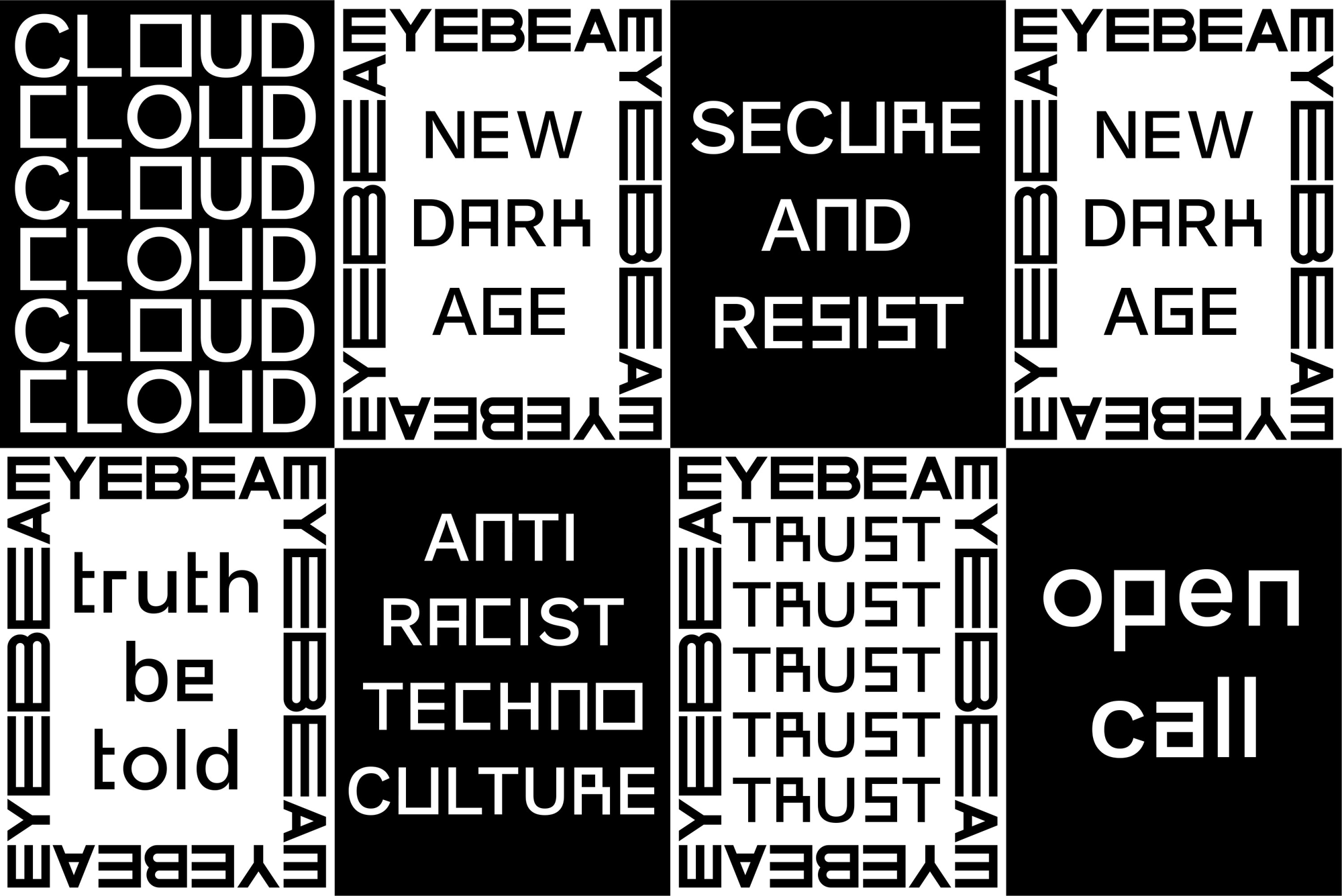
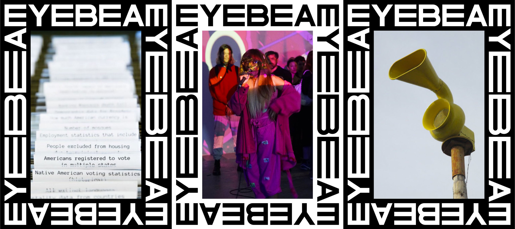
Our visual identity is a reflection of these tension points. The technical and the human, predictable and unpredictable, all referencing the collisions of disciplines, perspectives, and issues that Eyebeam explores every day.
Images (opinion after)
Opinion
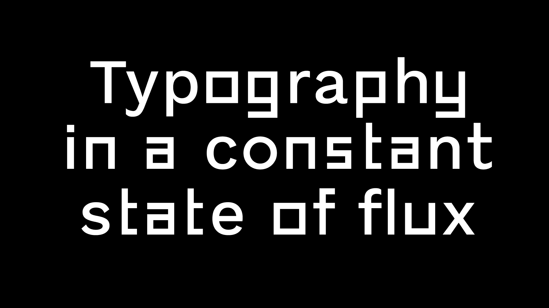
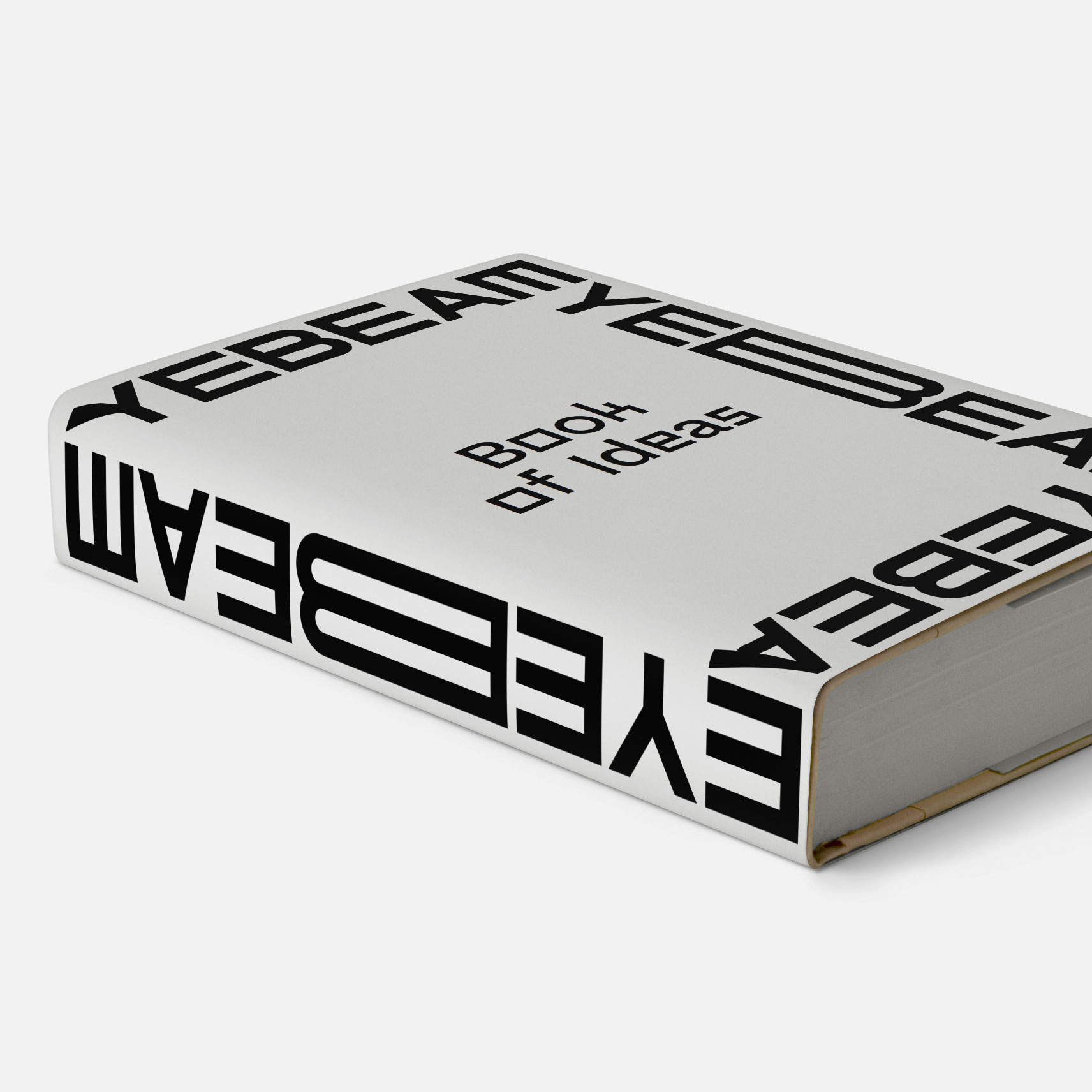
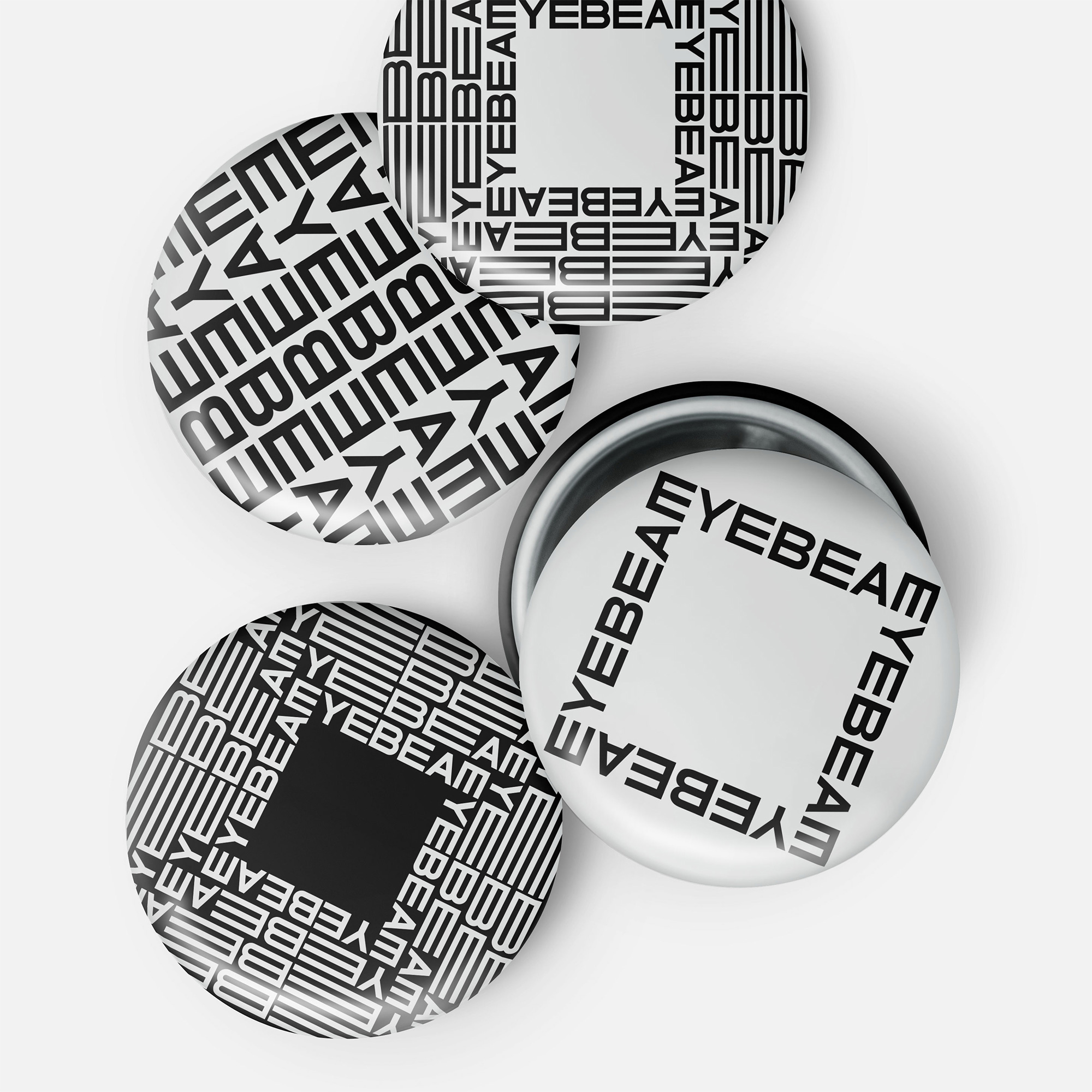
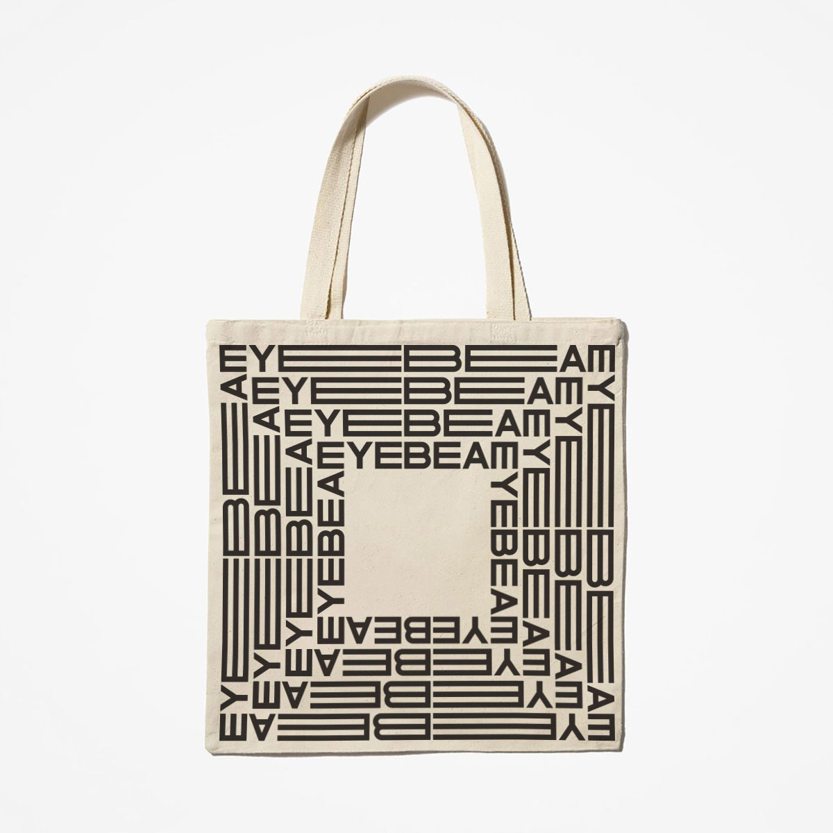
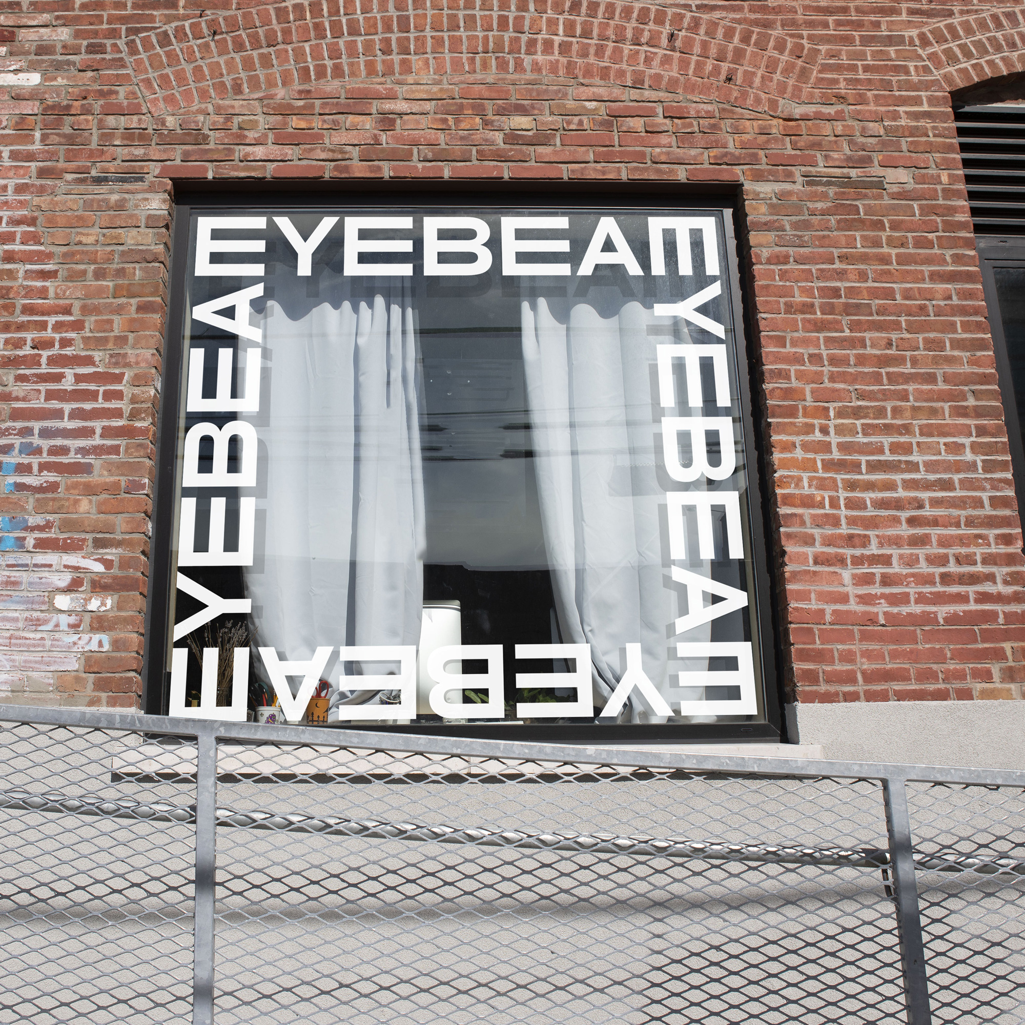
The old logo was extra ugly with some stubby slab serifs attached haphazardly and inconsistently to a bland sans serif. The new logo shoehorns every letter into a square, which means really big “E”s and really small “A” and “Y”. The “M” is a rotated “E” so you know this thing means rebellious business. It’s not particularly pleasant but it doesn’t have any intention to be. It does manage to convey the pent up energy that Eyebeam aims to foster and it explodes into a logo that expands and contracts with quick, kinetic energy as the “E”s and the “B” stretch back and forth. It’s cool and entertaining. For a while. Both in this post and in going through their website and social media it ends up being a little repetitive and tiresome, at times distracting from the content. No doubt, though, it certainly brings attention to the content, which I am guessing is the main goal, in which case, you got my attention.