Noted: New Logo for Ontario
“Hot Tub Time Machine”

"Ontario is one of the 13 provinces and territories of Canada and is located in east-central Canada.It is Canada's most populous province accounting for 38.3 percent of the country's population, and is the second-largest province in total area. Ontario is fourth-largest jurisdiction in total area when the territories of the Northwest Territories and Nunavut are included. It is home to the nation's capital city, Ottawa, and the nation's most populous city, Toronto, which is also Ontario's provincial capital." (Wikipedia)
Design by
N/A
Related links
2019 Ontario Budget Plan
CBC story
Relevant quote
The government has embarked on an ambitious effort to ensure all government activities reflect and reinforce a simple common brand standard rooted in the qualities of Trust, Responsiveness, Better Customer Experience, Caring and Fairness. This new shared brand will be encapsulated in a new shared visual identity rooted in the modernized Ontario Trillium Logo that you can find on the cover of this Budget. The logo is accompanied by a clear and succinct articulation of a simple unifying principle: that the Ontario government is “Working for You.”
The government intends to deliver a new visual identity directive across the entire public sector that will explicitly prohibit the spending of taxpayer dollars on new logos or other visual identifiers going forward. Since 2011, the ministries and agencies of the Ontario government wasted more than $2 million on visual identity work that only served to fragment the Ontario government’s brand and confuse the public about what it stands for. Existing visual identifiers will be retired and replaced by variations of a flexible and adaptable brand system based on the new Trillium. This will be done in a “no-waste” manner to allow different bodies to exhaust their pre-existing brand collateral before adopting the new standard. Revenue-generating government bodies with existing brand identities will be managed on a case-by-case basis.
Images (opinion after)

Opinion
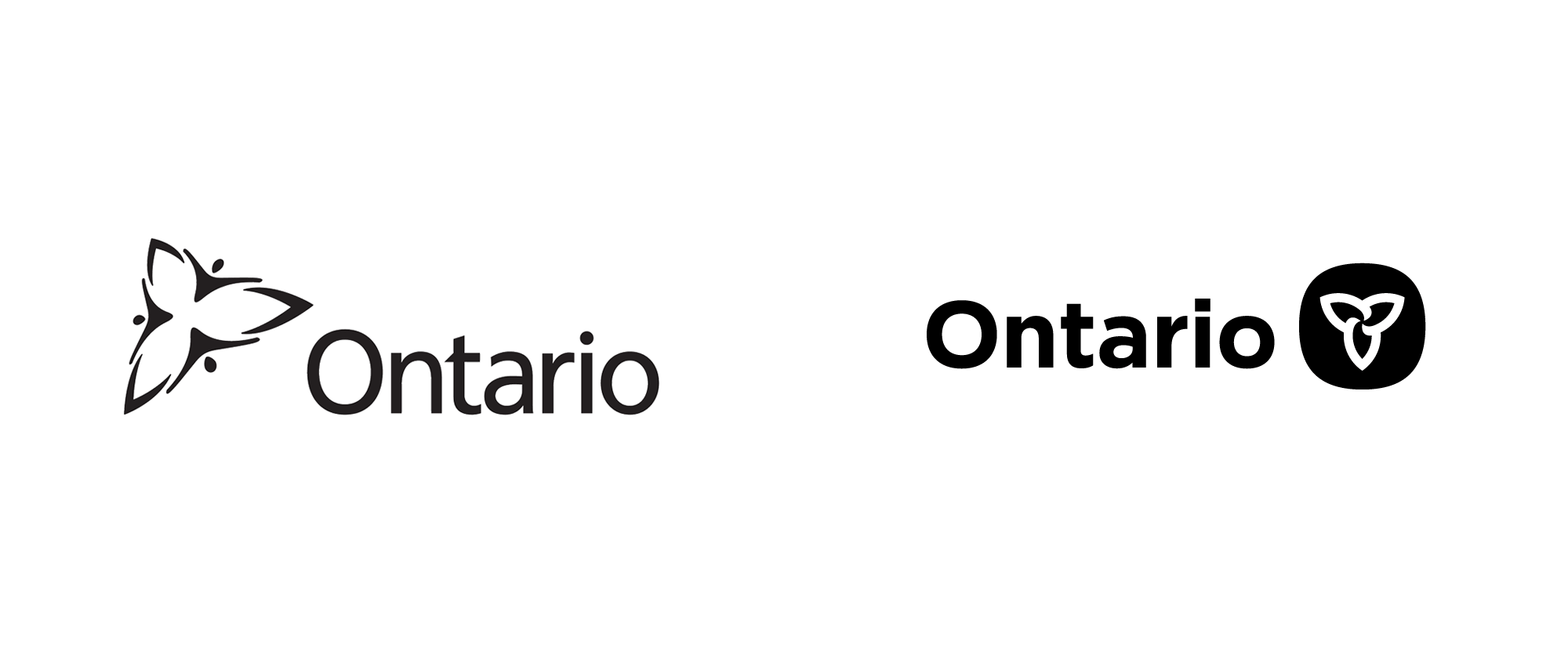
Trilliums are to Ontario what maple leaves are to Canada and the region has had a trillium icon since the 1960s. Between 2006 and 2019, it had what is commonly referred to as the “3 men in a hot tub” icon which, once you hear that moniker, is impossible to see anything else. I have never been a big fan of that logo — the abstract human sprites are too cheesy and the composition fairly awkward. The new logo goes back to the original version with a simplified icon in a style that would look right at home in this publication — so much so that it, in fact, is in that publication. This new-old approach is undoubtedly better and more dignified than the previous logo, even elevating the otherwise lackluster wordmark. The revised holding shape for the icon is quite nice too and should be interesting to see what kind of identity surrounds it, if any. The mention of the logo in the budget plan is pretty humorous to read as a kind of government logo trash talking gauntlet that comes across as very unapologetic for Canadian standards. Overall, a good decision was made even if it feels like the logo change was more of a political message being served.

