
Reviewed: Friday Likes 339: From Studio MPLS, Wade and Leta, and Unifikat Design Studio

“From Studio MPLS, Wade and Leta, and Unifikat Design Studio”
This week all projects come from repeat visitors, two of them from two weeks ago. I usually don't like to repeat designers within such a close timeframe but when the work -- from Minneapolis, Brooklyn, and Warsaw -- is this Friday-Like-ish, I can't argue with that.
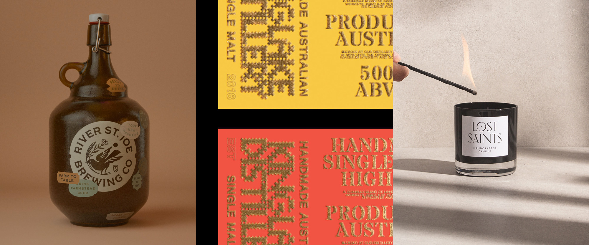
River Saint Joe by Studio MPLS
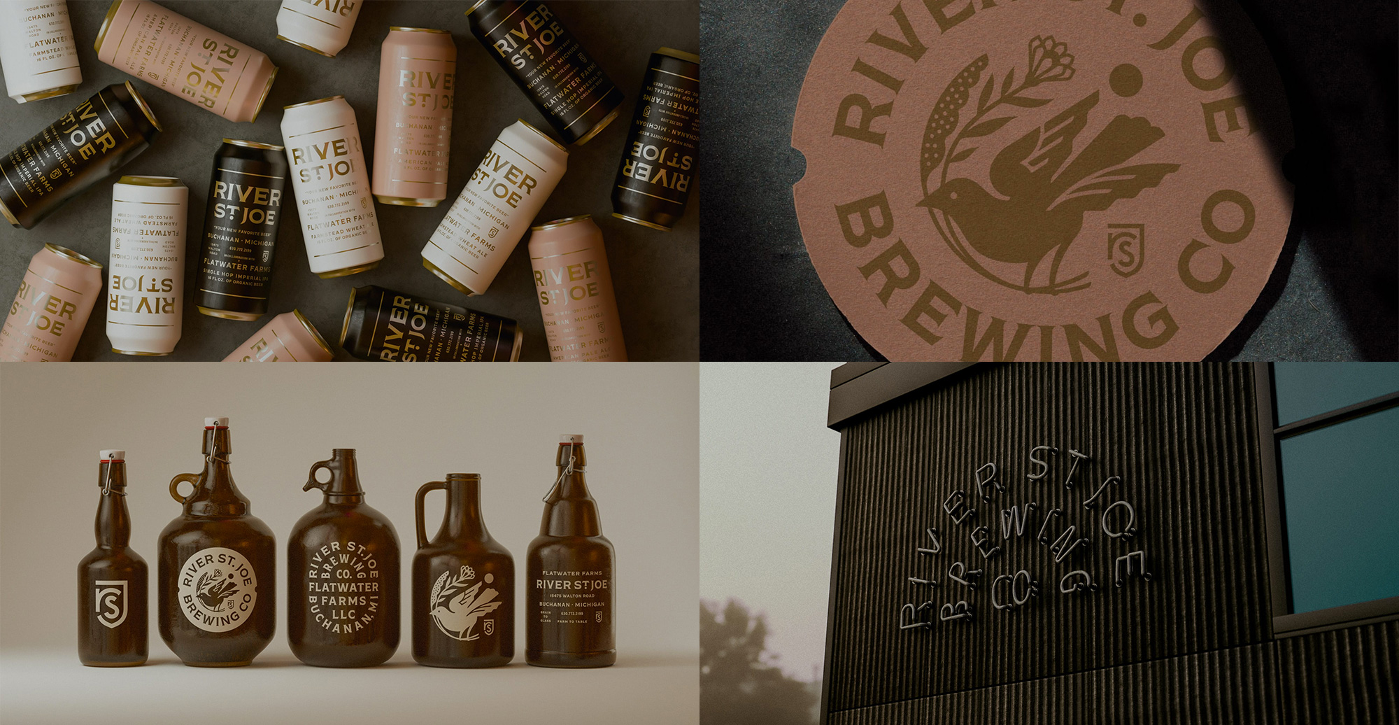
River Saint Joe is a brewery, farm-to-table restaurant, and event venue in Buchanan, MI, in an idyllic farmstead setting. Their identity, designed by Minneapolis, MN-based Studio MPLS, captures the richness of their offerings and surroundings with an equally idyllic typographic system that revolves around a lovely flared serif. A little on the hipster trend but absolutely perfectly done -- just look at that middle growler. A series of type badges and a lovely bird icon complete the identity that is non-stop beautifully produced and detailed. At first I thought the images above (and in the case study) were aspirational mock-ups but, nope, going through River Saint Joe's Instagram, a lot of those objects, are right there in real life. Would definitely love to visit, eat, drink, and be merry there. See full project
Kinglake Distillery by Wade and Leta
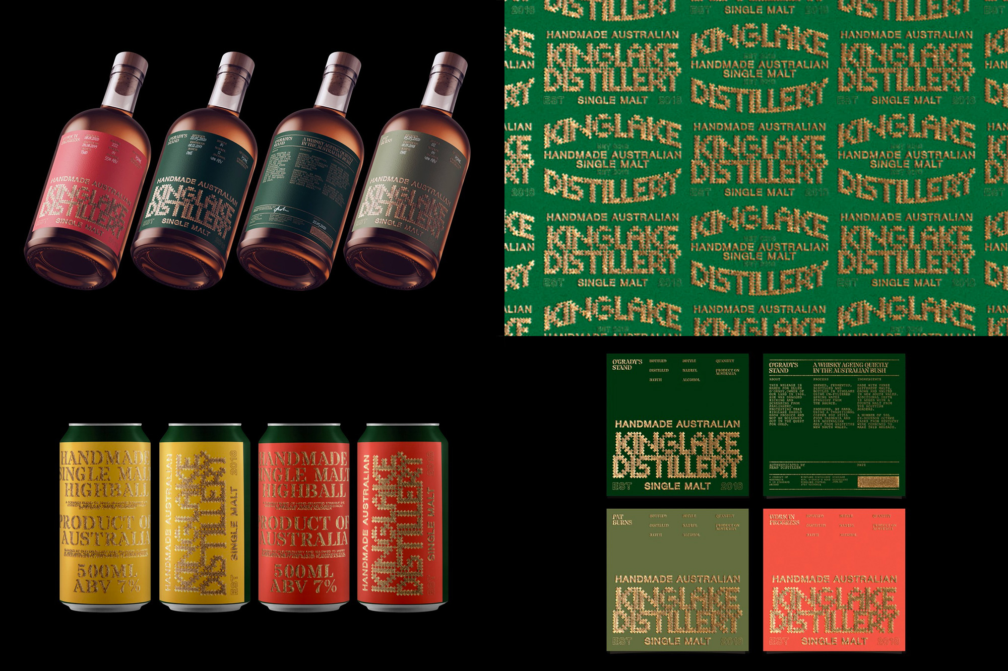
Kinglake Distillery is a family-run distillery in Kinglake, Victoria, Australia, that produces what sounds like a very tasty whisky whose key ingredient is water from a mountain stream rising on the distillery property, which is located in a rough landscape with rough weather, making the locals a hard-working bunch. The packaging, designed by Brooklyn, NY-based Wade and Leta, pays homage to the tools of these hard-working folk by creating a lettering that "references the hand-made labour of running a farm: the punch holes in machinery, the nailing of a post, and welding metal". While I'm not exactly convinced the typography conveys that, I am not going to argue with the fact that I heavily dig it. It's weird, it's clunky, and it's hard to read but it has a very unique and arresting personality that takes on a stranger vibe by being reproduced in gold foil. A secondary stencil serif adds to the oddity of the identity while a sans serif provides a needed balance of simplicity. To be honest, I'm not sure if I like-like this but I really enjoy staring at it. See full project
Lost Saints by Unifikat Design Studio
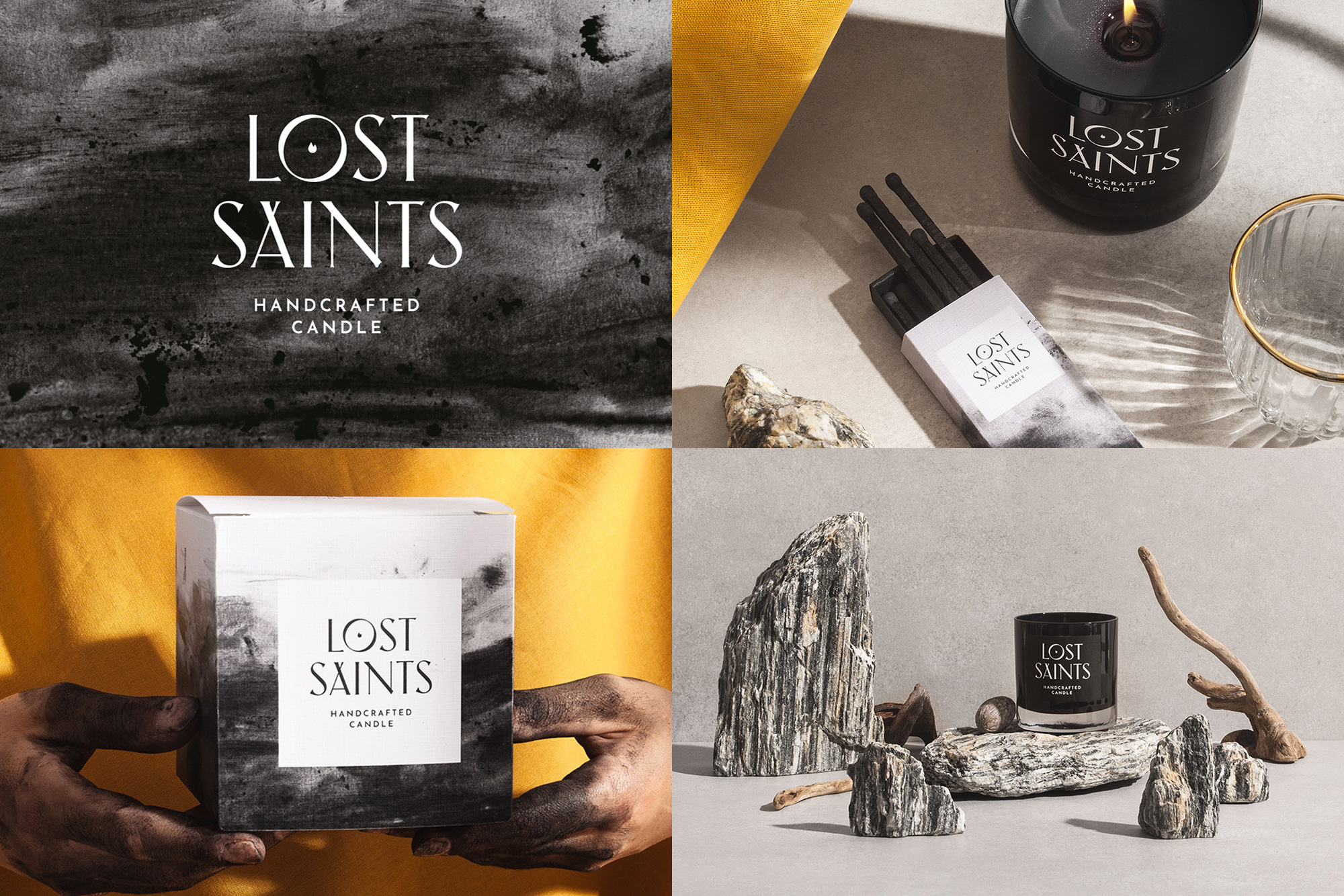
Lost Saints is a brand of handcrafted, vegan candles created by Los Angeles, CA-based Herminio Ochoa who, by day, works on film production at Netflix. The identity, designed by Warsaw, Poland-based Unifikat Design Studio, features a great wordmark with a flared sans serif -- akin to the last project of them we showed (which is a style I don't tire off easily) -- with a very wide "O" with a flame in it. If they had managed to center-align the "I" underneath with flame I would be doing cartwheels right now. Another nice, literal touch is the background used in the packaging which was created by rubbing dark, smeary ashes on their hands and then rubbing them on paper, yielding a moody vibe that goes very well with the name of the product. The touches of yellow in the presentation are worth mentioning as they match the flame of the candles. See full project