
Noted: New Logo and Identity for Kearney Group by Self-titled

“Logic at the Disco”
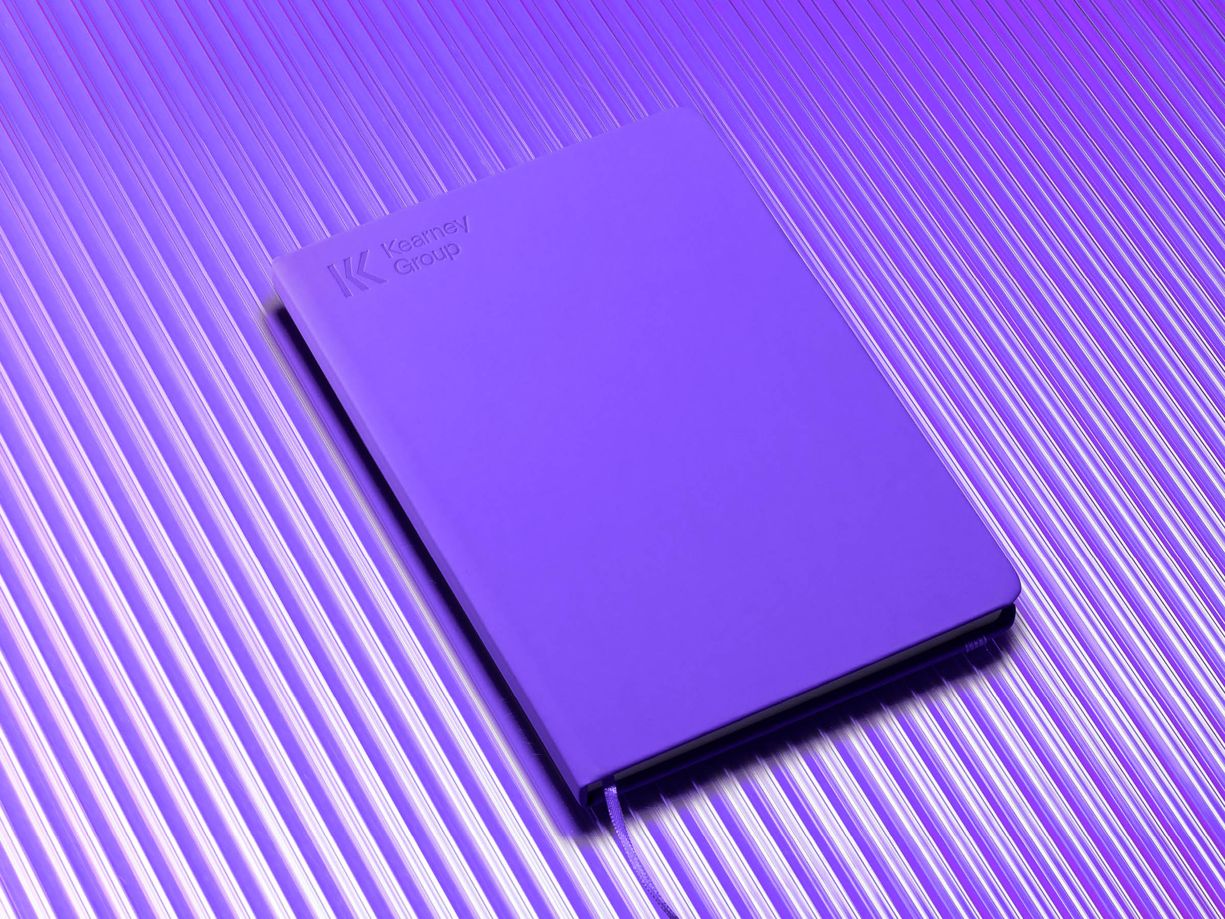
(Est. 1986) "Kearney Group is a nationally-recognised, multidisciplinary financial services firm based in Abbotsford, Melbourne. Our team is made up of over 50 financial professionals, dreamers, doers, pioneers and visionaries - all working collaboratively in Integrated Advice Teams and providing our award-winning Private Wealth, Business Advisory and Strategic Lending services. In a business landscape ruled by best practise, we are the vanguard of truly integrated financial advice for pioneers and their businesses. Our unique skills and truly holistic capability combines the experience and technical know-how required to tackle task based work, with the creativity needed to drive meaningful transformation. We occupy the 'intersection' between businesses and their households, becoming catalysts for connection and the collision of ideas. We are a lifelong home for the entrepreneurial spirit."
Design by
Self-titled (Prahran, Victoria, Australia)
Related links
Self-titled project page
Relevant quote
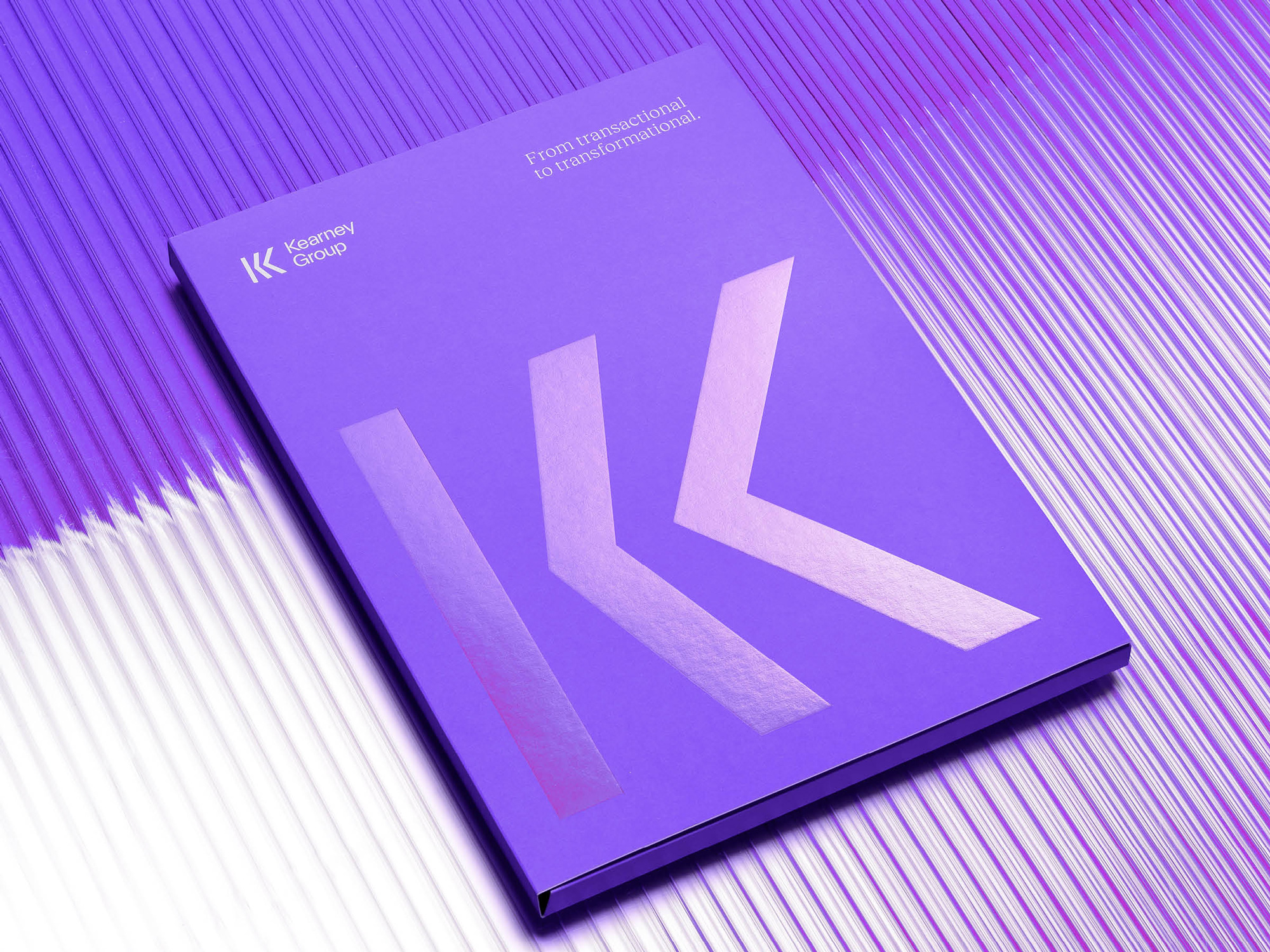
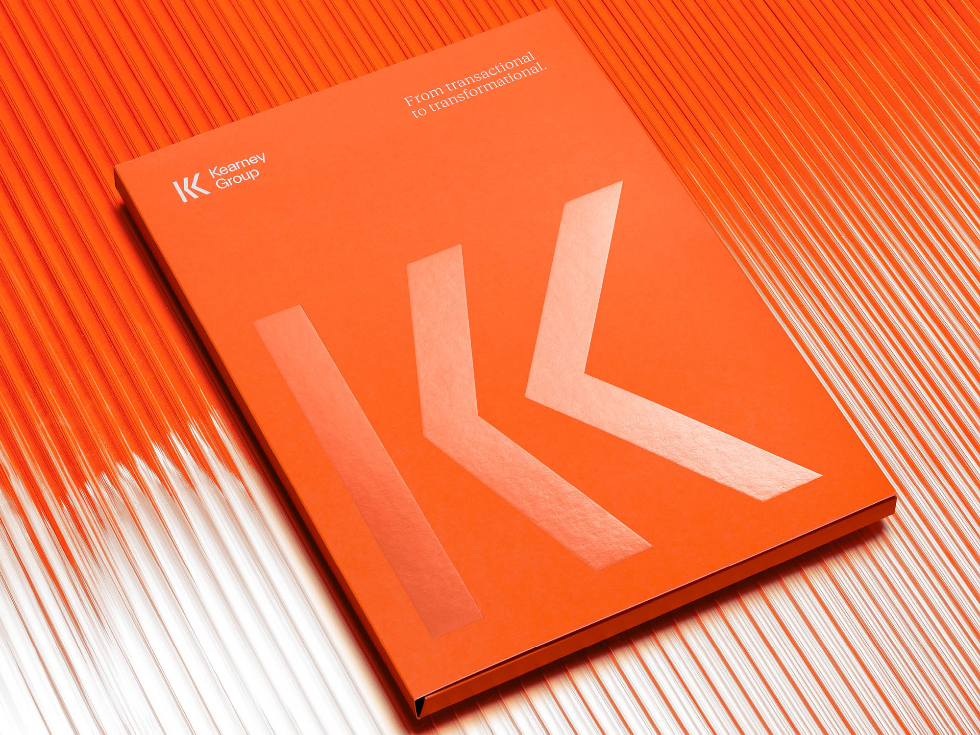
Our brand idea ‘from Logic to Magic’ reflects their unique combination of transactional and transformational skills. The fusion of these two is where the most value is added. These ideas of logic, magic and transformation drive the visual and verbal expressions of the brand.
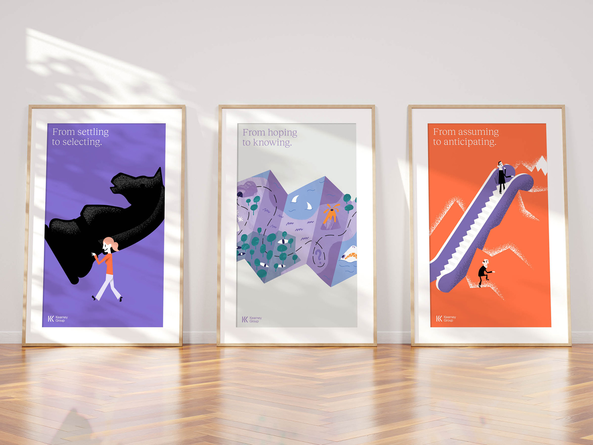
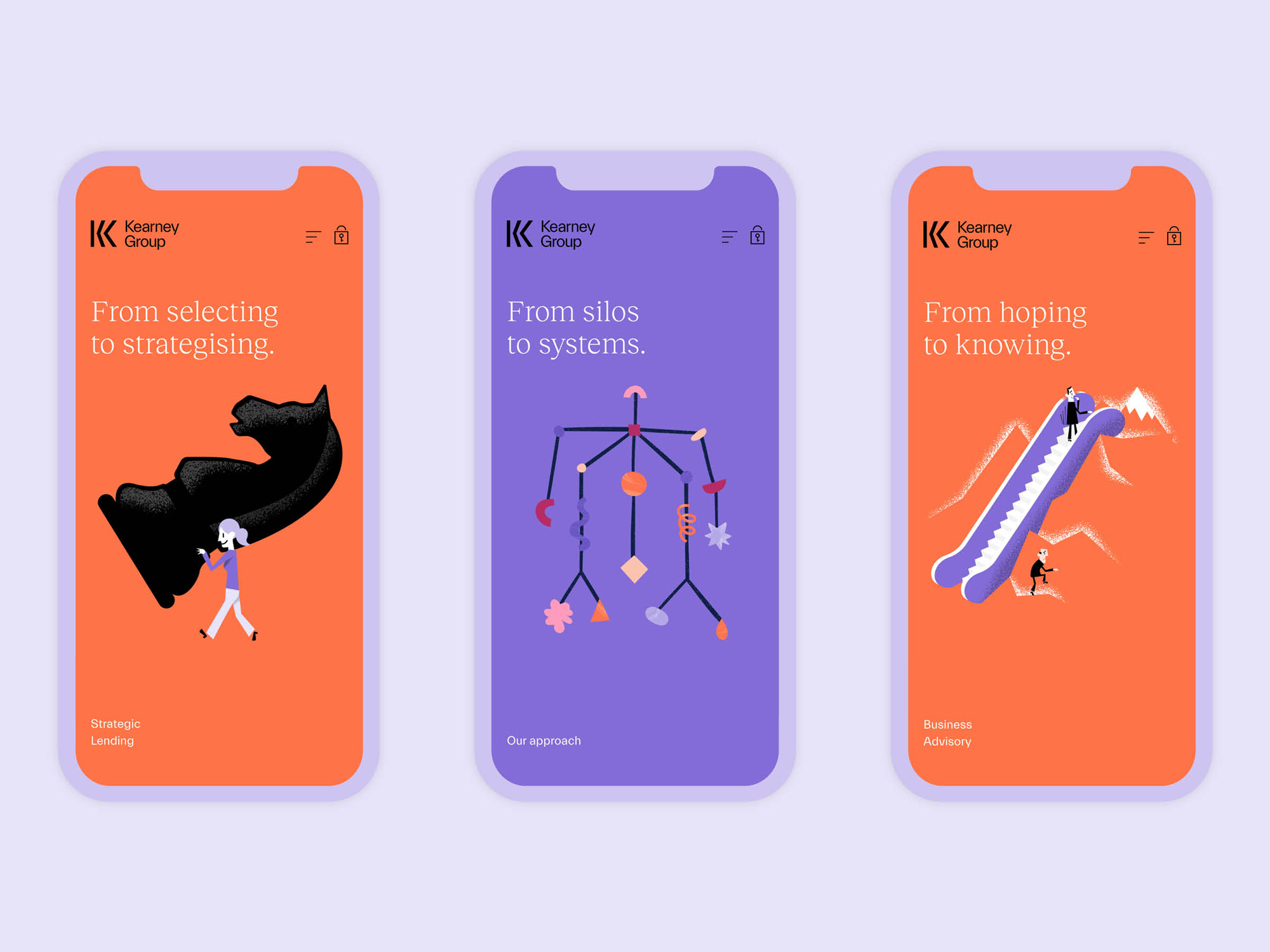
Being pioneers in their industry, Kearney Group needed to look different than the rest of the financial sector which heavily relies on aspirational images of retired couples walking along the beach or cheesy metaphoric stock imagery.
If you’re going to talk about going from Logic to Magic, illustration seemed a fitting approach.
Rather than use a single illustrator whose style becomes a default look for the brand, we worked with three stylistically different illustrators (Elin Matilda, Ben Sanders and Kim Lam), united by a common approach.
Images (opinion after)


Opinion
This isn’t a big company or an amazing identity but it’s an impressive transformation done in a very upbeat, sophisticated way. The old logo was really painful to look at with a very poor unbalanced icon and fake small caps for the wordmark. The new logo is a major glow up with a strong “K” monogram that illustrates the brand positioning of “From Logic to Magic“ by going from a flat vertical stick to the angular defining stroke of the “K”. The only drawback is that in my mind I keep wanting to find two “K”s in the name or a plural as the monogram could be interpreted as being two “K”s. Still, I dig it. The wordmark is alright for the most part; I’m not sure the “y” needs to be so unique as it feels distracting from the rest of the letters. The identity — beginning with their website — is quite lovely with the various illustrations from different illustrators unified by the color palette and whimsy tone that are paired with the very nice Reckless Neue light serif. Overall, for a financial company, this feels welcomingly light, airy, friendly, and approachable.