
Noted: New Logo and Identity for Yale by GW+Co

“Where the Sun do Shine”
(Est. 1843) "At Yale, we have the expertise and product range to protect your home and possessions. We pour passion and pride into our products, making sure our locks lead the way in home security. With a vast range of products from digital locks to alarms, cylinders, mortice locks and night latches to replacement PVCu locks, it's no wonder that we have been producing the world's favourite locks since 1843. Yale is part of the ASSA ABLOY group, the global leader in door opening solutions."
Design by
GW+Co (London, UK)
Related links
GW+Co project page
Studiotype project page
Relevant quote
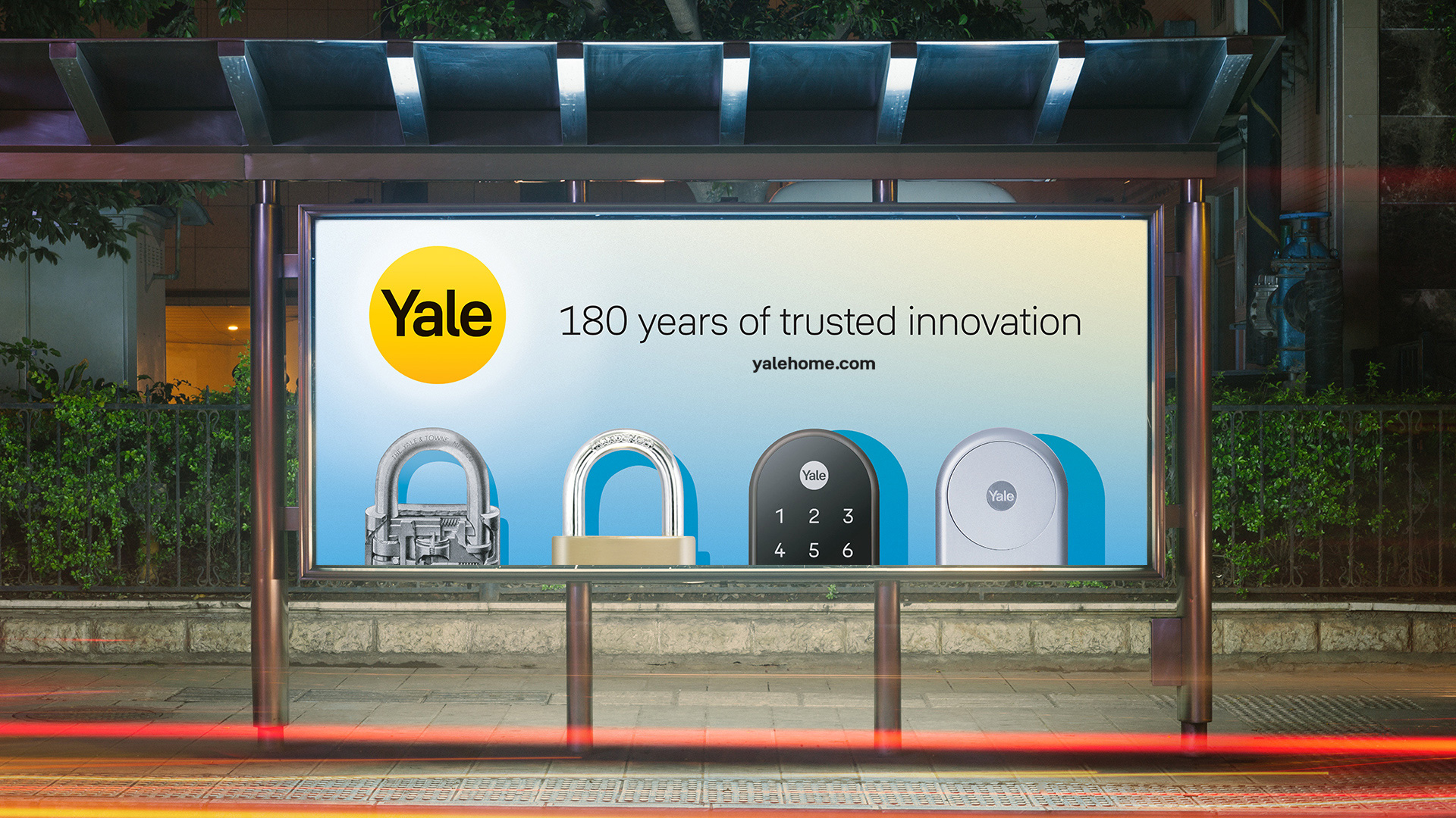
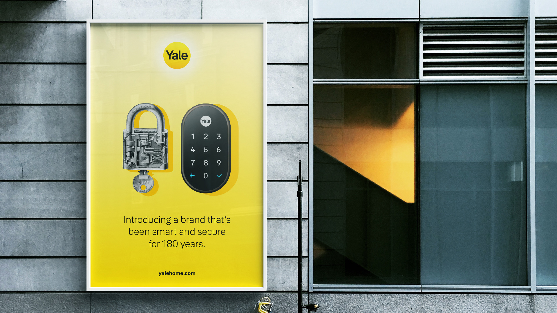
Our design solution emerged from a simple idea: Yale is like the sun. It’s warm and positive. The sun is always shining (even when you can’t see it). And it sustains life – from morning to night.
‘Yale is like the sun’ is a universal metaphor that is understood around the globe. It informed every aspect of our design language: a palette of gradients inspired by sunlight, graphic shadows that images cast, a range of light-shape illustrations, photography with a presence of sunlight and a unique, positive tone of voice.
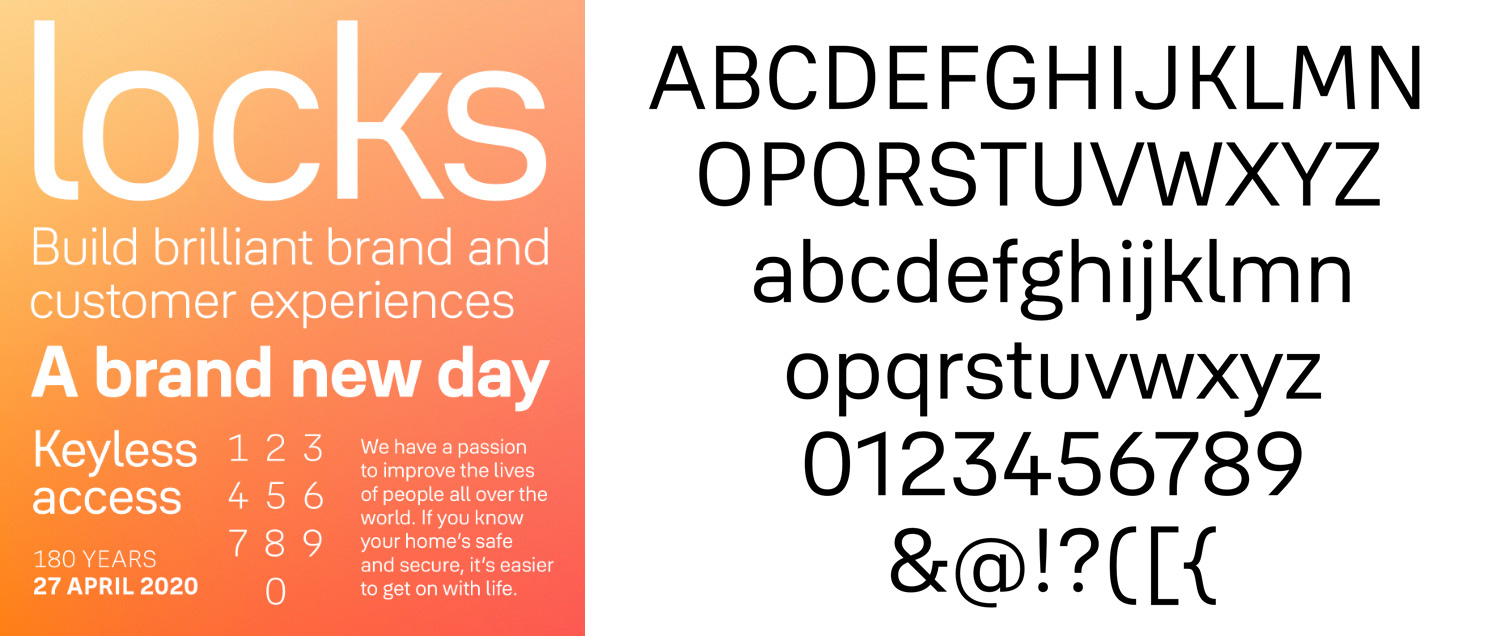
We commissioned a unique new typeface, Yale Solis (designed by Jeremy Tankard) that is inspired by the central brand idea and connects this warmth with the visual aesthetics of Yale’s new product designs. Each letter is different enough from each other so that a computer can interpret it easily, but also aesthetically pleasing to the human eye. Particular emphasis has been placed on numbers as they feature prominently on products.
It has a softness to its appearance though not soft in its outline. The proportions create an even rhythm that elegantly and effortlessly conveys Yale’s voice.
Images (opinion after)
Opinion
The old logo was eh, with Helvetica in a circle and I know that that you are not supposed to critique Helvetica because it’s neutral and it works and… zzzzz. Boring. And generic. The new logo maintains the premise of the logo of the name inside a yellow circle but livens it up with a new, custom wordmark (that’s part of the new custom typeface) that looks sturdier through its more squared-off structure and friendlier through the little curl in the “l”. I could do without the gradient but as part of the whole “Yale is like the sun” premise I guess I’m okay with it. At the beginning, with the first video, I was rolling my eyes at the concept but the advertising won me over with the nice use of soft gradients and hard shadows, creating an interesting dual sense of calmness and security. The custom typeface is pretty good and looks great in its thin weight… which makes me wonder what the logo would look like in it — could be interesting. Overall, this is a solid logo evolution and a smart and simple identity system that feels just right for smart and, um, non-smart locks: nothing too flashy or too security-focused, just a nice, calming, and reassuring presence.