
Noted: New Logo and Identity for DTS by Marchio

“Lost and Sound”
(Est. 1993) "DTS, Inc. (originally Digital Theater Systems) is an American company that makes multichannel audio technologies for film and video. Based in Calabasas, California, the company introduced its DTS technology in 1993 as a higher-quality competitor to Dolby Laboratories, incorporating DTS in the film Jurassic Park (1993). The DTS product is used in surround sound formats for both commercial/theatrical and consumer-grade applications. It was known as The Digital Experience until 1995. DTS licenses its technologies to consumer electronics manufacturers." (Wikipedia)
Design by
Marchio (Los Angeles, CA)
Related links
Marchio project page
Relevant quote
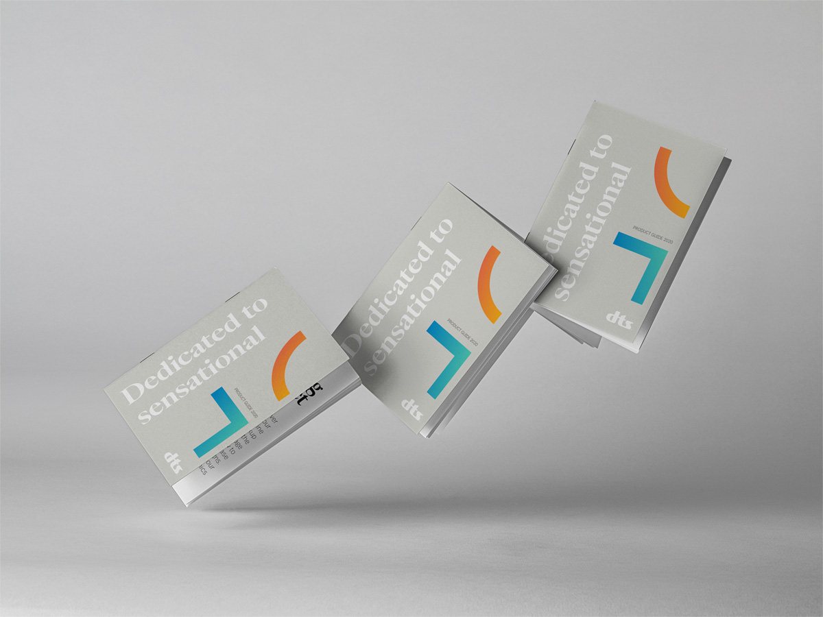
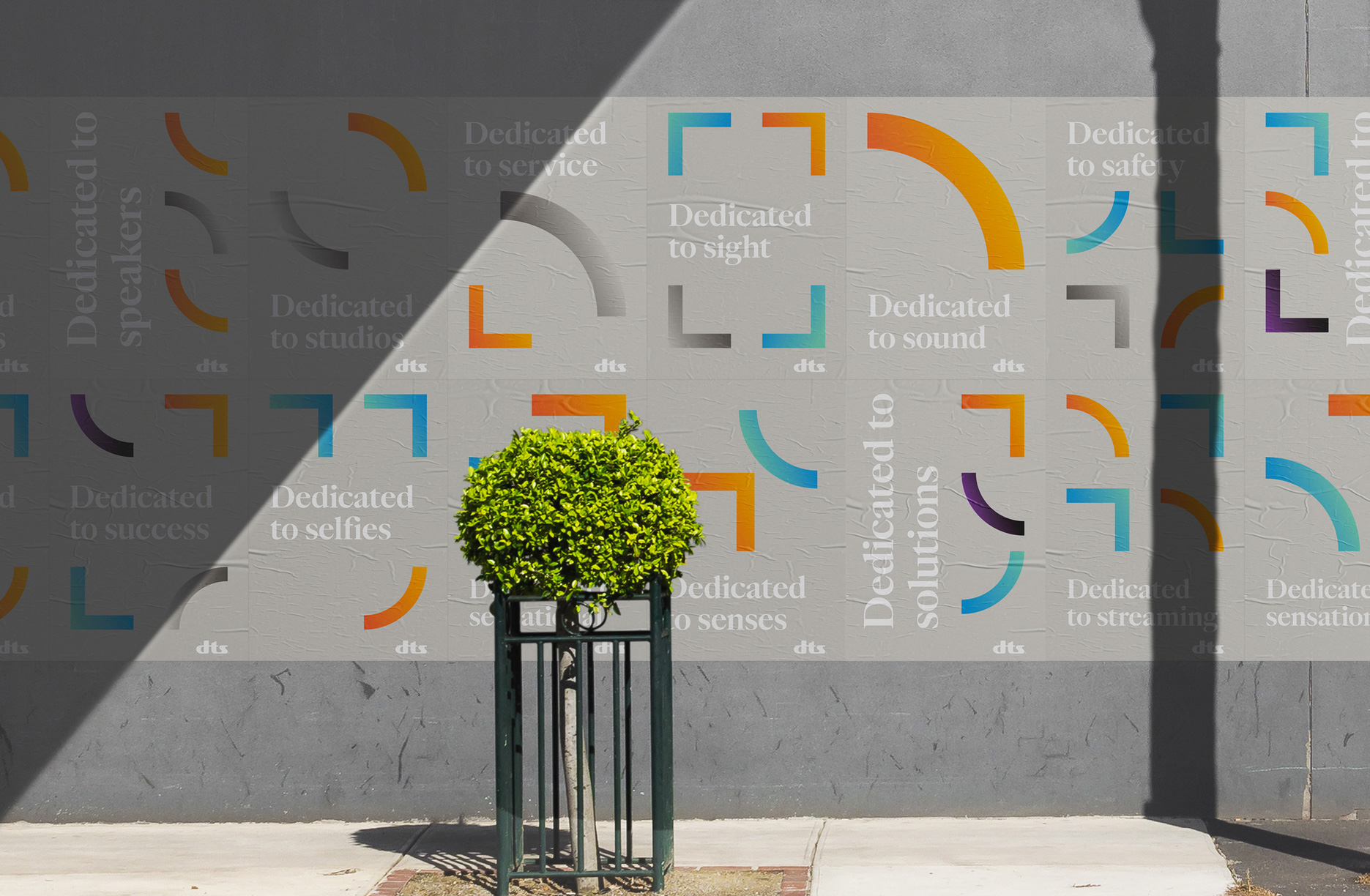
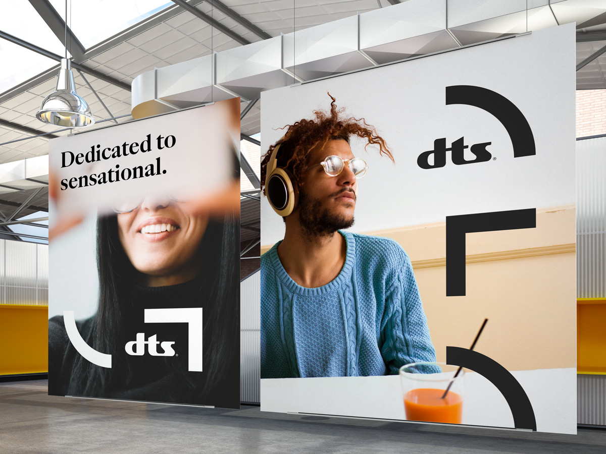
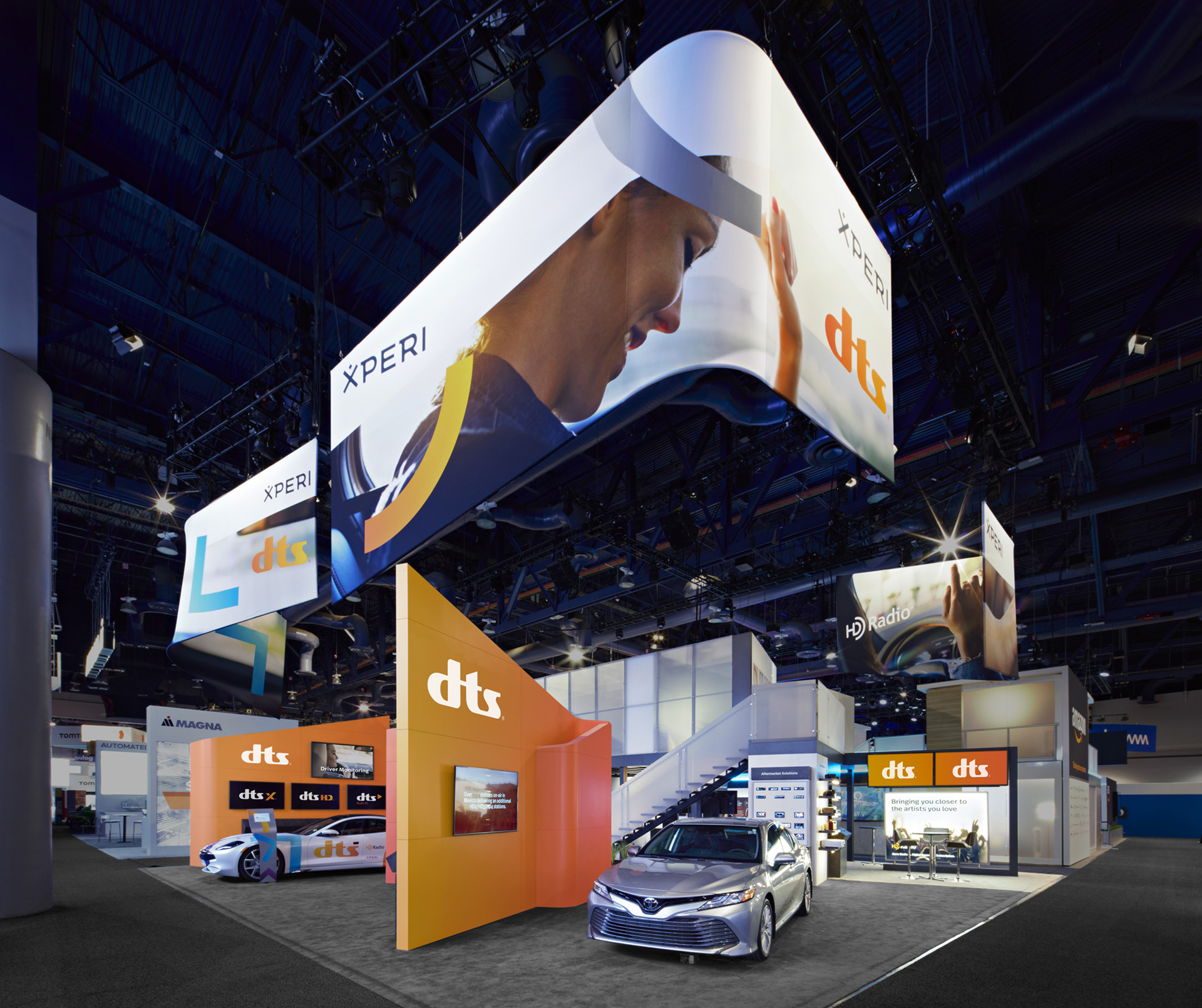
We helped DTS move from sensory to sensational with a new brand narrative that incorporates their expanded capabilities, along with a more modern, dynamic logo and visual identity system. The new brand celebrates legacies of innovation in sound and imaging while being a clear signal of change.
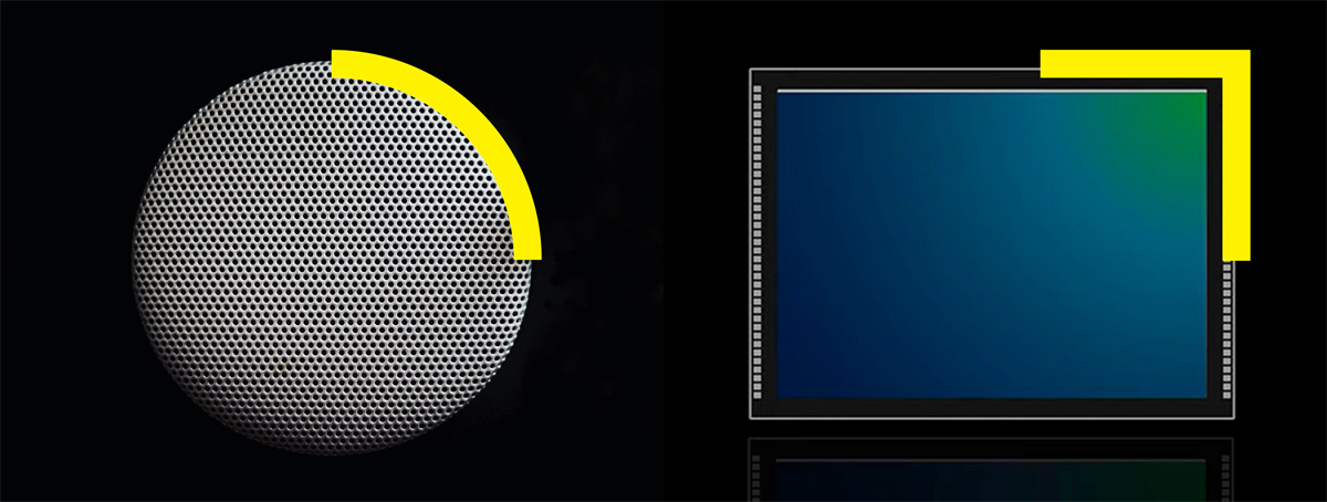
Curved lines represent the basic form of speakers, while rectilinear angles represent a tiled array of digital sensors that shape how people and machines see the world.
Images (opinion after)
Opinion
The old logo had so much quirkiness in the wordmark that the quadruple-double-swoosh icon was not just unnecessary but had zero relationship to the wordmark. I don’t recall ever seeing it but I do recognize the “dts” wordmark on its own. Officially dropping the icon was a no-brainer and redrawing the wordmark has been fairly beneficial, especially for the “s”, which has a sturdier structure now and it relates a lot better to the two other letters. I wonder if the “t” needed an extra rounded corner as well on the left side of the upward slope. Nonetheless, a technical improvement overall. The gradient in the logo is fine… could do without, can do with, I don’t think it’s a big deal either way. The sub-brands are a huge improvement and even manage to have some character of their own. The identity gets a little weird with elements that don’t quite make sense on their own or together. Mainly, the corners and quarter-circles that, without an explanation, make no sense and with an explanation still make no sense: “rectilinear angles represent a tiled array of digital sensors that shape how people and machines see the world”. Say what? But even if they made sense, they are so strangely used in a big, clunky way, with gradients that look super strange on the warm gray backgrounds. When used in single color, as in the banners, it’s just too random. The use of a serif, in theory would be fine, but this one doesn’t feel integrated with anything else, in either style or placement. So, yeah, a good logo evolution but a fumble on the identity which, given that the logo basically remains the same, needed to deliver more.