
Noted: New Logo and Identity for Northzone by Ragged Edge

“Heading in the Polar Opposite Direction”
(Est. 1996) "Northzone is a technology investment partnership. With two decades of experience, we have been chosen by some of the best entrepreneurs as their long-term partner for growth. With offices across the Nordics, London and in New York, we work around the clock to connect our companies with customers, business partners and key talent on a truly international scale. As former entrepreneurs ourselves, we have been sat on both sides of the table, and place the relationships with our Founders at the core of our business."
Design by
Ragged Edge (London, UK)
Related links
Ragged Edge project page
Relevant quote
The industry is defined by bravado. Everyone backs game changers, and everyone spots outliers. Northzone’s experience means they cut through the hype and get to the truth about the team. They build their relationships from this common ground. So we placed strength of character, not just size of opportunity, at the heart of their brand.
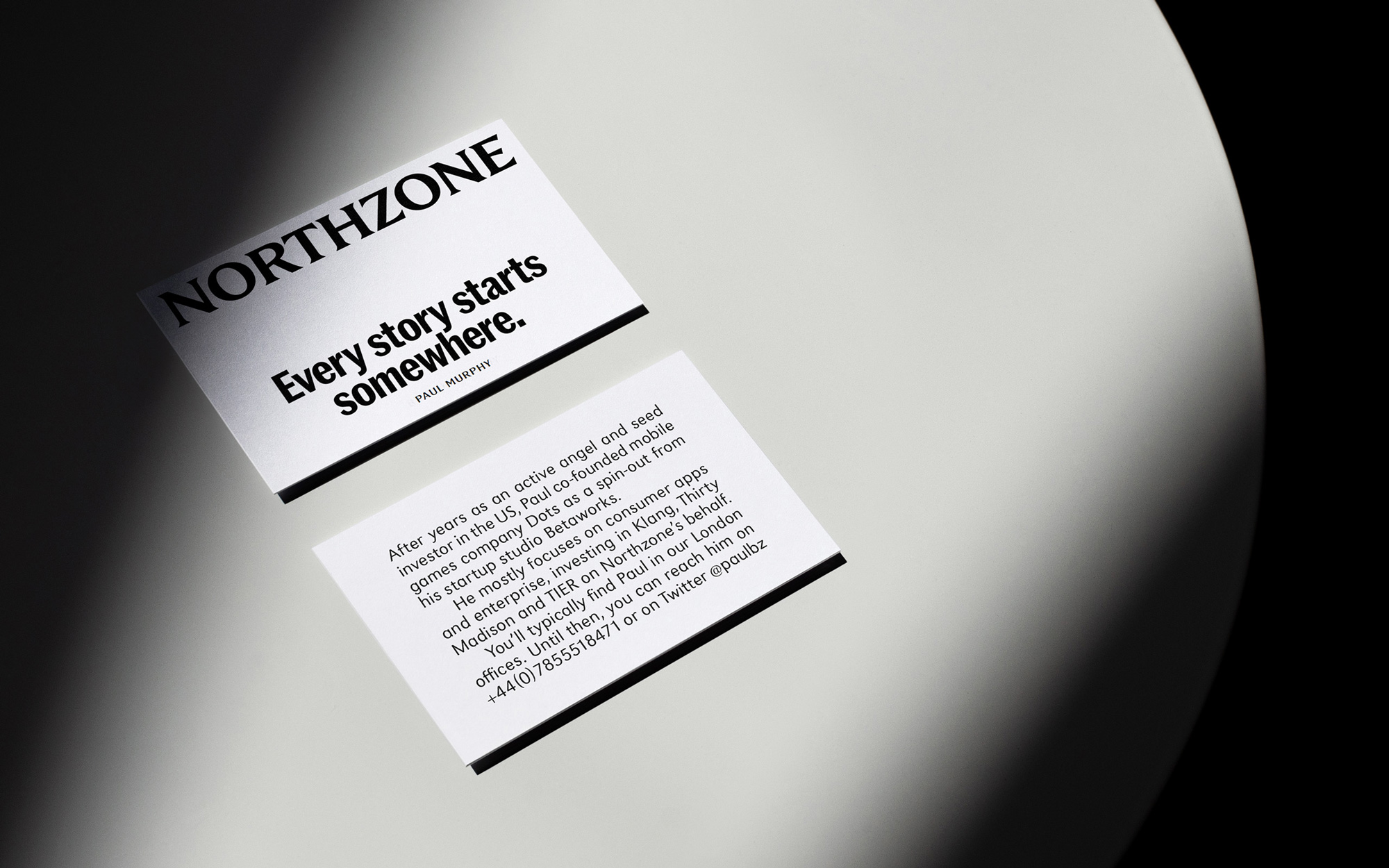
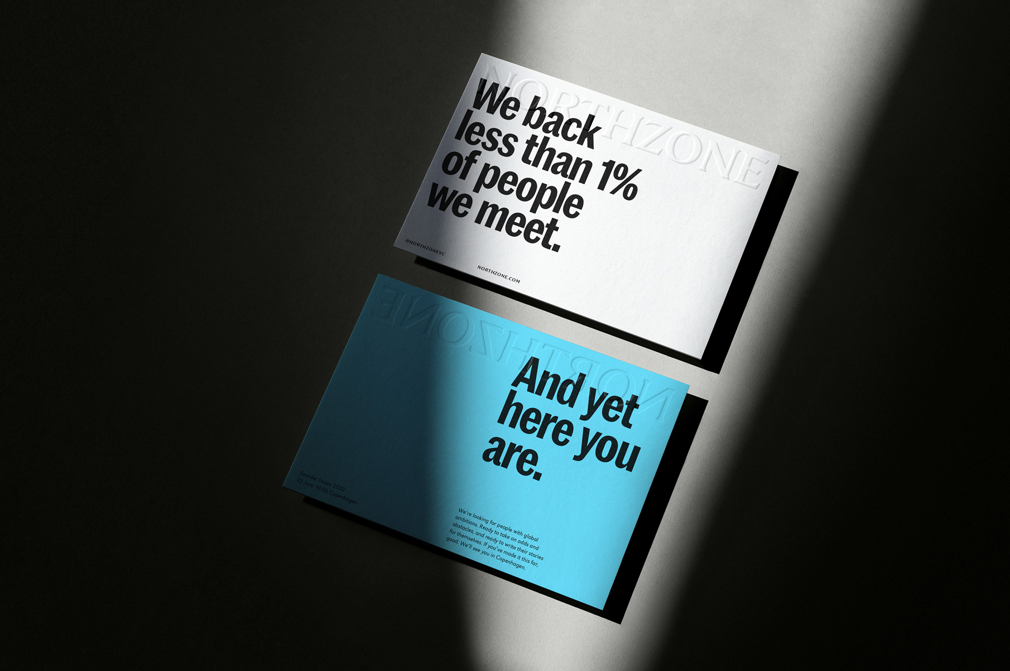
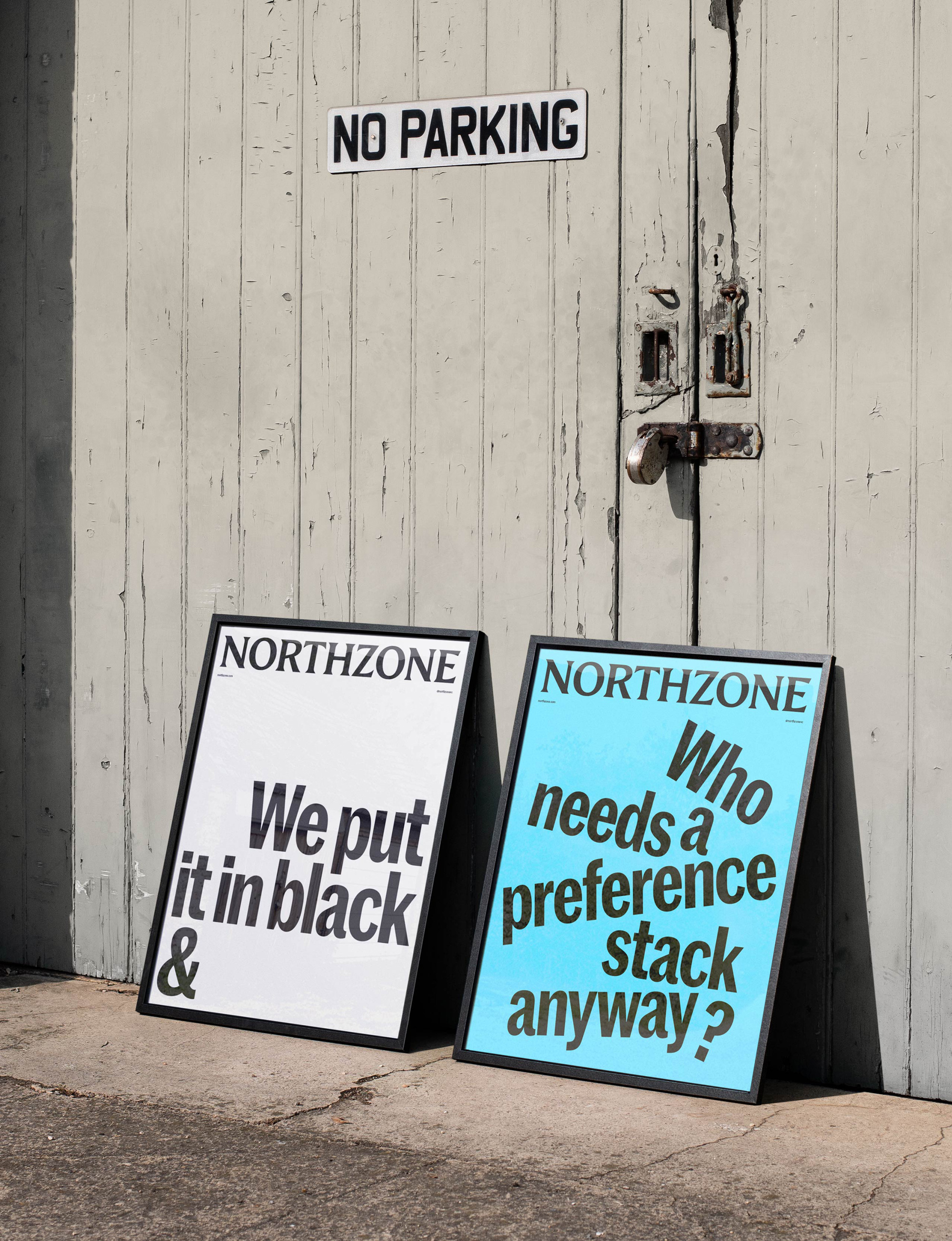
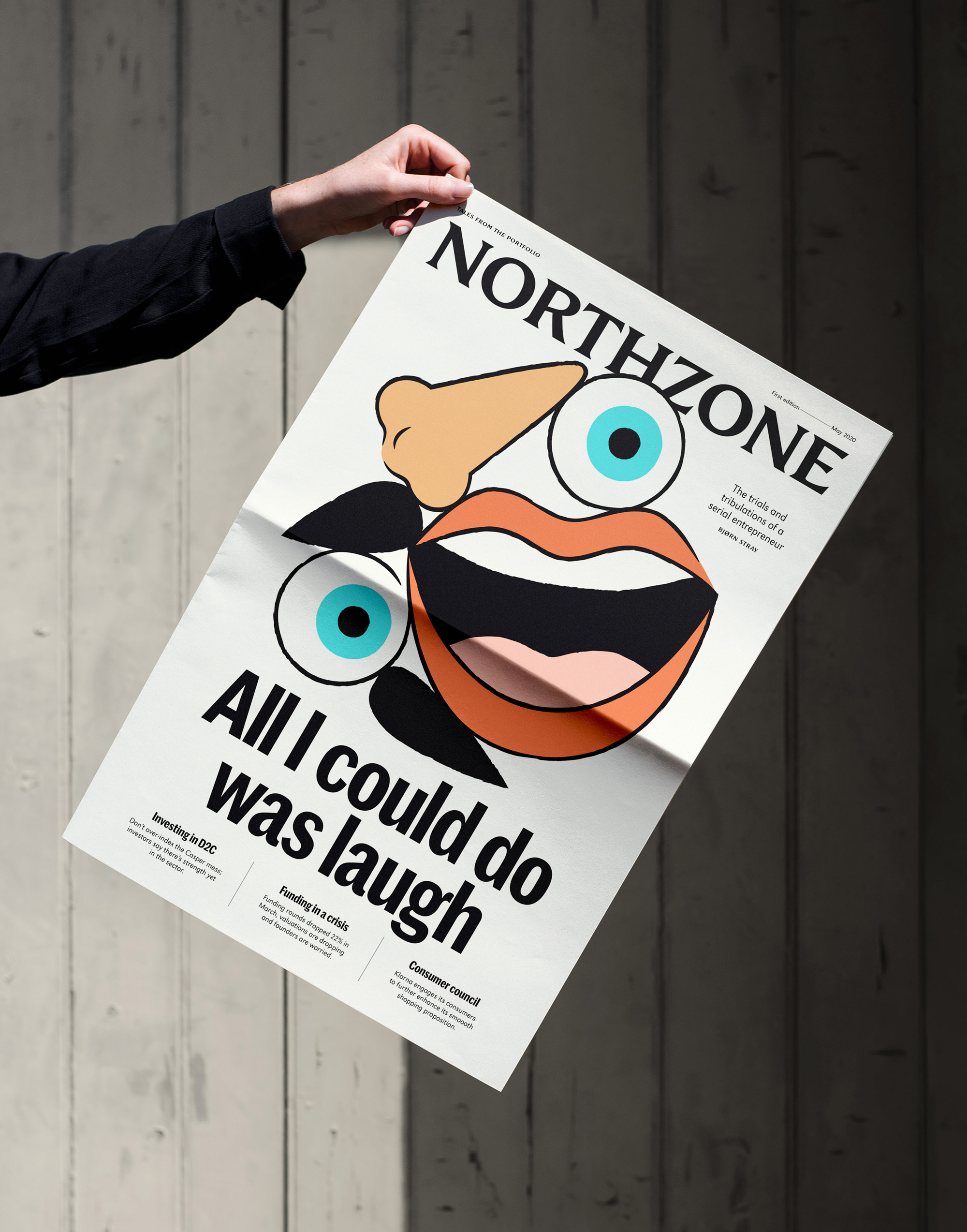
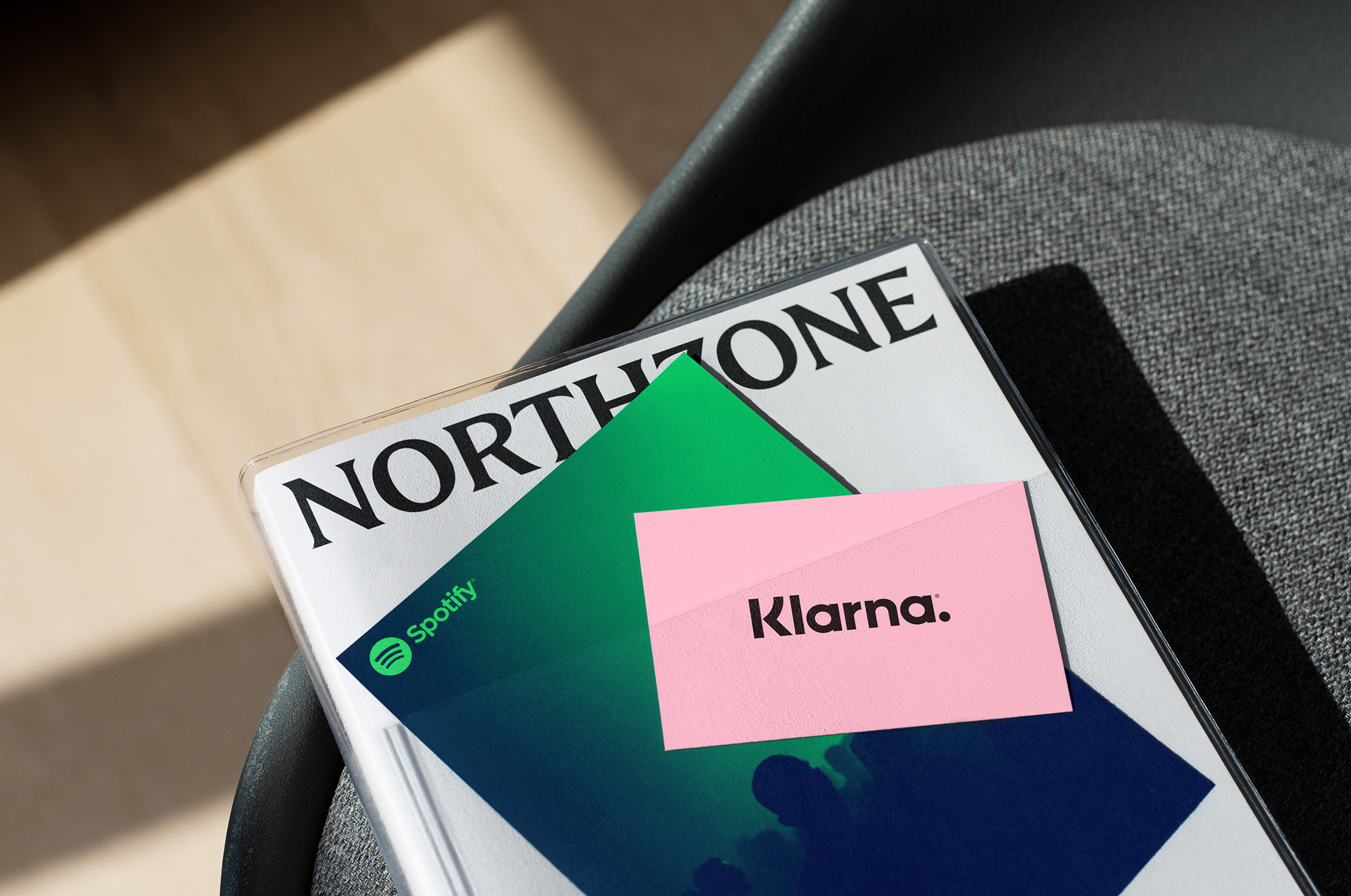
Their honesty drew us towards editorial design. The distinct logotype acts as a characterful masthead. Dynamic visual content responds to the story at hand. All mediated by an open and intelligible tone of voice. The result is a confident identity with flashes of personality, which cuts through the claims of other VCs.
Since Northzone stands behind founders, we needed a way to bring those founders to the fore. For that reason, we moved away from a “house style” of illustration and imagery. Instead, we built an adaptive brand system that can cope with whatever content is thrown at it.
Images (opinion after)
Opinion
The old logo… eh. Not bad, I guess, but doesn’t fire up any of my zones. Um, that sounded weird. Moving on. To say something more productive, I think it looked more like an outdoor gear company than a VC. The new logo is a very elegant serif with a strong editorial vibe — even before looking at the applications I thought, “This would make a killer masthead”. And it does. The identity uses AlfaType’s Romano with Commercial Type’s Marr Sans Condensed and it’s a stunning combination. The applications are perhaps a little too magazine-y for a company that’s not a magazine but those are some great combinations of typography and imagery with a lot of flexibility in their content and layout. Overall, a really well executed identity in a style that you would not expect from a VC.