
Noted: New Logo for Dolby

“Dolby Time Will Tell”
(Est. 1965) "Headquartered in San Francisco, Dolby has grown into a leading global innovator and developer of audio, imaging and voice technologies for cinema, home theaters, PCs, mobile phones, and games. Our products include Dolby Digital Plus, TrueHD, Dolby Voice, Dolby Atmos and Dolby Vision. Today, over 2,000 individuals around the globe share their talents and energy to enable the most immersive experiences that technology can deliver."
Design by
N/A
Related links
Dolby Tweet
2008 Brand New Noted post
Images (opinion after)
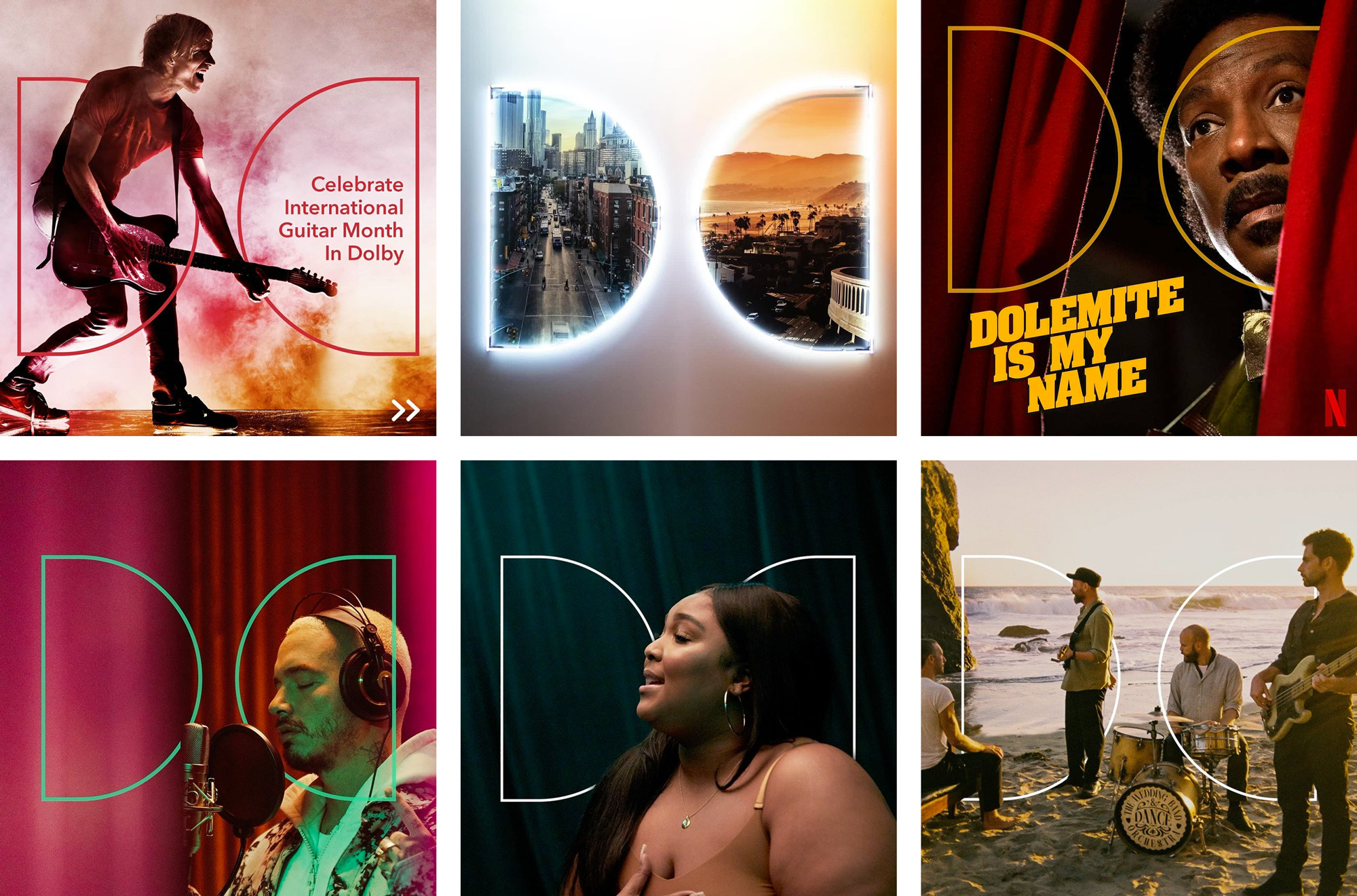
Opinion
Other than the odd counterspace of the “B”, I liked the old logo and it was a good update of the original logo that maintained its equity. The new logo takes the two “D”s out of their container box, which I think was the most recognizable aspect of this logo: that brief tension created inside the rectangle with the two “D”s facing each other, creating a funnel-like effect within the box. While I do admit there is something nice about the more free “D”s, I think it loses significant equity. The new wordmark, in title case, is technically fine but maybe it’s too informal? I liked the corporate-ness and technological coldness of the old one. However, without much information to go on — as there is no press release and the Twitter mention is not the most useful — it’s hard to figure out if this approach actually makes sense. I was able to scrounge some minimal usage on Instagram, with the “D”s used as a stroke and interacting with the photographs… it’s a start, I guess, just no on the neon effect image. Overall, as clean and crisp as the logo is or perhaps because of how clean and crisp the logo is, I would side with the old logo if I had to pick.