
Noted: New Logo and Identity for Malecare by Graphéine

“You’ve Got Male”
(Est. 1998) "Malecare is America's leading men's cancer survivor support and advocacy national nonprofit organization. Malecare, Inc. is a 501(c)(3) nonprofit organization, run by oncologists, psychologists, and social workers. Malecare sets the standard for best practice of patient peer to peer support. We push the limits of technology to create personalized cancer information delivery. We design great projects for communities ignored by commercial and mainstream organizations. Our goal is to help men and their loved ones live longer and happier lives."
Design by
Graphéine (Paris and Lyon, France)
Related links
Graphéine project page
Relevant quote
The logotype previously designed for the association consisted of a typographic wordmark that combined the words “male” and “care” with the letter “L” highlighted in red. The letter subtly hinted at the erectile dysfunction suffered by men with prostate cancer.
Prostate cancer is a painful subject associated with great suffering for patients and their families. Since men with this cancer can often perceive the disease as an attack on their virility, we wanted to create a logo that would allow members to carry the Malecare identity with dignity and without embarrassment about the subject.
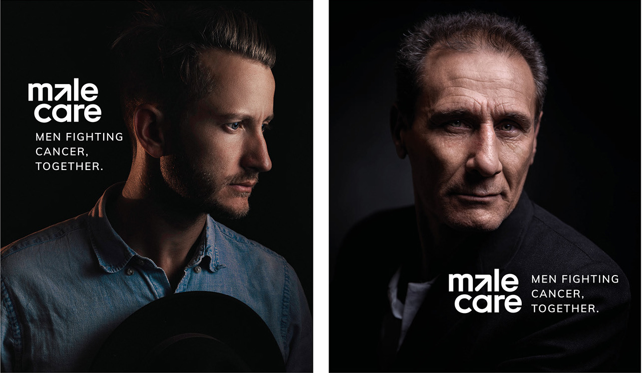
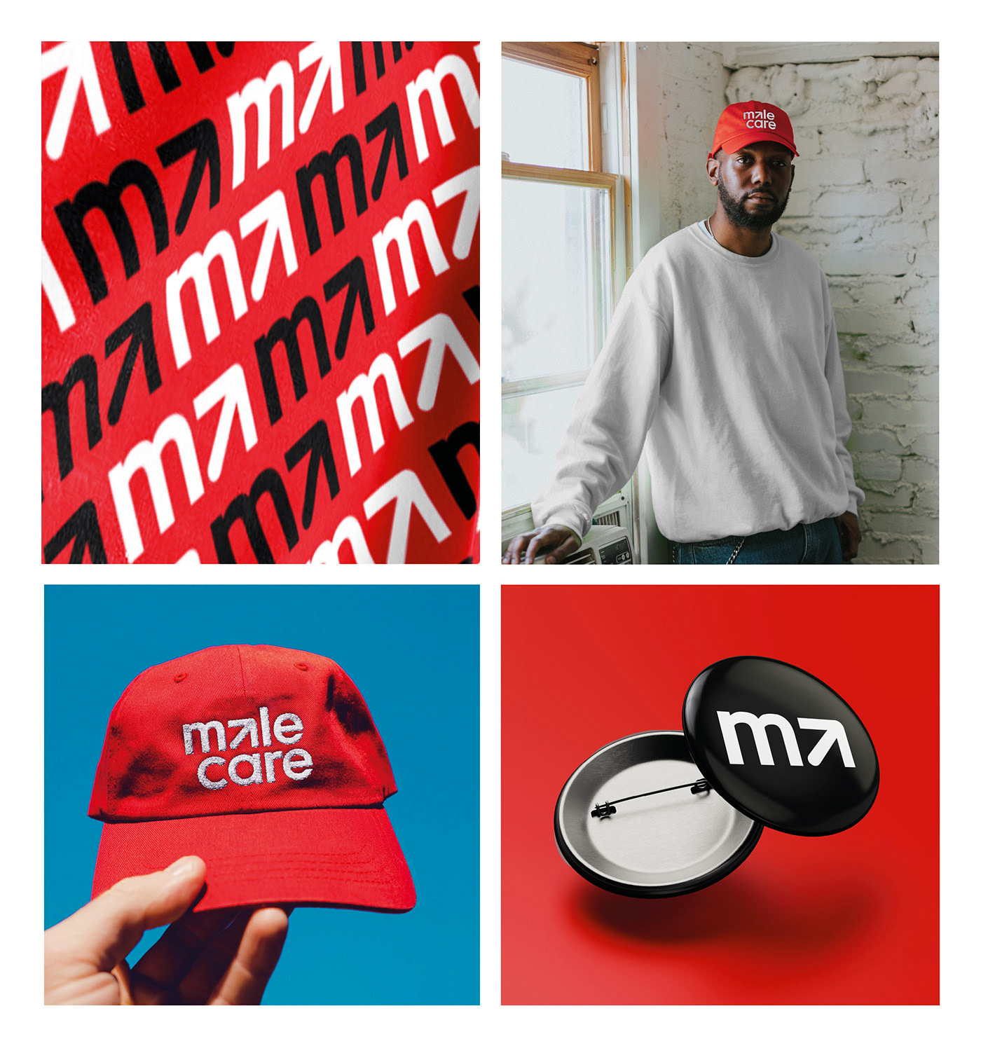
The final logotype consists of a geometric wordmark that conveys the idea of care. The rendering is both completely appropriate to the subject and timeless in this treatment. The arrow of the male symbol becomes the letter “a” in “male” as an evocation of a penis and to express the strength and commitment of the fight against cancer, while the circle becomes the “C” from “Care”. In the end, the masculine symbol is entirely hidden inside the new “MaleCare” logo, creating a smart graphic asset while maintaining the brand's readability.
Images (opinion after)
Opinion
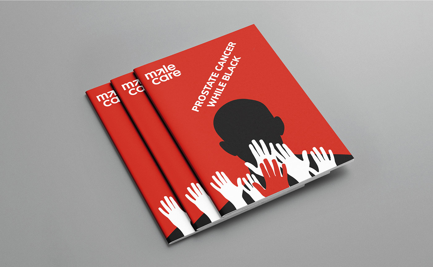
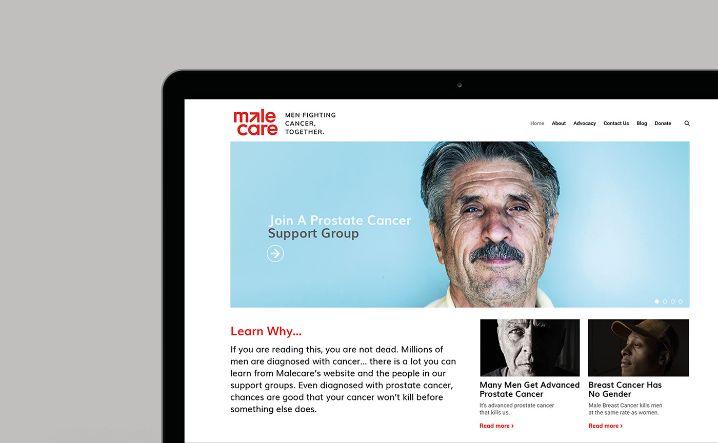
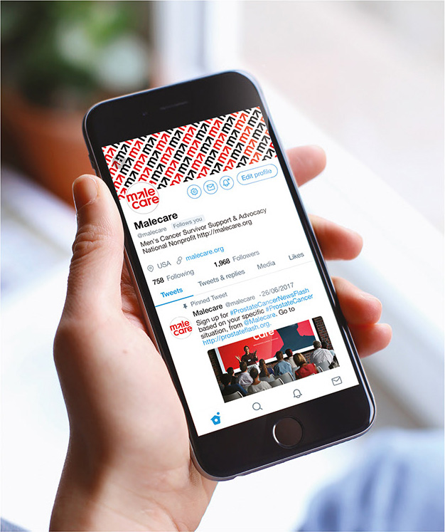
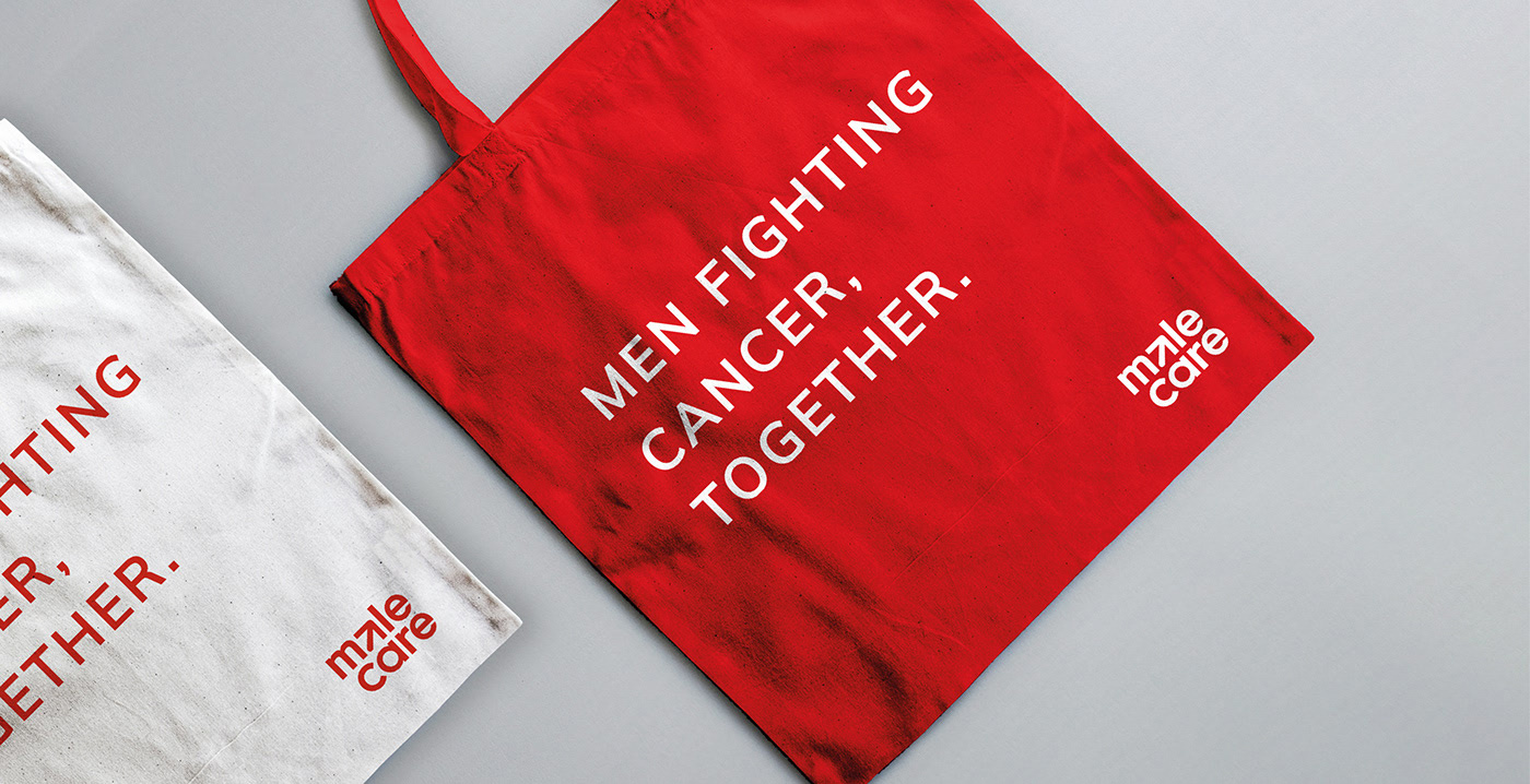
The old logo was really, really bad… looking like that bug in Adobe Acrobat where sans serif “l”s and “i”s look bolder than the rest of the letters — if you are still afflicted by this problem I found a solution years ago (at least for logos) — but also because it was very unpleasant to look at. It was sort of aggressive and the typography was as default-looking as it gets. Part of the problem is the name, which, to me, sounds like “malware” but even past that personal association, it’s an odd name. The new logo makes the best of it, though, by breaking the name into two lines and embedding a deconstructed male symbol that runs from the “c” to the abstracted “a”. When I first looked at the logo it took me a minute to see it and initially I wasn’t sure if it was intentional but then reading the explanation it was confirmed. Also while reading the explanation, the “a” looking like a penis is not unintentional either — tip of the hat for the U.S. client not shying away from it. I think the logo is great for its hidden meanings and its execution — even the slight offset from the left margin in the bottom line works great to add some sense of motion to it. The applications feel half-finished and I’m guessing it was a matter of the scope of the project being limited to initial ideas and not full execution as the few things shown don’t quite tie together and each on their own could use more hours of refinement. Nonetheless, the organization now has a strong logo to build an identity around and deliver its message.