
Noted: New Logo and Identity for Marylebone Cricket Club and Lord's by The Clearing

“Changes all Across the Lord”
(Est. 1787) "Marylebone Cricket Club (MCC) was founded in 1787, taking as its home a cricket ground set up by the ambitious entrepreneur Thomas Lord staged his first match - between Middlesex and Essex - on a ground on Dorset Fields in Marylebone. The following year, MCC laid down a Code of Laws, requiring the wickets to be pitched 22 yards apart and detailing how players could be given out. Its Laws were adopted throughout the game - and the Club today remains the custodian and arbiter of Laws relating to cricket around the world. There are now 18,000 Full and 5,000 Associate Members of MCC. These Members own the Ground and all of MCC's assets (the most famous of which is the Ashes Urn), they govern the Club through various committees, and some 2,000 of them represent MCC on the field of play each year. MCC plays more matches than any other cricket club - around 480 per year against schools, universities and clubs in the UK, and between 20 and 30 fixtures annually as part of its overseas touring programme which aims to develop cricket abroad."
Design by
The Clearing (London, UK)
Related links
The Clearing project page
Relevant quote
The new brand gives MCC the opportunity to re-assert all that the Club stands for; shared values and culture, our commitment to excellence at Lord’s and our love for the game.”
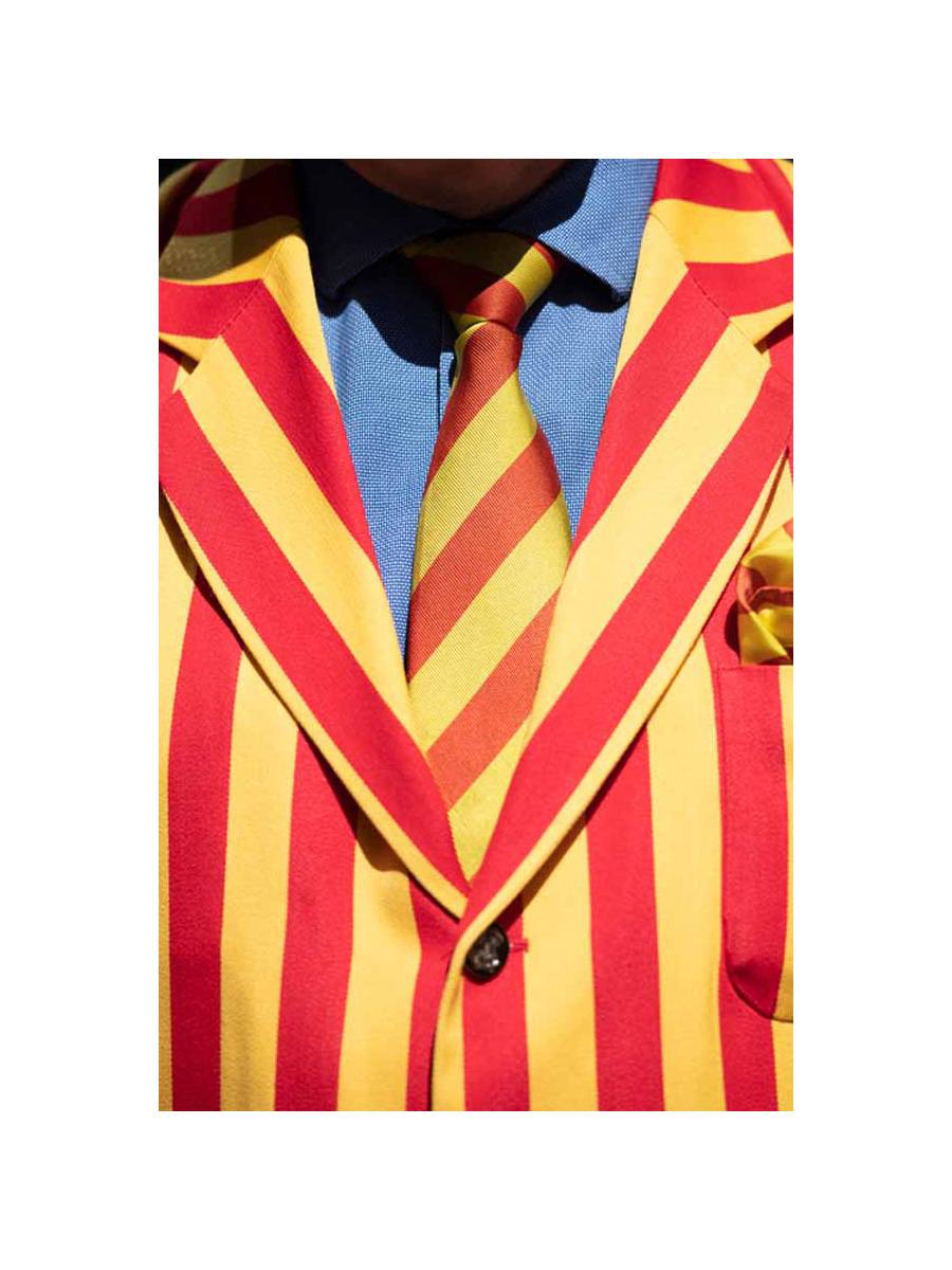
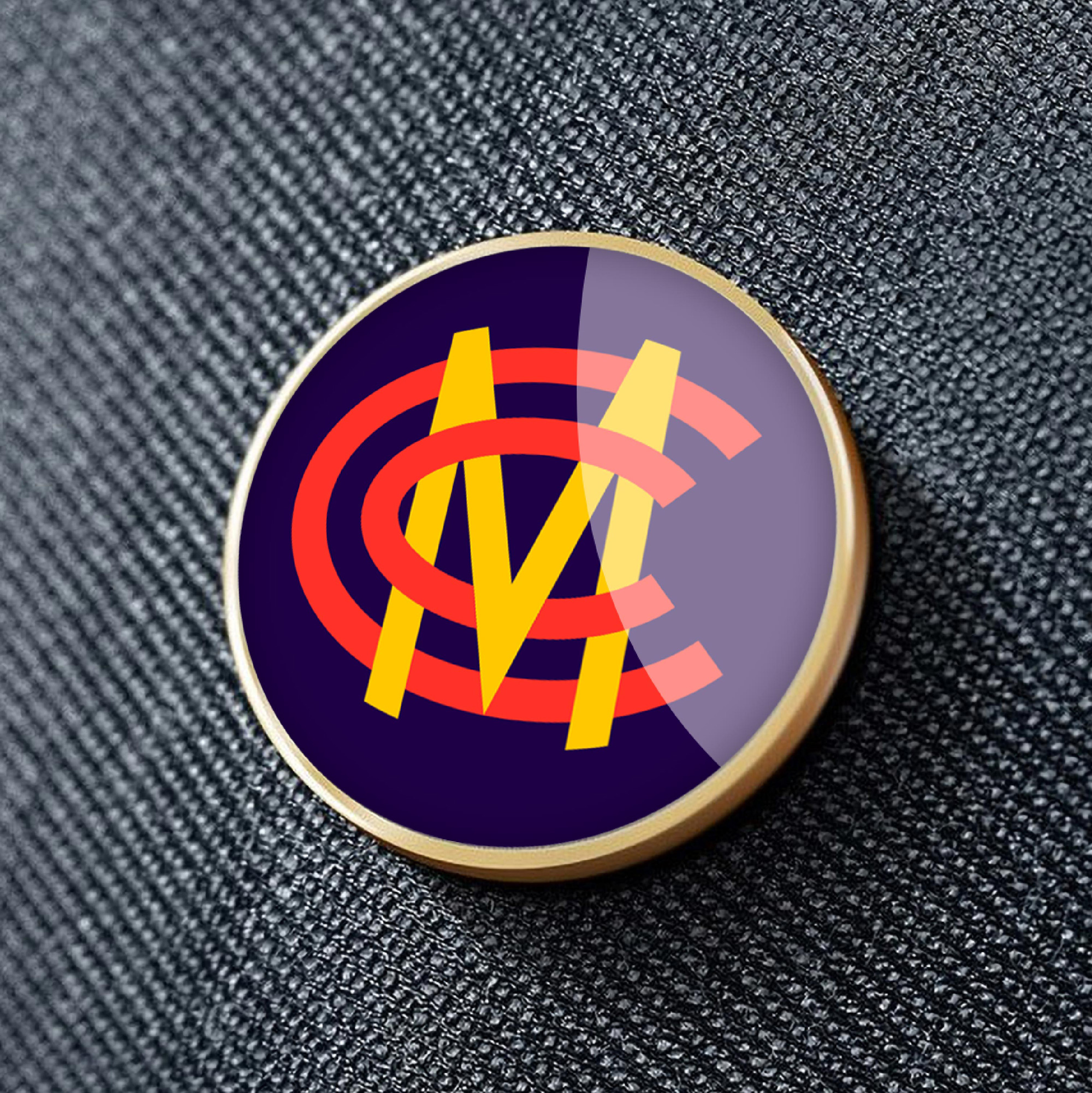
The new visual identity retains some of the Club’s most iconic features. The MCC monogram has evolved so that it works more boldly and confidently on digital channels, merchandise and communications. The ‘egg and bacon’ colours that are synonymous with MCC now have a greater purpose and are threaded throughout both brands to reinforce their relationship and help Lord’s build recognition of MCC, and vice versa.
Images (opinion after)


Opinion
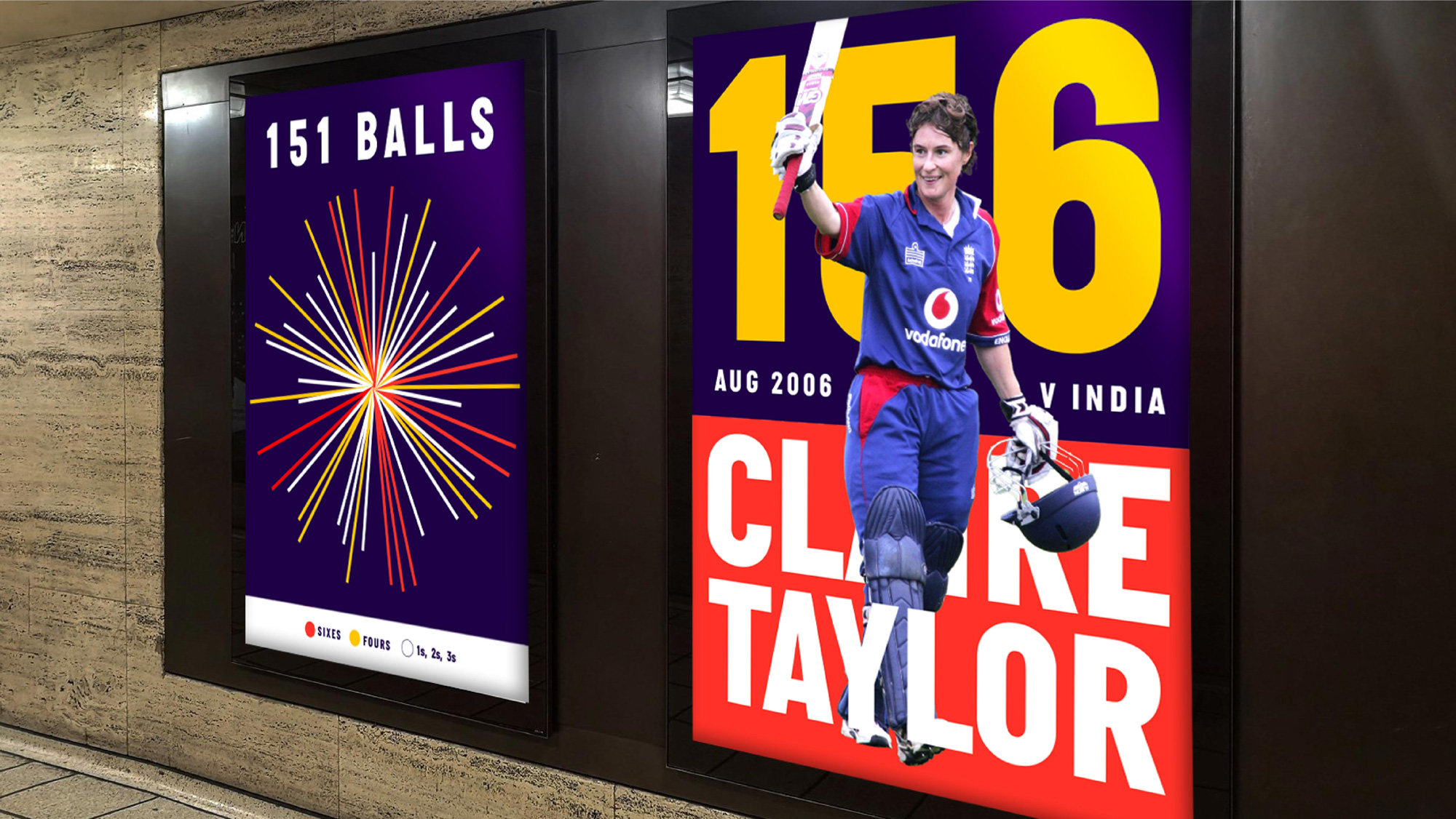
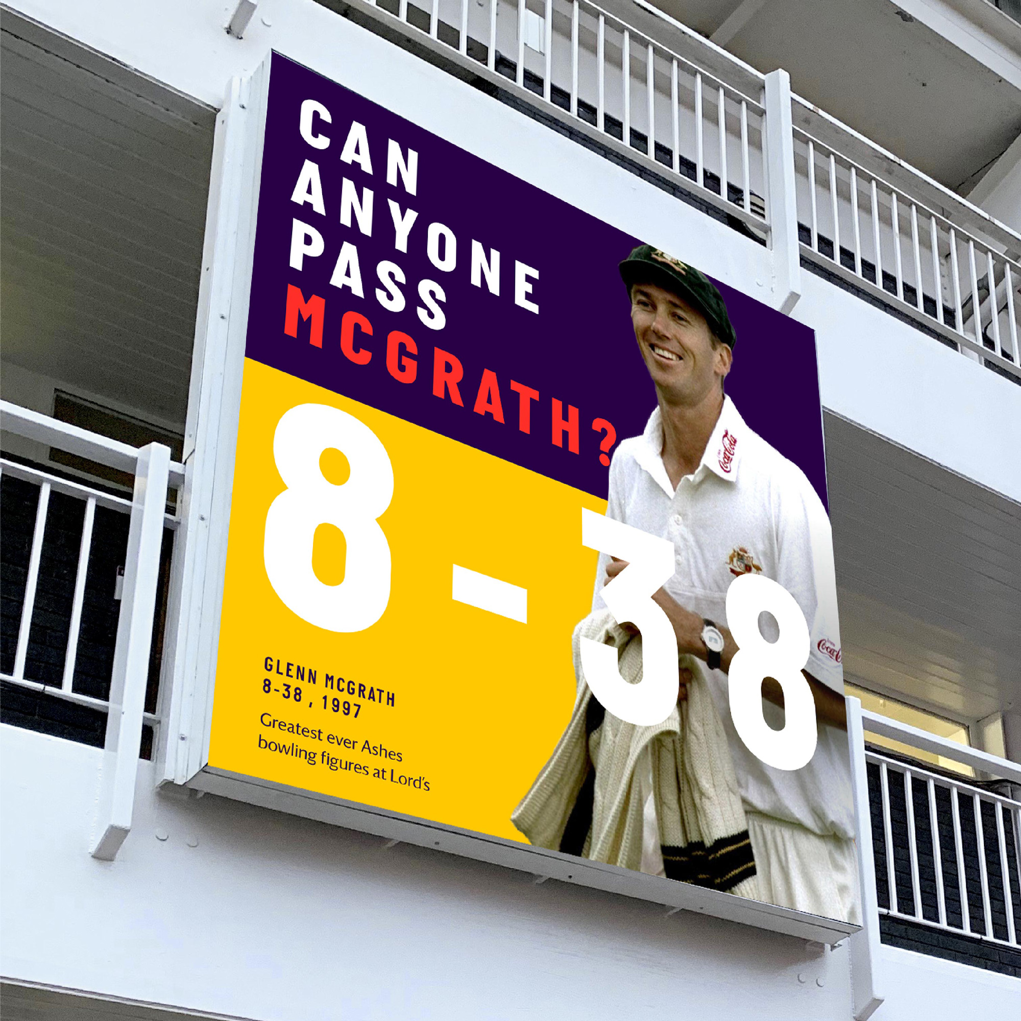
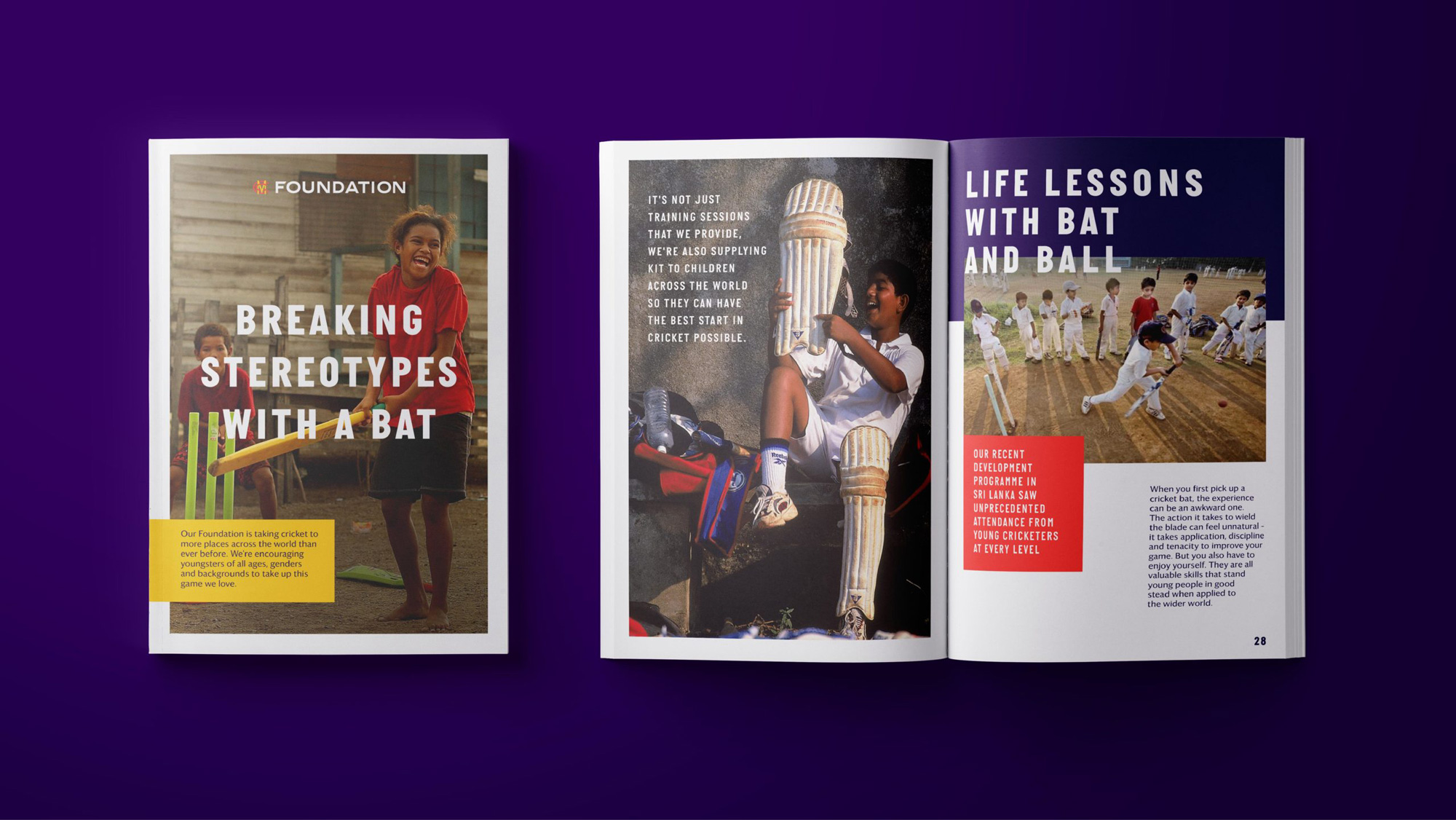
Please let the record show that I do not know anything about cricket — I mean, I know something but as far as the deep cultural implications and understanding of the sport, might as well be talking about the intricacies of dentistry. Having said that, the old monogram was bad, looking more like an unbalanced bacon and egg skewer than a monogram, so there is really nothing to be missed in the old logo. The new one is quite nice. Nothing overly surprising or exciting but well executed, nicely interlocked, and more accurately colored to match the actual bacon and egg color palette. The old Lord’s logo was kind of clever with the stickie thingies in the “L” — please refer to the record that acknowledges that I do not know what the stickie thingies are called, which I could easily Google but prefer not to, so as to emphasize my outsider’s point of view — and relatively elegant serif. Not amazing but not bad. The new wordmark is… odd. I get it that it ties well with the clean strokes of the monogram but it looks like an airline logo, the gap in the “R” is too distracting, and the apostrophe feels like it came from a serif typeface. It’s an okay logo for sure but odd, to me at least. The applications are mostly fine, although not sure where the bold condensed sans serif came from or how it relates to the logo. The silhouetted players interacting with the type feels somehow antiquated and there is a kind of heaviness to the applications that’s not very appealing. In general it seems like they want to portray an air of classiness which is appropriate since this isn’t the NBA or Minor League Baseball but maybe there is too much lack of excitement. Curious to hear from our cricket-loving readers on this one.