
Reviewed: Friday Likes 319

“From Blürb Studio, Studio Born, and Eskader”
A fairly broad range of clients and aesthetics this week, with work from Krakow, Istanbul, and Heusden-Zolder.
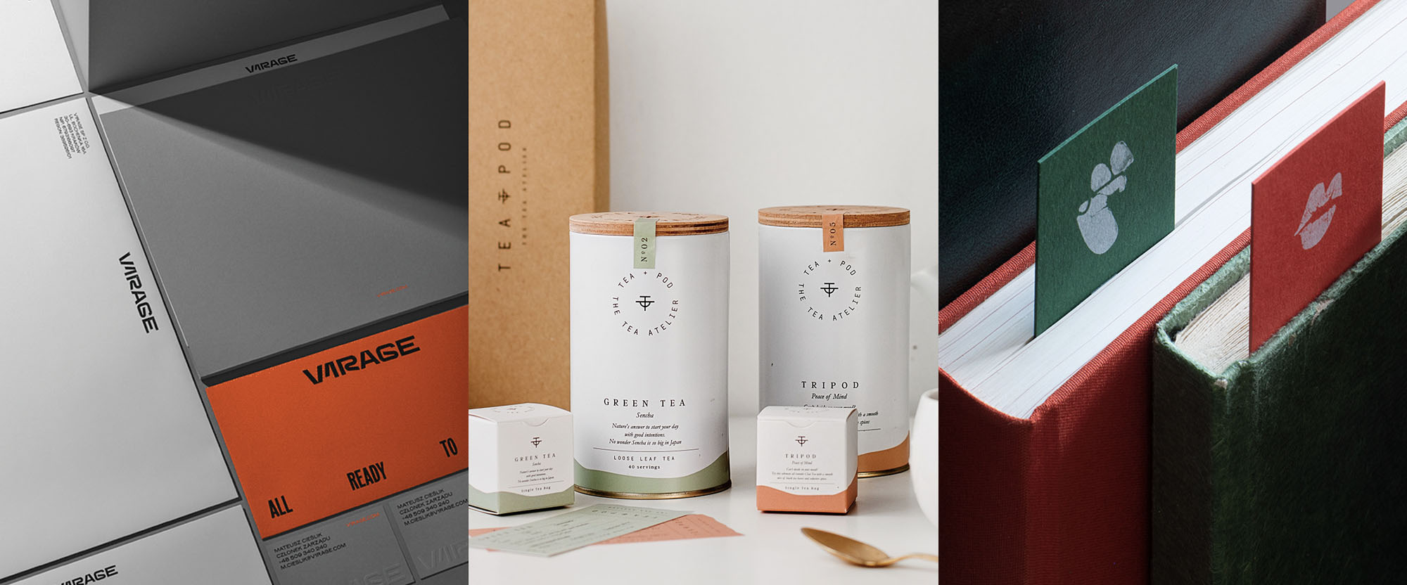
V1RAGE by Blürb Studio
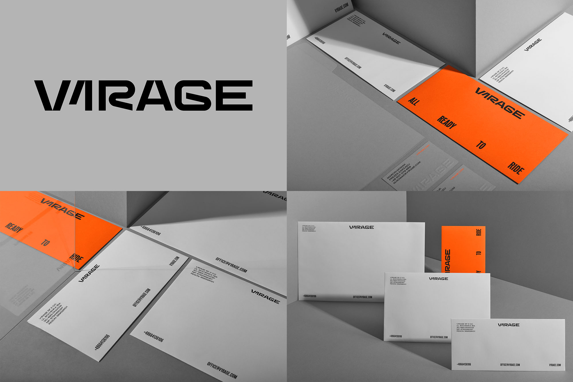
V1RAGE is a "motoconcierge" in Krakow, Poland, offering customers premium cars for purchase or rental (long- and short-term) as well as car service and maintenance. Like you, probably, I do not know how the name is pronounced... Virage? V-One-Rage? Don't know but what I do know is that this clearly caters to car enthusiasts who know a thing or two about cars and/or care about cars beyond Subaru Outbacks (holla! That's my car). The identity, designed by local firm Blürb Studio, is as if a concierge had set up a high-end pop-up booth at a Formula 1 event in Dubai and it's kind of cool. The wordmark, with letters that look like racetracks, may be an easy approach but the result is slick. The light gray, black, and sparks-of-orange palette looks great with the minimalist layouts where the logo is the only element with some bold, graphic flair. If I ever go to Krakow I'll probably end up renting a car from, like, Enterprise but V1RAGE is #lifegoals. See full project
Teapod Atelier by Studio Born
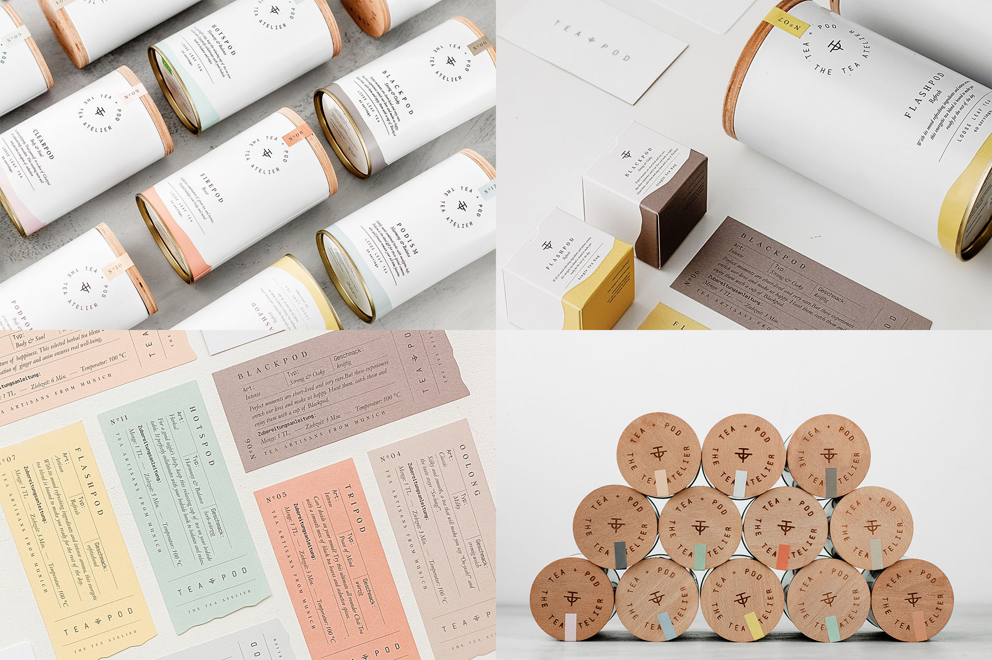
Teapod Atelier is a tea brand based in Munich, Germany, selling their own tea blends online that was started by two friends who were inspired by the tea culture in Istanbul, Turkey. The identity, designed by Istanbul-based Studio Born, revolves around a lovely minimal mark that combines the letter "T" with an abstract rendition of a cup that, if I'm reading it correctly, I think it's a cup with two handles? Regardless, it's nice and it's well complemented by a thin monospace typeface set in a circle where the words align ever so pleasantly. The teas come in a matte white can with awesome wood lids and some great supporting typography -- centered and classy. Smaller white boxes follow the same design cues and both packages are finished off with a swath of paint on the bottom that makes it look as if each item was dipped in paint. I'm not a tea person but I would buy some for the tins alone. See full project
Barefood Giulia by Eskader
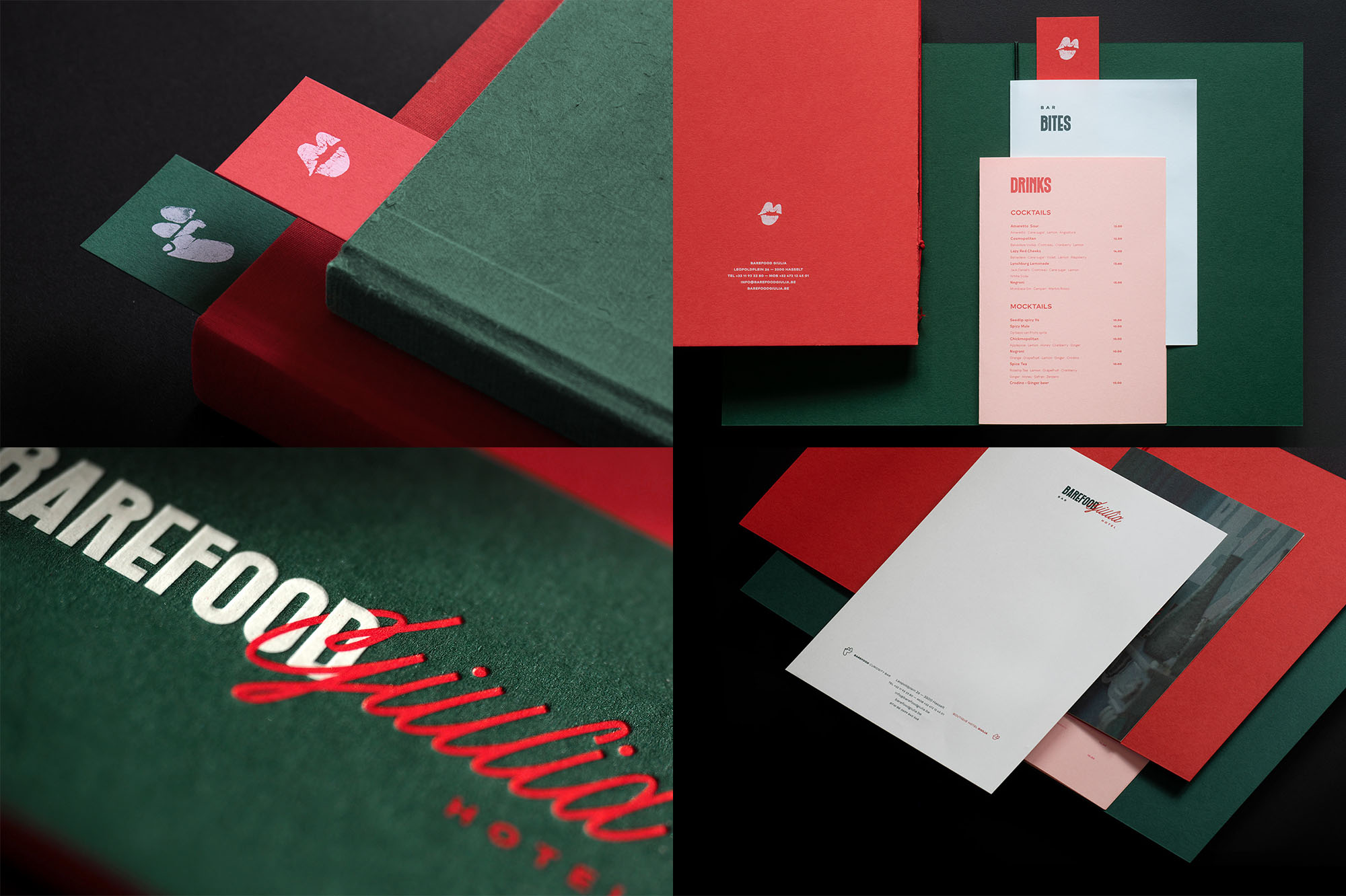
Barefood Giulia is a bar and boutique hotel in the center of Hasselt, Belgium, housed in a beautiful mansion that offers seven luxury, playfully-decorated rooms. The identity, designed by Heusden-Zolder, Belgium-based Eskader, is a little odd, to be honest, and in some aspects I'm not sure what's going on but it definitely has a quirky, positive vibe going on that's attractive, starting with the logo. One element I'm 99% sure is a pair of lips but the other element is I don't know... maybe the profile of a man wearing a hat? Maybe a foot? I keep seeing one because of "Barefood" which I keep reading as barefoot. (I was just scrolling through the project again and there is a mural with feet, so it's a foot - definitely a foot but not sure why it is a foot). Nonetheless, it's interesting and so is the type combination, where each word gets a very distinct flavor but are then nicely intertwined. The red and green color palette is surprisingly NOT Christmas-y. If I found myself in Hasselt I would totally try to stay here for the novelty factor and to ask someone about the foot. See full project