
Noted: New Logo for Dashlane by Pentagram

“Dash Forward”
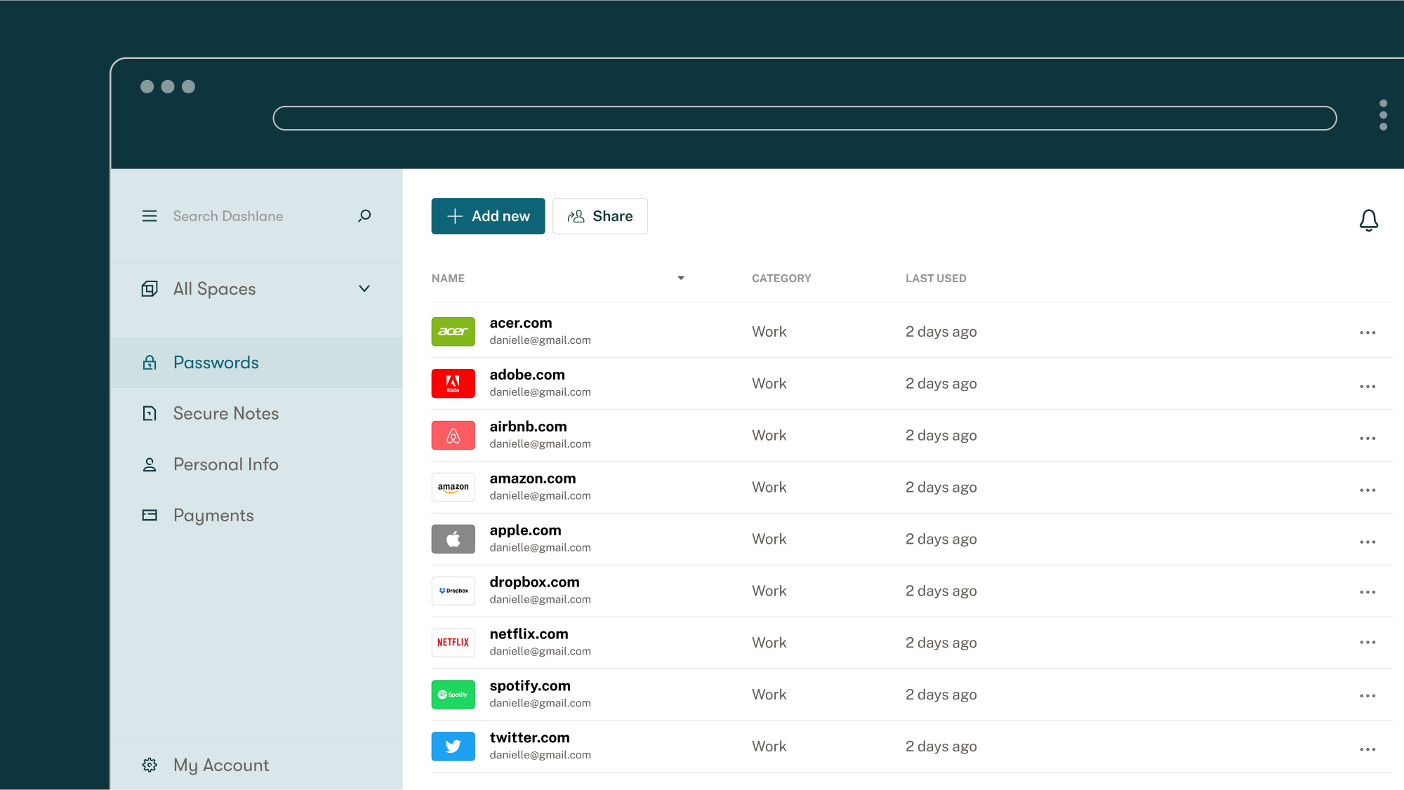
(Est. 2009) "Dashlane is a mobile and desktop app that gives you a shortcut for everything you do online. Log in instantly, fly through forms, and breeze through checkouts on every device you own. Dashlane works across every operating system, device, and browser, opening the walled gardens that normally inhibit our digital experience. Our team in Paris, New York, and Lisbon is united by our passion for improving the digital experience and the belief that with the right tools, we can help everyone realize the promise of the internet. Dashlane has empowered over 12 million users in 180 countries to dash across the internet without compromising on security."
Design by
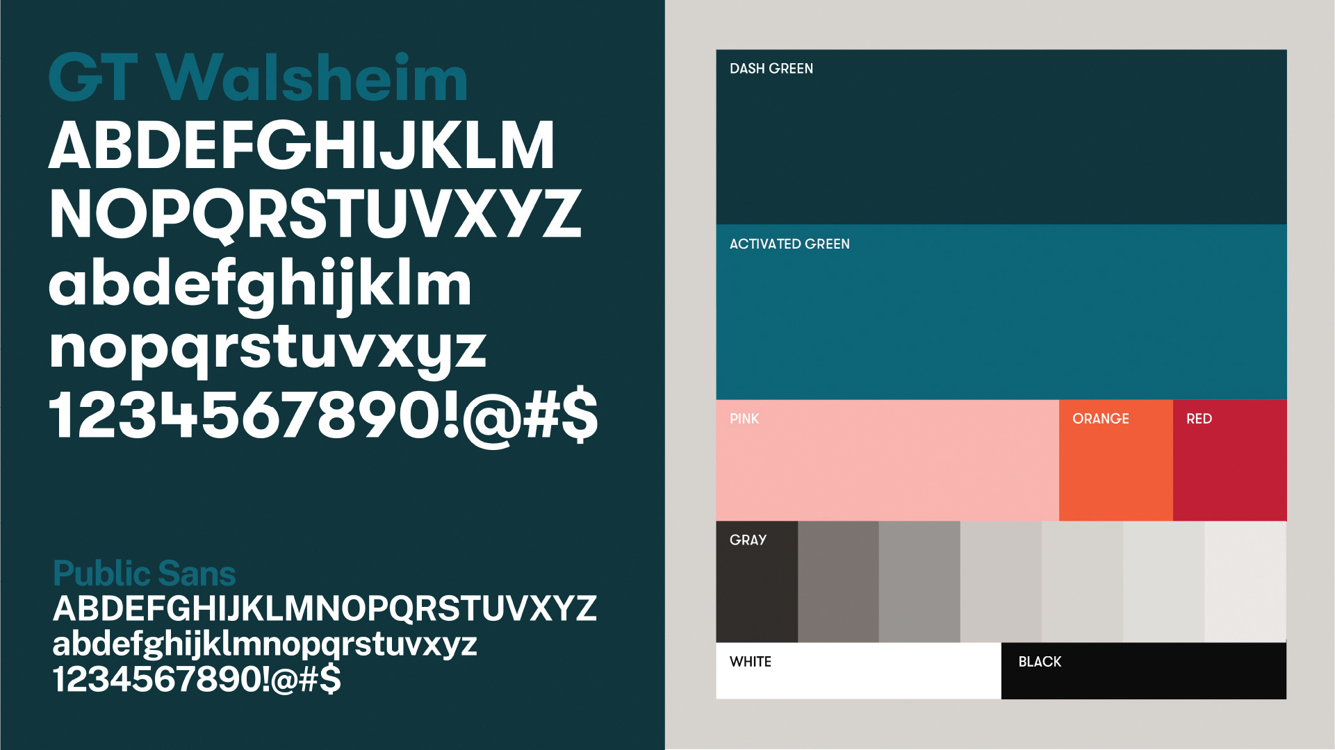
Pentagram (Eddie Opara, partner; New York, NY)
Related links
Dashlane, blog post about the brand
Dashlane, blog post about the overall change
Relevant quote
The basic building blocks of our design system are elements we’ve named AroundRects, hearkening back to the very beginnings of UI design, but with an added third dimension. Simple, dynamic, and endlessly versatile, they evoke dashes in the most literal sense. But they also conjure lanes on a highway, gesturing towards freedom of information and exploration.
Images (opinion after)
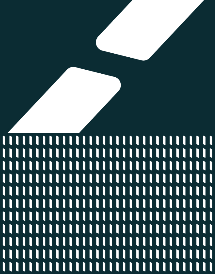

Opinion
Looks like we have a lot of Dashlane users among us, as the tips mounted quickly yesterday. The old logo had a pretty nice drawing of a gazelle and exuded a kind of home-security brand vibe that was an appropriate association for safe-password-keeping. The wordmark was decent too. Perhaps if it missed something was a more direct connection to the internet and the digital environments where it does its job. The new logo is a “D” monogram made of “Round Rects”, which seems like a really obscure reference to build a logo and identity around… I don’t mind the obscurity, that’s fine, but the ensuing logo is kind of hard to interpret with or without that reference. My initial interpretation is that they are the ubiquitous text fields we input passwords into and I think that supports the rationalization but their vertical orientation defeats that notion. I don’t know, maybe I’m thinking too hard about it but, even then, visually, it’s also a strange monogram as the individual shapes line up strangely and the perspective is wonky. I do like when the bits animate and do fun things, both on their own and in the logo. The wordmark is fine, since GT Walsheim is such a nice typeface. Overall, even though I may not be a fan of the monogram I think this new approach hints more both at this being a digital, cross-platform service and at the sense of living life online.