
Noted: New Logo for DK by Pentagram

“One for the Books”
(Est. 1974) "DK Publishing is world renowned for its distinctive, highly visual books that inform, inspire, and entertain readers of all ages. Publisher of New York Times bestselling LEGO® and Star Wars® non-fictionbooks, Smithsonian titles, the award-winning Eyewitness series for children and Eyewitness Travel Guides, in addition to a wide selection of other books for adults and children. With over 45 years of publishing experience, we sell to every corner of the globe and in 63 languages. We have employees worldwide with offices in London, New York, Toronto, Indianapolis, Delhi, Melbourne, Munich, Madrid, Beijing, and Jiangmen. BradyGames, Alpha (Idiot's Guides) and Rough Guides are also available from DK, a division of Penguin Group."
Design by
Pentagram (Angus Hyland, partner; London, UK)
Related links
Pentagram project page
Relevant quote
Working closely with the in-house DK team, the design team went through a series of design iterations that refined and simplified the familiar logo to function at different scales and on multiple platforms and applications. A new brand tagline— ‘For the curious’—focuses on DK’s vision to both inspire curiosity and enable discovery.
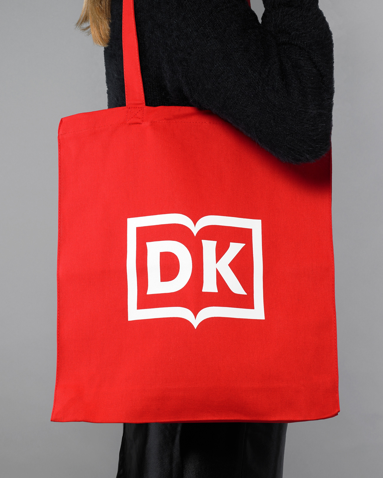
An evolution of its previous iteration (also designed by Pentagram), the new logo retains the central open book motif which houses the ‘DK’ monogram, but simplifies it and uses bespoke modern serif letterforms. Designed to work seamlessly across all print and digital communications, the logo works at all scales with a flexible but consistent system of how it resolves within a DK cover design. Now a single colour, the logo can now be applied in whatever colours and finishes best complement each book cover, and becomes an intrinsic part of the book’s design.
Images (opinion after)
Opinion
I was never a big fan of the old logo, mostly because of all the unnecessary elements like the grid behind the letters and the abundance of strokes but it was certainly effective in conveying the idea of books. The new logo is a great evolution that drops all the extraneous elements in favor of a far more minimalist approach with a simple abstraction of a book and a crisp, custom monogram in a flared serif. It’s very nicely done, with the curvature of the “D” matching that of the book as it curves towards the spine. I really like the vertical asymmetry of the “K” — which is how it should be done but could easily not be done like that — and how everything feels like a tight, concise unit. The logo looks fantastic on spines and has both great readability and a classy distinctiveness to it that the old logo simply didn’t. Overall, a big fan now.