
Noted: New Logo and Identity for Oirschot by George&Harrison

“Who Schot the Serif?”
"Oirschot is a municipality and a town in the southern Netherlands. It is situated 12 kilometres (7.5 mi) from the city of Eindhoven and 20 kilometres (12 mi) from the city of Tilburg in the province Noord-Brabant (North Brabant). The municipality had a population of 18,599 in 2017." (Wikipedia)
Design by
George&Harrison (Eindhoven, Netherlands)
Related links
Oirschot logo page
Oirschot news announcement
Relevant quote
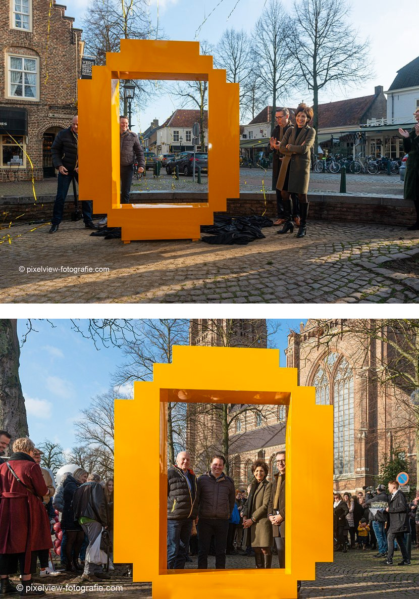
The municipality of Oirschot and Visit Oirschot use one logo. The new logo: "Oirschot" is in a modern font. A striking element has been added to the letters 'r' and 'h'. This creates a kind of 'stairs', which again refer to the architecture of monumental buildings.
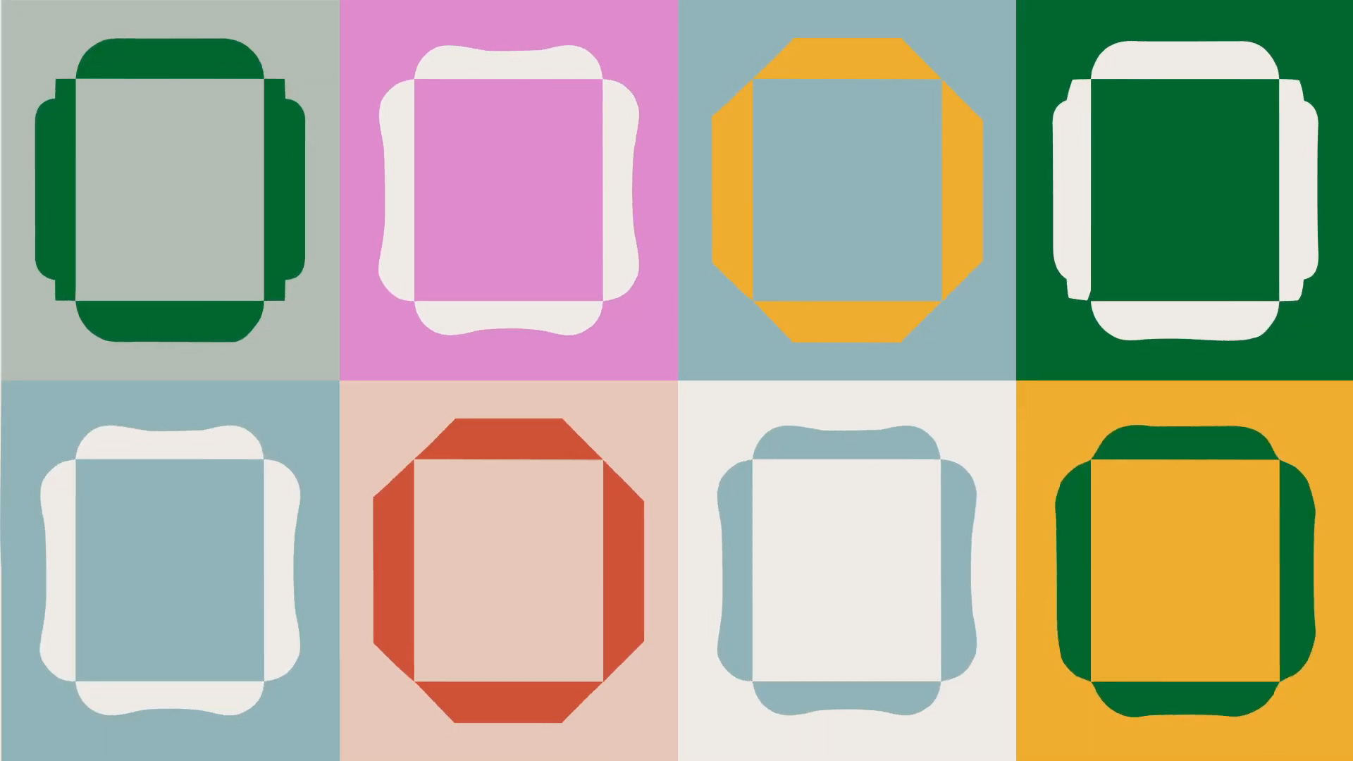
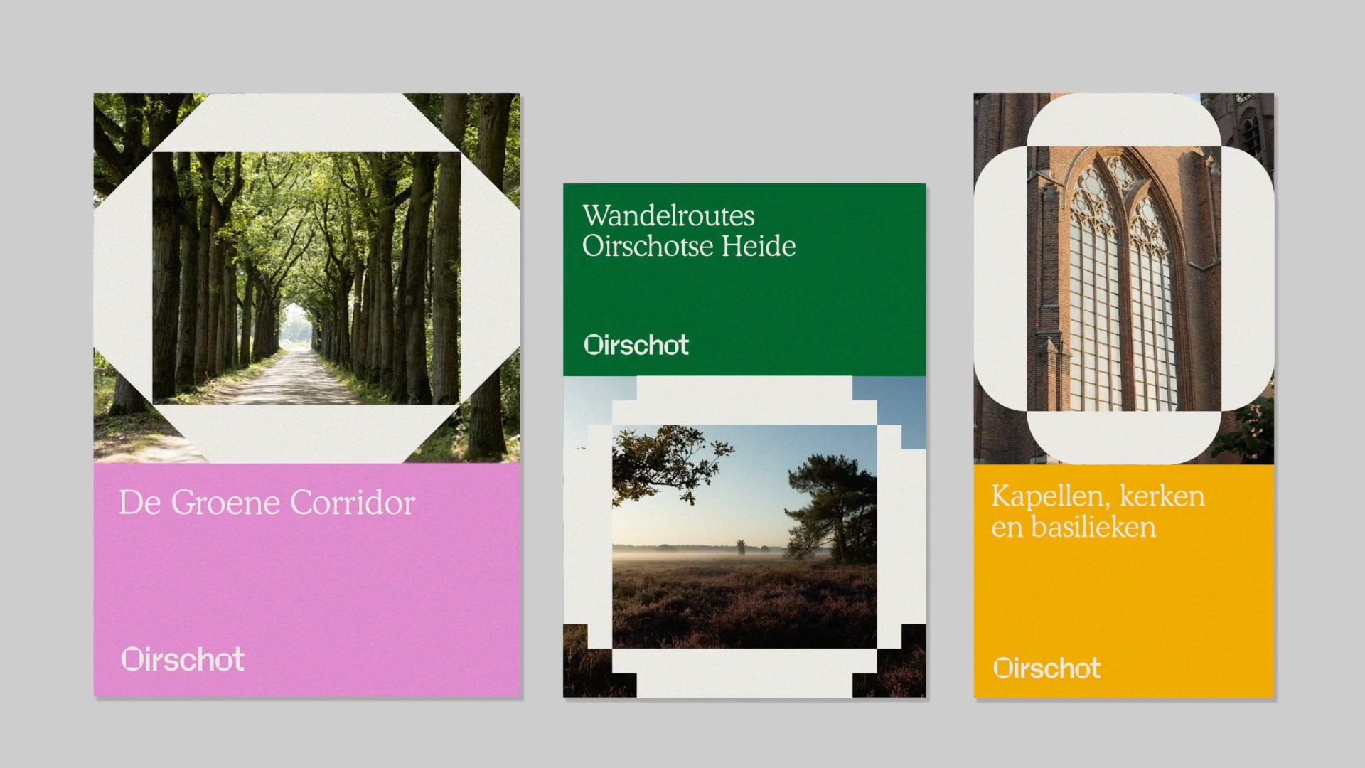
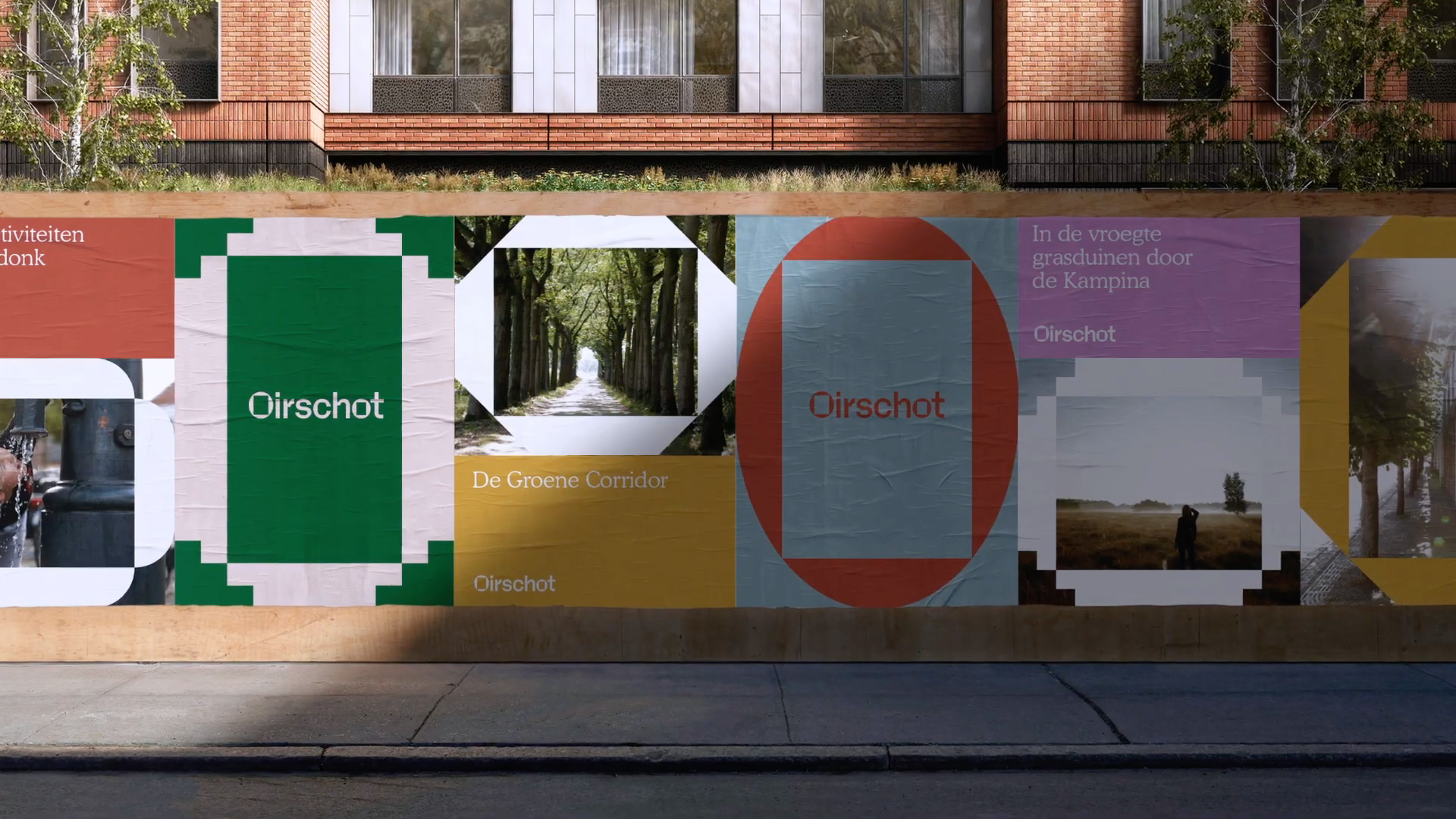
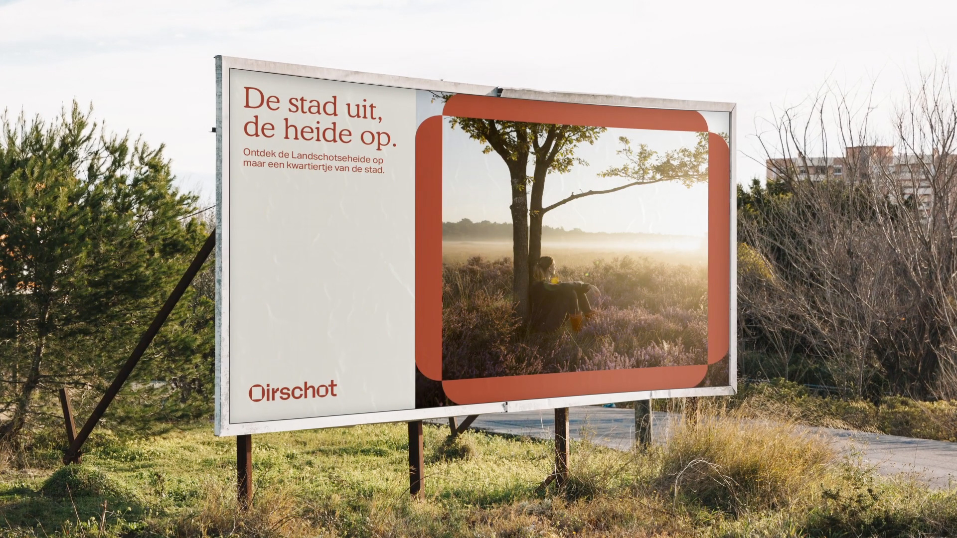
We use the 'round O' in our logo. But the 'O' is central to the house style and exists in various forms. These are based on recognizable monuments from our municipality.
By showing a frame in the interior of the O's , we focus on something. With this we put the cultural, monumental, social and natural offer of the municipality of Oirschot and the people who make this possible in the spotlight.
Images (opinion after)

Opinion
The old logo was kind of nice, with its mirrored-yet-not-identical icon of a leaf and a fish. The wordmark was pretty generic and long but nothing offensive. The new logo pays homage to the architecture found throughout the small city with a funky wordmark that features an “O” with a frame in its counterspace that then sets up a set of different “O”s that can be used individually as expandable frames. I’m still torn on whether I hate a lot, hate neutrally, or not completely hate the stair-like feature of the “r” and the “h” — I can appreciate where it came from, but it looks so wonky, like those letters are going to break just by looking at them. Still, it’s different and enjoyable for its eccentricity. I like the different “O”s and how they can be expanded to fit in different layouts. I’m not sure about the choice of Cooper Light… like maybe it’s too playful or unrelated? Overall, for a small city of 20,000+ citizens this is far more interesting than the identity of many larger metropolis-es.