
Noted: New Logo, Identity, and Livery for Eastern by Mechanica

“All Over the Map”
(Re-est. 2019) "Eastern Airlines, LLC ('Eastern') is a US Part 121 Flag Air Carrier with Scheduled Domestic and International, Passenger and Cargo authority from the US Department of Transportation ("DOT") operating wide-body, long-range aircraft. As of May 1st, 2019, our operating fleet consisted of eight (8), wholly owned, Boeing B767 series passenger aircraft."
Design by
Design: Mechanic (Newburyport, MA)
Strategy: Playbook Studio
Related links
Long-ish CCN piece about the return of Eastern
Relevant quote
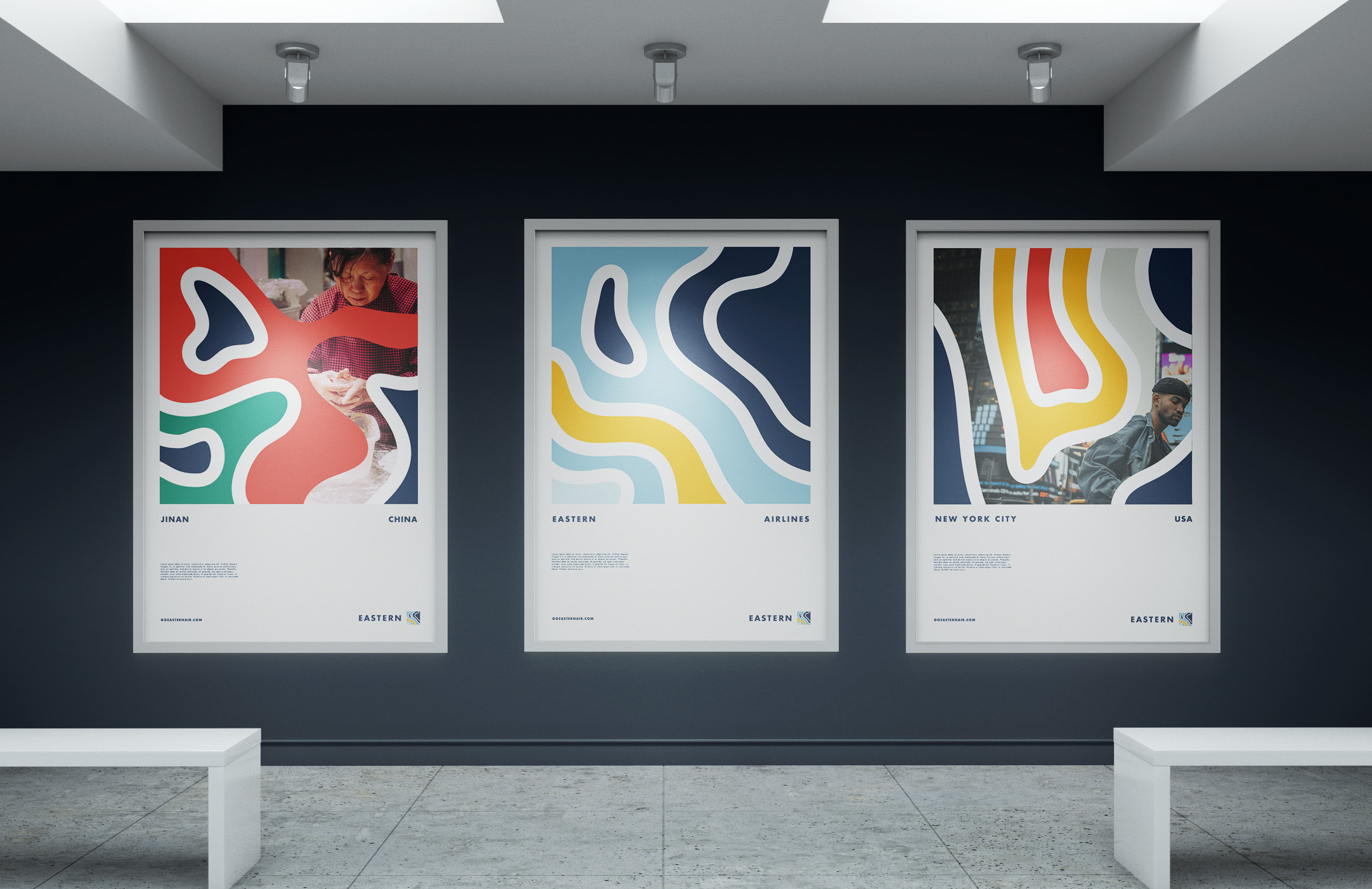
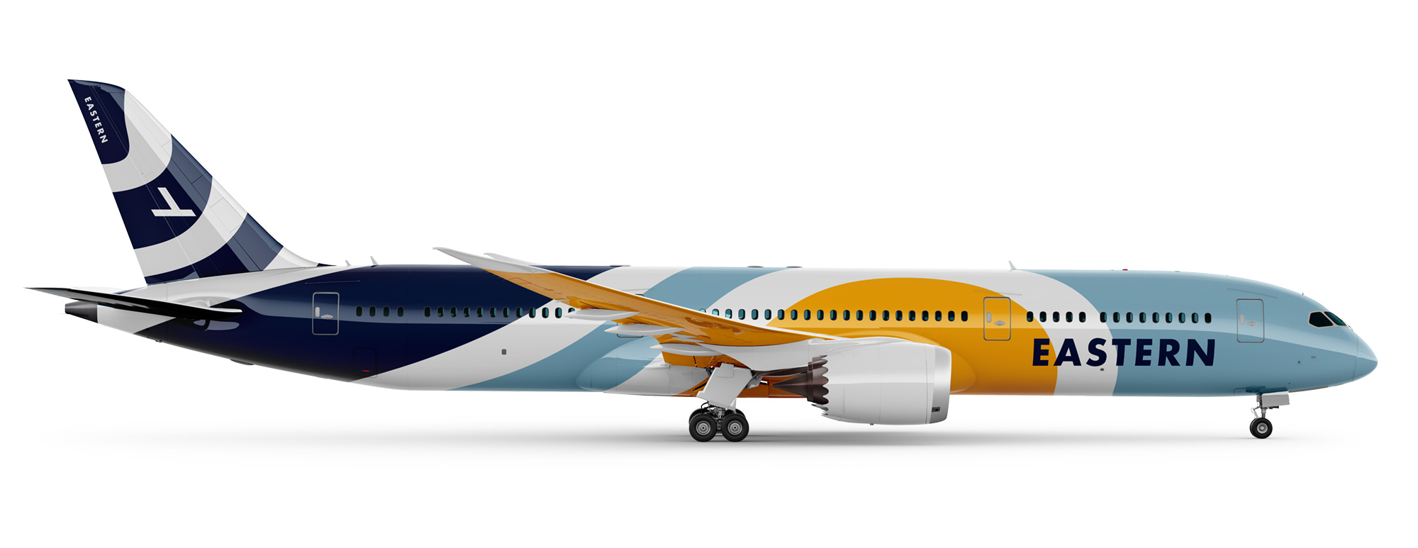
Our new logo is inspired by our rich and iconic history, and our future of being an “Explorer” brand is modeled after topographical maps.
Our main “map” logo is not tied to any one geographic location, but represents the universal space we all share as global citizens among the places we fly. The colors of dark blue, light blue and golden yellow represent the sky, sea and sun and all come from historic Eastern Airlines colors but have been re-interpreted for today.
Images (opinion after)

Opinion
The old logo is not the exact logo last used by the airline which tried to do a revival back in 2010 – 11 and is more close to what was used during the heydays of the airline in the 1960s and 1970s when it was one of the most prominent, until the early 1990s when it was liquidated. Now, flying to a whopping one destination — JFK to Georgetown, Guyana — Eastern is back for another go with a new ambiguous logo. Either boldly or foolishly, the new logo is very un-airline-y, with no type in italic and no element at an angle, which, if anything, it at least says Eastern is willing to go against the grain. The abstract map icon is sort of visually interesting, like an artsy topographical visualization and the idea that the square can change destination is ambitious but doable given the limited amount of current and planned destinations. I don’t know if the blobbiness of the lines makes the map look like something under a microscope, though, like if it could be for a big pharma company. The wordmark is a little cold and devoid of any kind of personality. The single application of the posters shows some odd potential with some decent layouts and some interesting use of the maps. The livery is pretty festive and I like the nod to the original airline by having the old icon in the tail. Overall, a weird but interesting re-entry into the airline industry.