
Reviewed: Friday Likes 313: From Korotich, Futura, and Pendo

“From Korotich, Futura, and Pendo”
A range of food-festive and strong-type projects this week, with work from Moscow, Mexico City, and Vancouver.
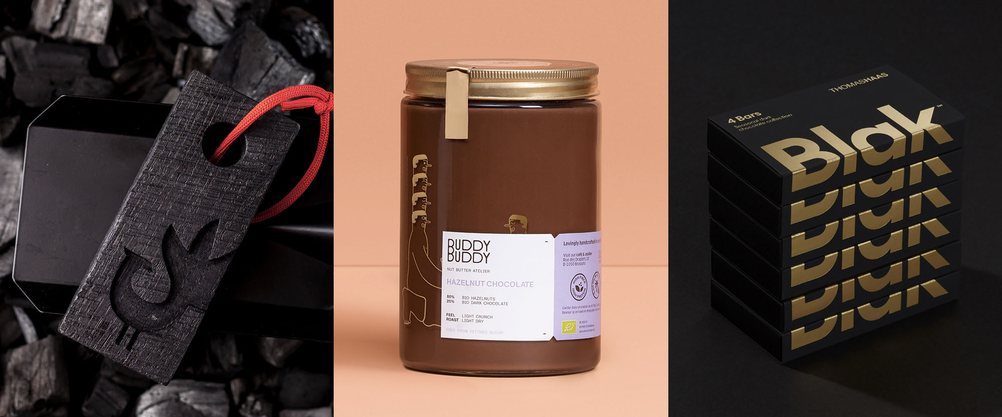
AGON by Korotich
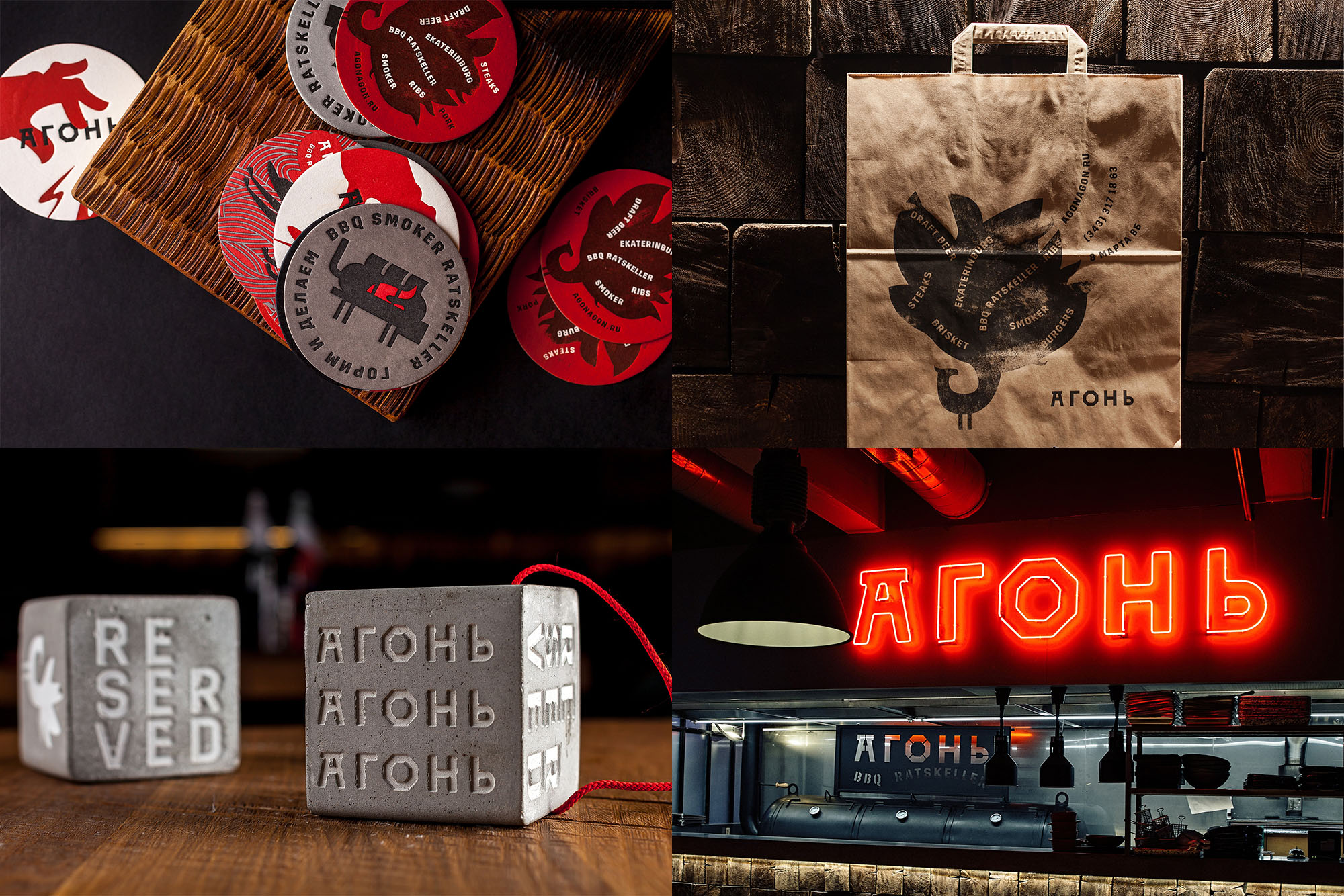
AGON is a BBQ restaurant located inside the City Hall building of Yekaterinburg, Russia, and whose literal centerpiece is its smoker, placed in the middle of the restaurant. "AGON" in Russian, as Moscow-based Korotich explains, "means 'fire', and also briefly calls something 'really cool'". Which is two things that this identity is: fire and really cool. The identity has a familiar BBQ joint aesthetic with the flames and the industrial typography but it also has some really unexpected details like the flames emanating from the tail of an undisclosed bird and the industrial typography cast on blocks of concrete (which you know we would love). And in general there is a kind of heavy playfulness to this that's hard to explain but easy to enjoy, like BBQ in a city hall building in Russia. See full project
Buddy Buddy by Futura
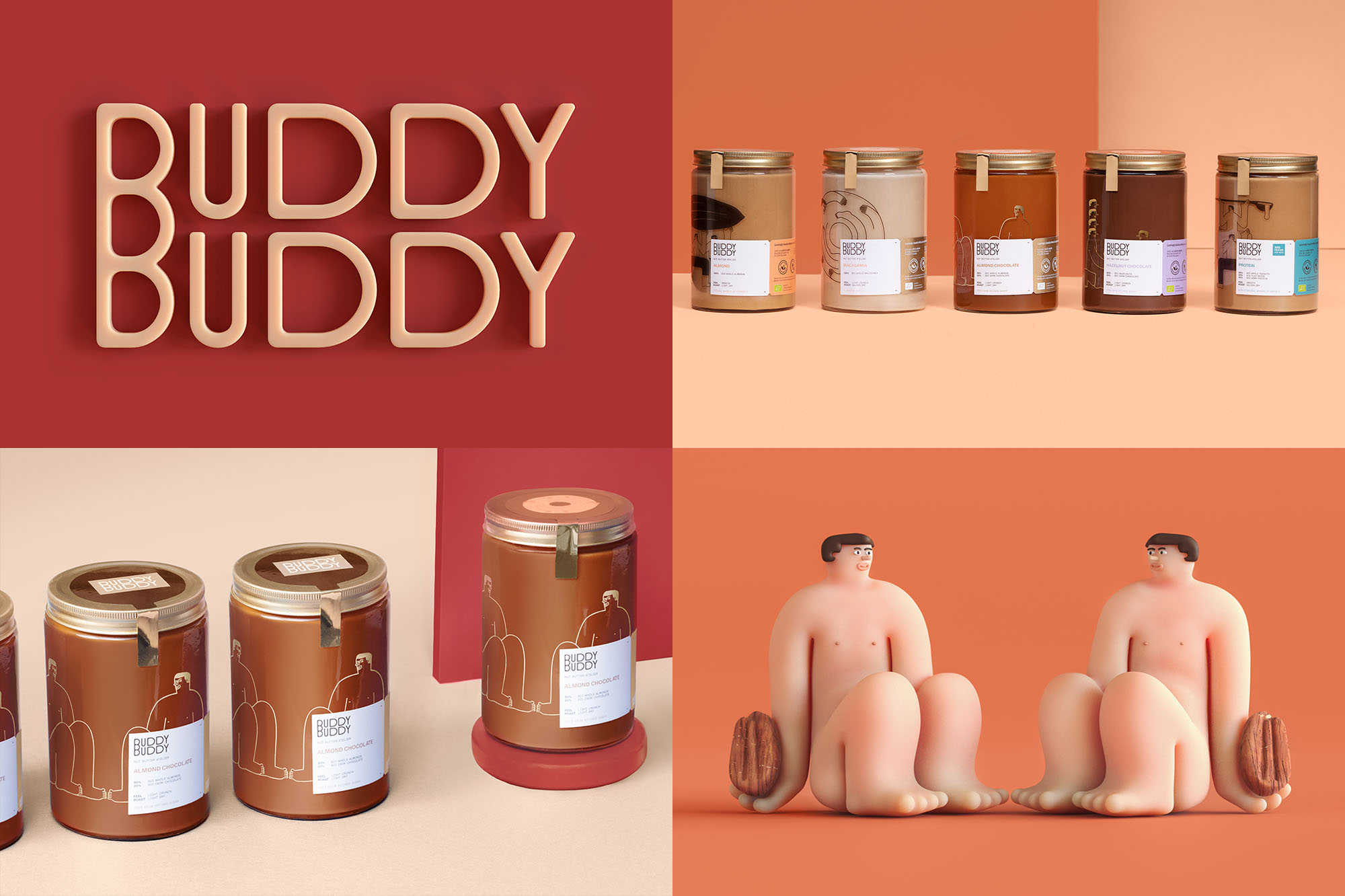
Buddy Buddy is an "independent nut butter atelier" -- which is the best description I have ever copied-pasted for Friday Likes -- in Brussels, Belgium, that creates its own peanut, almond, and hazelnut chocolate butters, among others. The identity, designed by Mexico City-based Futura, provides a great interpretation to the name name through the repetition and mirroring of elements as well as the introduction of buddy illustrations. The logo repeats the two words equally but cleverly unites them with a mega-"B" with three bowls that, in my mind, captures the gooey-ness and spreadability of nut butters. The illustrations are great in 3D but also work very nicely as line-art and, perhaps, it's not a proper thing to mention but their tiny nipples are everything. The color palette is nutty and I love the variety of the applications with the different elements in use. As a nut butter and Futura enthusiast, this is such a pleasing Venn Diagram overlap for me. See full project
Thomas Haas Blak by Pendo
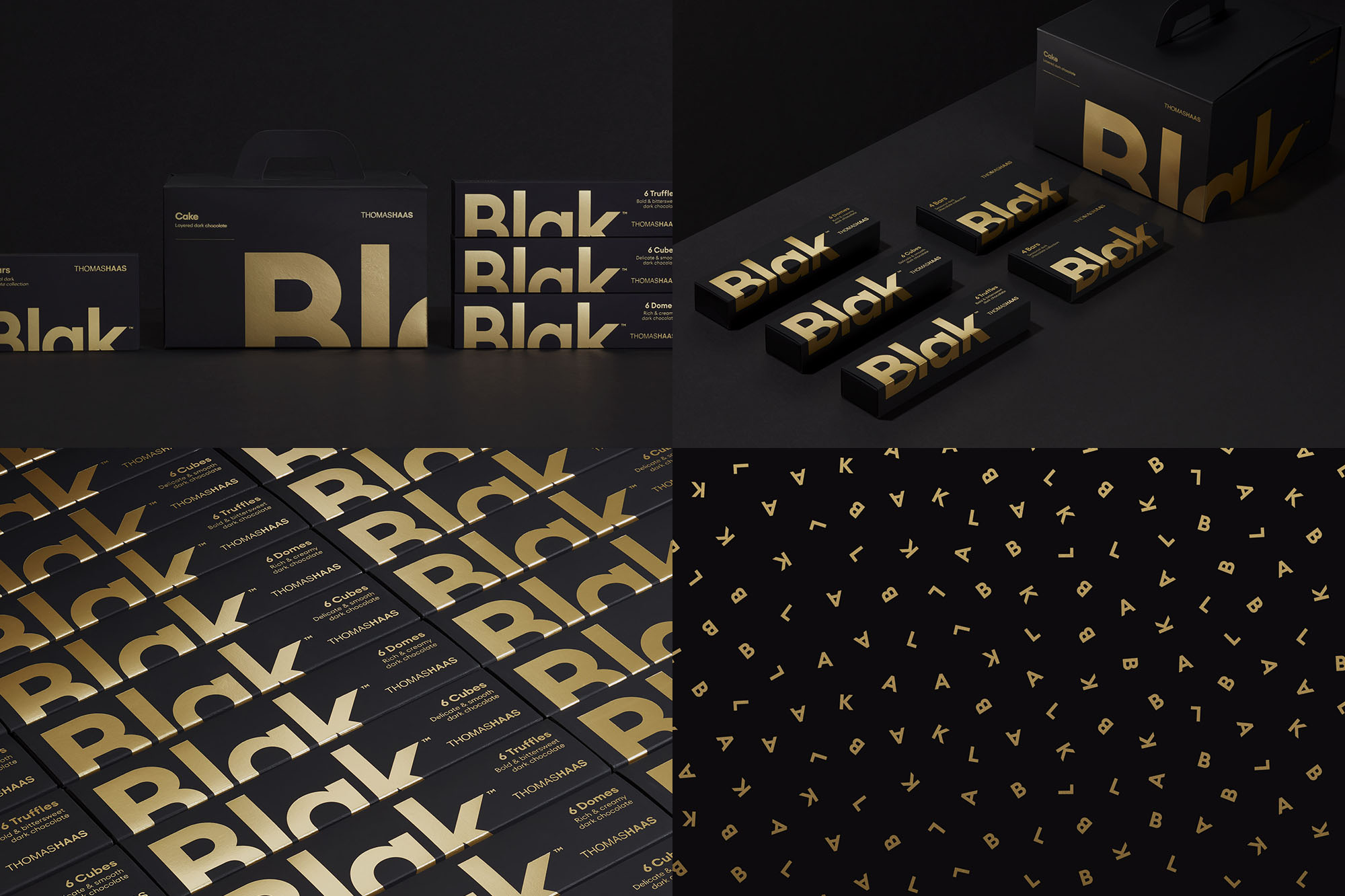
Thomas Haas Blak is a new line of pure, dark chocolate from the eponymous brand of fourth-generation pâtissier, Thomas Haas, that offers chocolates, pastries, and desserts, all handmade in Vancouver. The packaging, designed by local firm Pendo, is as delectable as the pure, dark chocolate looks. As much as we -- I -- rail on the default overuse of sans serif this is a case where it's sublimely used, creating an unexpected elegant, classy, and bold brand for dark chocolate. The black boxes with gold foil are a nod to the black truffles with edible gold leaf that wraps around the little pieces of chocolate heaven. The typography on the packaging is perfect and the final boxes have some of the most photogenic stacking we've had on Friday Likes. See full project