Noted: New Logo and Identity for Klaipeda University by Andstudio
“Making Waves”
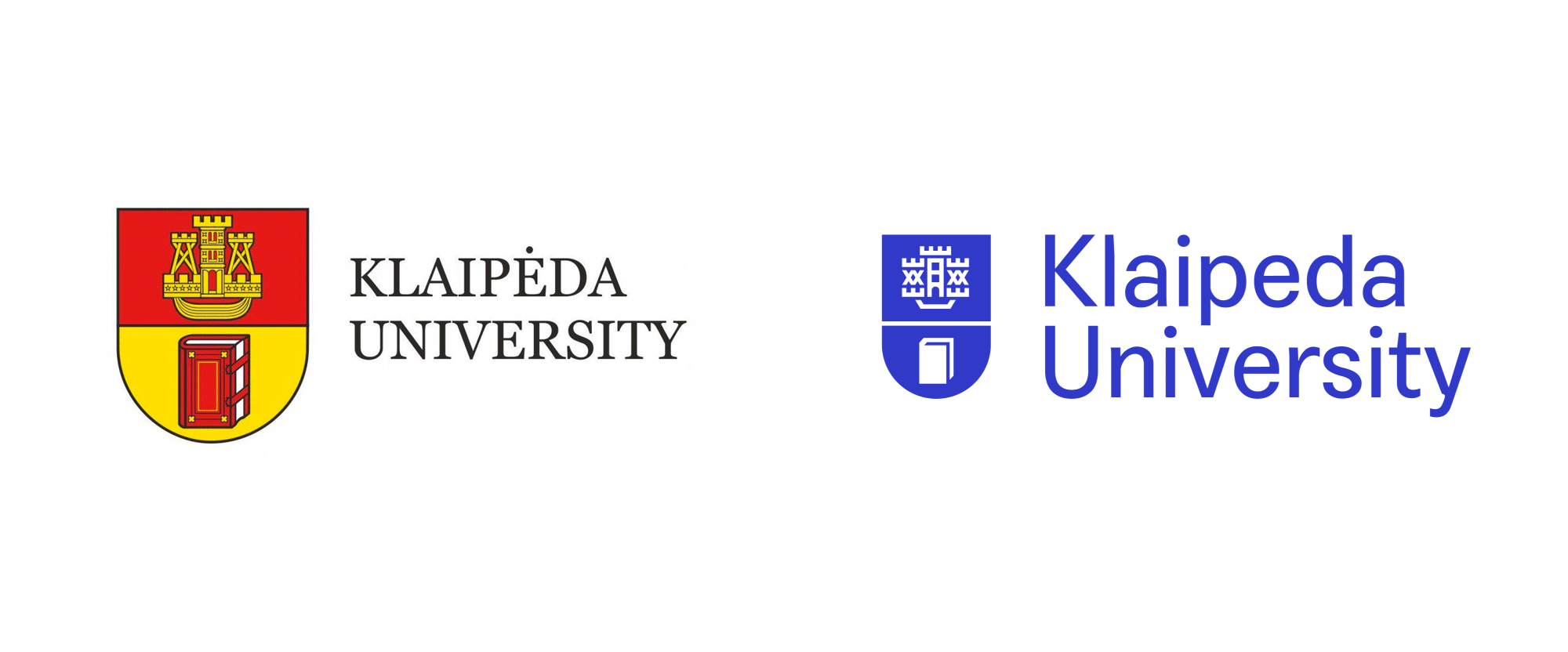
(Est. 1991) "Klaipėda University today enters into third decade of existence. It is the only structurally full-rate university in a large part of Western Lithuania, where a perspective industrial and commercial potential is rallied, where marine complex is developed and distinctive cultural traditions are cherished. It was established for realization of scientific researches and studies in marine topics. Dominant in the University are trends in scientific researches, artistic activity and academic activities, which are not cultivated by other Lithuanian universities. It develops as an autonomous and modern scientific and study centre."
Design by
Andstudio (Vilnius, Lithuania)
Related links
Andstudio project page
Relevant quote
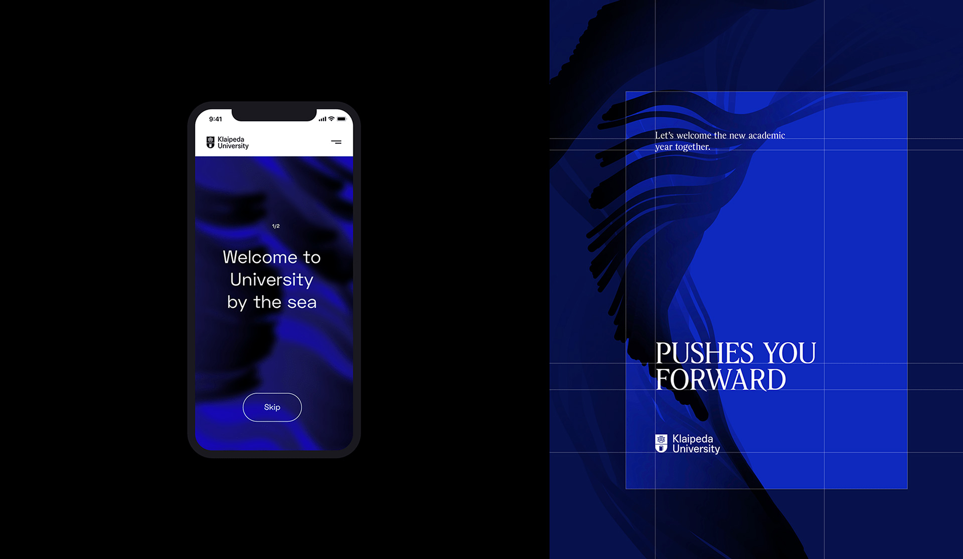
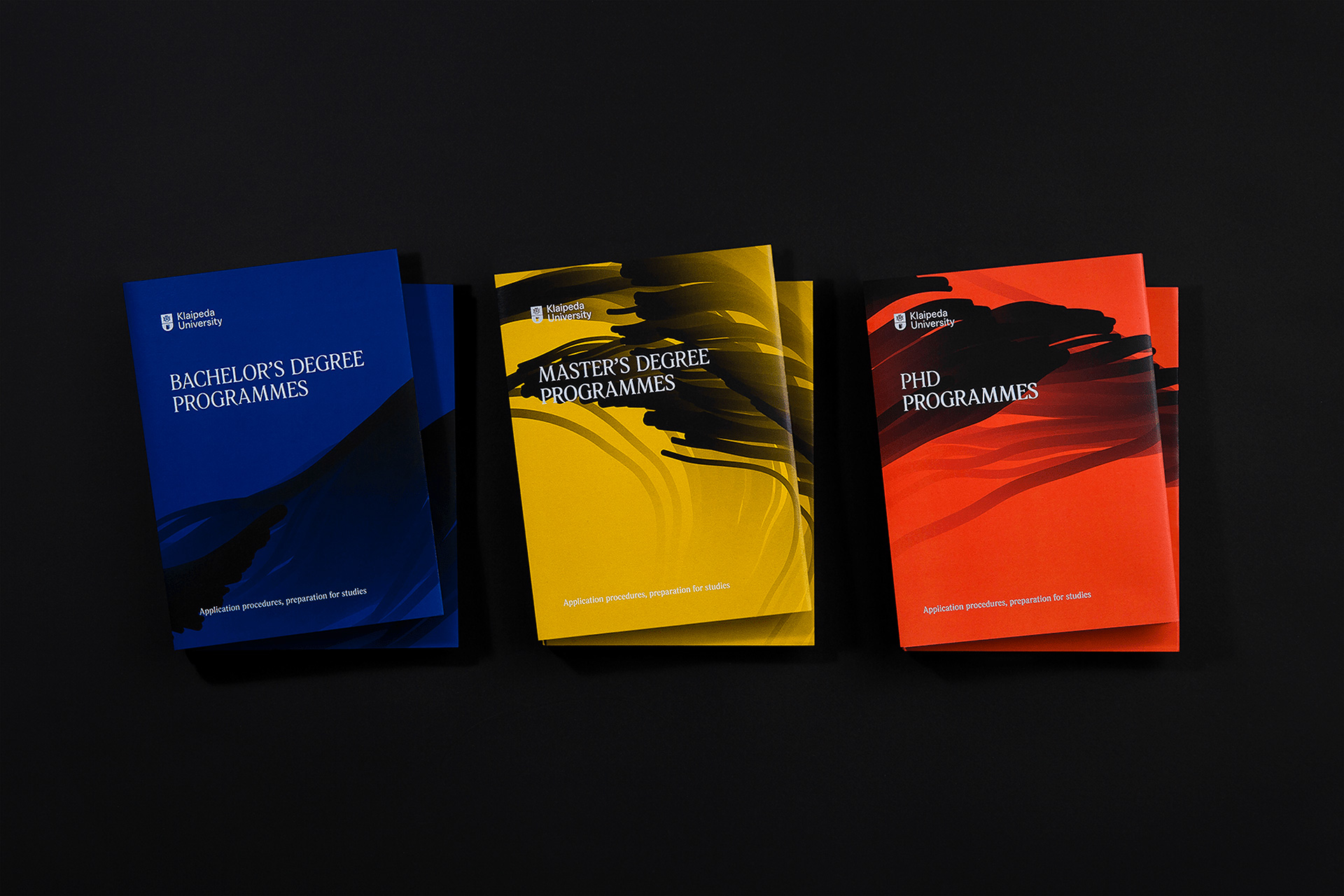
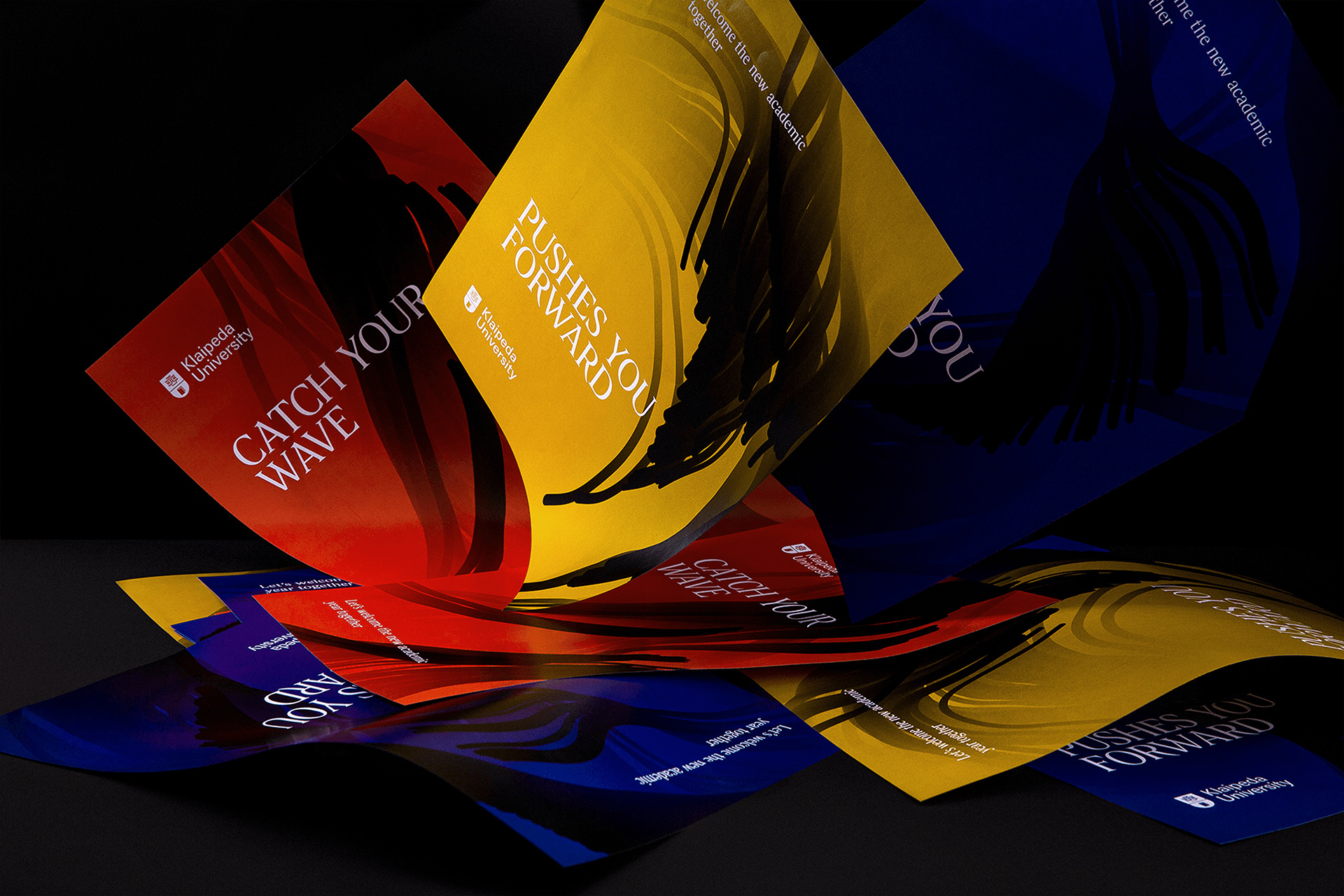
The goals of Klaipėda University were twofold. Firstly, it aimed to continually educate future marine specialists about the sea and its numerous nuances. For this, we created a graphic design system, which became a symbol of the sea’s constant change and development. Secondly, it sought to represent and promote a maritime mentality. In order to accomplish this, we established a visual identity system, based on the actual, real-time data, measuring and predicting the intensity and height of the waves, influenced by the wind’s strength.
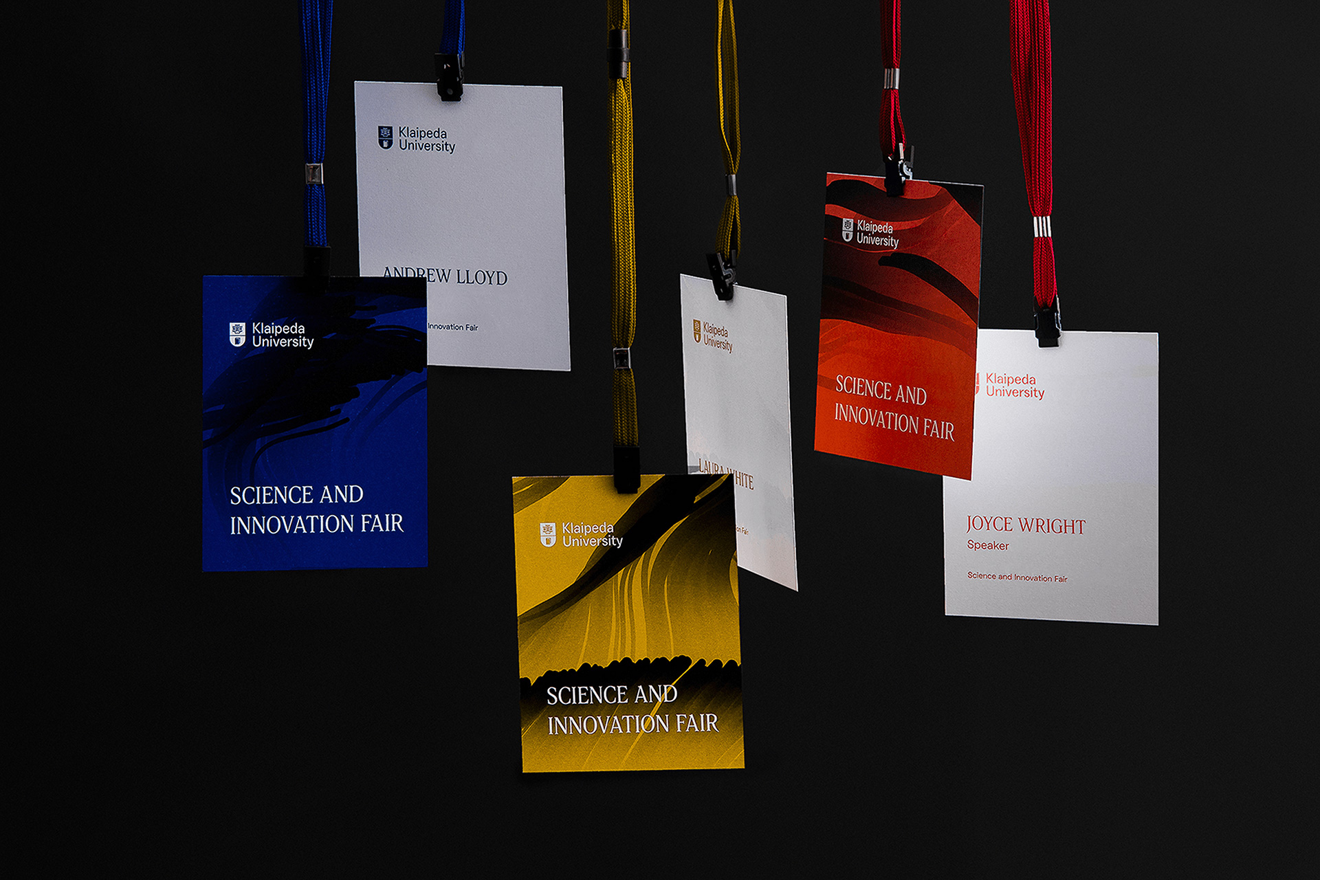
To create everchanging graphics and a ceaseless identity for KU, we developed a single, overarching principle, which was the basis of a self-propelled identity generating tool. The latter seamlessly combines practical information with an inspirational angle to it. Patterns derived from the current data can be exported and used in any university paperwork, social media and even official merchandising, making it a go-to, simple to use design tool for an audience reaching far beyond the university.
Images (opinion after)
Opinion
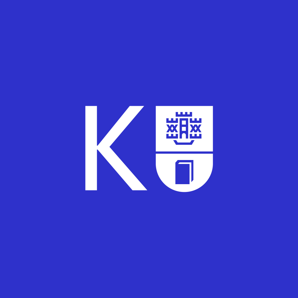
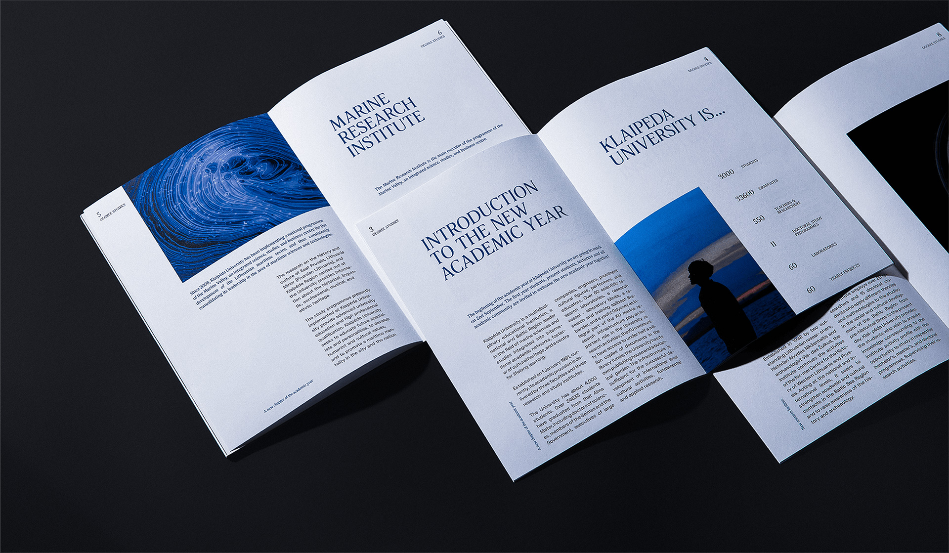
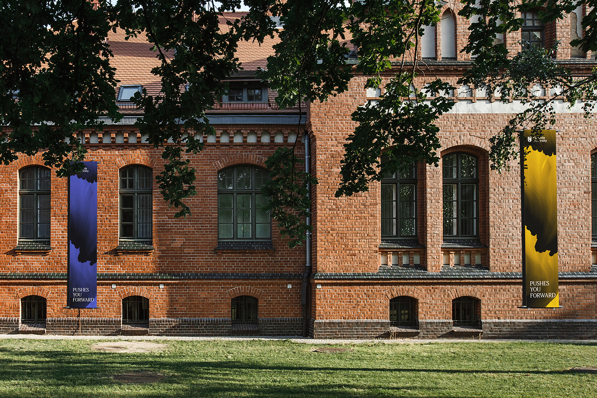
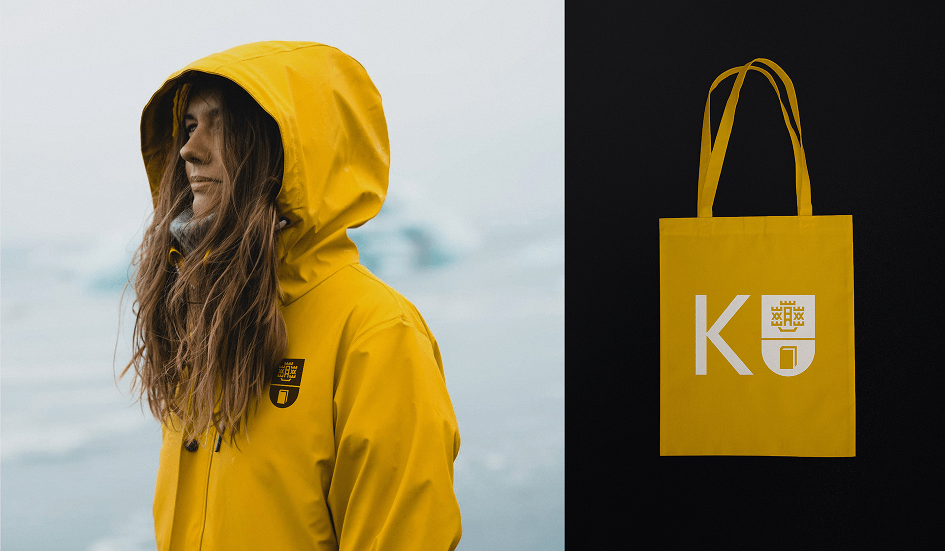
The old logo — it’s possible I have a slightly older logo but the gist remains — was not very imaginative, mixing the city of Klaipeda’s coat of arms, which depicts a stone castle and boat merged together, with a book, because knowledge. A random serif for the wordmark was random. The new logo maintains the coat of arms iconography but in the contemporary aesthetic of thick lines that, while still as hard to decipher as the old drawing that this is a stone-castle-boat, it at least now looks like it belongs in this century. The book drawing seems off though as it has too much white in contrast to the element above it. Still, it’s an attractive unit. The wordmark is crisp and has just the right amount of personality. The “KU” shorthand version is great, tightly pairing the crest with a “K” that nicely frames and props the “U”. The identity then introduces a wavy pattern — reflecting the marine-ness of the university — generated in real time (at each time it’s generated) using data from the ocean. It’s a cool idea but the core ingredient of the patterns is a little unrefined and has a bitmap graphic aesthetic that feels slightly at odds with the rest of the identity. I don’t think it’s bad, but I feel like the tool is driving the design more than the design driving the tool. Still, it’s a nice respite from the usual happy colors or happy student photography that permeates universities. The secondary serif typeface is a nice addition that contrasts well with the logo and patterns, providing a good scholarly vibe. Overall, this strikes a good balance of feeling marine-technology-advanced (whatever that may be) and like a proper higher education establishment.

