
Noted: New Logo and Packaging for Somersby by Elmwood

“The Tree doesn’t Grow far from the Apple”
(Est. 2008) "Somersby cider is a brand of 4.5% abv cider by Danish brewing company Carlsberg Group. Developed in 2008, it was originally developed for the Danish market, but today has been launched in more than 46 markets, including all of Europe, Israel, Nepal, Australia, New Zealand, Malaysia, Hong Kong, Taiwan, Thailand, South Korea, Canada and the USA.[2] Of the world's ten biggest cider brands, Somersby was the one that grew most in 2012. Despite its Danish origin, the cider is marketed in many territories as being the creation of 'Lord Somersby', a fictional English Lord." (Wikipedia)
Design by
Elmwood (Leeds, UK, office)
Related links
Elmwood project page
Relevant quote
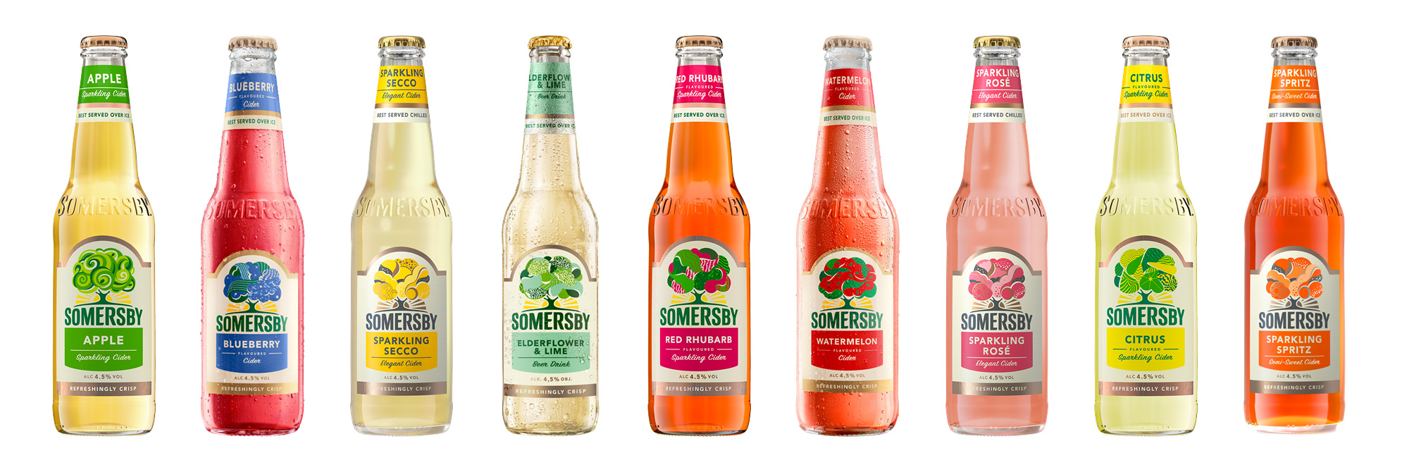
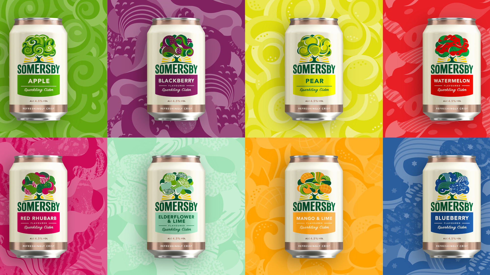
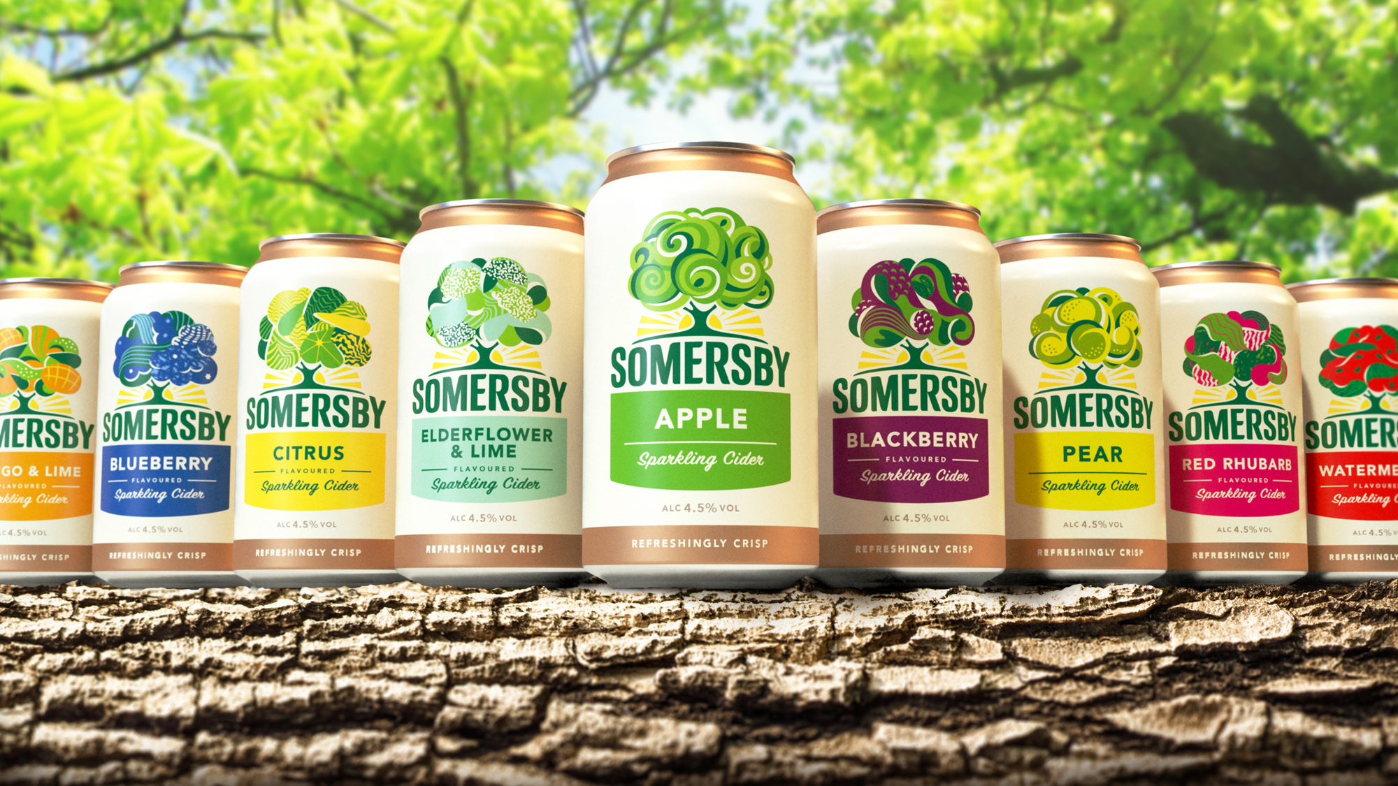
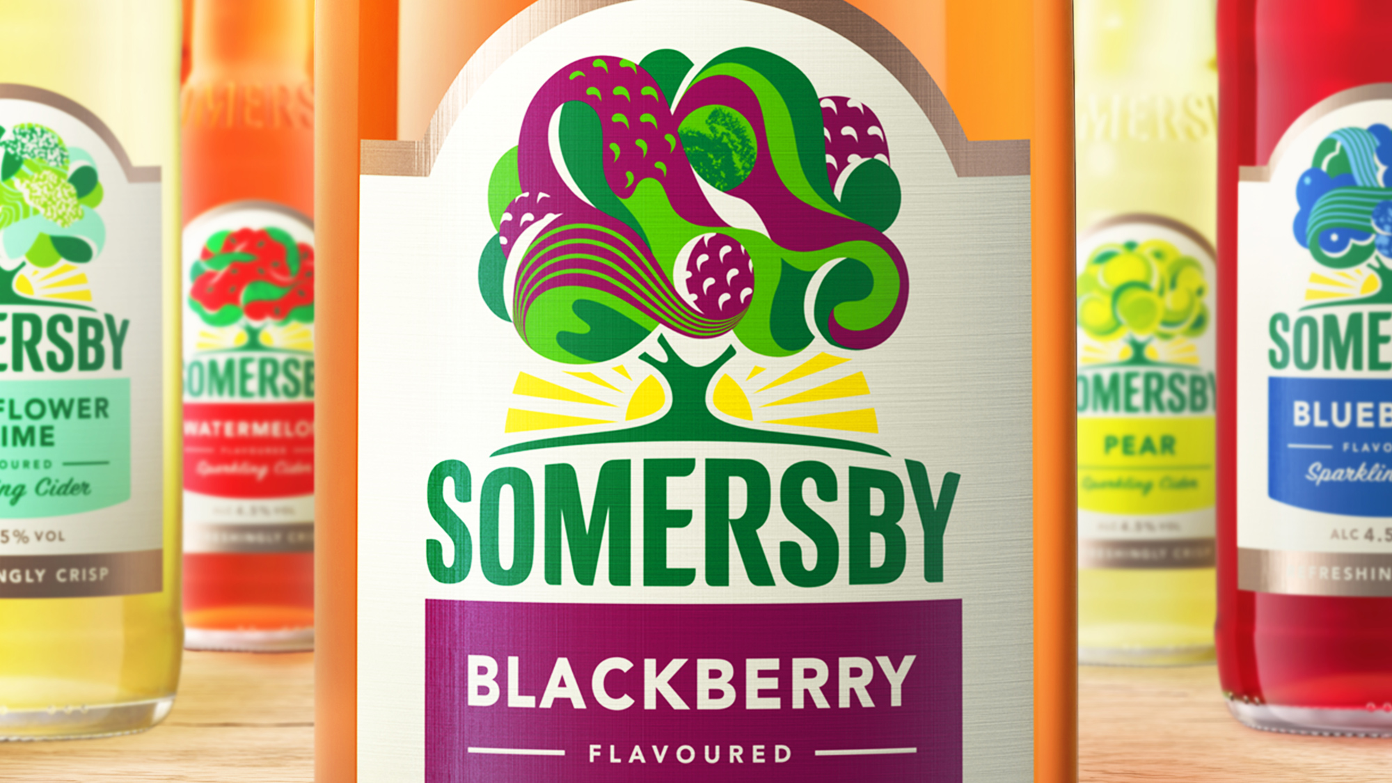
The positioning, ‘Refreshingly Optimistic’ is a rallying cry encouraging consumers to come together, enjoy carefree time and embrace life. Every asset was designed to be a ‘smile in the mind’, to tell the Somersby brand story and to bring its brand values of sharing, being uplifting and embracing optimism to life. Moving away from the literal interpretation of an apple tree, an established category code, our Leeds team developed the idea of a ‘living tree’ – a dynamic symbol with many expressions bringing the various flavours to life. Flowing curves paired with bright colours welcome consumers to a refreshingly optimistic brand, in complete alignment with the new positioning. The fixed iconic shape provides meaningful brand architecture, whilst the flexible canopy brings each of the refreshing flavours to life, capturing the individual tasting notes.
Images (opinion after)
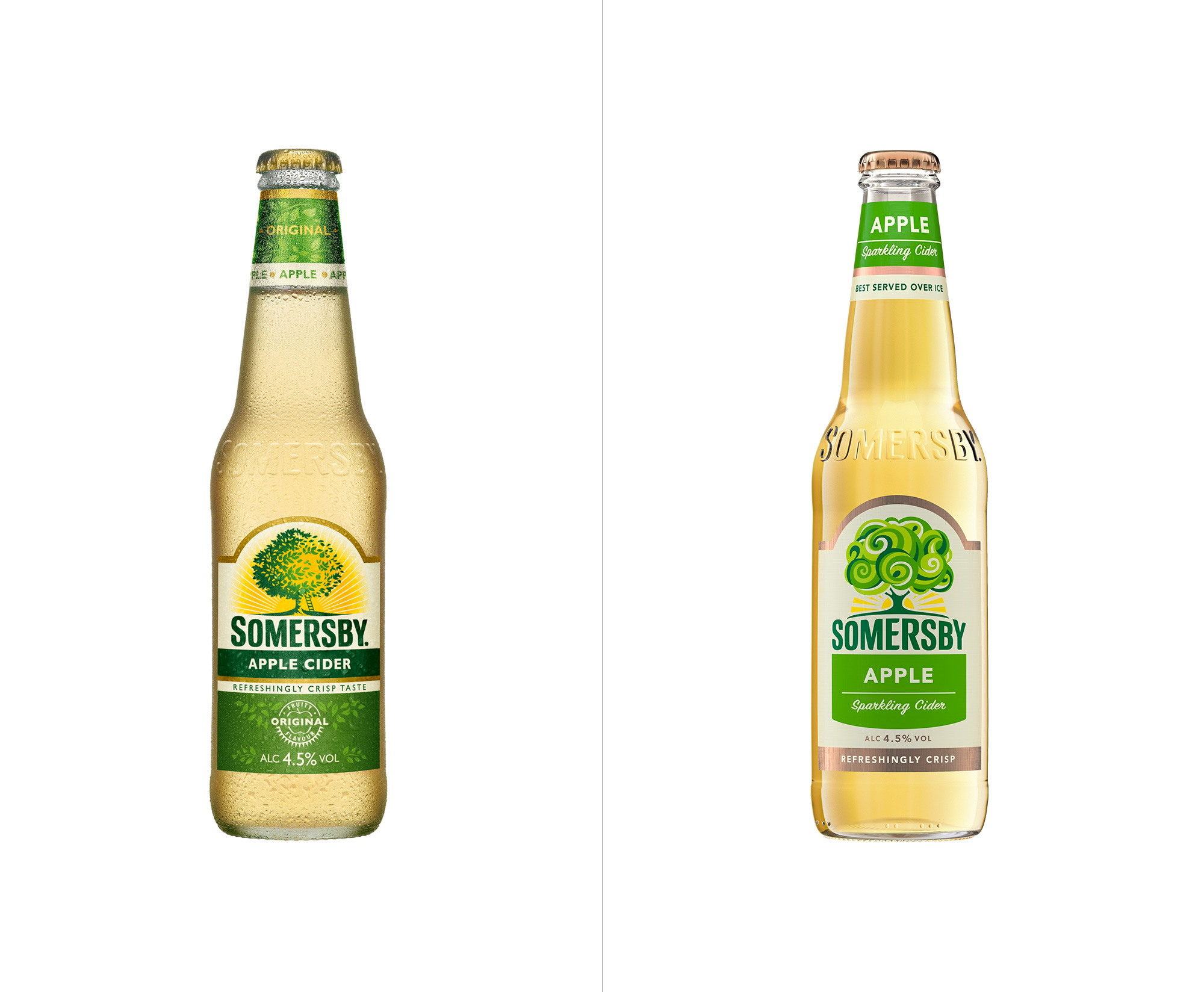
Opinion
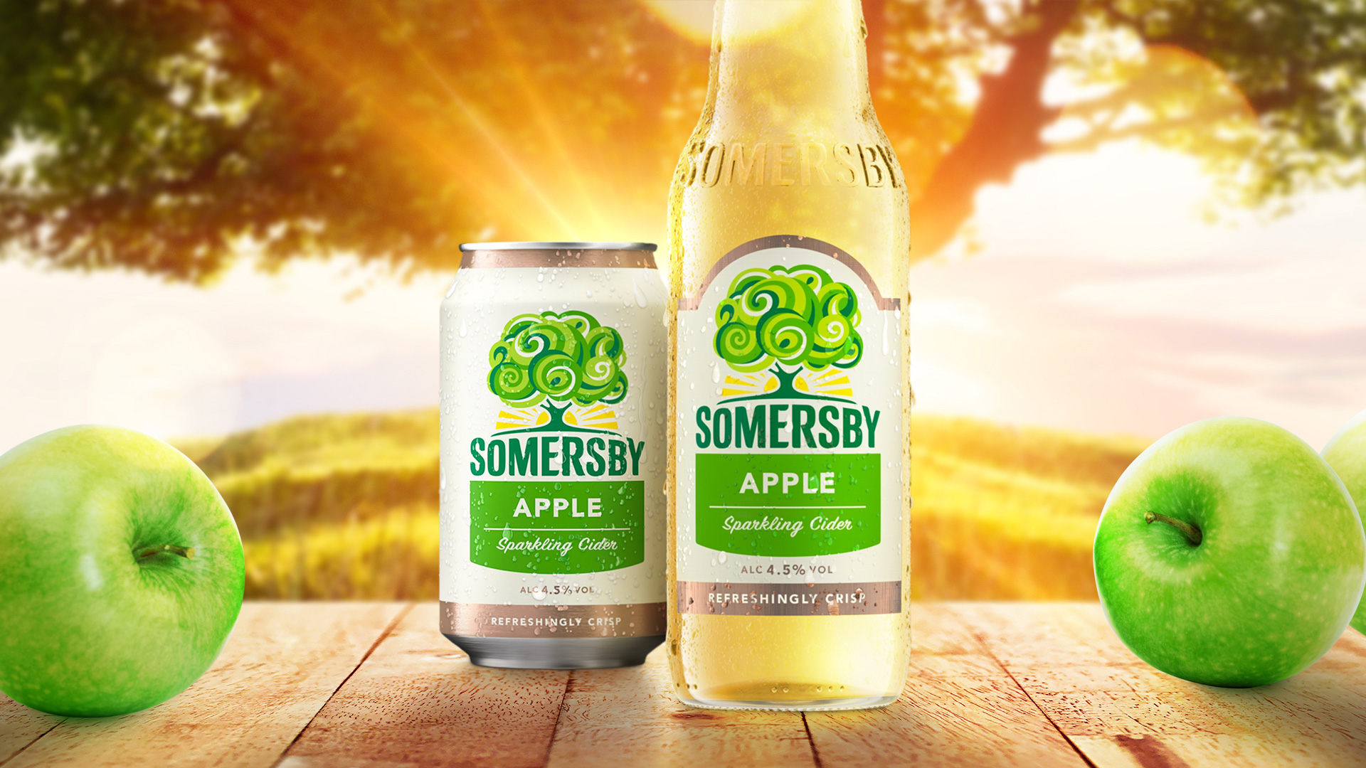
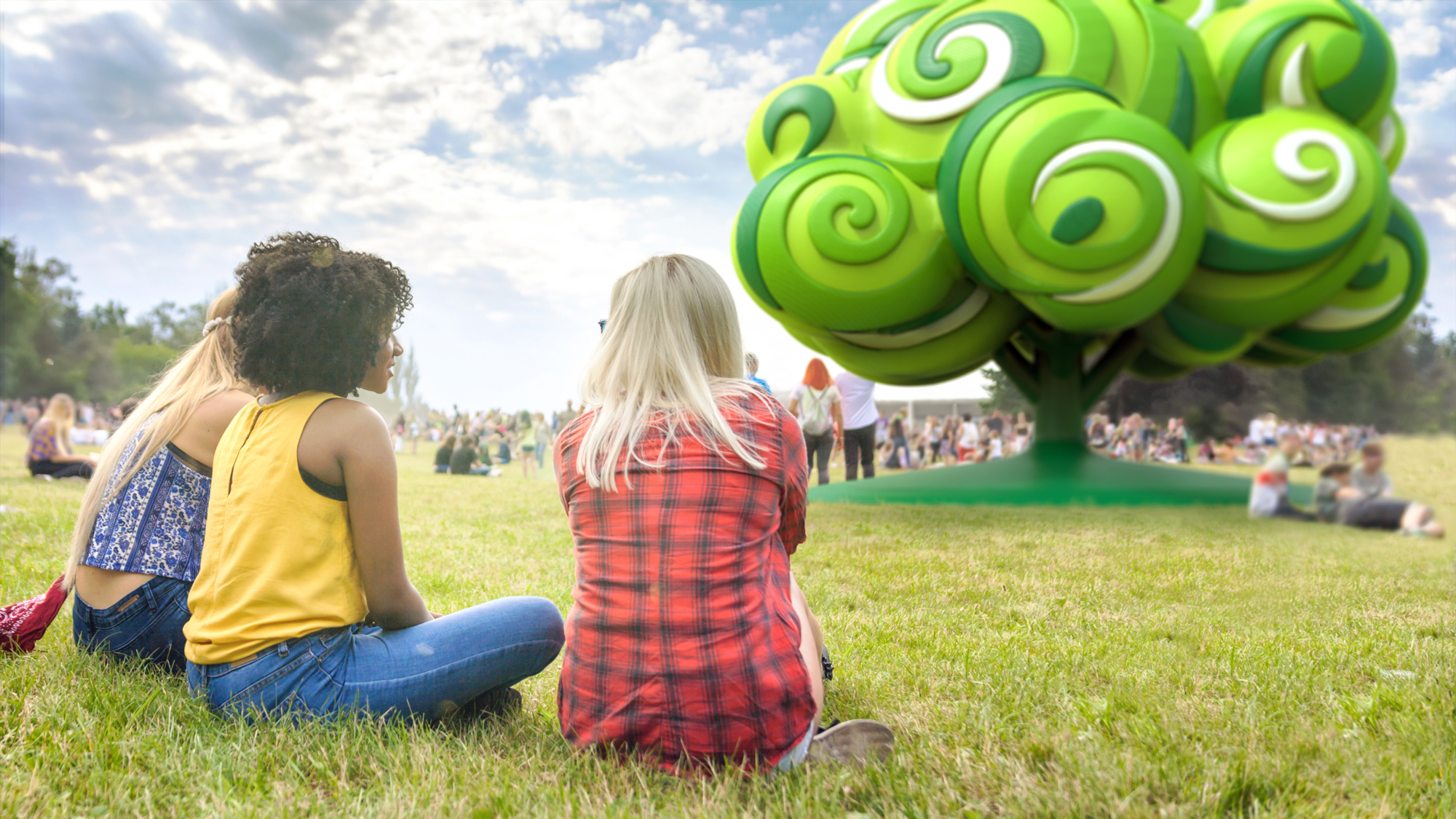
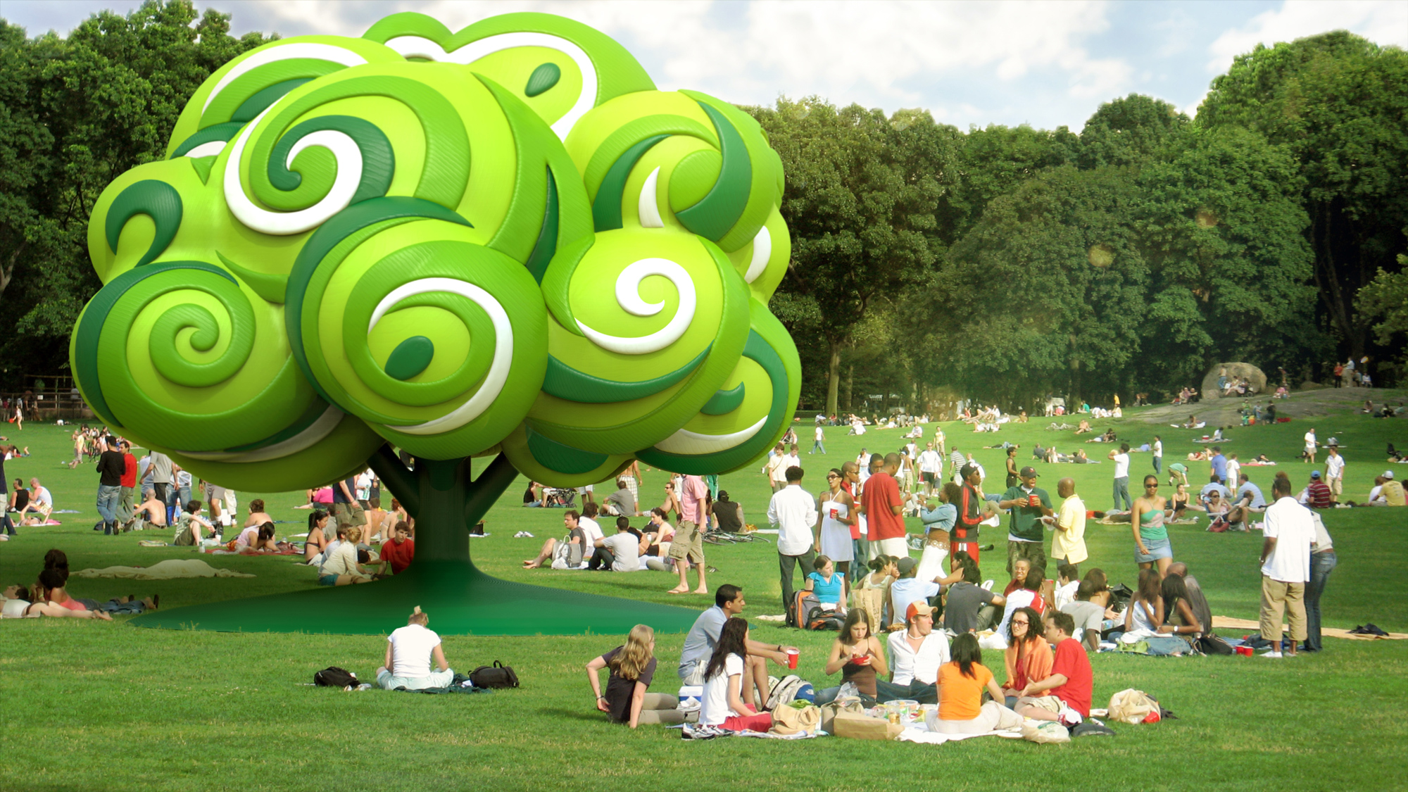
The old logo was mostly fine… fairly literal on the concept but decently done, except for the weird mustache ground. The new tree is the old tree on a light acid trip and it’s a visual improvement, making the logo much more interesting and feeling less like yet another micro-cider brand that you might find at a small store on the side of the road. If there was one issue with the new expression is that it looks way too kid-friendly, like it could be innocent flavored water. The overall look could benefit from some kind signal that this is an adult beverage. The wordmark could have done this job but instead they kept the premise of the old wordmark and made it friendlier as if it were to go on a juice box. Execution-wise it’s more or less fine but I think they could have definitely added a 4.5% of edge to the typography to match the alcohol level. I like that the tree can be reinterpreted for the different flavors and, other than the watermelon one, they all seem pretty convincing. The packaging evolution is fine… nothing too drastic and with a few tweaks in hierarchy to make the flavors more discernible. Lastly, there is a 3D tree that has an eerie uncanny valley vibe to it… like, they really pulled off the renderings in the park and it’s disconcerting that all the picnic revelers are going about their business while an alien tree sits in the middle of the park. Overall, a charming evolution but missing something that hints at the ABV in the product.