
Noted: New Logo and Identity for ATLAS by Berger & Föhr

“It’s A-okay”
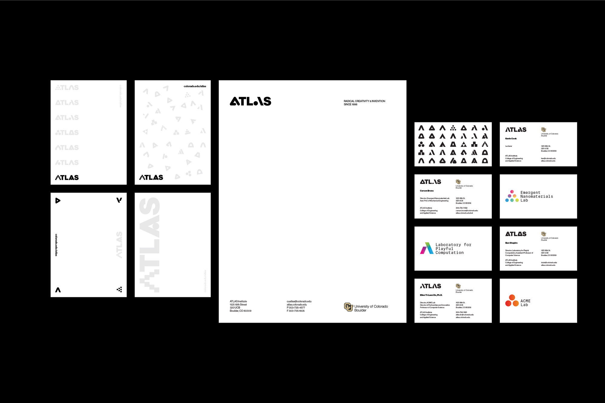
(Est. 1998) "ATLAS is an interdisciplinary institute for radical creativity and invention. We inspire research, experimentation and critical thinking that turns ingenious ideas into reality. The institute's labs and academic programs encourage out-of-the-box thinking and creative exploration, attracting technology visionaries and virtuosos who reach beyond convention, take risks and innovate. Our synthesis of design and technology amplifies innovation in engineering and the arts. We believe the best way to shape the future is to invent it. We promote rigorous, curiosity-driven investigation in a thriving academic community that is supportive, energetic and playful. A changemaker at the University of Colorado Boulder, ATLAS is proud to offer a full portfolio of interdisciplinary academic programs through the College of Engineering and Applied Science."
Design by
Berger & Föhr (Boulder, CO)
Related links
Berger & Föhr project page
Relevant quote
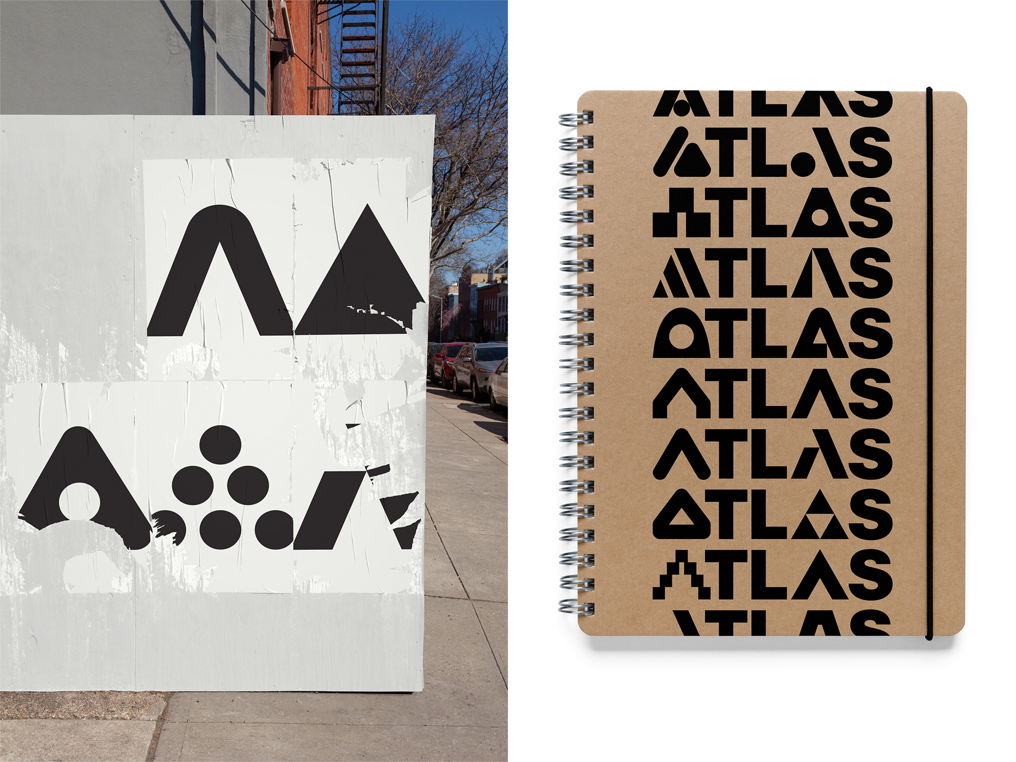
We designed ATLAS a flexible and dynamic brand identity — [utilizing 36 different “A”s, which yield 665 variations] — and collateral system reflecting the creativity and agility of an organization where interdisciplinary, creative thinking, and doing thrives.
Images (opinion after)
Opinion
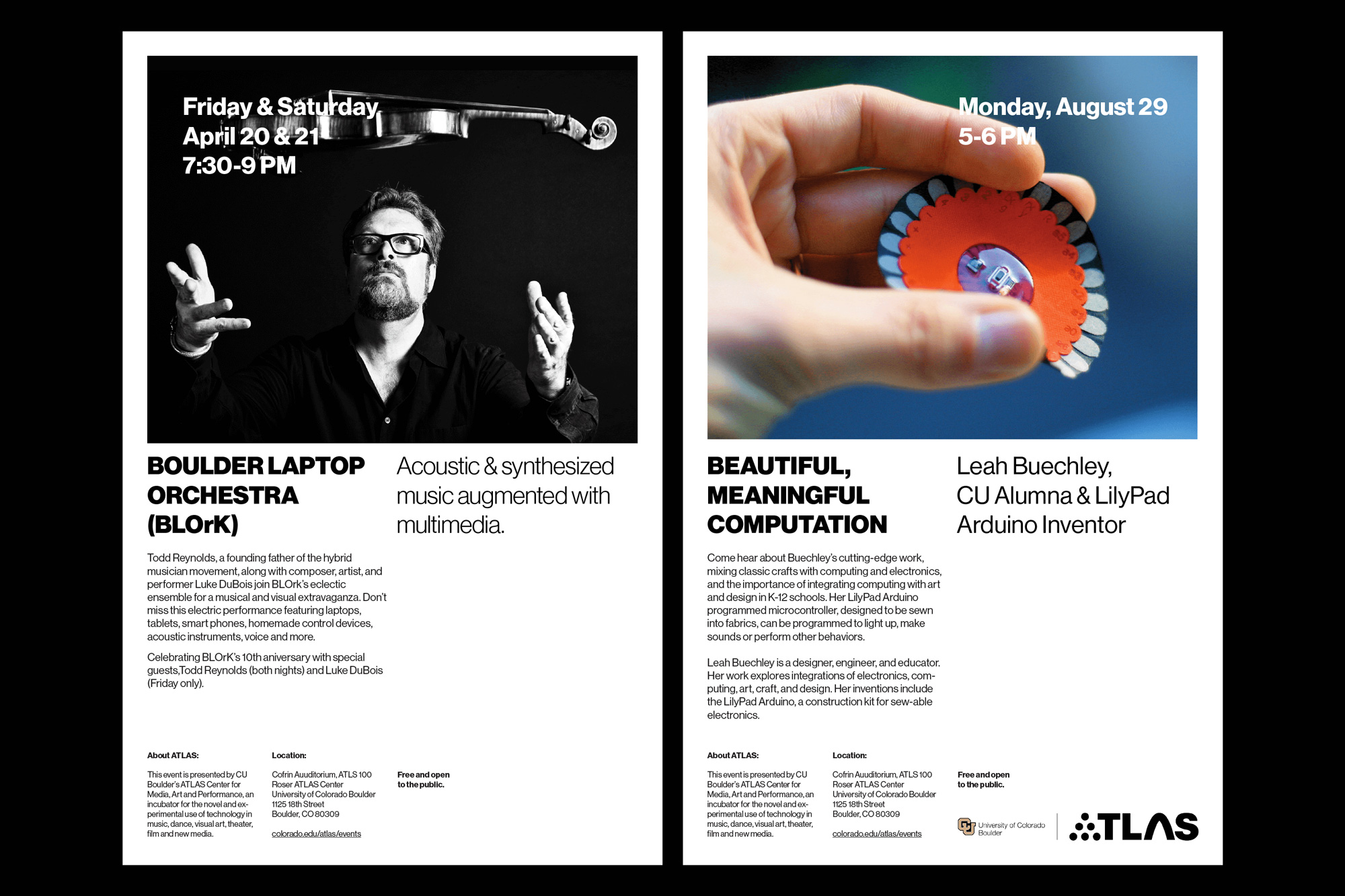
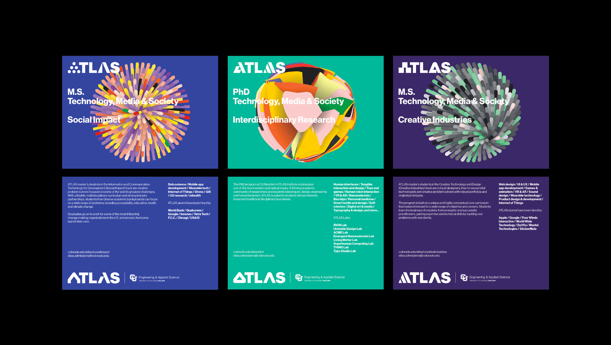
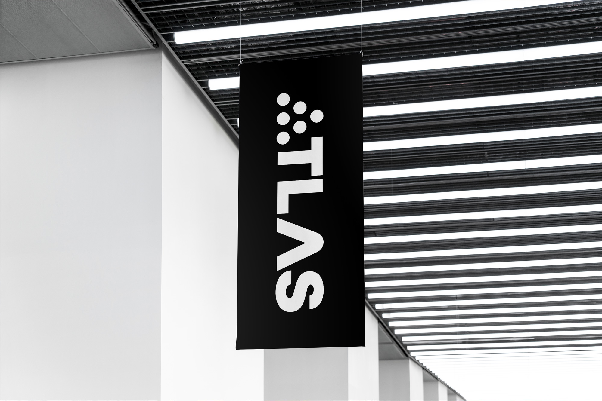
The old logo looked unassuming but don’t be fooled, it was bad, ligaturizing all the letters in very offensive and then, for som reason, stopping from doing it to the initial “A” — also, I’m pretty sure that “S” was stretched horizontally. The new logo is a huge improvement obviously by comparison but it’s also a pretty good typographic execution regardless of what it replaced. The multiple “A”s have a solid diversity to them but all designed with a minimalist aesthetic that allows them to flow in and out of the two “A” spaces in the name and play nicely with the rest of the letters. Any of the variations on their own would probably be only so-so but the variety of them amounts to a much more interesting design. Some certainly work better than others but as a whole they are convincing. The sub-brands are interesting but I think the introduction of the gradients cheapened the simplicity the main logo had going and almost feels like part of the identity of another project. The applications could be more engaging somehow… the posters feel so heavy and, like, old… there is none of the playfulness of the logo in them but when they did try to add some playfulness, as in the stationery, it came out like me trying to dance where all the smooth movements that in my mind I think I am performing manifest as nothing more graceful than a Minecraft character doing a robot dance. Anyway, I have no idea how this opinion ended with me dancing… overall, a solid logo system with room to evolve in application.