
Noted: New Logo and Identity for Ameris Bank by Matchstic

“The Lion’s Share”
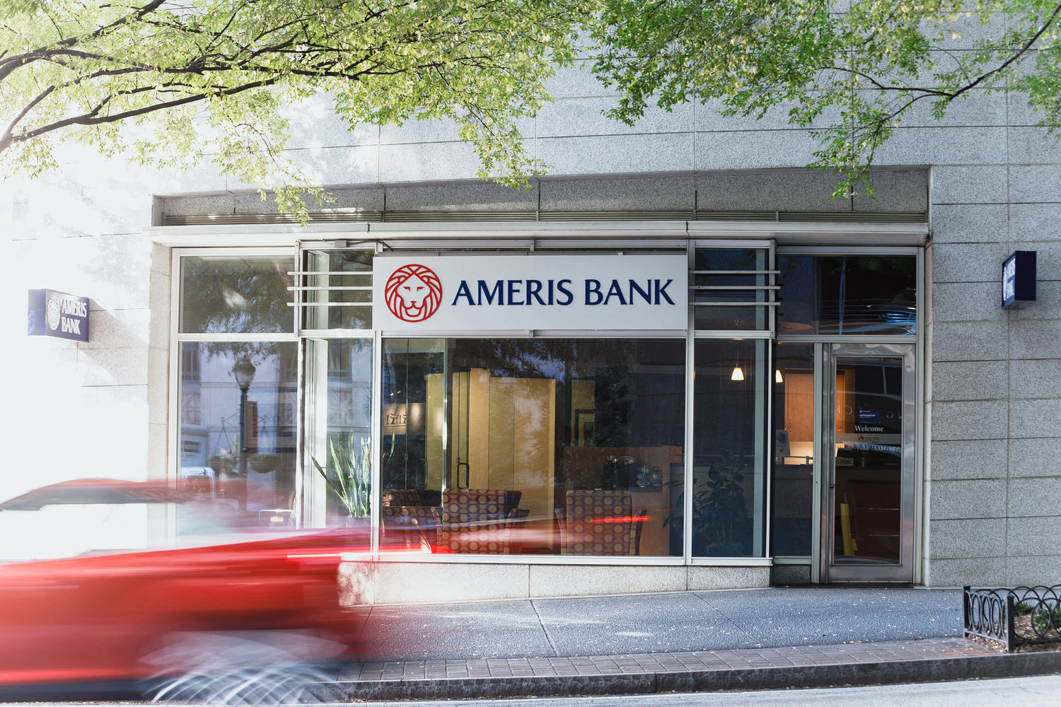
(Est. 1971) "Ameris Bank manages over $16 billion in assets and more than 300 financial centers across the Southeast. Headquartered in Atlanta, Ameris Bank is fiercely committed to bringing financial peace of mind to the communities it serves. A subsidiary of Ameris Bancorp (NASDAQ: ABCB), Ameris Bank offers a full range of financial services, including traditional banking and lending products, treasury and cash management, wealth management, insurance premium financing, and mortgage and refinancing solutions."
Design by
Matchstic (Atlanta, GA)
Related links
Matchstic project page
Ameris Bank press release
Relevant quote
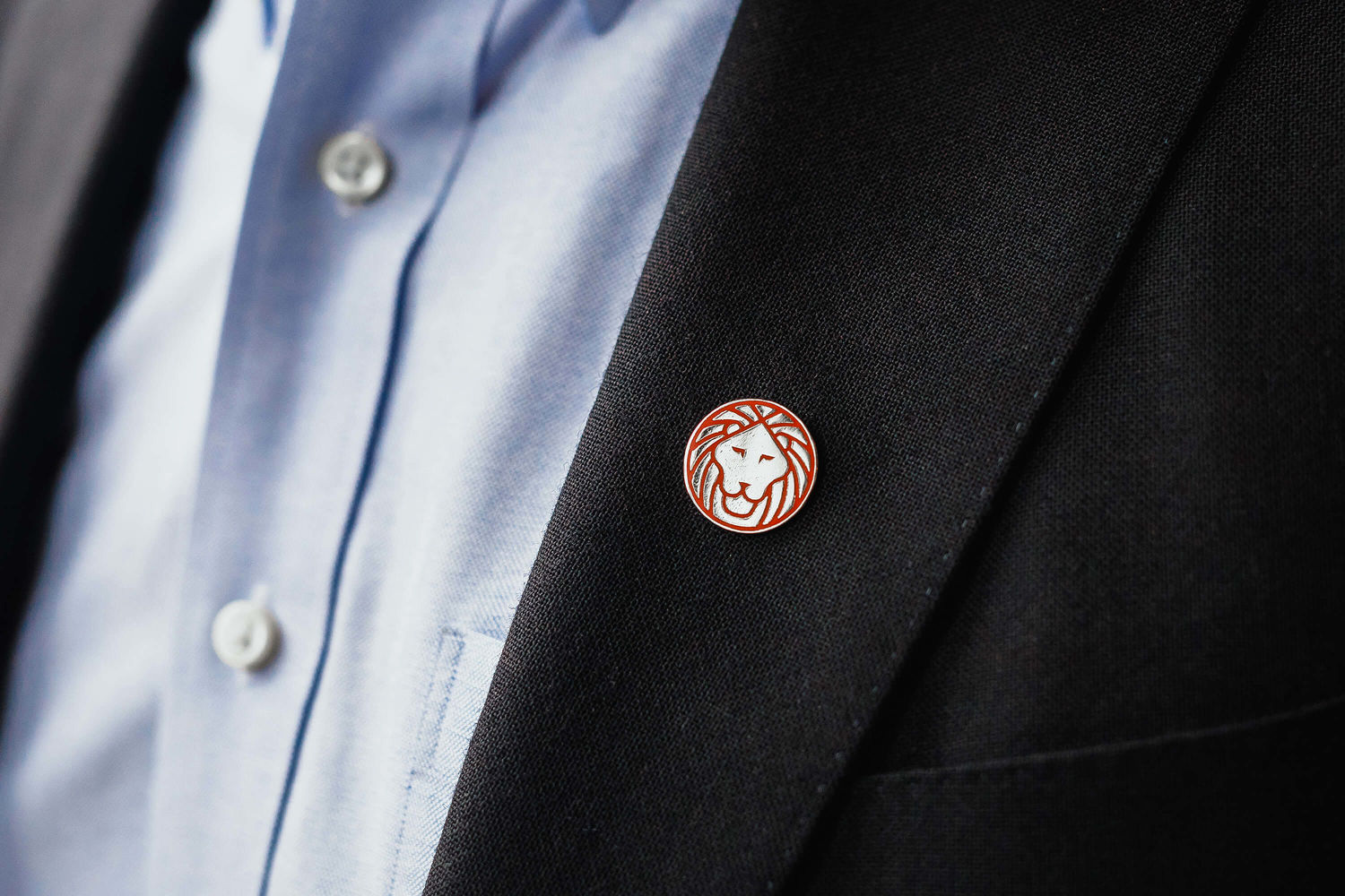
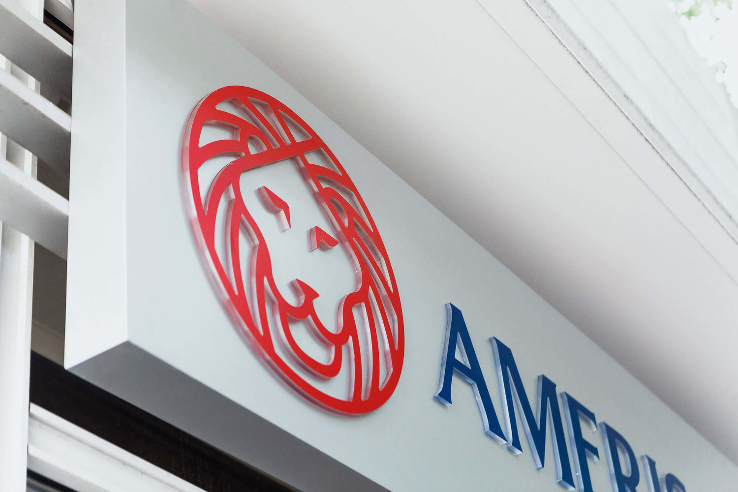
We discovered strong affinities for Fidelity’s recognizable lion symbol and the confident, patriotic typography and palette Ameris had developed. But harmonizing these elements would require a careful approach and many, many lion drawings. After an anatomical form study, we began to evolve Fidelity’s lion to be more representative, incorporating perfect circles and dialing in on an expression that felt simultaneously fierce and dependable.
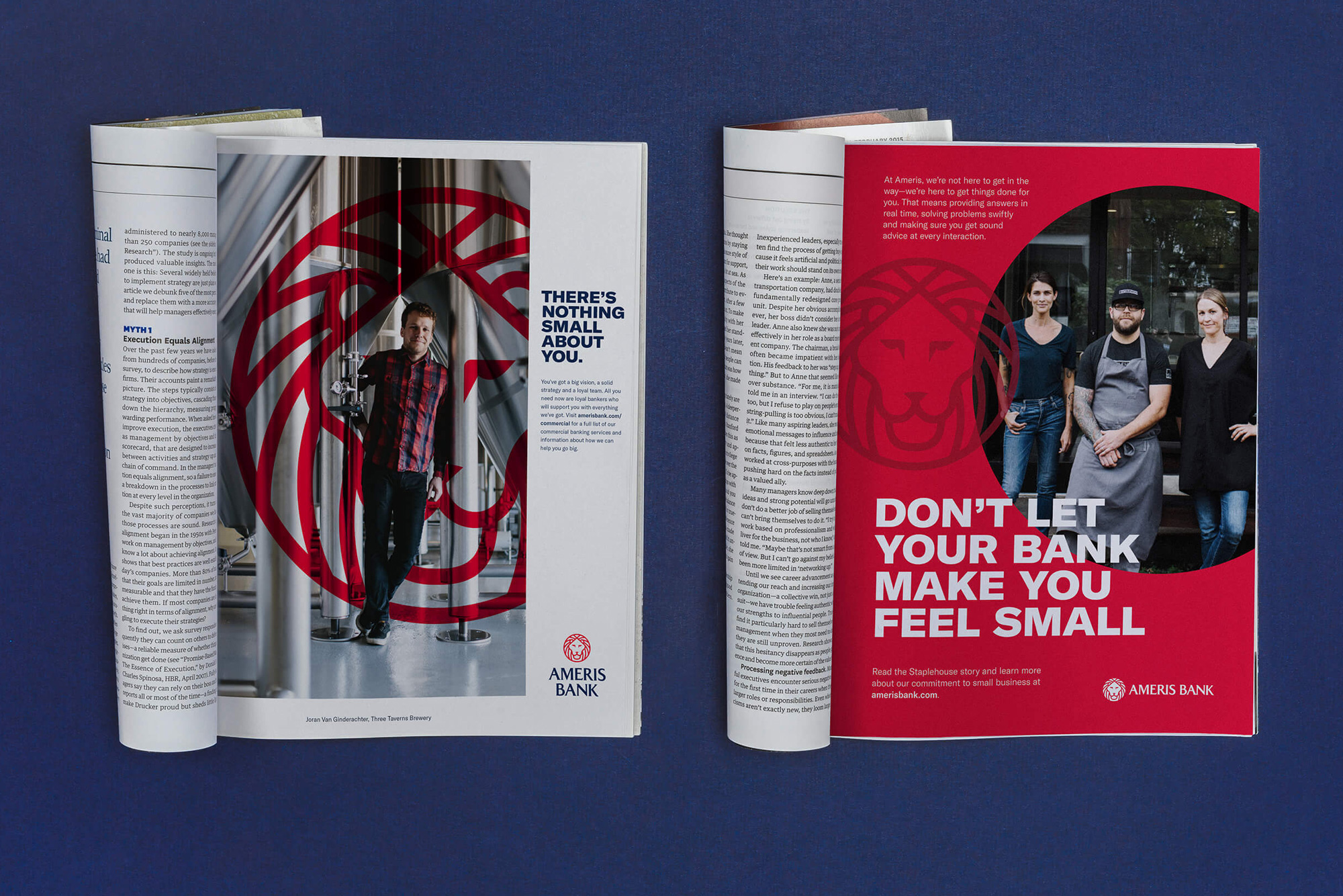
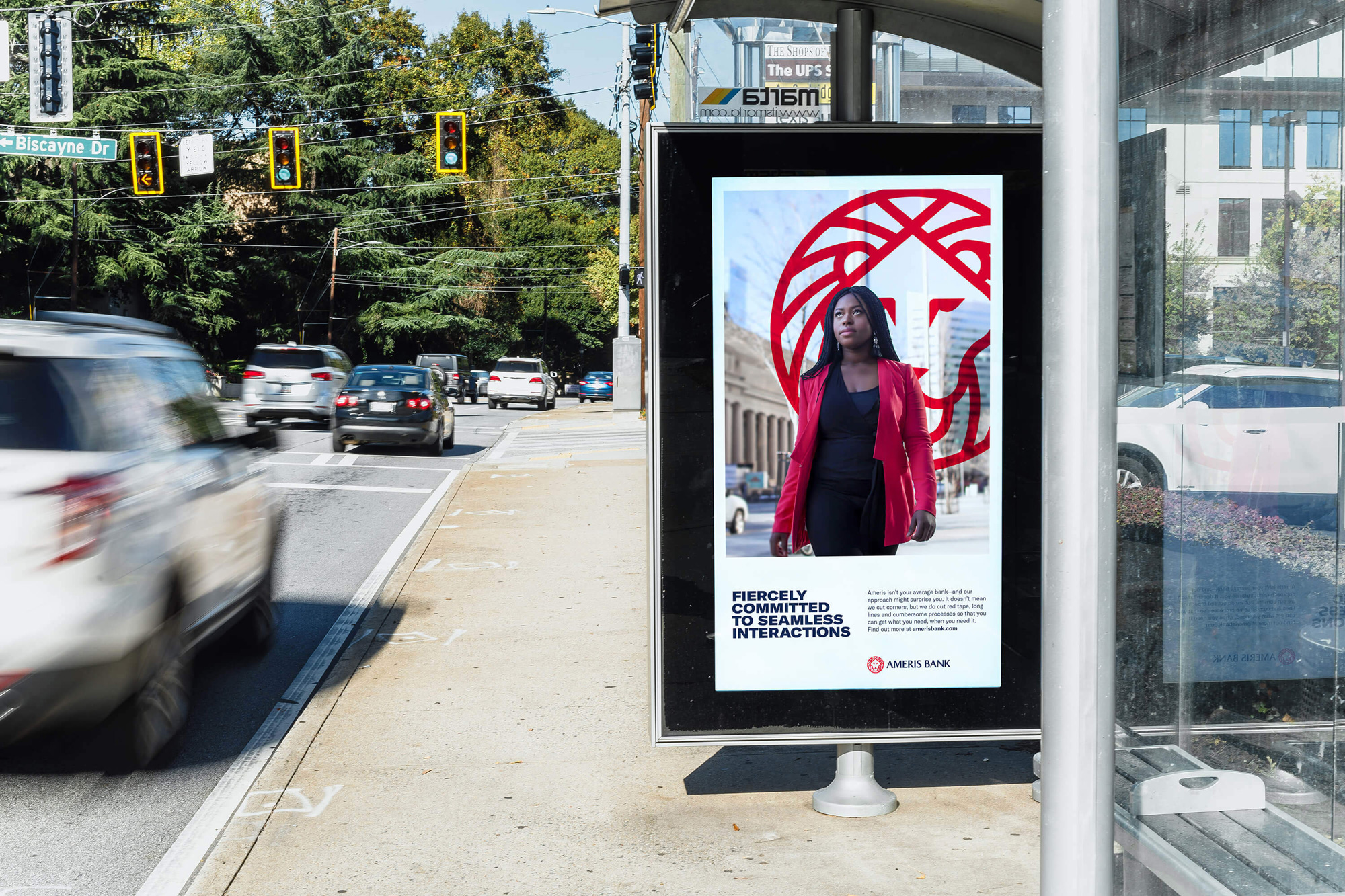
Our strategy positions them as a confident team of bankers that will scrap convention to get things done for people. To help express this position, we landed on a bold and feisty brand voice that will help them stand out—and stand up to big-box banks.
Images (opinion after)
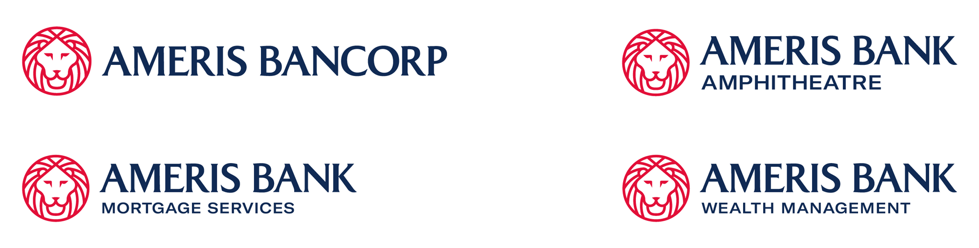
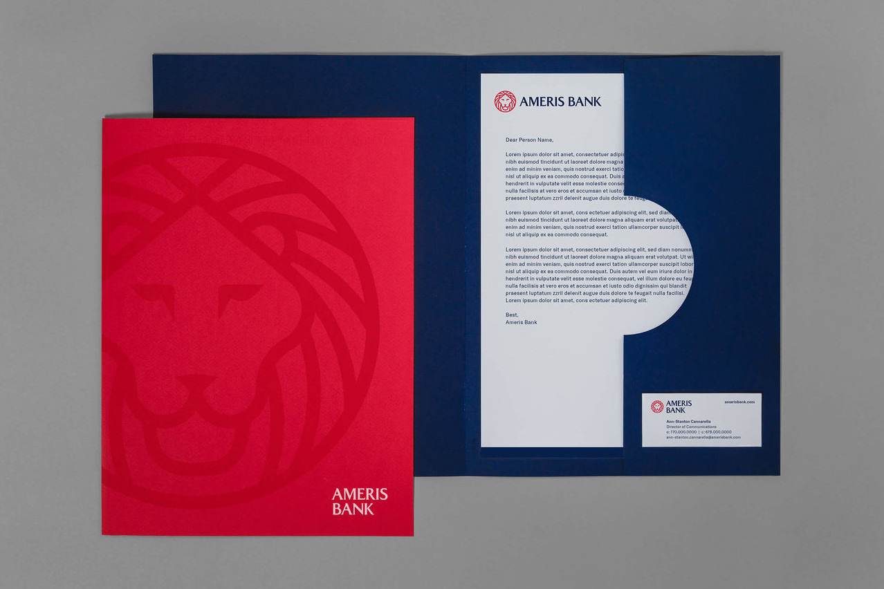
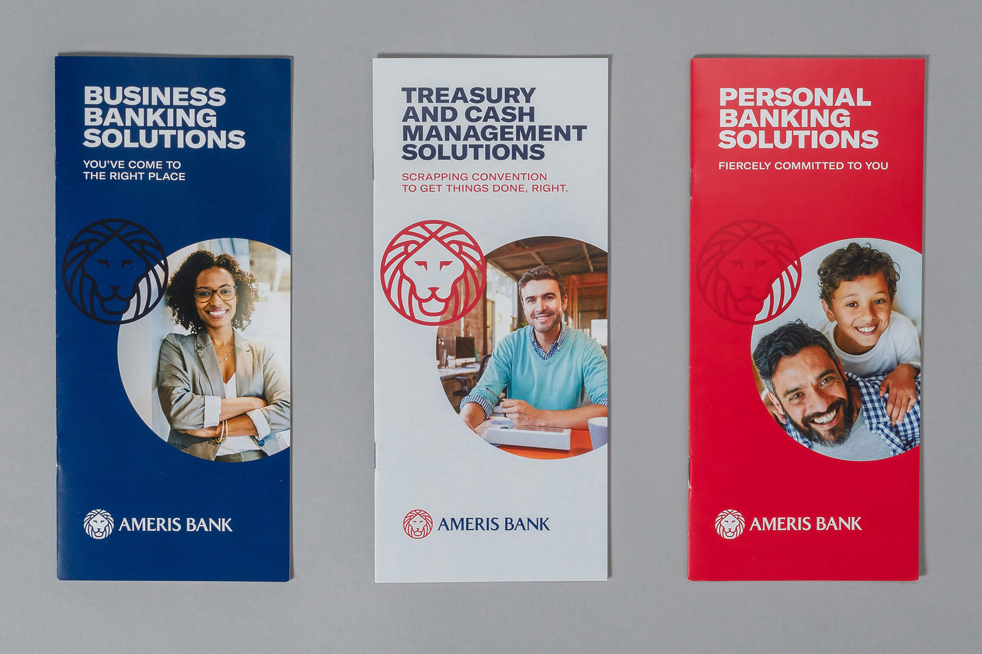
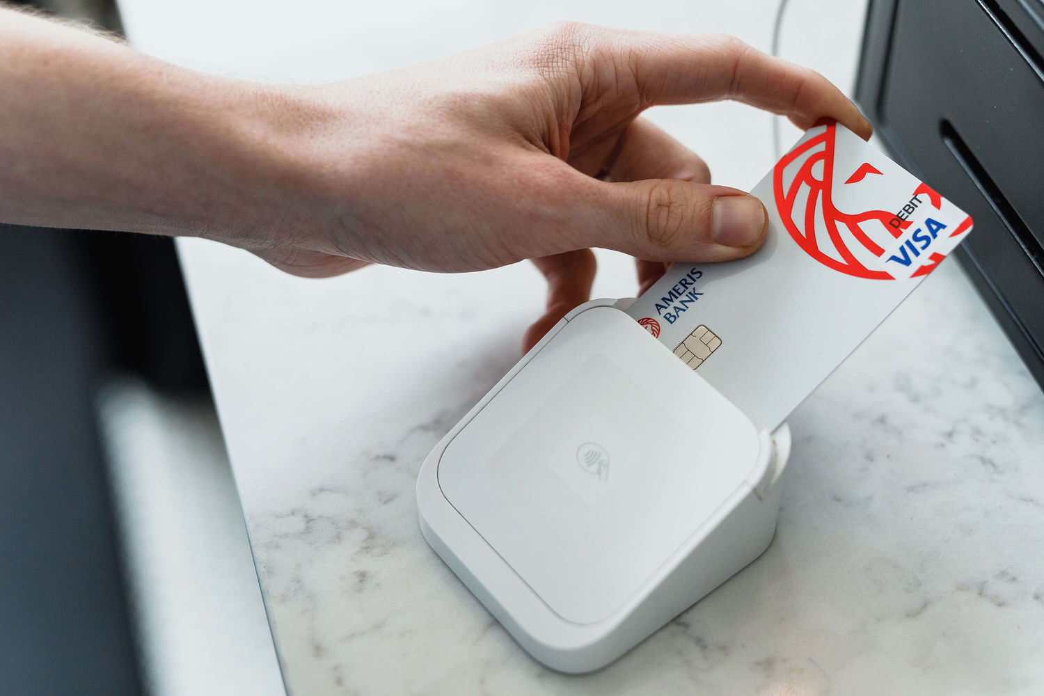
Opinion
The old Ameris logo was pretty bad, with one too many ideas — it’s either the flag or the weird human “i” but not both — executed poorly. The old Fidelity logo was semi-decent with a lion that looked sad and a strong but overly fuzzy slab serif. The new logo smartly avoids taking any cues from the old Ameris logo and instead builds on the stronger proposition of Fidelity’s lion. The evolution of the icon is pretty good, making its face much more readable and amenable while maintaining all the lines neatly contained in a circle. I wonder if the mane lines could have been more wobbly/organic to make it a little less static. Nonetheless, it’s a solid icon and it works very well on its own in applications either as standalone item like the lapel pin and app icons or as an element in the layouts, overlaid on photographs. The wordmark is a classy flared serif that looks good with the icon — it’s a pair of words that are hard to kern so there are some odd counterspaces here and there. The applications are exactly what I would want my regional bank to be: clean and confident. Everything from the print ads to the brochures to the credit card is properly conservative but with a bold appeal that makes the bank look like a big, storied financial institution.