
Noted: New Logo and Identity for Joe Coffee Company by Godfrey Dadich Partners

“A Warm Cup of Serif”
(Est. 2003) "Joe Coffee Company was founded in 2003 by Jonathan Rubinstein as a singular specialty coffee house in Manhattan's West Village with the simple vision of brewing high quality, unique coffees and creating a welcoming space for our community. We have since expanded to 22 cafes in New York and Philadelphia, and a roastery in Long Island City, yet our mission remains unchanged: to serve excellent coffee with warm hospitality in every one of our communities. At Joe, we believe the secret to a great coffee experience relies just as much on the coffee as it does the barista, which is why we foster and promote the continued education and success of our baristas through industry-leading professional training. As an early pioneer of artisan coffee to New York more than 16 years ago, we are proud to continue to innovate, grow, and lead as the specialty coffee movement expands."
Design by
Godfrey Dadich Partners (San Francisco, CA)
Related links
N/A
Relevant quote
Guests will notice the same warm hospitality they’ve come to expect, along with following branding upgrades:
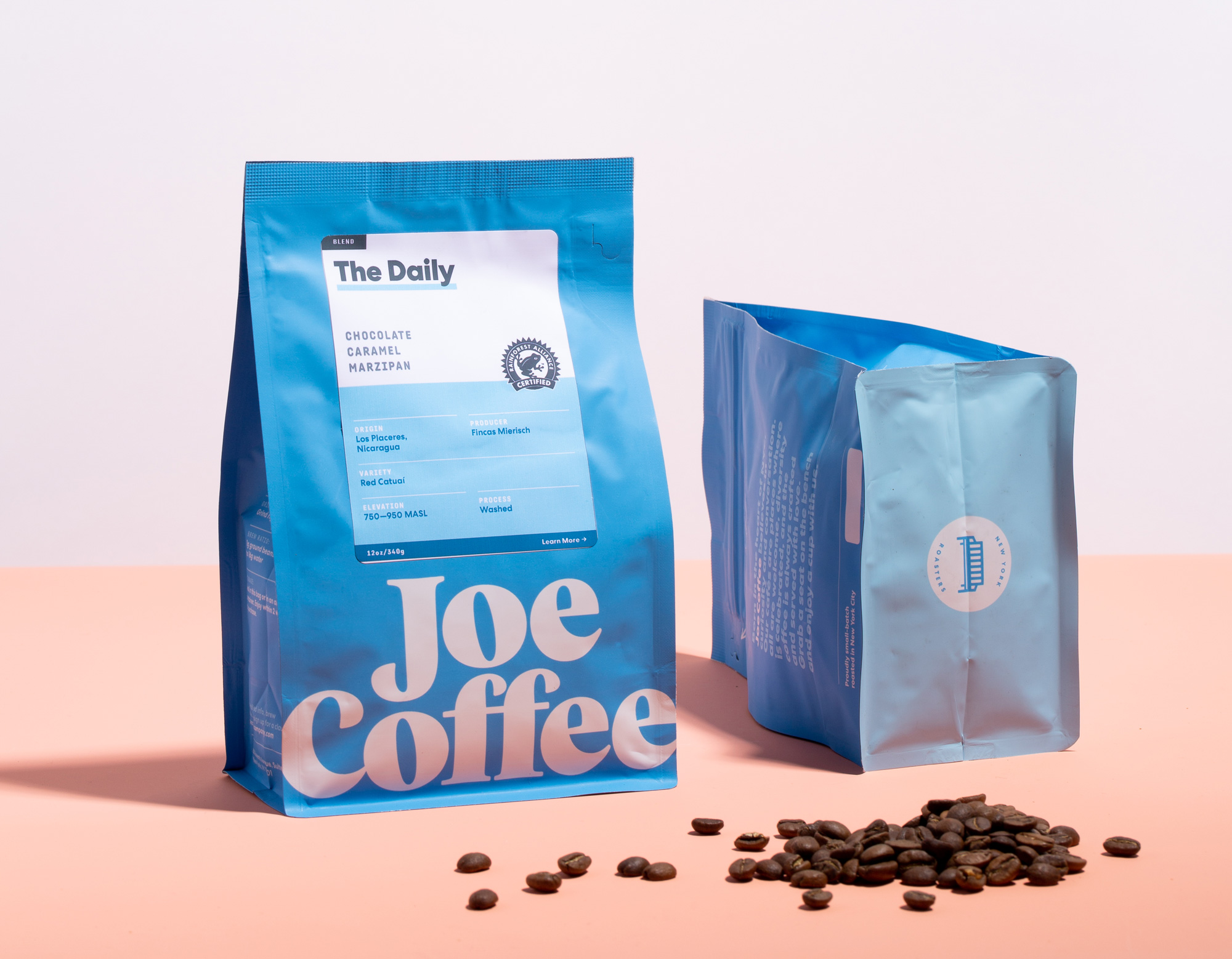
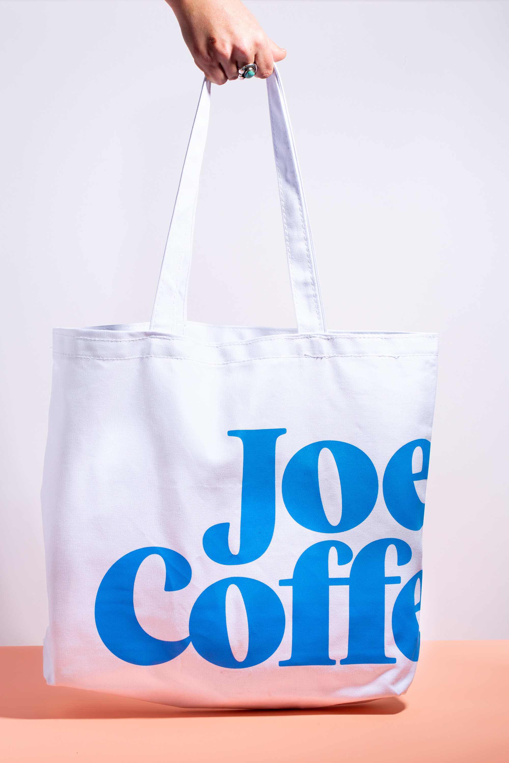
The brand evolution can be seen in the new typography and iconography, including the new custom drawn logo by GDP, as well as an updated specialty mark that includes a bench inspired by the first cafe as a nod to the community of Joe Coffee, and as a welcoming identifier.
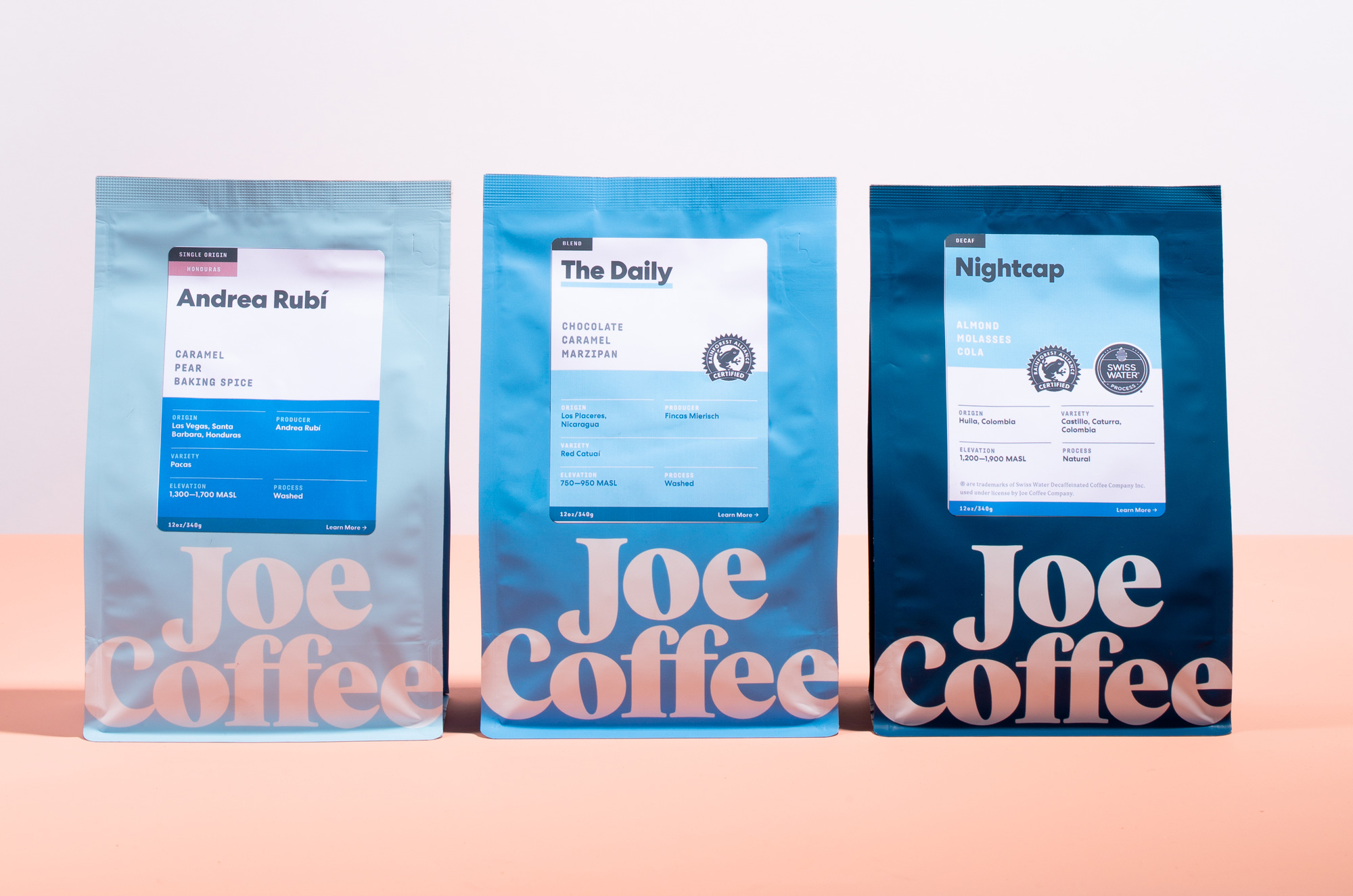
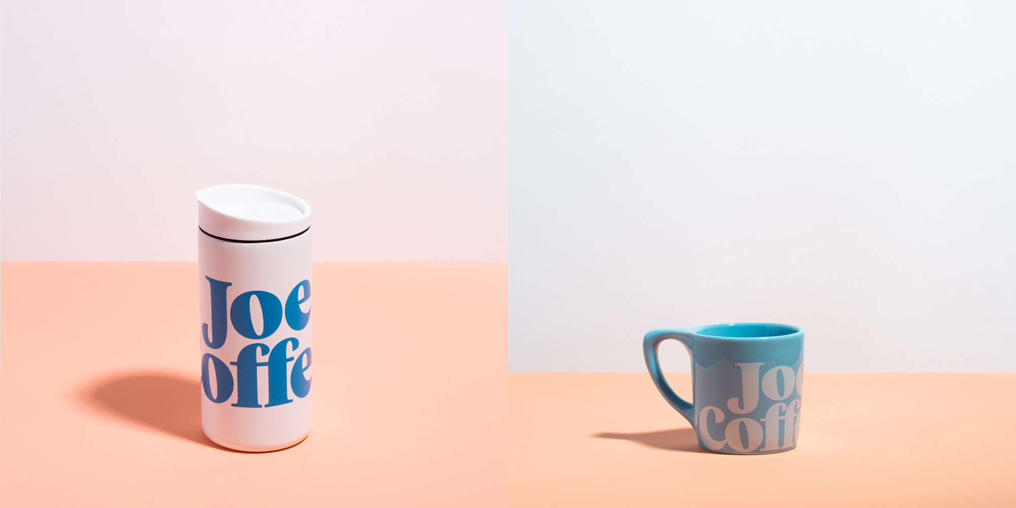
The new, bolder “Joe Blue” color has a swagger and pop to it that embodies a New York attitude while also being optimistic and welcoming.
The secondary palette has warm tones and shades of blue, including the brand’s original blue, bringing to mind a sunrise, and starting your day with Joe Coffee.
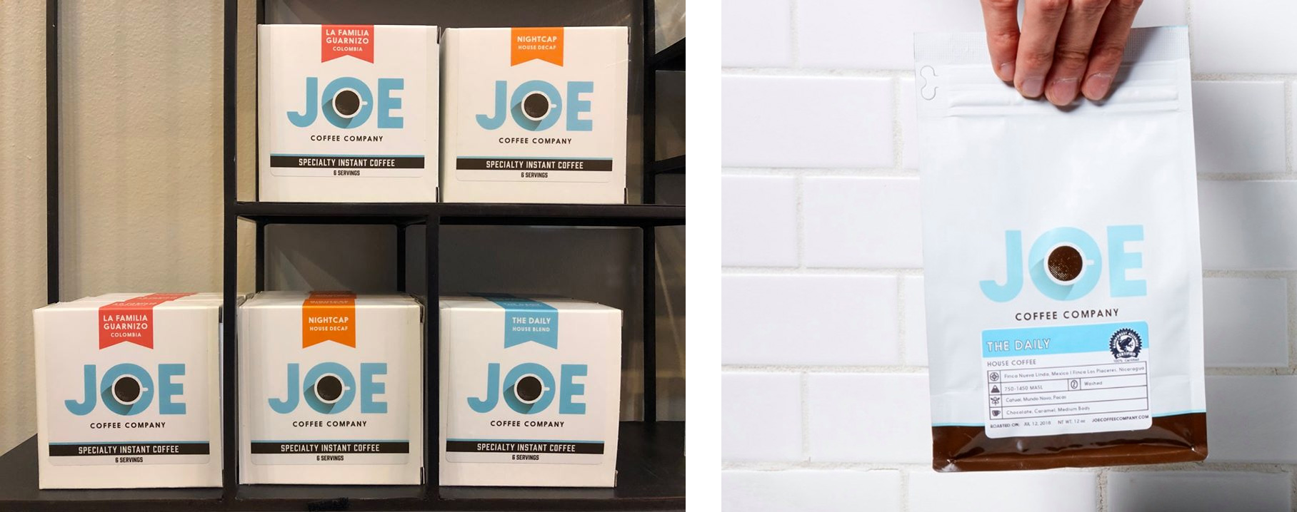
The coffee bags and cups also have an all new design. GDP explored different ways of surfacing information about the coffee—origin, elevation, washed or natural—in order to help customers learn and be informed about the details of a bag or cup or Joe Coffee.
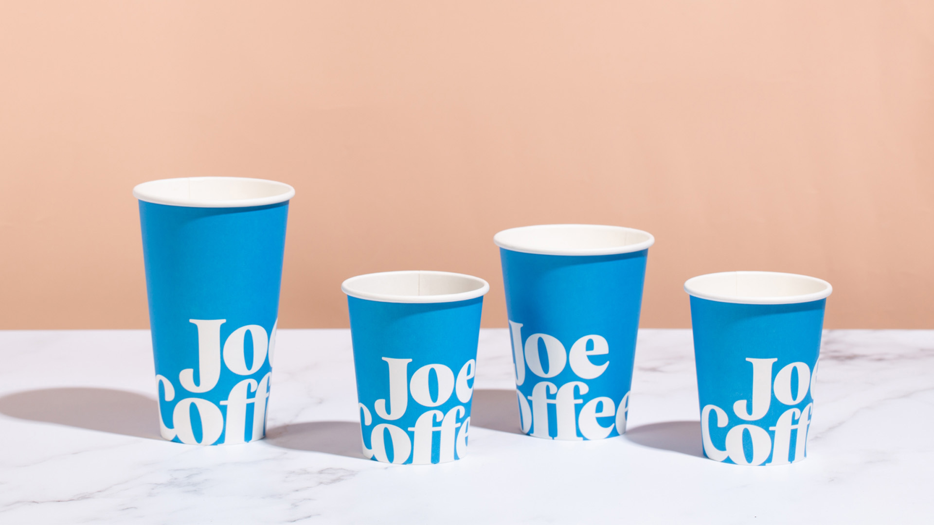
Additional changes will be seen in the brand's merchandise, cafe interiors (over the course of the next year or so), cups (to-go and to stay), and the Joe Coffee website. An app featuring the new identity and design, as well as a brand new loyalty program, will also be available soon.
Images (opinion after)
Opinion
The old logo was pretty good, with a clever use of the “O” as a plate with a cup on it as its counterspace — if the shadow of the cup had also been done in a halftone pattern as the shading of the coffee, it would have been even better. An evolution of that logo with the new brighter blue would have probably been good too. The new logo is also good in a parallel universe where another Joe Coffee Company exists, meaning both logos are individually attractive and equally acceptable as solutions that serve the client well. I love the chunky serifness of the new one, the bolder blue, and the bench graphic is an unexpected and apt trigger for “coffee” especially for a New York-based company. The way the “J” nestles on “Coffee” is endlessly pleasing. With the packaging there is a more clear and beneficial improvement, where the old one almost looked like a private label coffee brand for Walgreens (i.e., it was fairly generic) and the new packaging feels much more like a custom, ownable identity that very nicely plays up the name of the roaster. The shades of blue are well balanced and put to use very well on the labels. The cups and merch look great with the logo applied extra big. Overall, an attractive and energizing redesign.