
Noted: New Logo and Identity for Speed Skating Canada by Will Creative Inc.

“Skaters gonna Skate”
(Est. 1887) "Speed Skating Canada (commonly abbreviated to SSC) is the governing body for competitive long track and short track speed skating in Canada. It was founded in 1887, five years before the International Skating Union of which SSC later became a member in 1894." (Wikipedia)
Design by
Will Creative Inc. (Vancouver, BC)
Related links
Speed Skating Canada brand page
Relevant quote
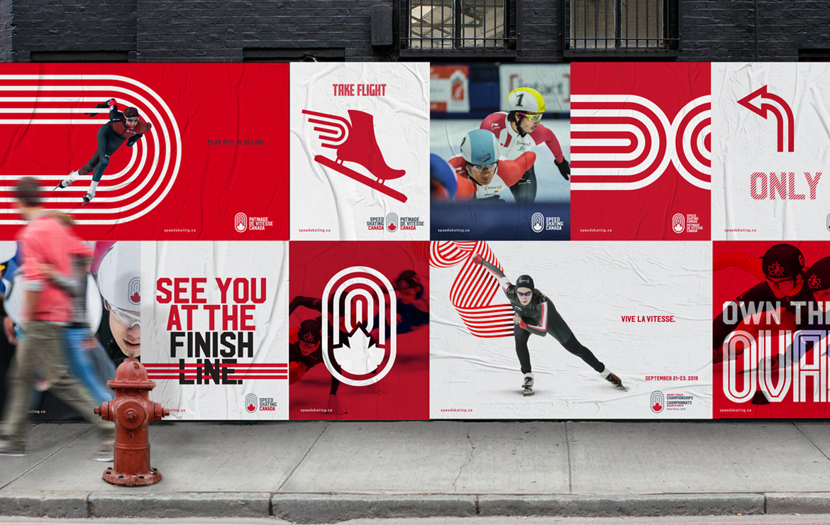
Inspired by the shape of the oval, our logo represents both long track and short track speed skating. With a Canadian maple leaf at its heart, it is a true reflection of the rallying spirit and pride of our sport.
Our graphic style and typography gives the feeling of movement and speed, but also symbolizes the passion that radiates from our arena, with a colour palette that’s proudly Canadian.
Images (opinion after)


Opinion
The old logo was… old but there was a salvageable element in the fading maple leaf that perhaps with a Draplin-esque, thick-line approach could have been an interesting evolution. The new logo is fine as a concept, bringing in the shape of the skating track but it lacks the sense of speed and motion the old logo had, if in a clunky way. The obligatory maple leaf feels very shoe-horned in there and its interaction with the loops is no less clunky than the previous logo. The wordmark is fine but clearly follows the playbook established by Hulse & Durrell and all their Canada sports organization logos. The applications are a mix of good and bad… the grid of images has some good stuff, in particular the patterns of the oval but the wild posting image has all kinds of cheesy treatments that feel like they were done by another designer. There is also a strange mix of using the same typeface from the logo in headlines but then also using a similar yet different typeface, Fresno, in other applications. Lastly, the “Faster Forward.” tagline… it reads like when I jokingly add “–er” to words as in, “Overall, this is fine but it could have been better-er”.