
Noted: New Logo and Packaging for Vita Coco by Interesting Development

“Livin’ la Vita Coco”
(Est. 2004) "When Vita Coco launched in New York City in 2004, not only did it bring coconut water into the mainstream beverage section of groceries, it re-branded coconut water as a premium lifestyle drink and helped start the trend of natural-functional beverages. Today, Vita Coco is a leader in coconut water and a growing global brand sold in 30 countries. Celebrated for its delicious, electrolyte-rich hydration and replenishment, Vita Coco is the brand that helps you "drink a little better, eat a little better, and live a little better." Vita Coco maintains the same entrepreneurial spirit upon which it was founded: a can-do culture that's just beginning to tap into the potential of the coconut. Vita Coco is headquartered in New York City."
Design by
Interesting Development (New York, NY)
Related links
Interesting Development project page
Relevant quote
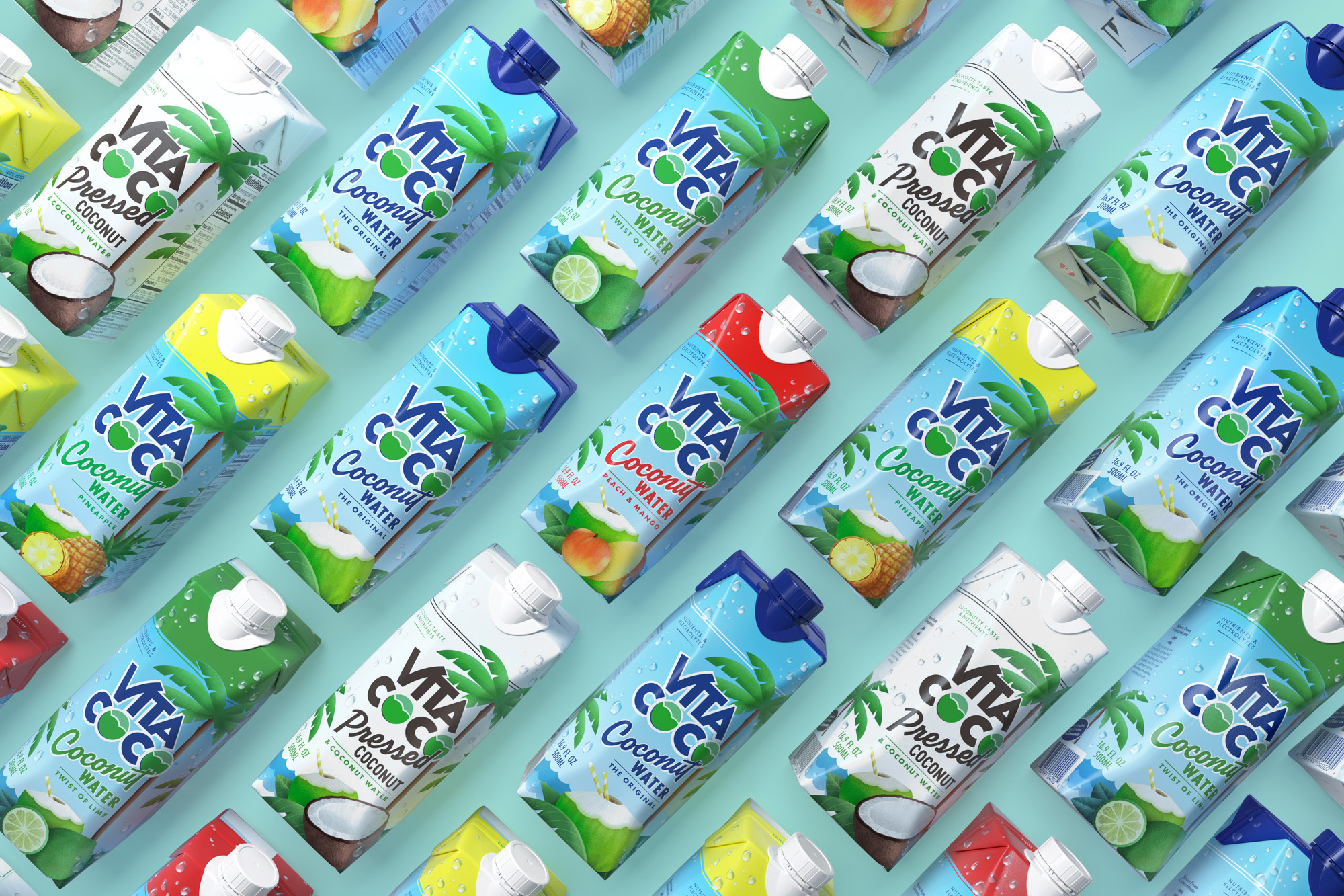
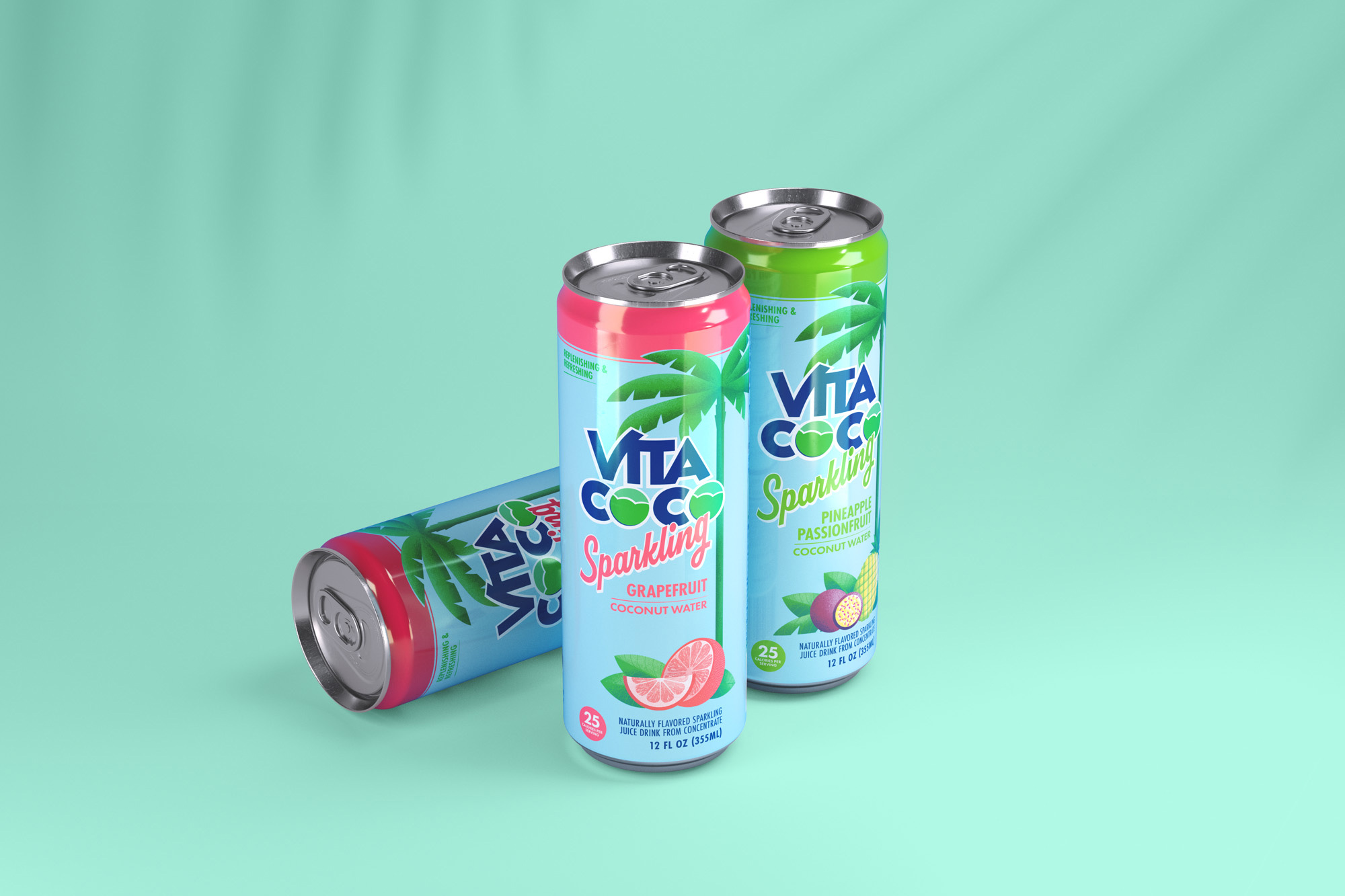
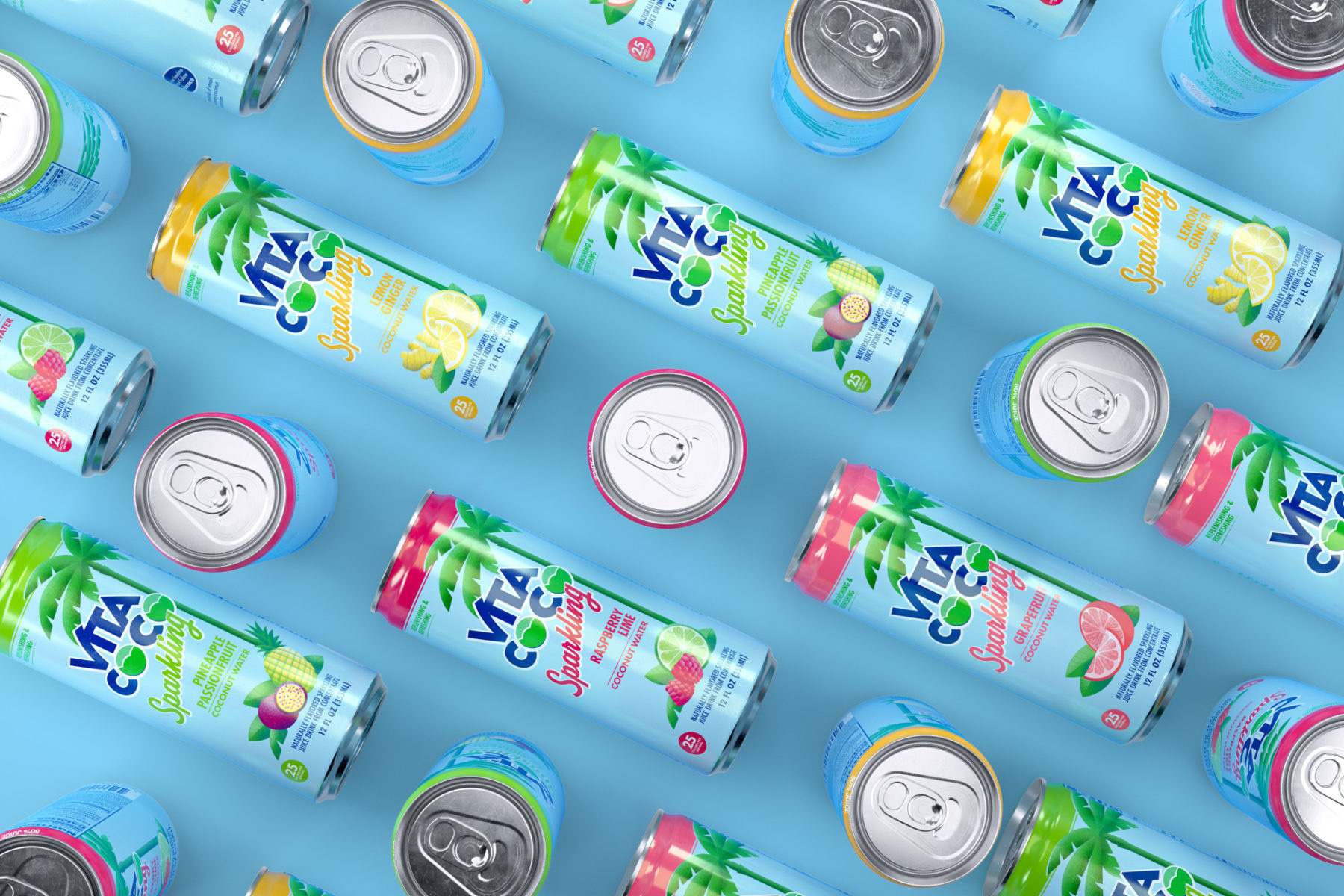
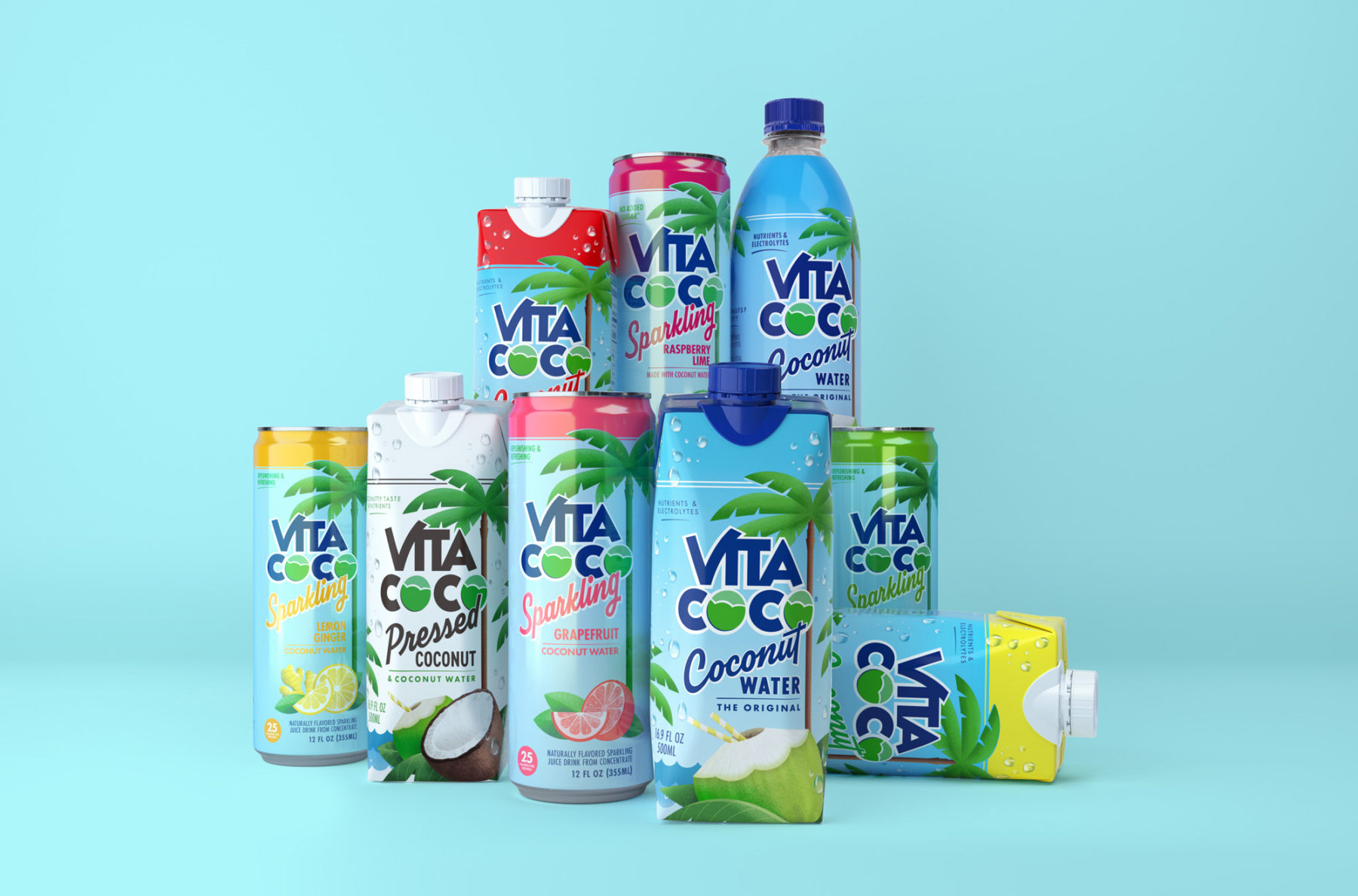
Vita Coco has become the number one coconut water in the world not by chasing trends or data, but by following their hearts. We set out to bring this natural, innocent and good natured approach to the entirety of Vita Coco’s brand, starting with their packaging. Drawing inspiration from vintage fruit lugs—the boxes farmers would ship their goods in at time when everything we ate was really real—we evolved Vita Coco’s logo, packaging, and overall identity to be more in line with the qualities everybody already loves about Vita Coco’s brand and product.
Images (opinion after)
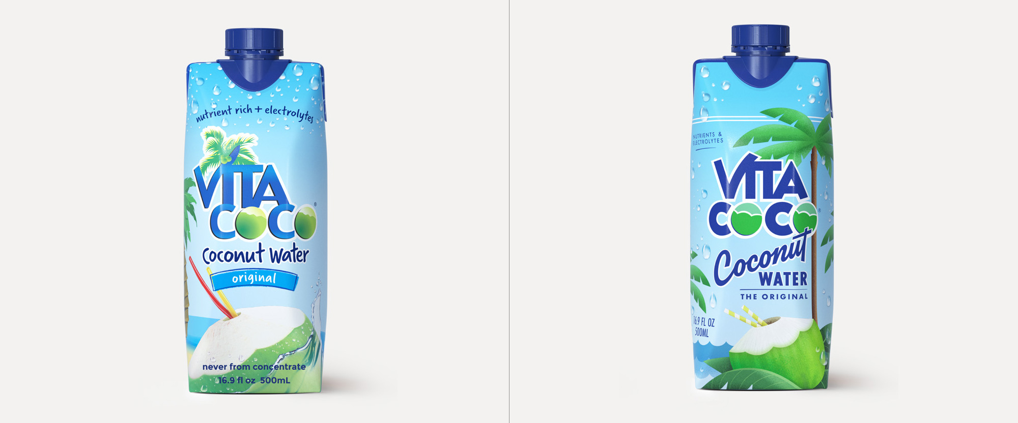
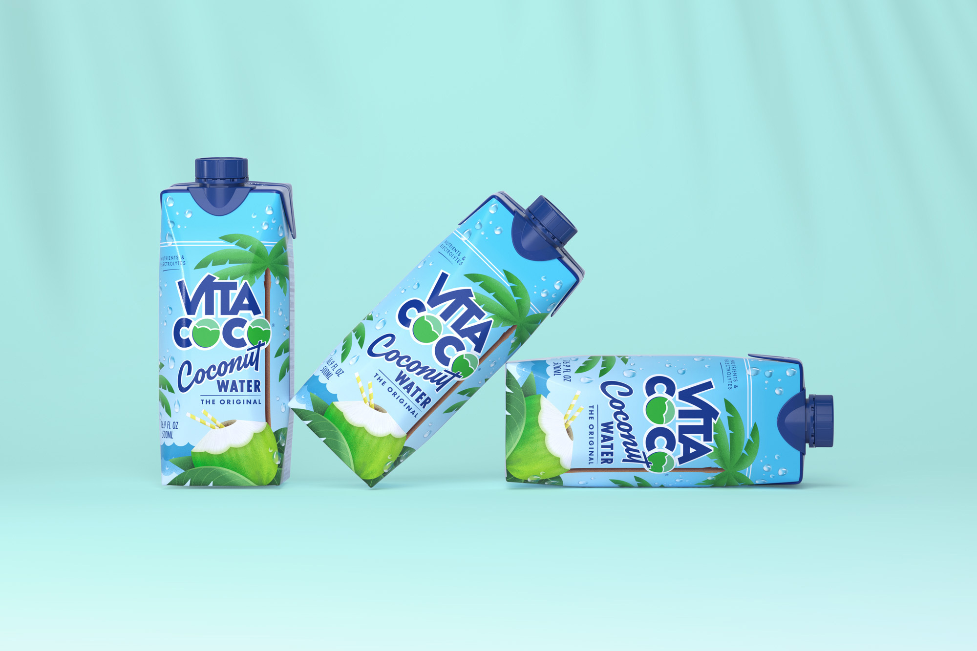
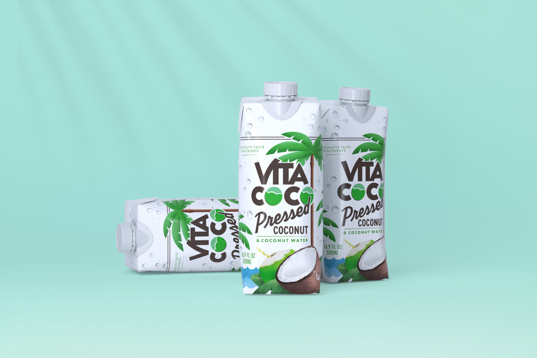
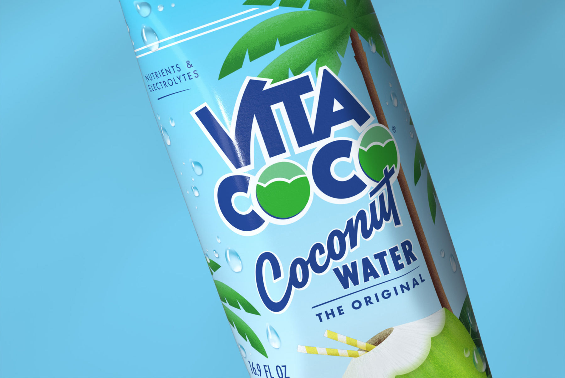
Opinion
The old logo looked like a faux logo for a Saturday Night Live skit with its cheesy gradients and terrible typography. The new logo is better only by contrast and under the assumption that as much as the equity of the previous logo had to be maintained. The only commendable improvement is in the “VI” situation, where they somewhat decently kept the flair of the old crooked “V”. The coconut graphics for the “O”s are real lamentable — a whole lot more could have been done to make them more like coconuts and less like bland decorated Easter eggs. The packaging… sort of the same thing… a very literal, cheesy old packaging with the new one being better simply because the old one was so bad. Most of the changes are indeed an improvement but I feel like it barely scratches the surface to make an actual significant improvement. Yet, I am guessing this was on purpose, given that Vita Coco is probably the most recognized brand in the coconut water game so rather than add confusion by creating a drastic new look that would make them re-compete for market share they simply nip-ed and tuck-ed to make it look a little more vibrant. And to be fair, as a mainstream product, this has a relatively attractive appeal that looks refreshing and has an overt tropical-ish flair to it that serves as an escape from city tap water.