
Noted: New Logo and Packaging for Lay's

“Lay it on me”
(Est. 1932) "Lay's is the name of a brand for a number of potato chip varieties, as well as the name of the company that founded the chip brand in the U.S. It has also been called Frito-Lay with Fritos. Lay's has been owned by PepsiCo through Frito-Lay since 1963. 'Lay's' is the company's primary brand, with the exception of limited markets where other brand names are used: Walkers in the UK and Ireland; Smith's in Australia; Chipsy in Egypt and the West Balkans; Tapuchips in Israel; Margarita in Colombia; Sabritas in Mexico; and, formerly, Hostess in Canada and Frenchitas in Argentina." (Wikipedia)
Design by
N/A
Related links
Lay's press release
Relevant quote
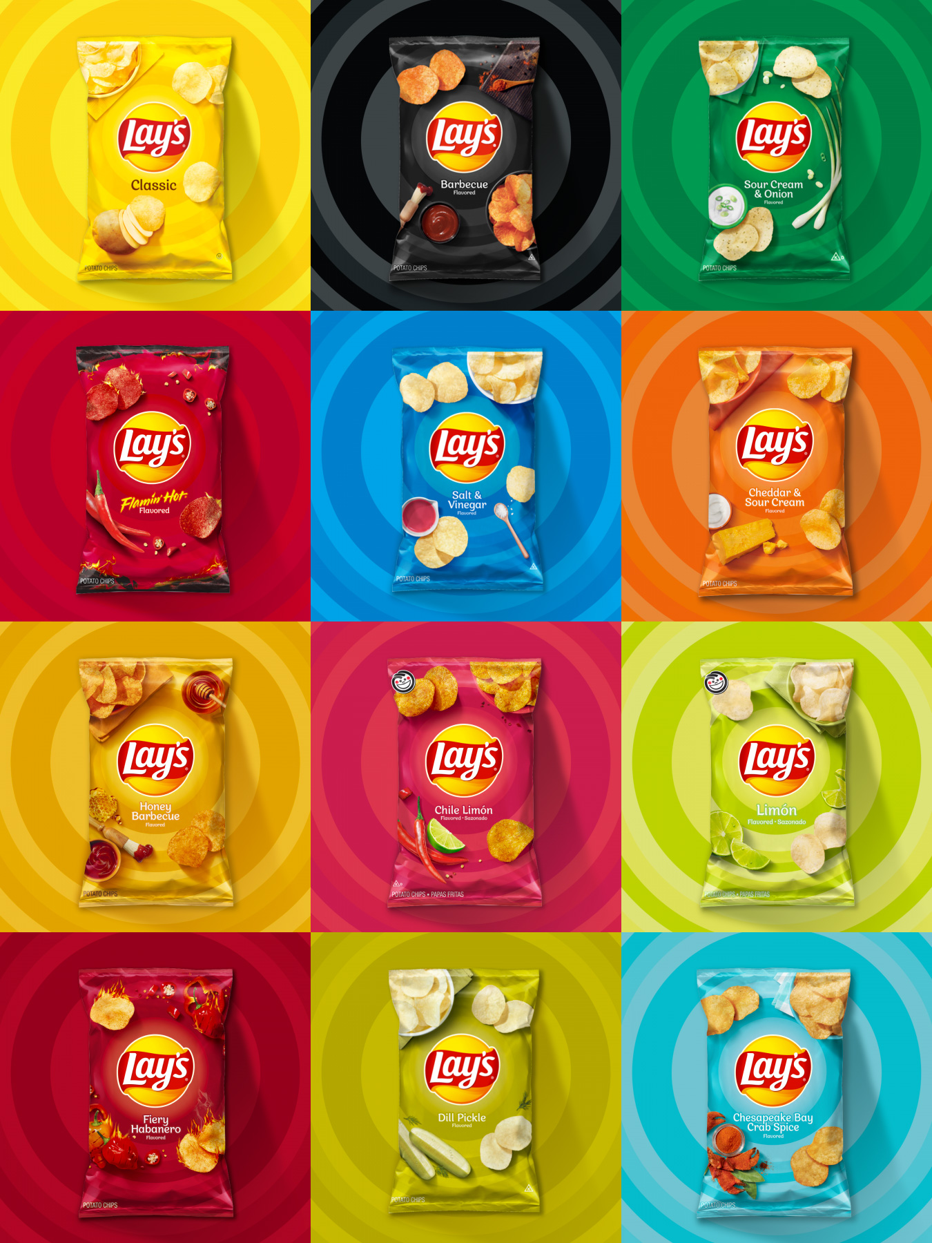
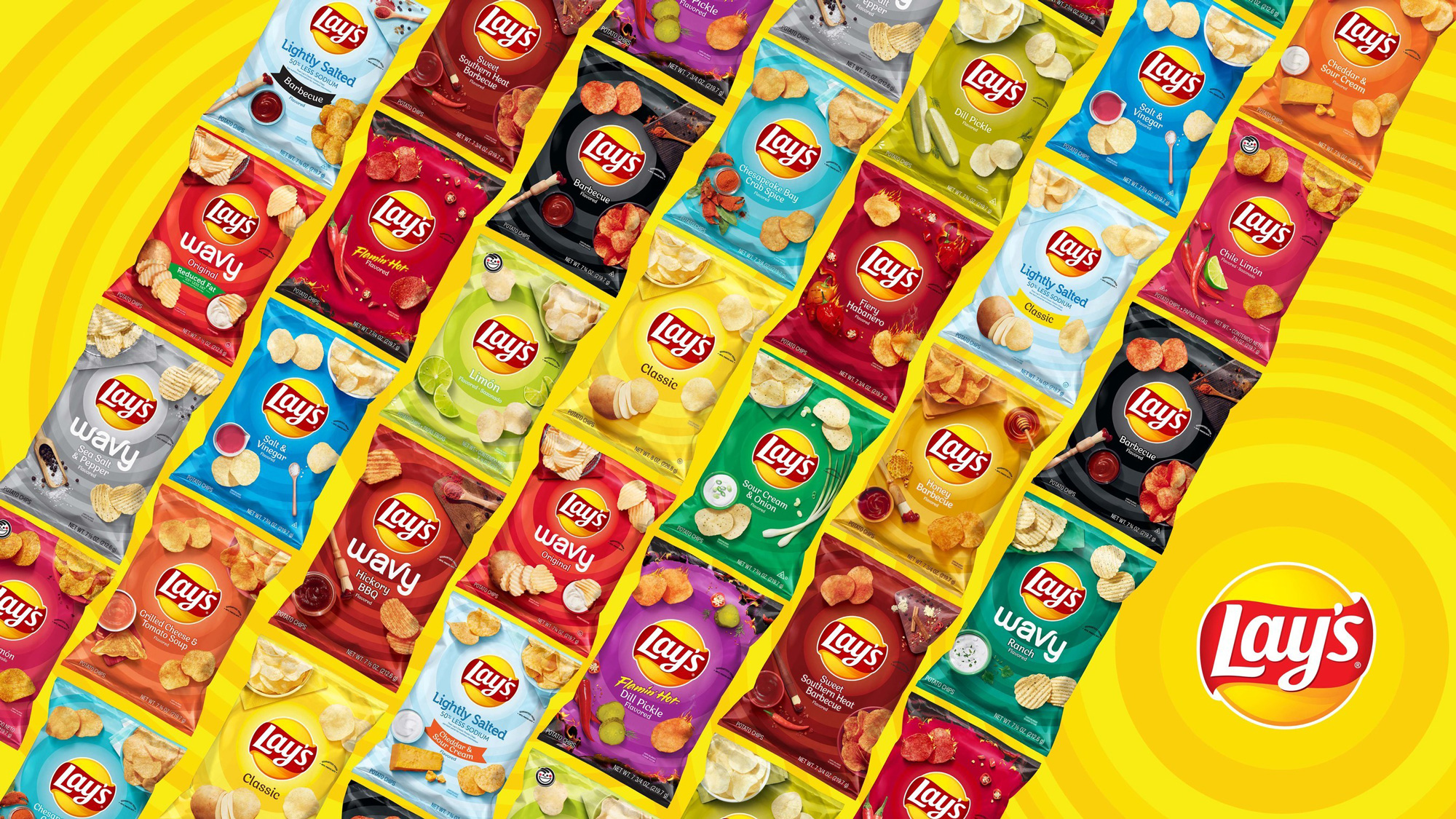
Since unveiling its new packaging last month, Lay's has been transforming shelves across 250,000 retailers in the United States with new designs on 115 packages across 25+ flavor varieties. The sleek, modernized look features fun, distinct design elements such as radiant rings around the Lay's banner sun logo and bold colors, plus appealing food photography to emphasize flavor.
Images (opinion after)
Opinion
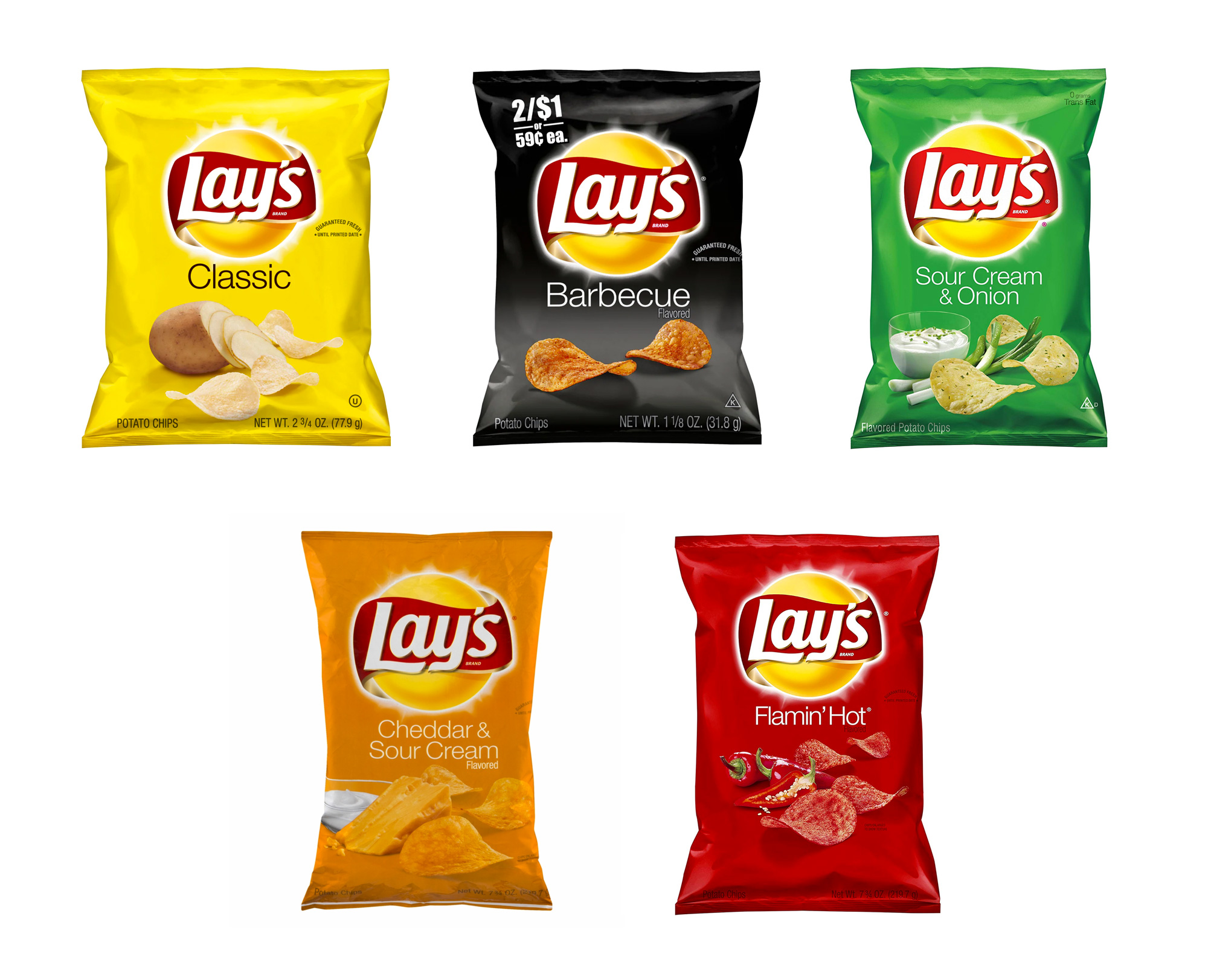
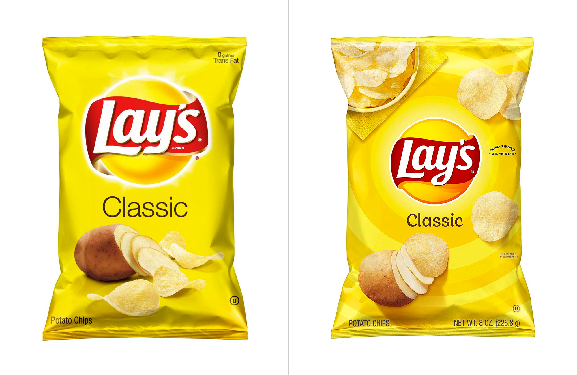
Lay’s chips are one of those products that are easy to take for granted… they just exist and their design is sort of inconsequential… it’s easy to recognize but there is nothing about it that’s interesting, memorable, or engaging. The old logo was pretty bad with a giant hard-boiled egg yolk wrapped in a cheap ribbon and overlaid with a generic script. Again: recognizable but, also, whatever. The new logo sheds about a dozen layers of gradients and shines and shadows for a more “graphic” look that works much better now to create a more usable logo. It still has a generic mainstream brand look to it and, judging within this context, I would say it’s a huge improvement. The typography is also relatively improved with a cleaner, crisper design, with the “y” getting the biggest makeover. On their site, there is even a more minimal version of the logo without any shading whatsoever and that’s also kind of interesting, although the red stroke around the “y” and the apostrophe is somewhat clunky. The old bags were probably some of the lamest in the chips category which, in an odd way, is what made them stand out. The new bags retain relative simplicity and the concentric circles emanating from the logo are (very) relatively engaging. The ingredient and chips being served images on top of the rings are a little trite but they are an improvement from the old ones. Overall, within the mainstream/ubiquitous-brand category that Lay’s operates in, this is a solid improvement that makes the bags more attractive, engaging, and descriptive. This review has been brought to you by the word “Relative”.