
Noted: New Logo, Identity, and Packaging for Paddletek by Young & Laramore

“In a Pickle”
(Est. 2010) "Paddletek began with an intense passion for Pickleball and a vision to create innovative high performance Pickleball paddles. Superior quality and performance remains the standard with every paddle we craft today. Since being founded in 2010, Paddletek has grown to become a brand leader in the sport with revolutionary innovations that completely changed the pickleball paddle market by enhancing performance and the Pickleball experience. Paddletek technology can be found in over 80% of the premium paddles sold today. Team Paddletek crowds medal stands at professional Pickleball tournaments all over the world. Family owned and operated, Paddletek continues to innovate with three main priorities: performance, quality and customer service."
Design by
Young & Laramore (Indianapolis, IN)
Related links
Young & Laramore project page
Relevant quote
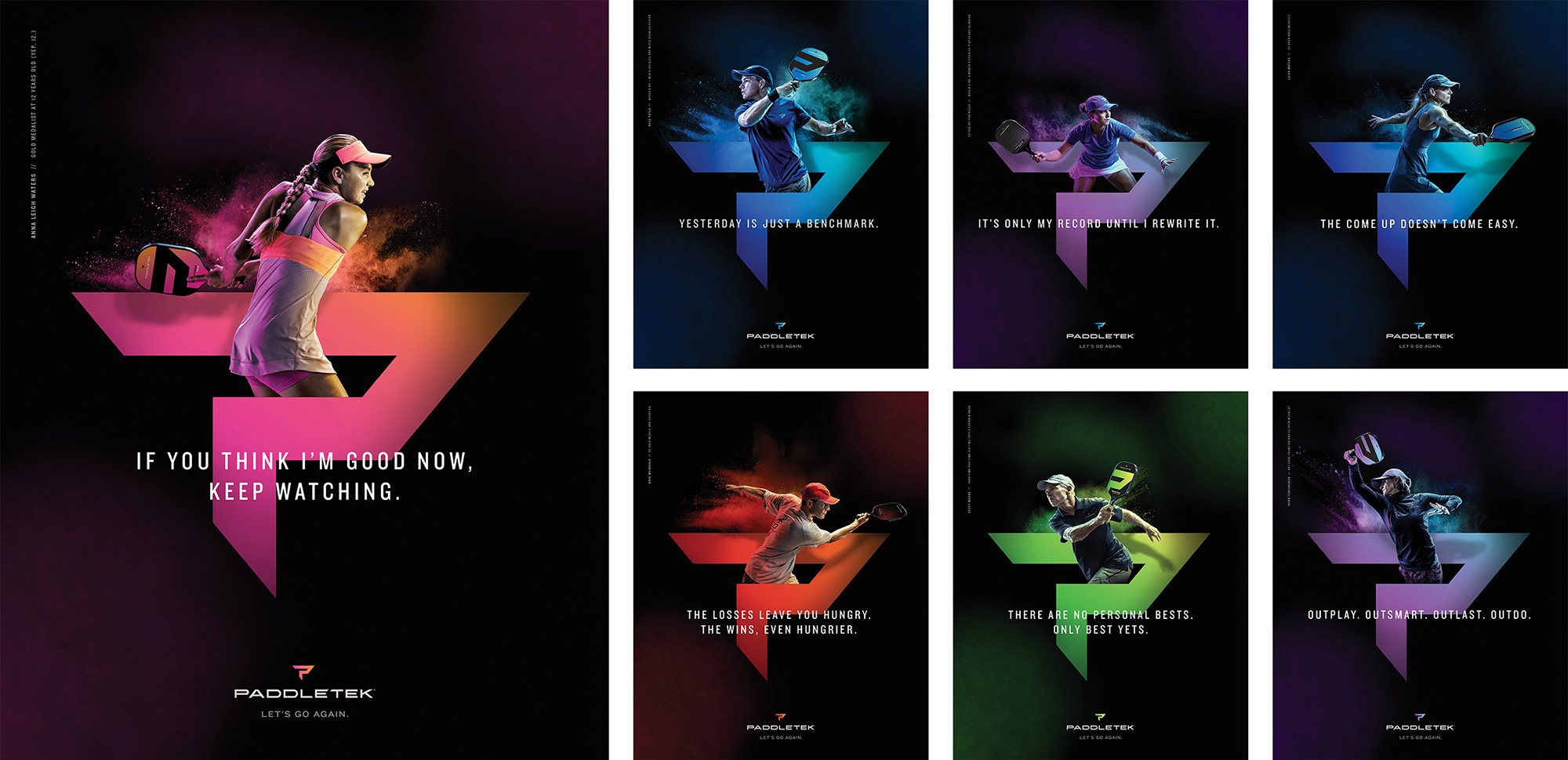
With a name like Pickleball, our approach was as much about legitimizing the sport as anything. We wanted to showcase athleticism in a way that felt true to the game: bright, colorful and wildly addictive. You want to keep playing. You want to get better. We channeled that addictive feeling with the “Let’s Go Again” tagline and brought a bold color spectrum and logo that really pops on the court.
Images (opinion after)

Opinion
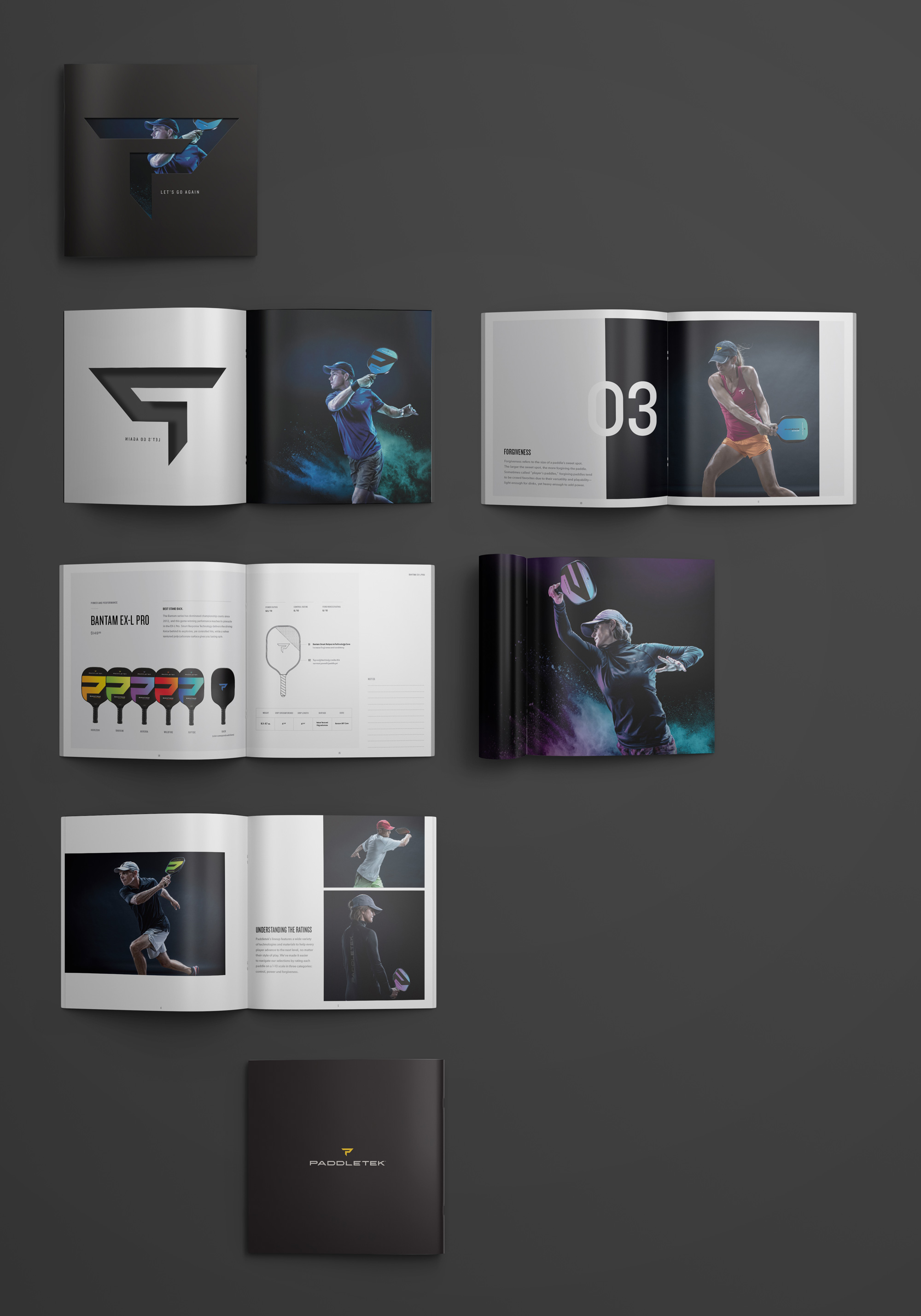
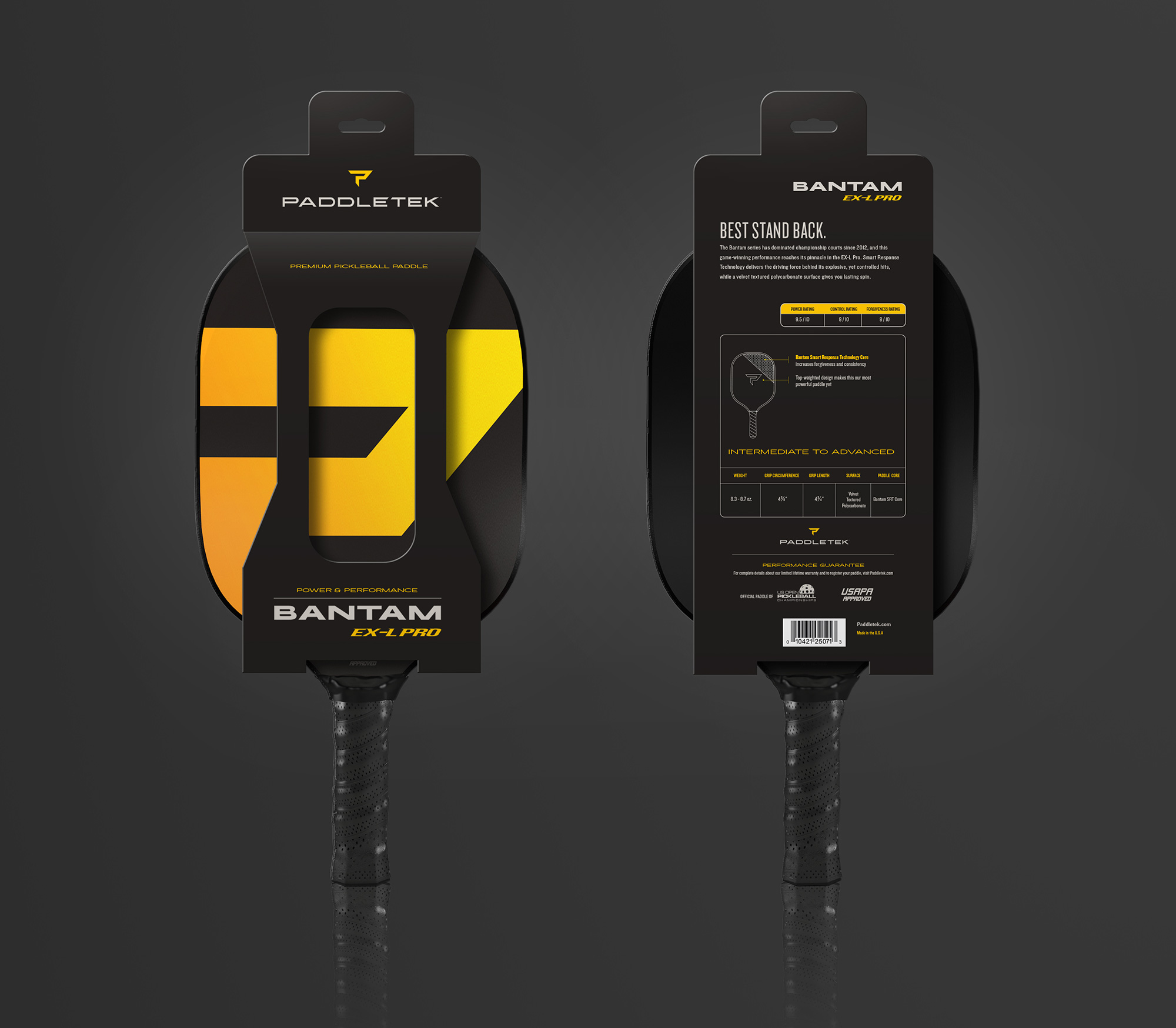
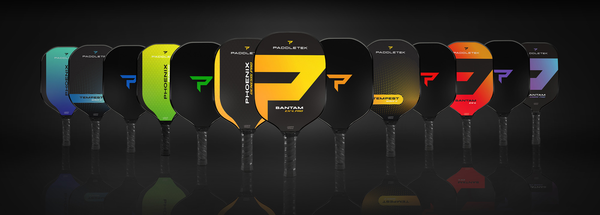
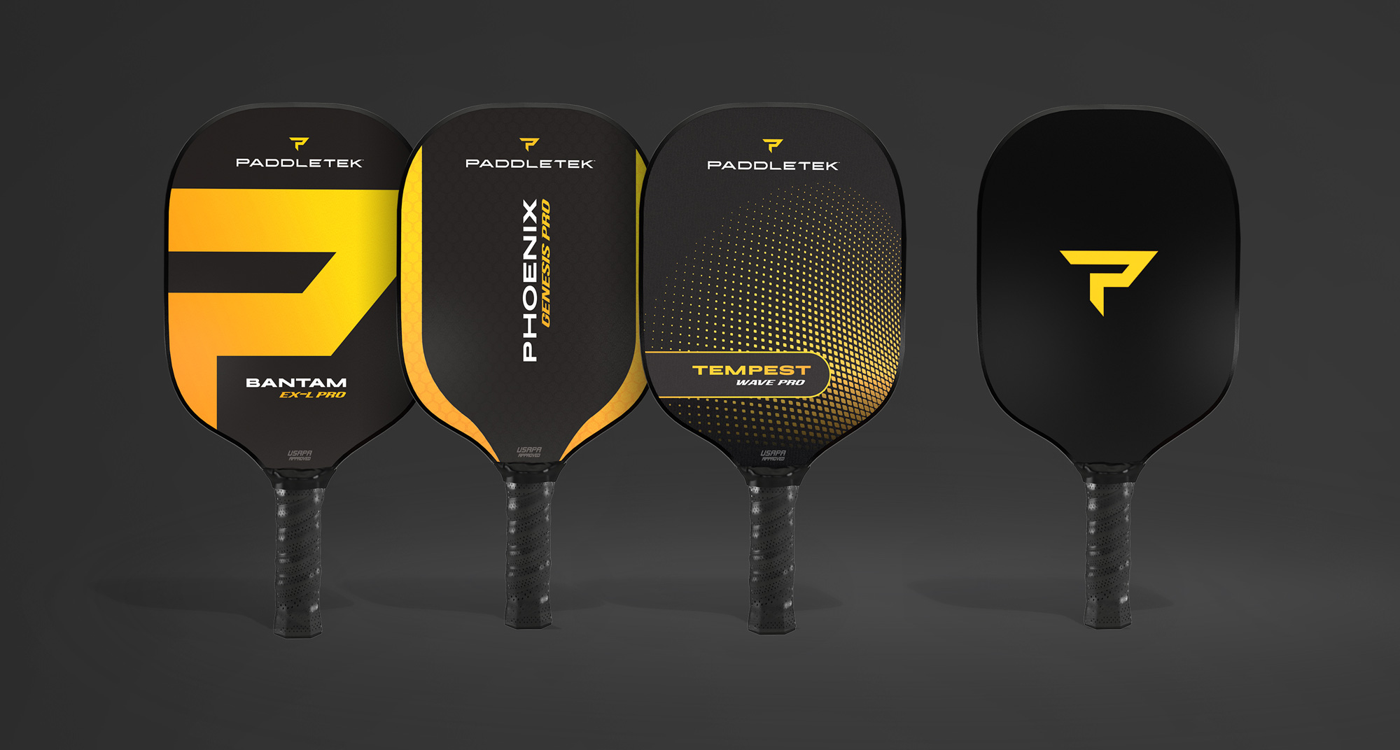
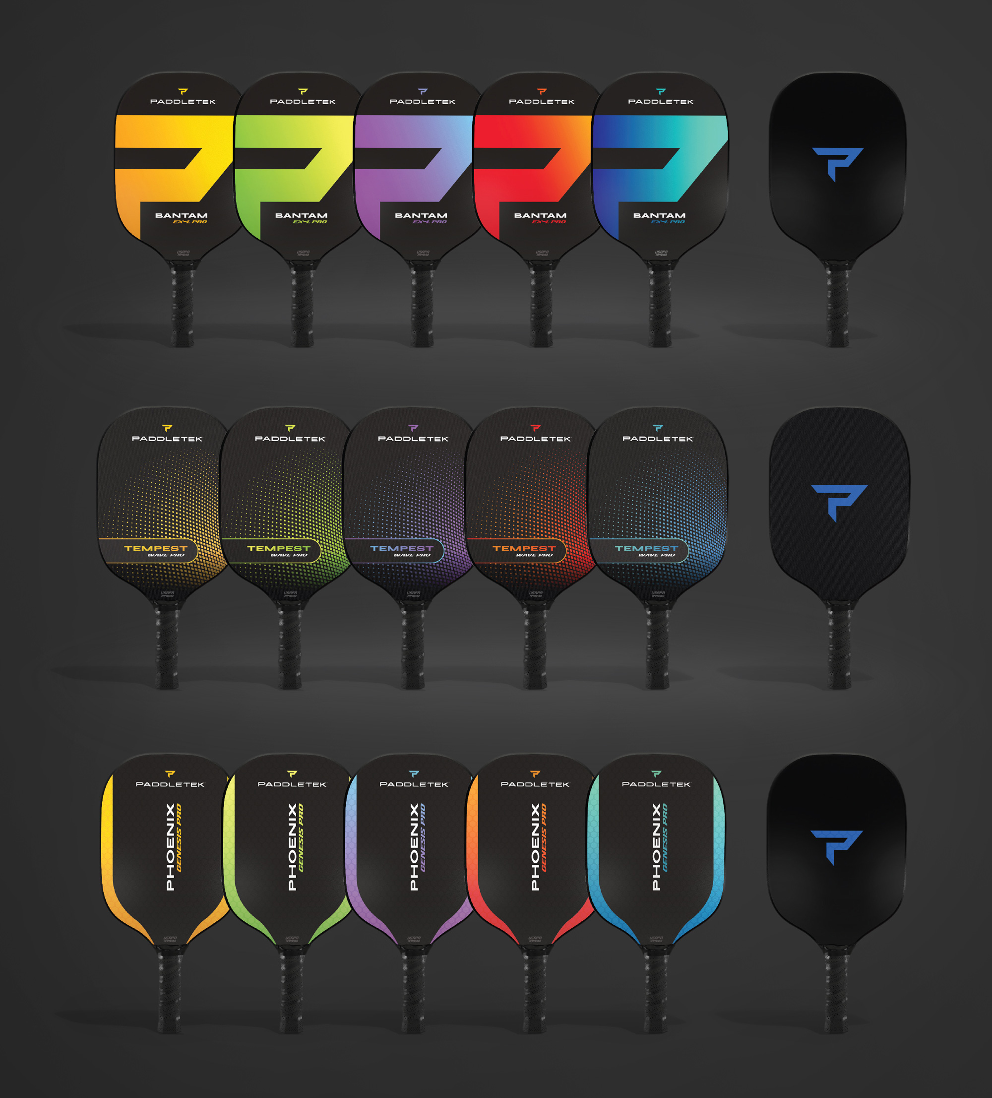
The old logo was fairly sad, with a clunky rounded sans serif that looked as if it belonged on a knock-off Commodore computer or something. Based on some image-searching it was also confused as to which logo was the right one, as the “pppp” icon or monogram was sometimes all “p”s and sometimes it had an “a” in there like the one in the header image… not that one or the other was better but clearly needed to be reigned in. The new logo aims to Gatorade/Powerade the brand by amping up the visual edge through a hard-angled and spiky monogram and wordmark. Both are relatively fine but they are also a little on the weak side. The monogram sort of floats in space when it’s with the wordmark and doesn’t have as much oomph on its own. The wordmark is a little too extended, especially since it’s such a long word, and it seems to go on forever. In the “ET” combo, where the top bar of the “E” extends to connect with the “T”, someone should have said “Nah” because it’s not good. The packaging is amped up, yo. It definitely builds up excitement around the paddles and, in the right mindset, they are kind of cool-looking but not exactly my aesthetic. The print ads are probably the best part of the project and where the monogram looks and works its best but, if like me, you are tired of the colorful powder explosions, then this can be a little too much of that. Overall, as much as I’m not a fan, I think this ticks all the right boxes for the audience, for the growing popularity of the sport, and the correct inclination to make Pickleball look more competitive and exciting than its name suggests.