
Noted: New Logo for Adorama

“Shuttered Hopes and Dreams”
(Est. 1974) "Located in New York City [with a significant online ecommerce site], Adorama is the affordable photography, electronics, video and camera store. We carry a large selection of camera equipment and have the best prices in the NYC area. Whether you're a professional photographer or just starting out, our helpful and knowledgeable salespeople will help select the right studio gear, lighting, tripods and camera equipment just for you."
Design by
N/A
Related links
Adorama "Equip your Creativity" new brand positioning
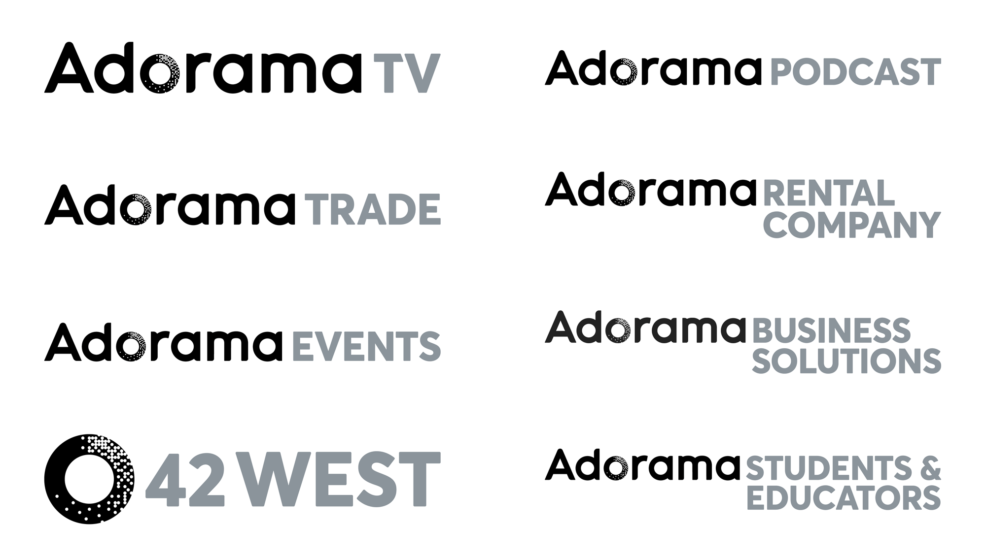
Images (opinion after)
Opinion
I think I am posting this mostly out of nostalgia — for some reason I went multiple times to their store in New York and it was the equivalent of being a kid at FAO Schwartz, made all the more charming by its clunky old logo, which really doubled down on that angle, applying it to all letters one way or another. The old logo’s “O”, an abstract camera shutter, has been replaced by some pixel-like dust inside the “o” so as to visually expand the availability of digital products and services in Adorama’s inventory, which I get the impetus of but, unfortunately, it’s not the best of executions. The “o” looks as if it has been hole-punched multiple times and when used small, the effect is very fuzzy and hard to discern what’s going on. It’s also fairly rigid with dots being removed from a grid instead of some more organic or looser approach to better conform with the circle-ness of the “o”. Outside the “o”, the typography in the wordmark is quite unpleasant, with a half-rounded-corner, half-not typeface with very short ascenders that yield very odd proportions. The sub-brands introduce a different yet not different enough sans serif and my heart breaks a little. Overall, this had the right intentions but the execution just didn’t have enough exposure — that’s a photography metaphor for this not coming out right. I think.