
Noted: New Logo and Identity for Essence by Ueno

“Font Weight is of the Essence”
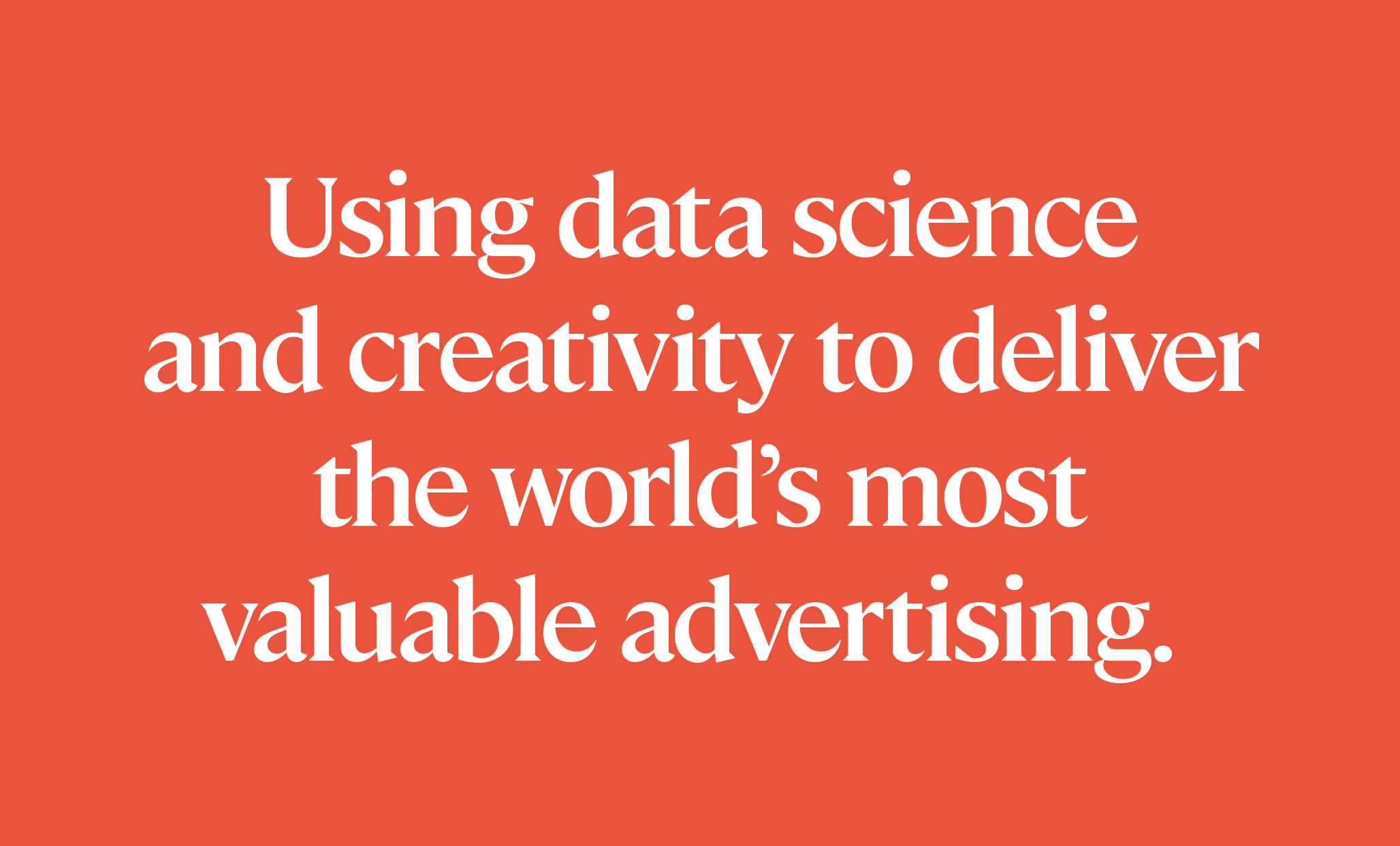
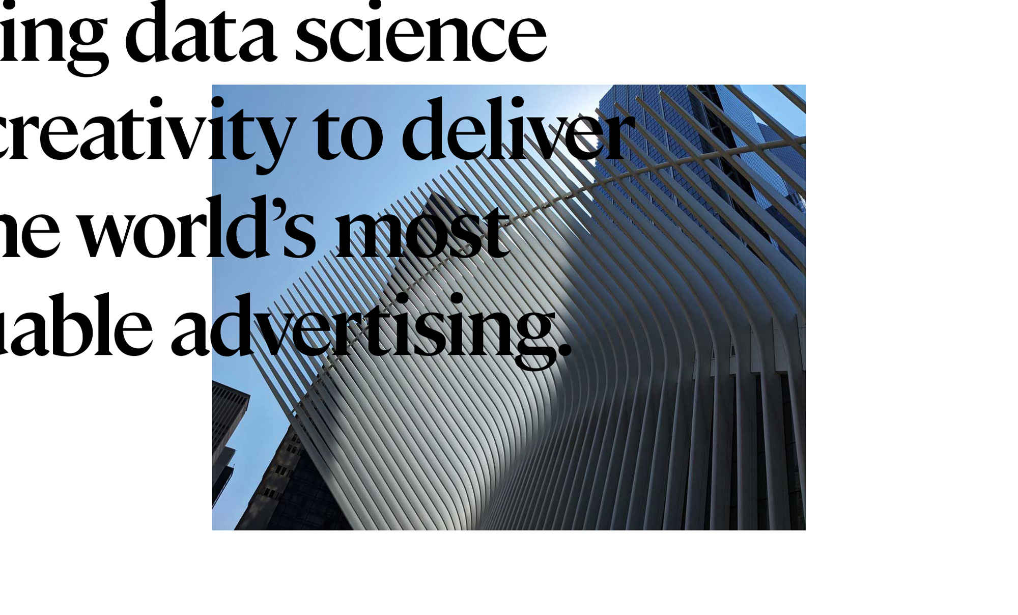
(Est. 2005) "Essence, part of GroupM, is a global data and measurement-driven media agency whose mission is to make advertising more valuable to the world. Clients include Google, Flipkart, NBCUniversal, L'Oreal, and the Financial Times. The agency is more than 1,800 people strong, manages $4B in annualized media spend and deploys campaigns in 106 markets via 20 offices in APAC, EMEA, and North America."
Design by
Ueno (San Francisco, CA, office)
Related links
Essence blog post
Relevant quote
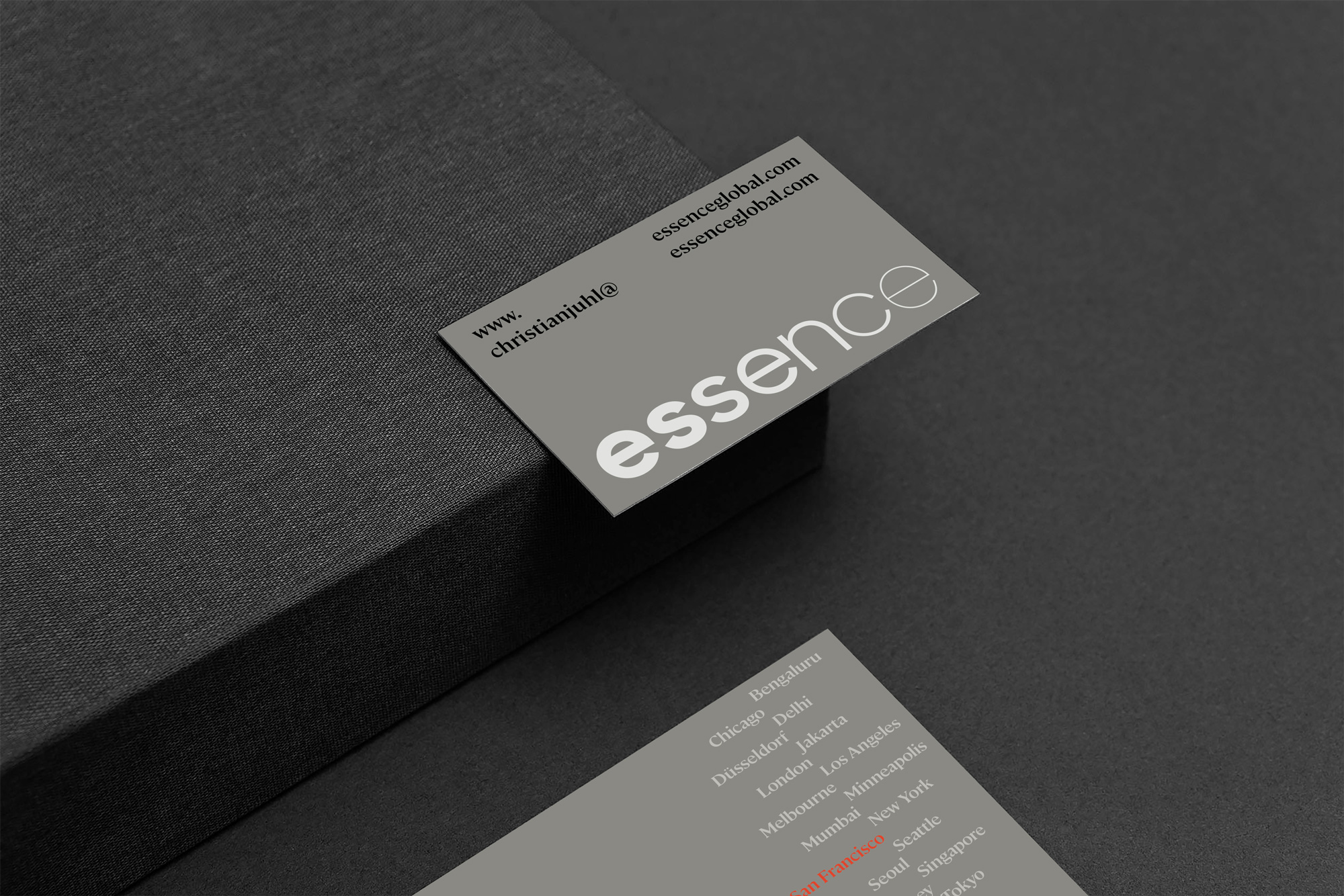
The word mark is a simple and elegant representation, utilizing descending weights to convey the meaning in their name; specifically their ability to help clients get to the simplest, most efficient and most effective articulation of an idea.
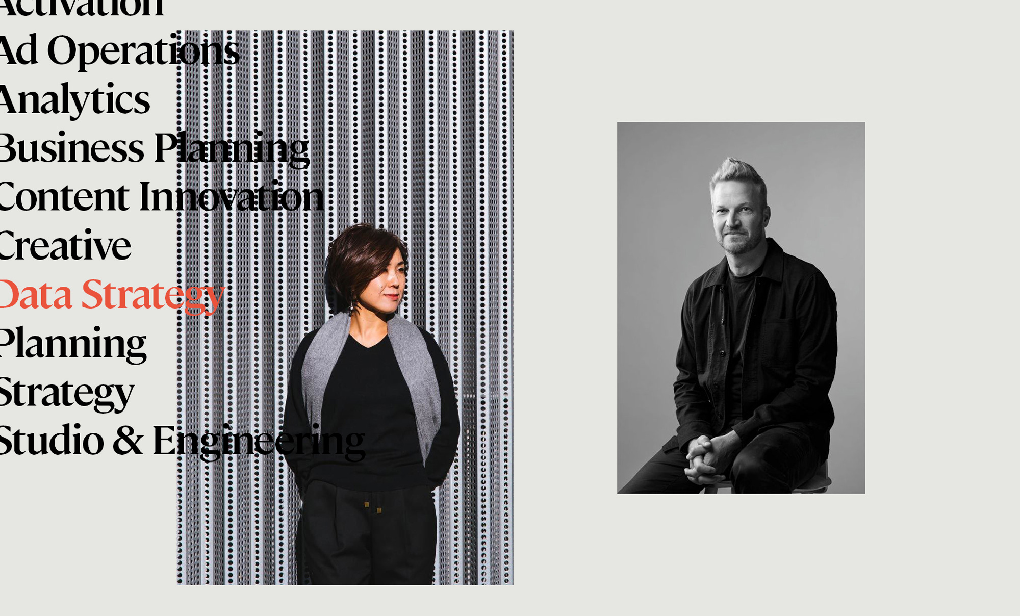
Today, branding is more about the verbal identity than a logo. Anyone can make a logo. So the audience they were speaking to played a big part of crafting our tone of voice. Based on the data centric nature of their business we felt the industry already had enough data speak going on, so we leaned towards a more editorial approach, one grounded in a more conversational tone. To that end, our font choice and pairing, was as important, if not more than the logo. Verbal identity is the new brand identity, so in this case, we chose a lovely robust serif called Cambon by General Type Studio combined with the rational and perfectly executed Sharp Sans by Sharp Type Foundry. Both work well independently, but they’re even better together.
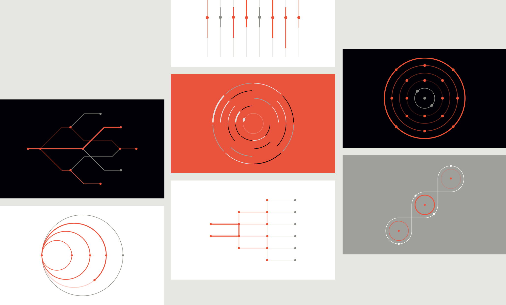
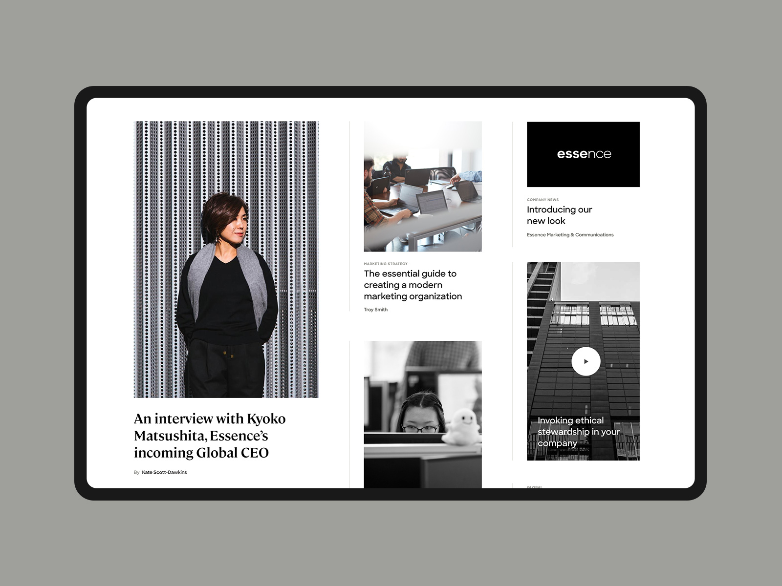
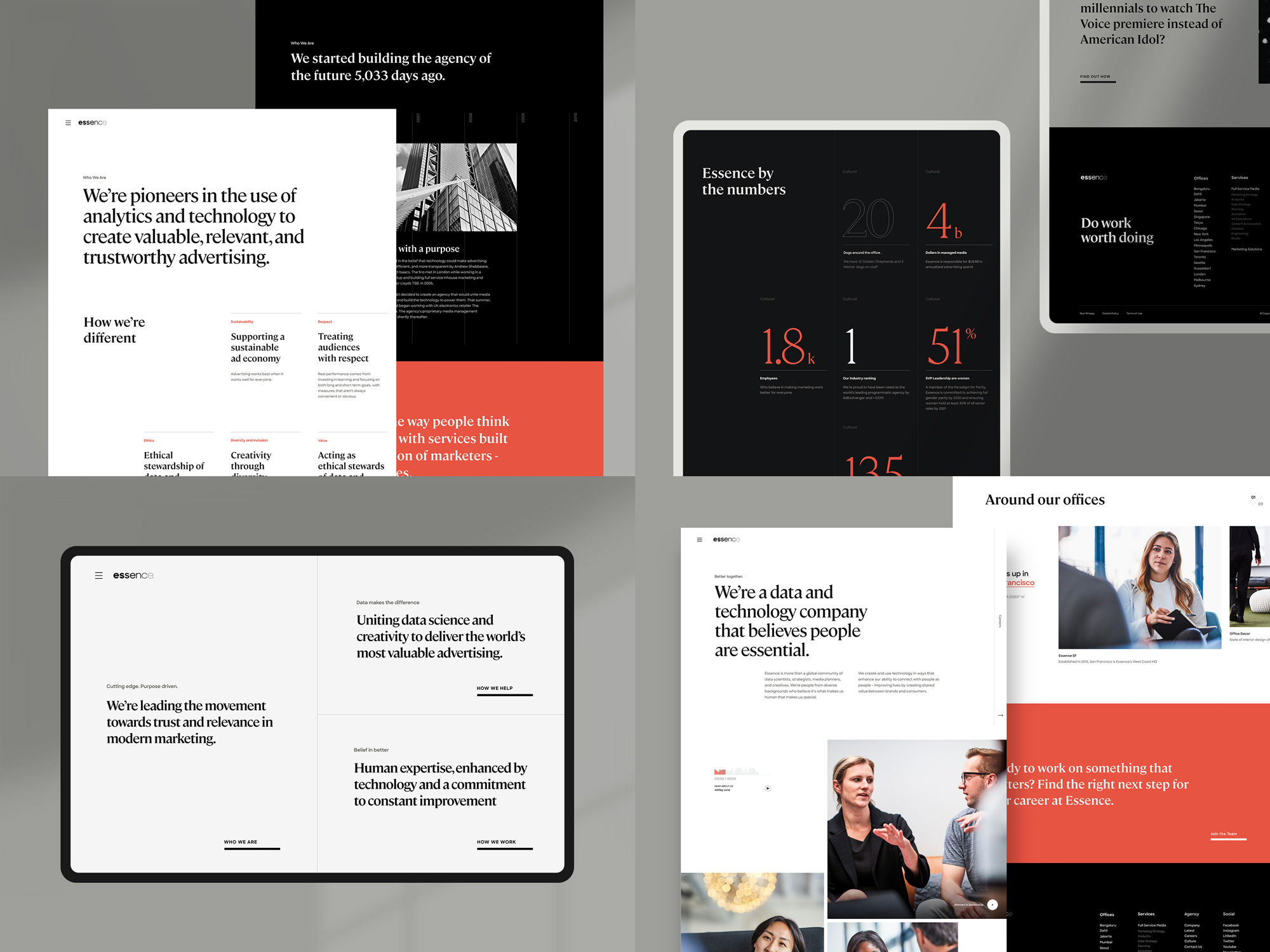
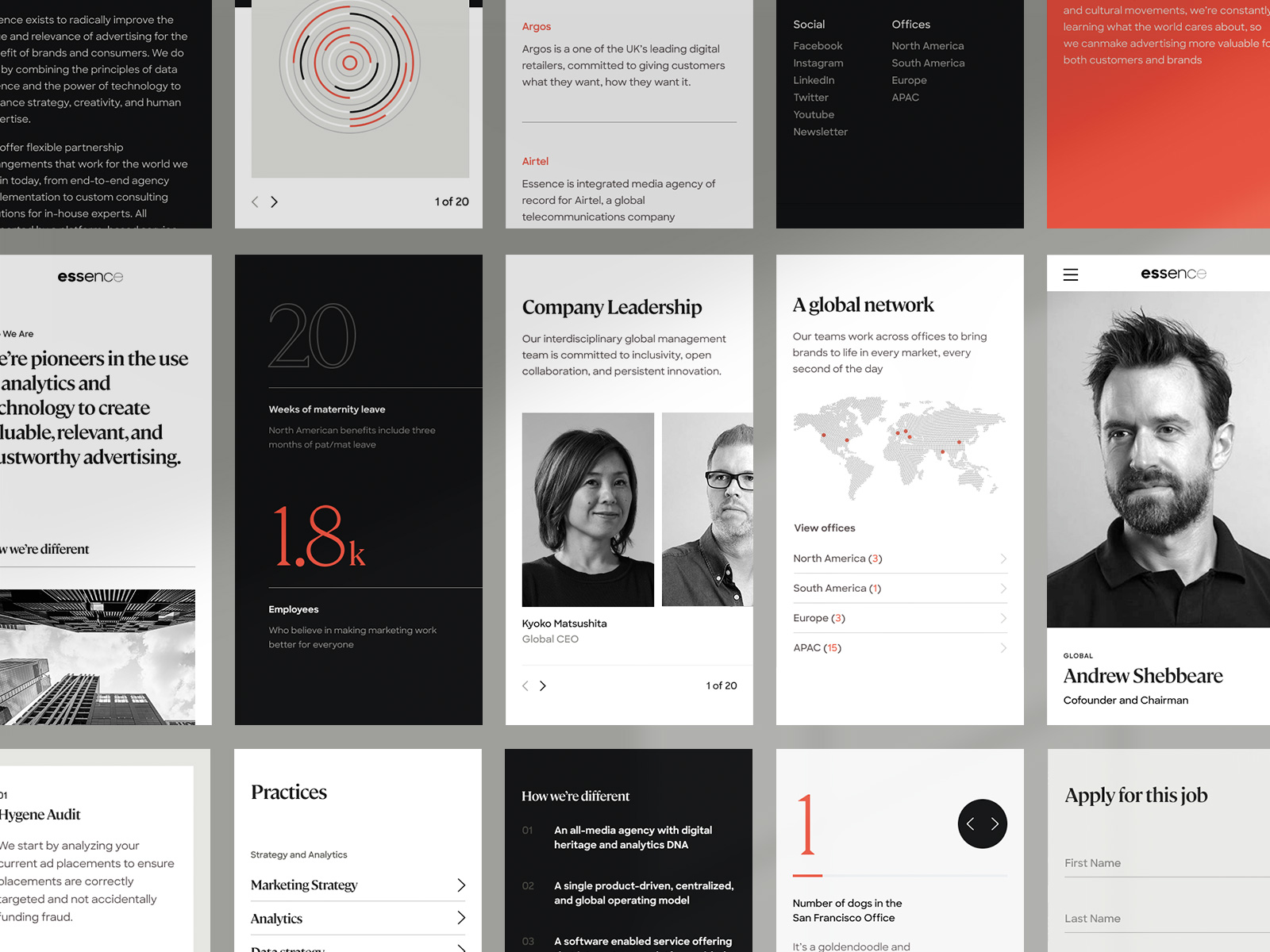
The design system ultimately came to fruition in the website, with its confident yet refined editorial aesthetic. The website celebrates their mission and shares the unique combination of creativity, technology, and people that differentiates essence from their competitors.All the elements including, brand, typography, color palette, photography, data visualization, and the editorial web structure map well to support the new brand strategy and messaging platform. We’re so excited to have formed such a strong partnership with them and can’t wait to see the Essence grow and evolve from here.
Images (opinion after)
Opinion
The old logo was really bad, not just in terms of execution but in representing the company… I’m not sure that, if I had them at my disposal, I would fork over millions of dollars to have them place a large ad buy for me. The new logo now looks like the large, business-minded organization it is with a more buttoned-up approach. I think we have all toyed with this black to thin (or vice versa) font weight approach at some point so it’s not entirely surprising or inspiring. The rationalization for it makes sense — conveying Essence’s “ability to help clients get to the simplest, most efficient and most effective articulation of an idea” — but nothing revelatory. Execution-wise, it’s okay. The effect is clear and properly done and the fact that all the characters are “round” helps deliver the approach efficiently. In application there isn’t much to see here and the best representation of it is their website which is pretty nice, making good use of plenty of white space and General Type Studio’s slick and slightly funky Cambon as the primary typography. Overall, I still feel like their logo doesn’t quite reflect the offering but the rest of the identity does with a robust and contemporary aesthetic.