
Noted: New Logo and Identity for Sri Lanka (Tourism) by Landor

“So-so”
"Sri Lanka is the quintessential Southeast Asian holiday destination wherein everything falls perfectly into place. Monsoons aside, the sky is the deepest blue and the sun shines bright. The island nation is home to lush tropical forests and an enormous amount of biodiversity, including more than 140 species of frogs. Its history is rich, and strong physical evidence remains in the form of Buddhist temples, Dutch forts, and Colonial buildings. Cycle, swim, sail, and surf your way around the country; you'll need the exercise to take advantage of Sri Lanka's fiery cuisine, which is heavily influenced by neighboring India." (Fodor's)
Design by
Landor
Related links
Landor project page
Relevant quote
We identified millennials as the group with the highest motivation and economic freedom to travel across markets. Strategically, this traveling cohort would ensure an increase in both traffic to Sri Lanka and the value perceptions of the destination. With this in mind, we focused on the need to attract these high-spending experience seekers through distinct accommodation and experience offerings.
Our inspiration for the positioning emerged from the way we observed how tourists regularly talked about their experiences: “You know, it was just so Sri Lanka,” and the way others, who had also been there, nodded in agreement, as if in on a secret.
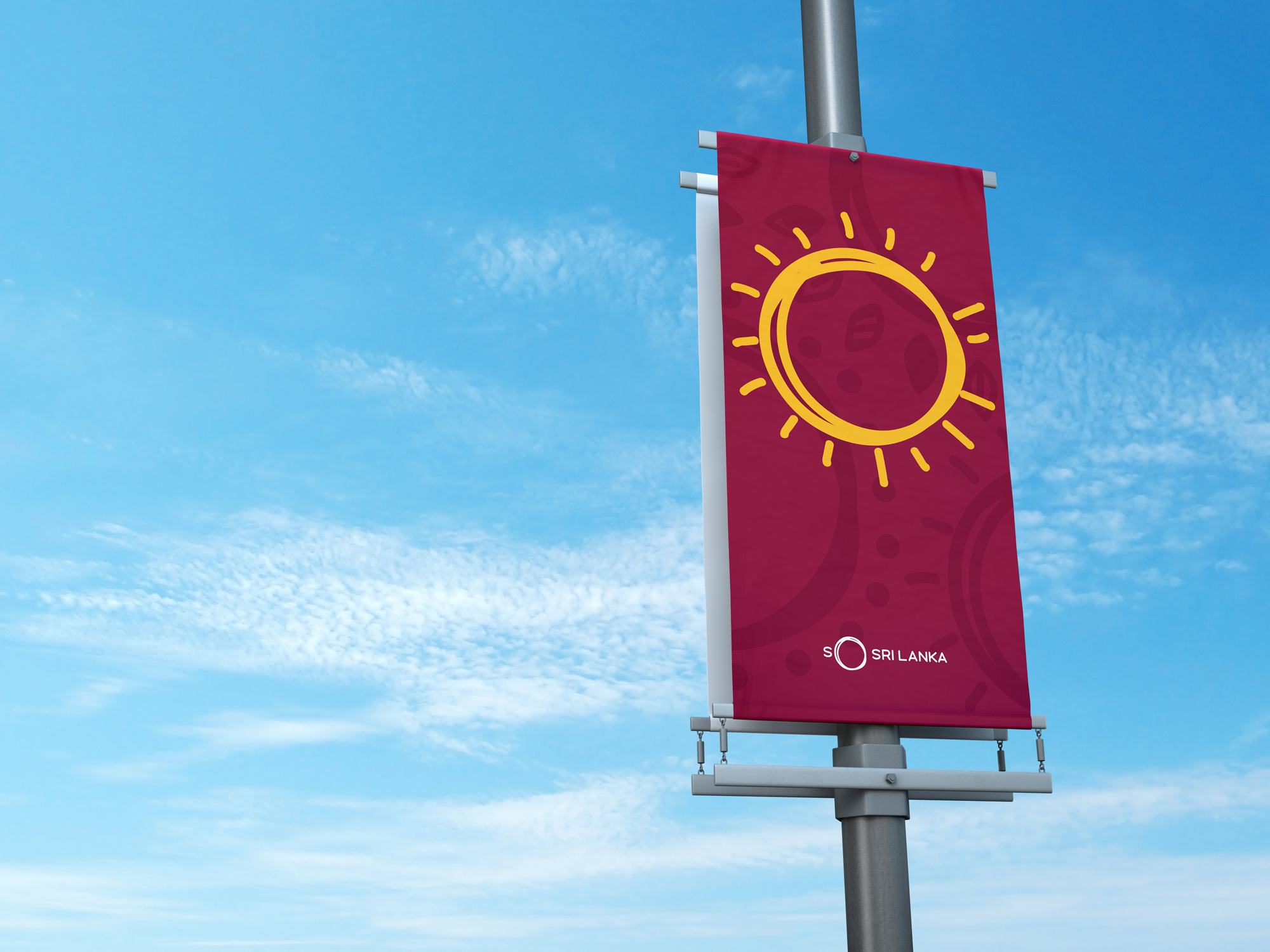
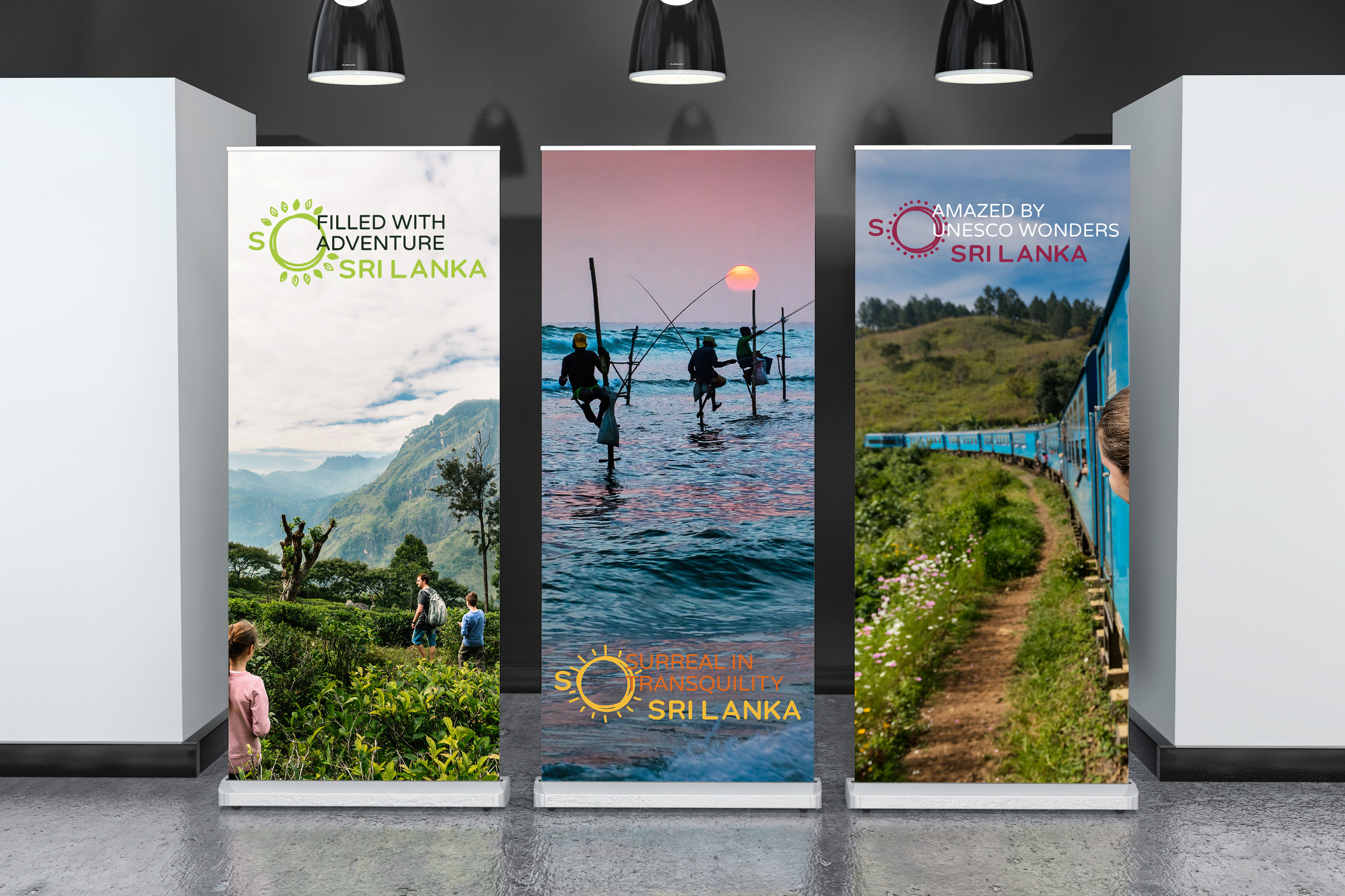
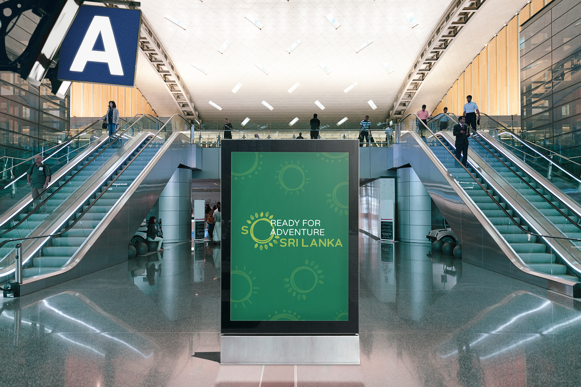
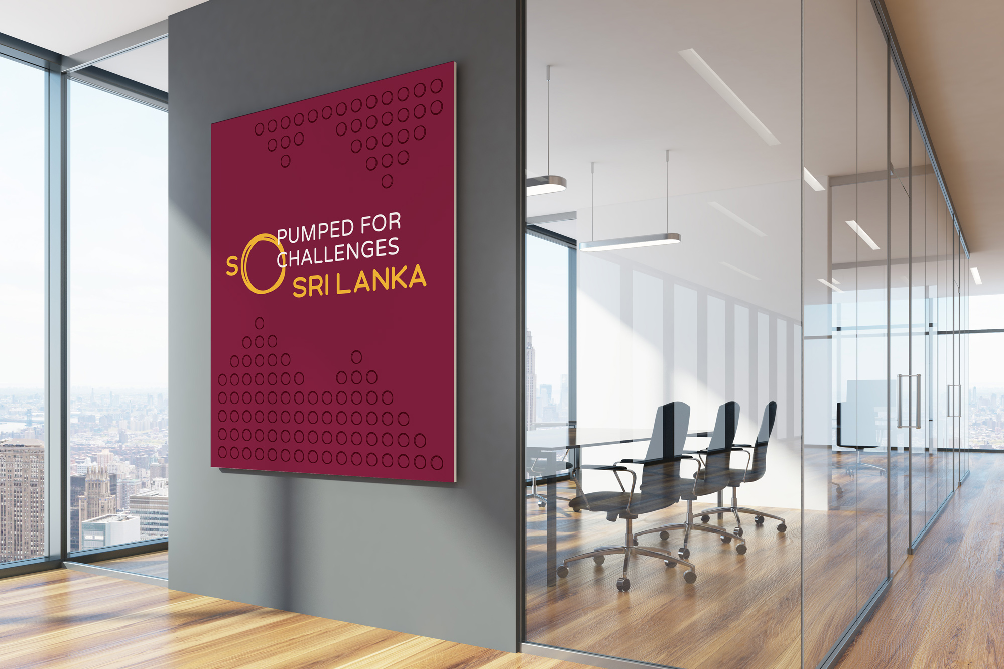
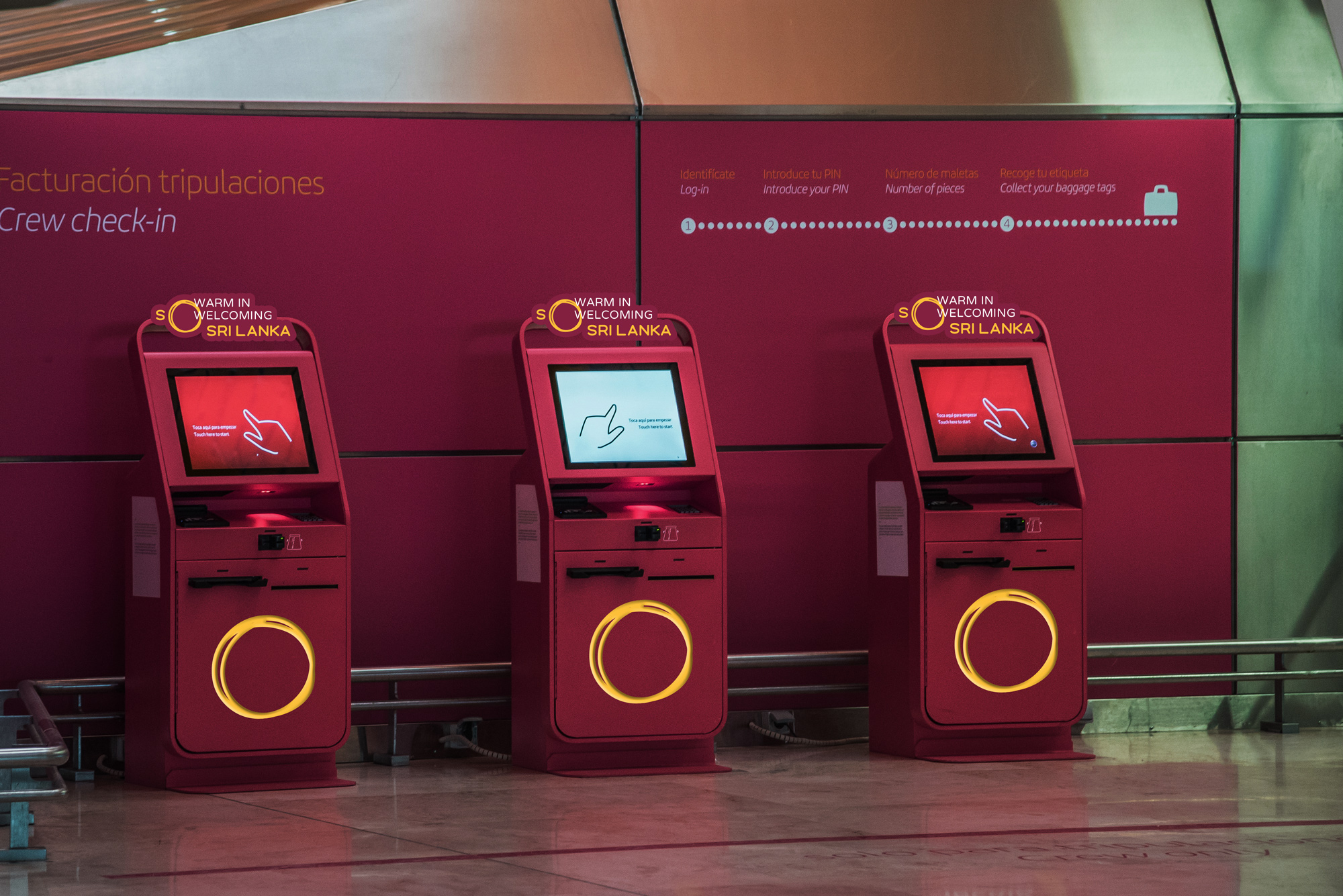
Our visual identity captures the rare, authentic and diverse aspects of the country. Inspired by the landscape, the enlarged, layered “O” has a triple function: It represents a world of attractions waiting to be experienced; it serves as a window to reveal the wonders of Sri Lanka at different places and moments; and it encourages people to put verbal emphasis on the “so” (reflecting a conversational tone).
Images (opinion after)
Opinion
First the disclaimer that this logo has been out since November of 2018 but somehow it’s just now getting more press — the case study on Landor’s website did go up in late April so I’m late to the game on this one. Still, worth a publish. The old logo had quirkiness going in its favor, with a lot of colors and funky type but the shape of the country in between the words looked super awkward and, quirkiness aside, the type wasn’t entirely pleasant. The new logo is problematic in that it tries to create a logo out of a new tagline that is very hard to discern on the graphic execution. Before reading anything about it, it took me a bunch of glimpses to understand the logo said “So Sri Lanka”. I kept seeing an “S” for “Sri” and perhaps a sun. Even after knowing what it’s supposed to read like I have a hard time reading it as it’s supposed to. Execution-wise… arguably, it’s okay. I like the scribble and there is something cool about when it highlights something on a photo but the techie rounded sans serif is strange, not just as a choice but the font itself is somehow odd. The applications are a bit of a mess with really generic destination photos and an even more confusing way of treating the logo by adding extraneous messages like “So filled with adventure” and “So surreal in transquility [sic]”. I like the idea of activating the scribble circles with dots, leaves, and rays but they turned out a little too child-like and there is no smooth integration with the other elements. That office render baffles me to no end, from the choice of the photo to the tagline to the design of the poster. Overall, this maybe had potential at some point but there is too many things half-cooked to amount to a substantial whole.