
Noted: New Logo and Identity for ArtsWave by LPK

“When it Waves it Pours”
(Est. 1927) "ArtsWave is the Greater Cincinnati region's leading local arts agency and nation's largest and oldest united arts fund. With the help of tens of thousands of donors, ArtsWave supports over 100 arts organizations that make Greater Cincinnati an amazing place to live."
Design by
LPK (Cincinnati, OH)
Related links
LPK project page
Relevant quote
“We wanted to evolve the ArtsWave brand to be as dynamic and powerful as they are,” explains LPK Design Director Meredith Post. “The wave is something inherent to the brand. We built a modernized creative system around the wave, making it an element that they can truly own and continuously build upon as they widen their reach.”
Images (opinion after)
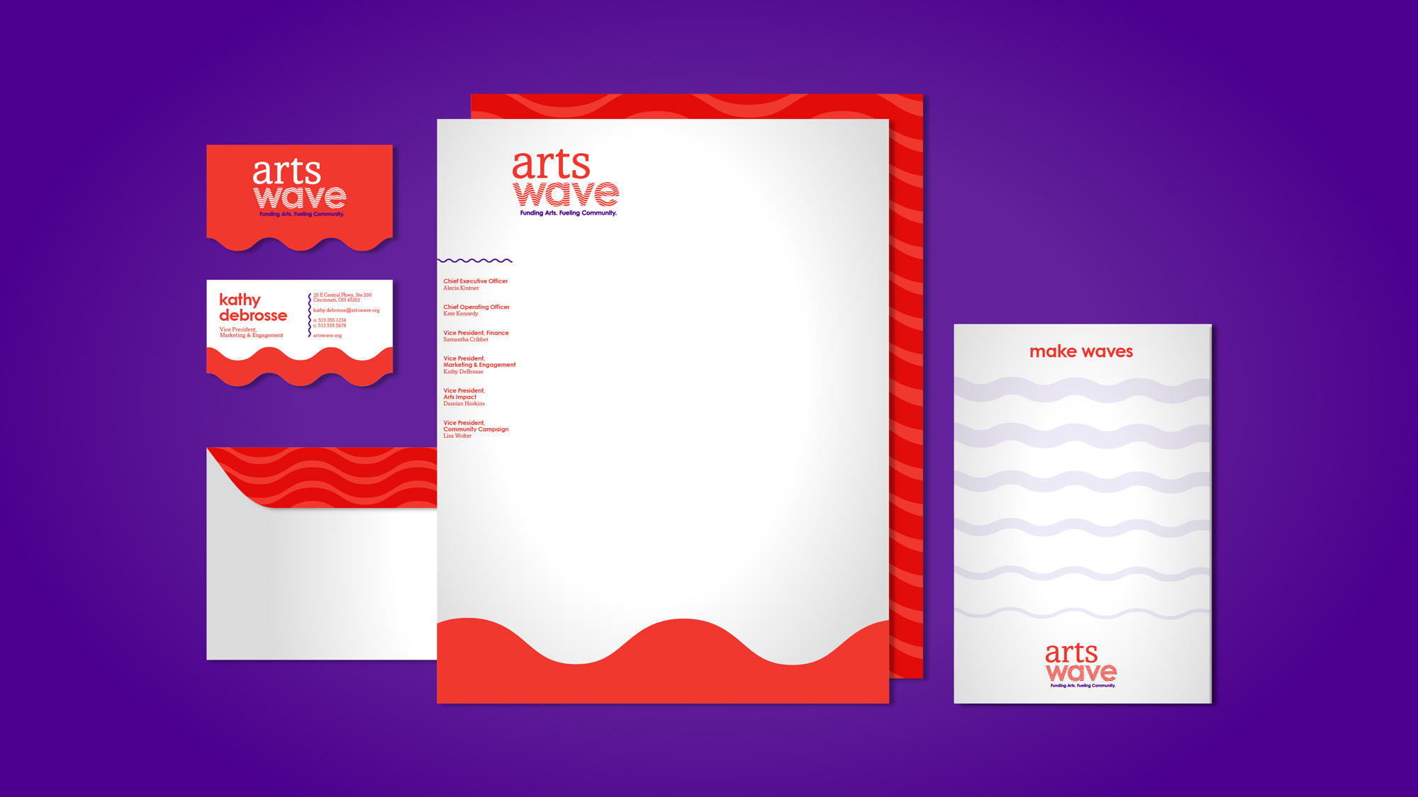
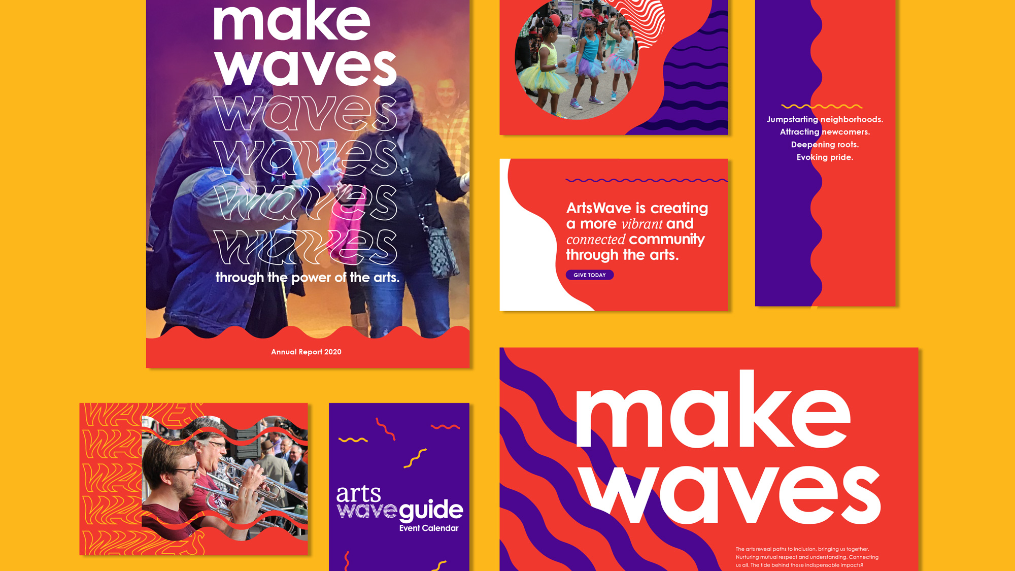
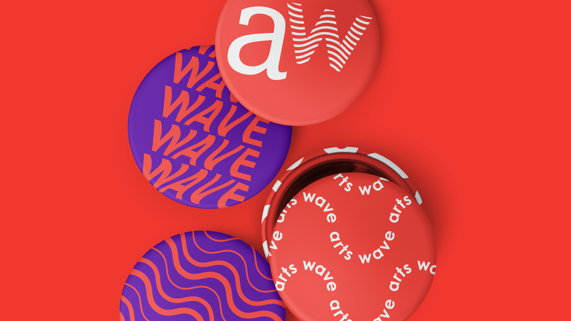
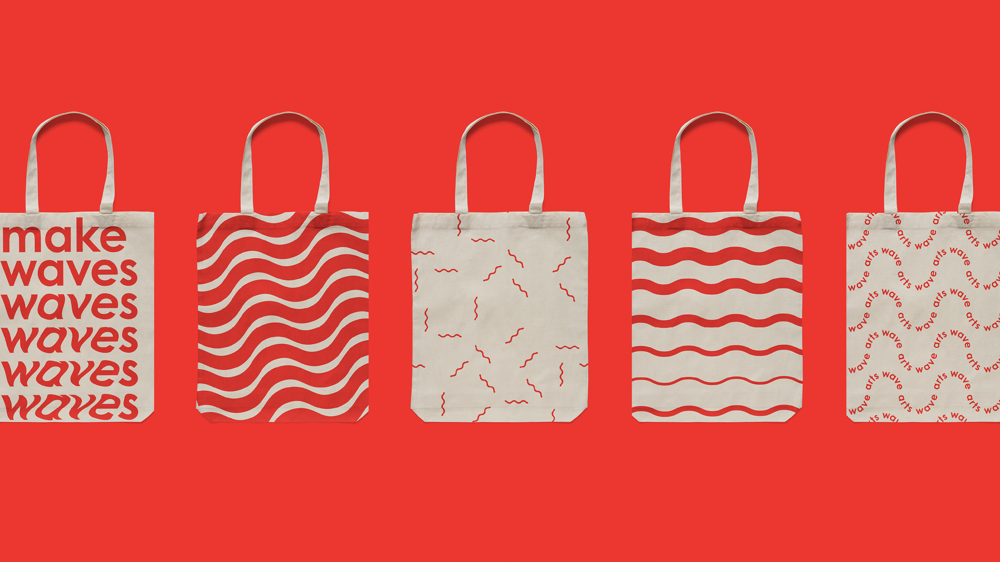
Opinion
The old logo had a decent non-profit feel, with an ambiguous but open-to-positive-interpretations icon and an okay wordmark. The new logo ditches the icon, maintains the serif “arts”, and adds a sans serif with a wave pattern in it. In principle this could have been pretty great had the “wave” typography been more purposely built out of wave line instead of simply masking a wave pattern. It gets the effect across but it’s one round short of execution. The animated wave patterns and some of the applications are the start of something cool, with their trippy and awkward-on-purpose aesthetic. Like the logo, everything needs one extra push to take it to the next level of interesting-ness — except for the business card, that needs to be started from zero. Overall, this kind of design is, like, Tuesday in Amsterdam but for a nonprofit in Cincinnati this is light years ahead and away from the Midwest’s comfort zone so it’s quite surprising to see something like this for this organization.