
Noted: New Logo and Identity for Nuvance Health by Monigle

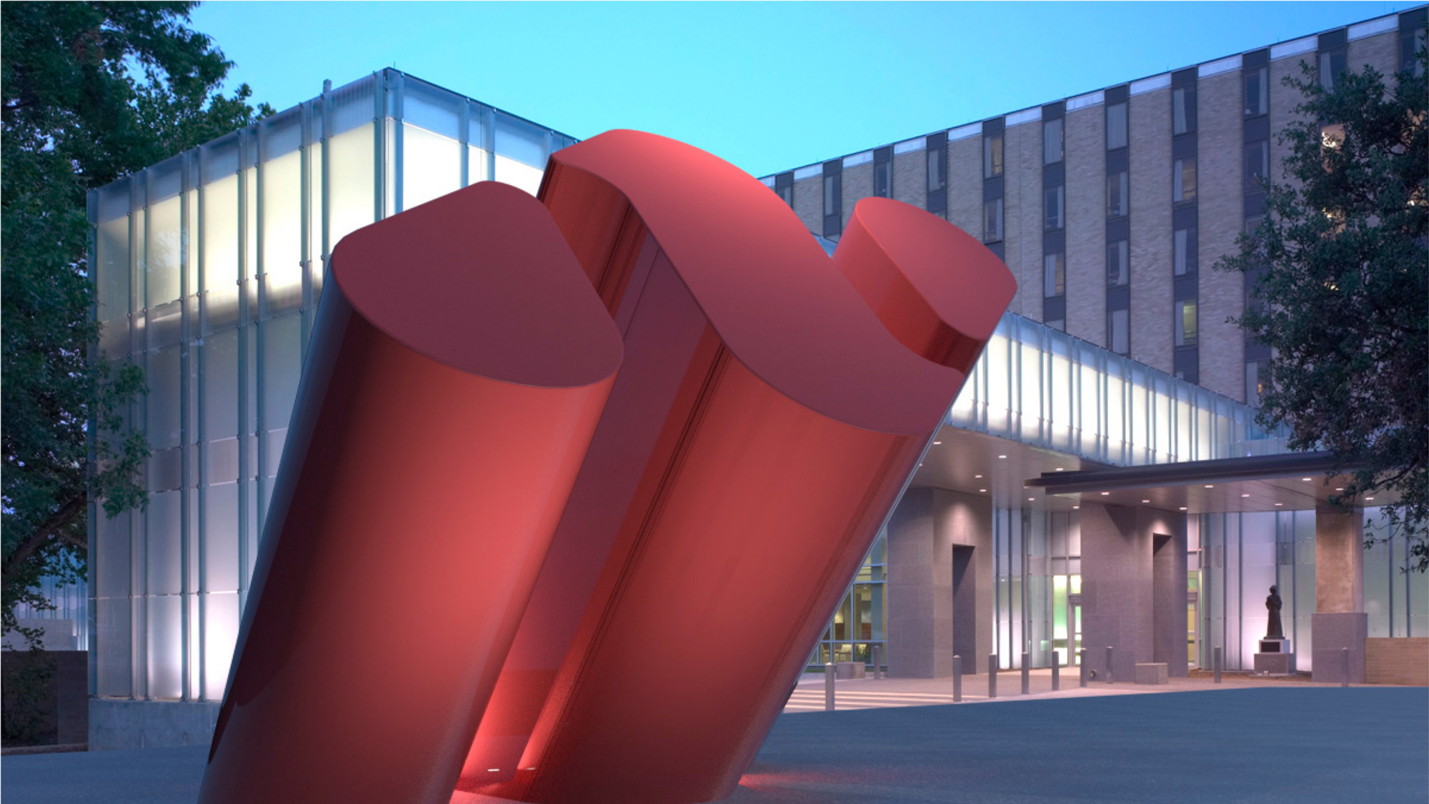
“Uplifting Angle”
(Est. 2019) "Motivated to challenge assumptions and expectations in healthcare, we -- Health Quest and Western Connecticut Health Network -- have formed Nuvance Health, a system that cares for 1.5 million residents across New York and Connecticut. We've come together to deliver more convenient and accessible care throughout New York's mid-Hudson Valley and western Connecticut. And in joining forces, we're pushing the expected, working together to make the impossible, possible."
Design by
Monigle (Denver, CO, and New York, NY)
Related links
N/A
Relevant quote
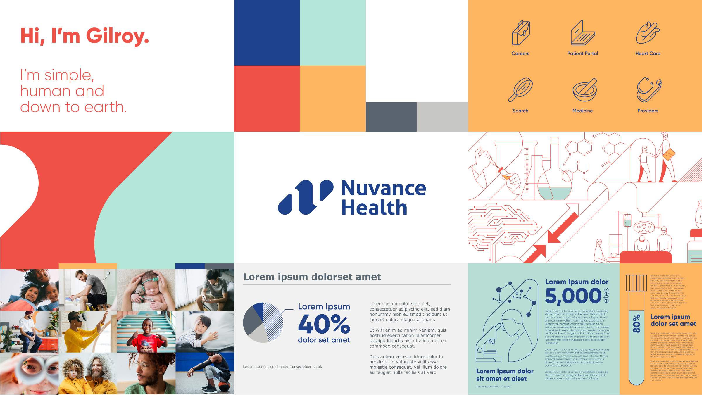
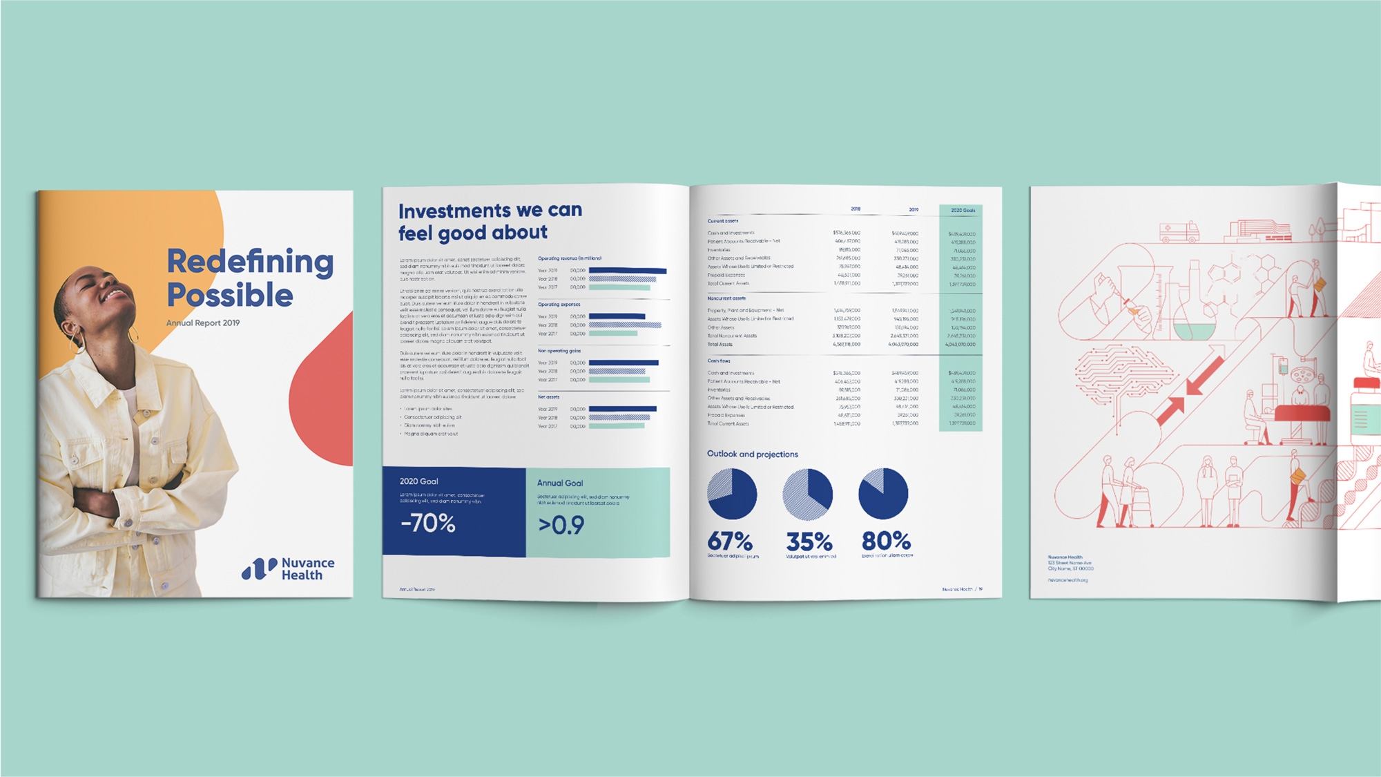
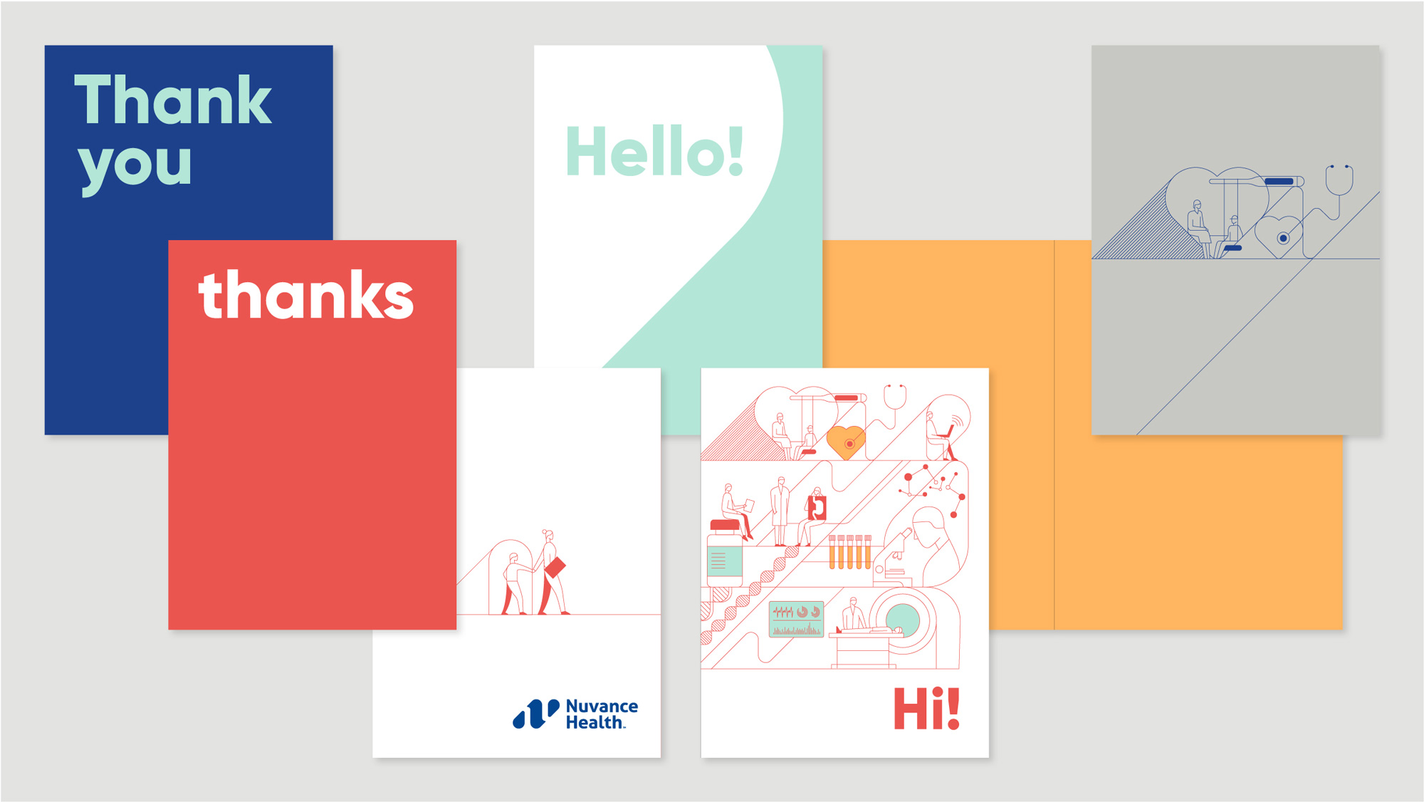
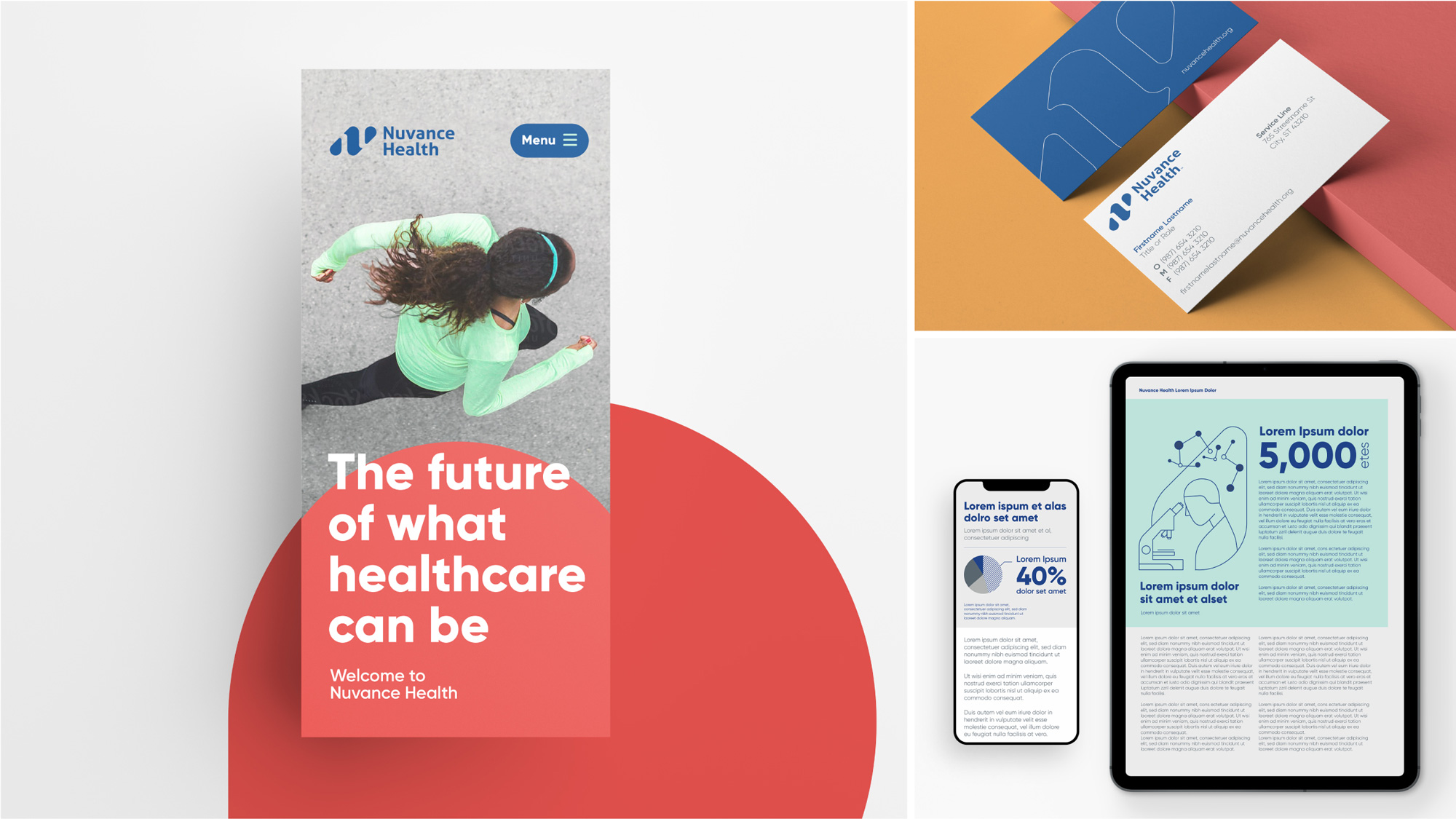
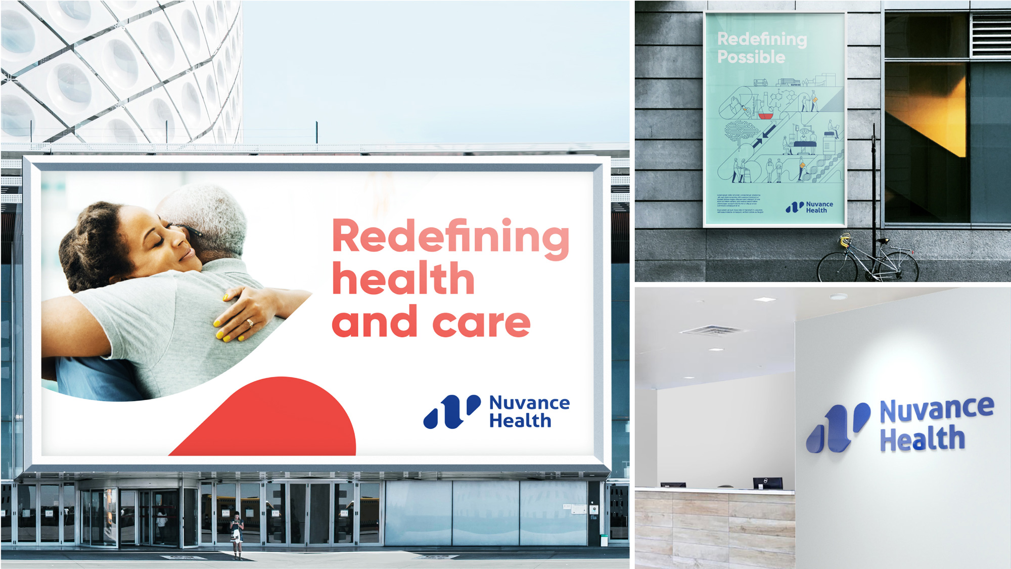
Creating something bold, simple, and personal. Leading with a bright and unexpected color palette that covers the full spectrum between humanity and science, our voice is unapologetically bold and refreshingly straight forward. The world of Nuvance is brought to life through an illustration motif of scientific and human-centric moments that illustrate the work of Nuvance Health in an accessible way. A strong forward angle, first introduced in the logo and continuing as undercurrent throughout the entire visual system, reinforces the progressive brand platform “pursue impossible” by constantly pushing forward.
Images (opinion after)
Opinion
The old logos… HealthQuest gets a passing grade for the relatively clever “HQ” monogram in the middle of the name (although the rest of kerning is questionable) but Western Connecticut flunks with aplomb with its weird shapes in the icon. The new logo has a great monogram that offers a fairly innovative interpretation of the letter “N”… if it were for a water utility company it would be perfect with the big droplet forms but it works well for healthcare too. I keep wanting to see an “H” in the negative space but I guess that’s not going to happen. The wordmark I dislike because I hate that style of “spurless” sans serif, which then makes me question why the “n” isn’t like the “u”? Anyway, it’s not that bad if you don’t mind that style. The color palette is a nice change of pace… that egg yolk yellow isn’t very common and it works well with the rest. I really enjoyed the brand illustration that, even though follows the faceless trend, it at least builds in elements of health and science through the structure of the monogram. I kind of hate to be “that person” to point out something petty but someone needs to learn “Snap to Point” in Illustrator (or if not that, at least learn to “Pay Attention” in Real Life): this SVG, from the various illustrations peppered throughout the website, is so painful to look at. Back to the overall design… I felt that, for a healthcare identity, which are usually pretty generic, this had some good life to it. A little more vibrant and optimistic than the rest without flexing too hard.