
Noted: New Logo and Campaign for Public Mobile by Cossette

“Power to the Public”
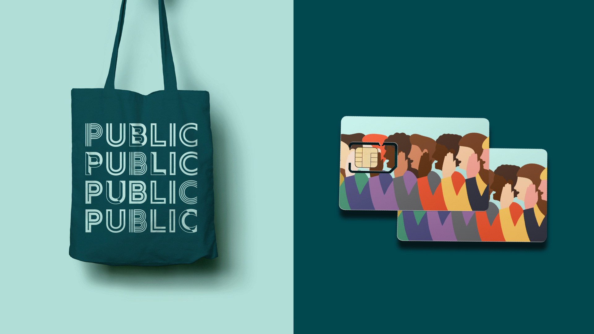
(Est. 2010) "Public Mobile Inc. is a Canadian self-serve, mobile brand which is owned by Telus. Launched on March 18, 2010, Public Mobile was one of several new Canadian cellphone providers that started in 2009-10 after a federal government initiative to encourage competition in the wireless sector. Public Mobile was acquired by Telus in October 2013. As of August 8, 2014, Public Mobile operates as a mobile virtual network operator on the Telus Mobility network. On August 31, 2015, Public Mobile "relaunched" to the public under a beta program providing free SIM cards and three tiers of BYOD plans starting with a 10-day, 30-day or a 90-day period, all of which have respective options of Talk, Text and Data. The service is not charged by minute, as with other prepaid providers. Instead, customers select which types of unlimited talk and text service and which data caps they would like for a 10-, 30-, or 90-day period."
Design by
Cossette
Related links
N/A
Relevant quote
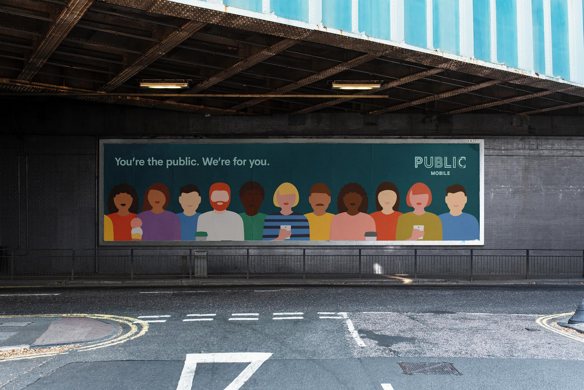
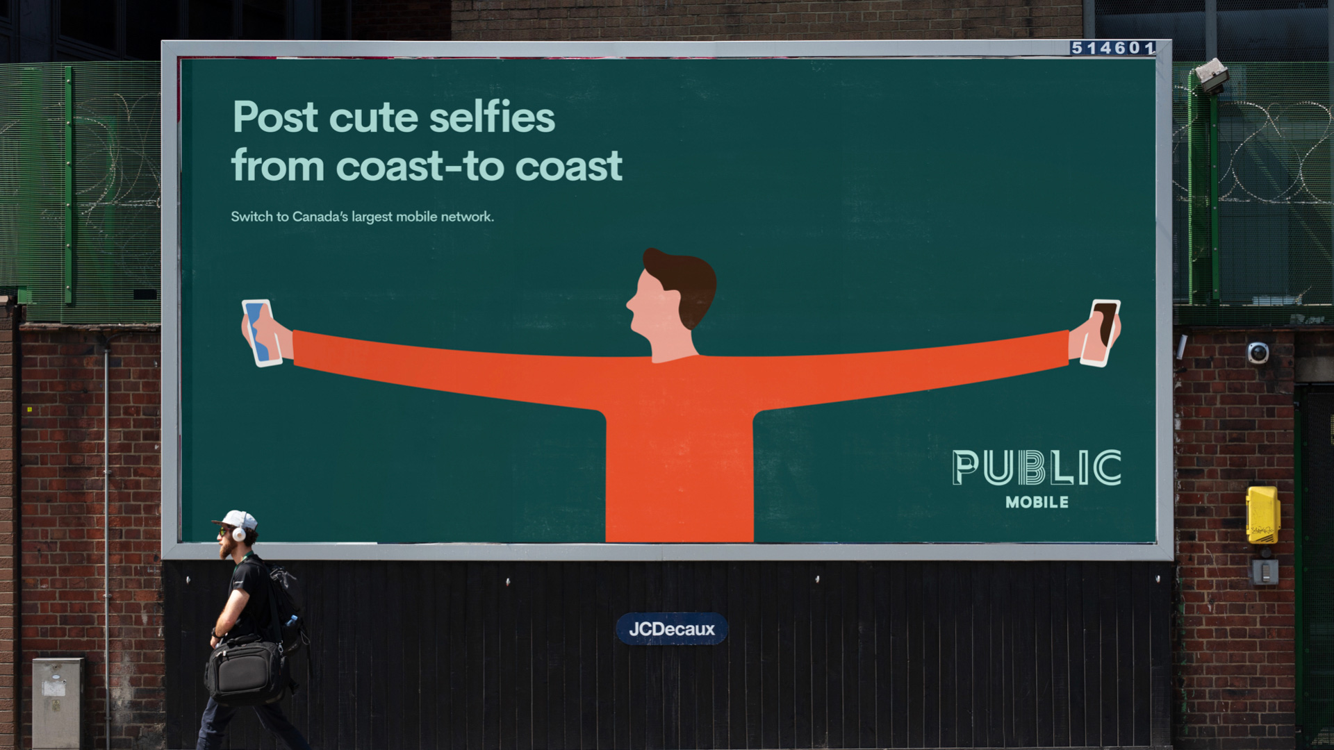
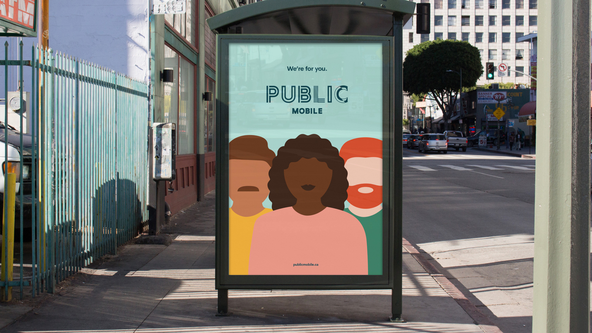
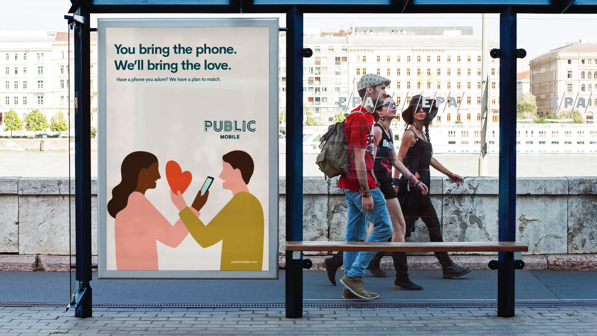
As it works to differentiate itself in the ultra-competitive wireless telco market, Public Mobile has launched a new brand identity with customers and an emphasis on human connection at its core. Working with its AOR Cossette, Public has unveiled a new design system that includes a new logo, colours, typography and illustrations that reinforce the diversity, individuality and interconnectedness of its customers. It also launched its first campaign under the new branding, “Public Displays of Affection,” a warm and humourous campaign that showcases Public Mobile’s love and commitment to its customers with amazing savings and community.
Images (opinion after)

Opinion
The old logo had a decent icon with funky little people inside an orange circle but a ghastly wordmark — that “P”, that “u”, that “b”… ugh. I guess the “l” was fine. To its credit, it played the part of a low-cost, no-contract cell service provider. The new logo is much better… if it were for a museum, restaurant, theater, or even a retailer but as a logo for a mobile phone utility? It’s a stretch. Perhaps I am being narrow-minded and unwilling to expand my preconceptions about what a company like this should look like but I would imagine I’m not alone. I mean, the idea is well-grounded and the execution is fairly good in communicating diversity and celebrating the different people that make up the customer base but it’s not entirely convincing as a representation of the service being offered. The campaign is more or less — probably less — interesting in visually expanding on the name of the company with lots of “public” being represented. The abstract faceless illustrations though, at this point and at least for us Brand New readers, is so overdone that it’s really difficult to not roll the eyes. The color palette is nice, and perhaps if they had leaned in more heavily into a vintage style with the illustrations somehow, this could have been more, instead of less, interesting. Overall, what it does well, is stand out from other cell phone service providers but I wonder if it does so to such an extent that it’s unrecognizable as a player in that category. (Oh, and then there are the TV spots… yeah… I dunno… I have never enjoyed bizarre-for-the-sake-of-bizarre ads so… you decide.)