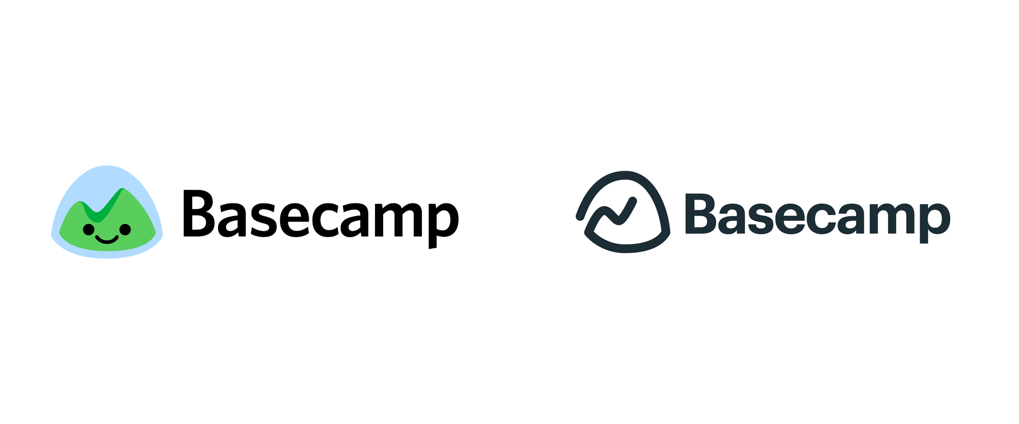
Noted: New Logo for Basecamp done In-house
“All your Basecamps are Belong to Us”

(Est. 2004) "Back in 1999 (pretty much forever ago, in Internet Years), we opened a web design company called 37signals. As 37signals, we launched several successful products, created and open-sourced Ruby on Rails, wrote a few best-sellers, and published thousands of posts on the Signal v. Noise blog. In 2004, we created and launched a little project management tool named Basecamp. We built Basecamp to scratch our own itch: We needed a simple, usable program to help us stay organized, communicate with our clients and each other, and make it easier to finish projects together. Over time, Basecamp grew into something much bigger. In 2014, ten years to the day that Basecamp launched, 37signals became Basecamp, a one-product company (read more on that here). Today, people all over the word manage millions of Basecamp projects and create thousands of new accounts every week. With customers in nearly every industry and every country on Earth, we're helping a whole lot of creative teams do their best work."
Design by
N/A
Related links
N/A
Images (opinion after)


Opinion
It seems there is a large Venn Diagram intersection of Basecamp users and Brand New readers, given the amount of tips we received about this. Basecamp is like an internet OG and having known the 37 Signals folks from way back, it’s been great to see their ascent (pun intended). The most recent logo features a smiley face addition to the mountain-in-a-dome graphic that has been around since the beginning. Why a smiley face? Because they felt like it, which has been 37 Signals’/Basecamp’s MO all these years. Until now, the notion of a basecamp at the foot of a mountain has been well maintained by the logo but this new version drops the literal mountain and in its wake is left a chart line going up inside a gummy-like shape. The best case scenario is that the logo was designed with the existing user base in mind and that most people will recognize the mountain in the new abstract shape. For completely new users I really wonder — because I can’t not see the mountain — what they will read into the logo? Execution-wise, the icon is a little questionable with barely finessed curves and joints, especially on the incline area. The wordmark update is fine, I guess, but perhaps something a tad softer would have paired better with the icon. The choice of yellow as an accent color is odd, given that green and blue are relatively iconic to their logo. Overall, it’s an odd update and even more odd is that there is no acknowledgment of the change given that Basecamp has always been super open about any changes/updates they do to their app and business.

