
Noted: New Logo and Identity for Gusto done In-house

“Say it with Gusto”
(Est. 2012, originally ZenPayroll) "Gusto serves more than 100,000 businesses nationwide. Each year we process tens of billions of dollars of payroll and provide employee benefits--like health insurance and 401(k) accounts--while helping companies create incredible work places. Through one refreshingly easy, integrated platform, we automate and simplify your payroll, benefits, and HR, all while providing expert support. You and your employees will get the peace of mind you need to do your best work."
Design by
In-house in collaboration with Koto
Related links
Gusto brand page
Relevant quote
Our wordmark puts the spotlight on our expressive name. Notice the balance, the approachable, rounded letters, and the subtle smile of the lowercase “g”.
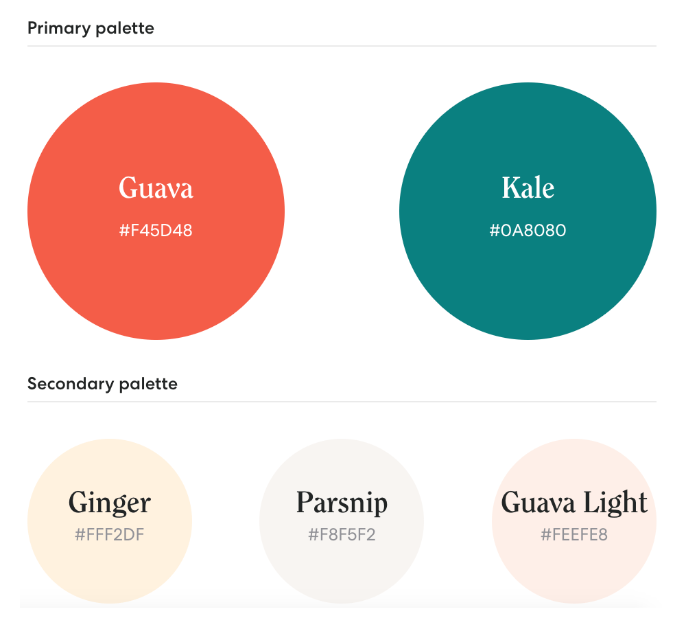
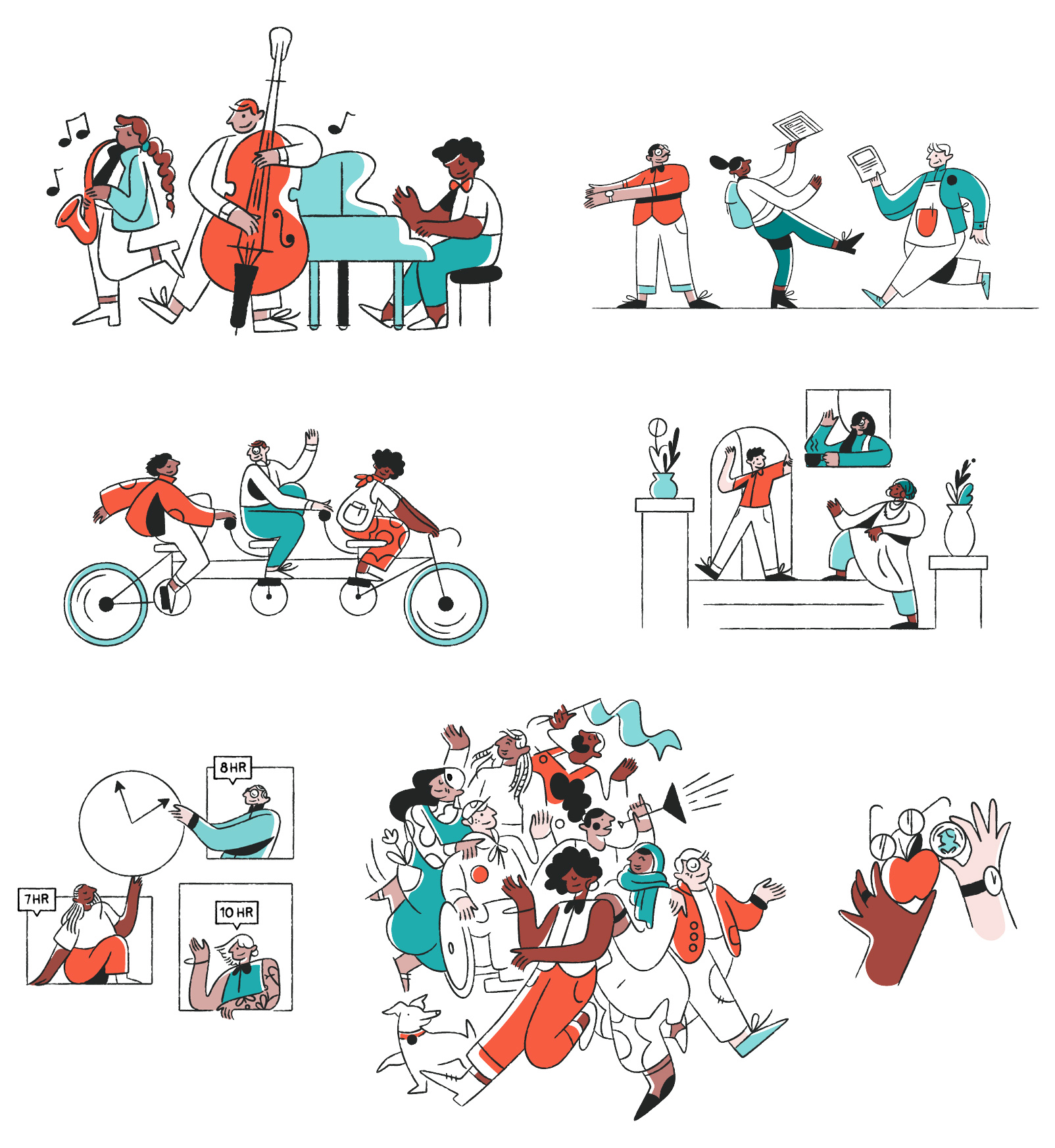
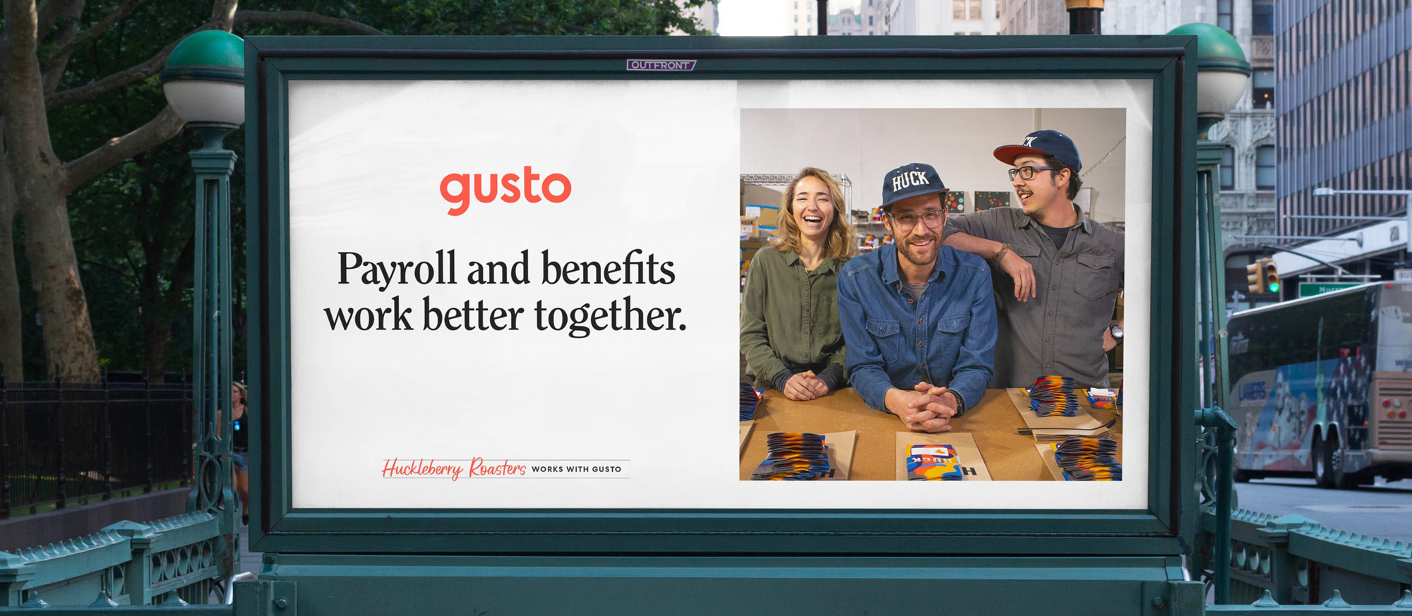
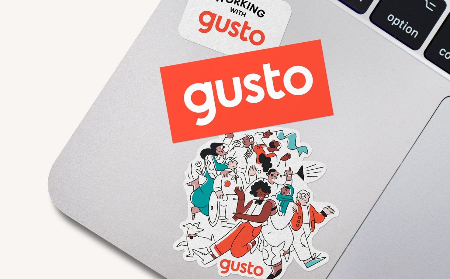
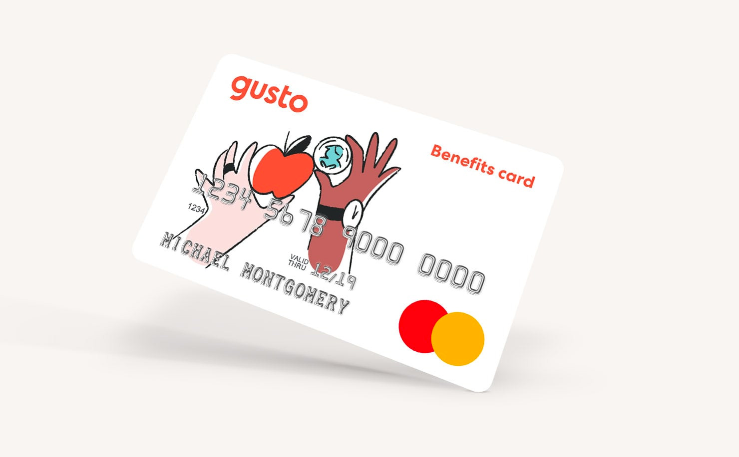
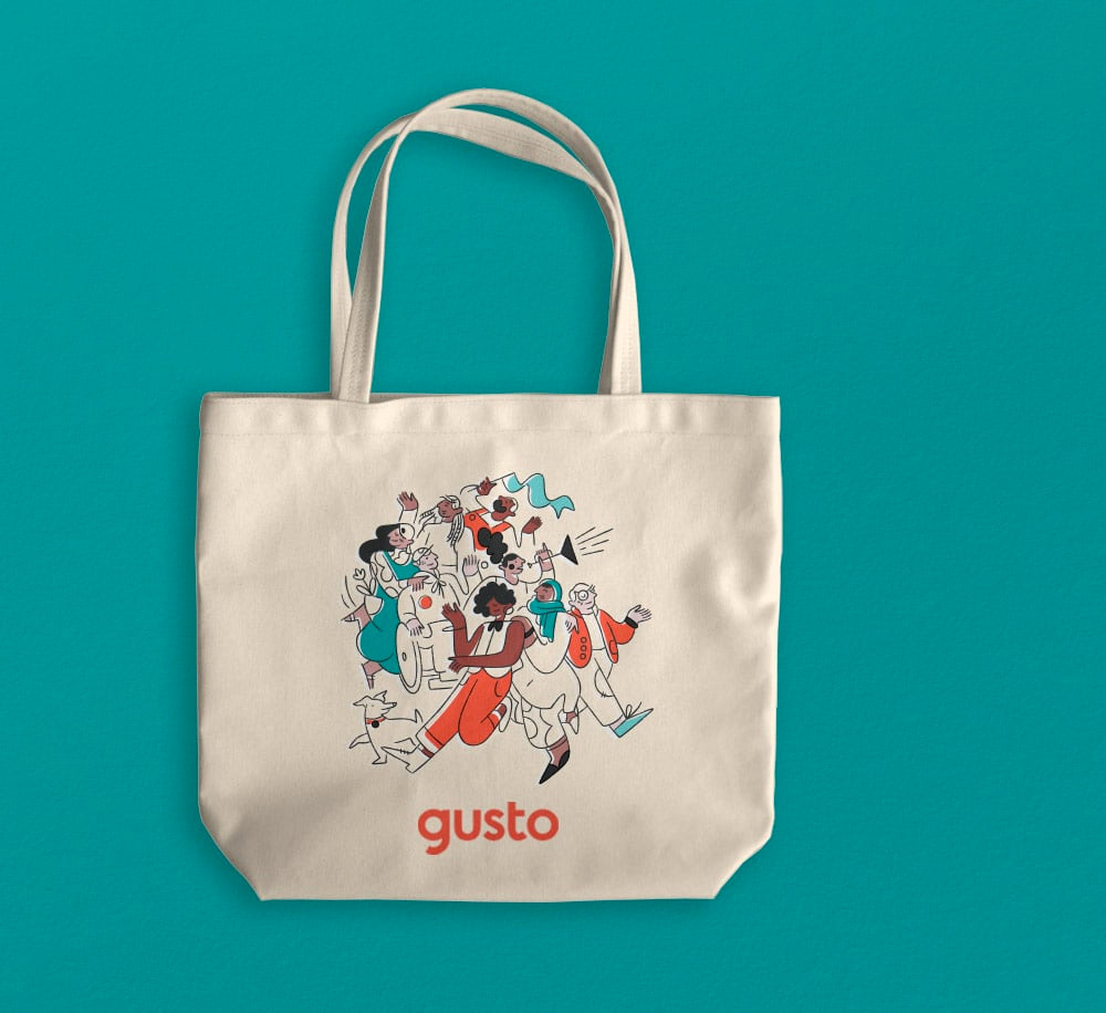
This brand is all about people. Our photography captures teams and emphasizes human connection. And our hand-drawn illustration style gushes with personality.
Words matter — both how they look and how they sound. From Clearface, our unique, personality-packed typeface, to our conversational voice and tone, we draw people into vibrant dialogue (without sacrificing clarity).
Images (opinion after)

Opinion
The old logo was fine but odd at the same time; the wordmark was unassuming but the monogram was trying to do way too much with the arrow in the “G” and the multiple strokes. Hard to know what the message was. The new logo is pretty much WYSIWYG: the name in lowercase in sans serif. The only core idea behind it is that the “g” has a smile in it which, yeah, it’s sort of there — I hadn’t seen it until I read the description — but, mostly, it just yields a slightly unbalanced “g”. I can perhaps commend the structure of the wordmark that has two wide, circular letters on each end (the “g” and the “o”) with more condensed letters in between. But, in general, it’s simply another sans serif wordmark. The illustrations are pretty nice and at least this time we got actual faces and expressions on the heads, so that’s a bonus. The colors are nicely applied to the illustrations and they look nice on the website and other applications. Clearface for the supporting type is good, in part because it’s on trend at the moment, but, sure, it does pair well with the illustrations and photography. Overall, nothing revolutionary here but a good, crisp, and lively execution of current trends and standards.