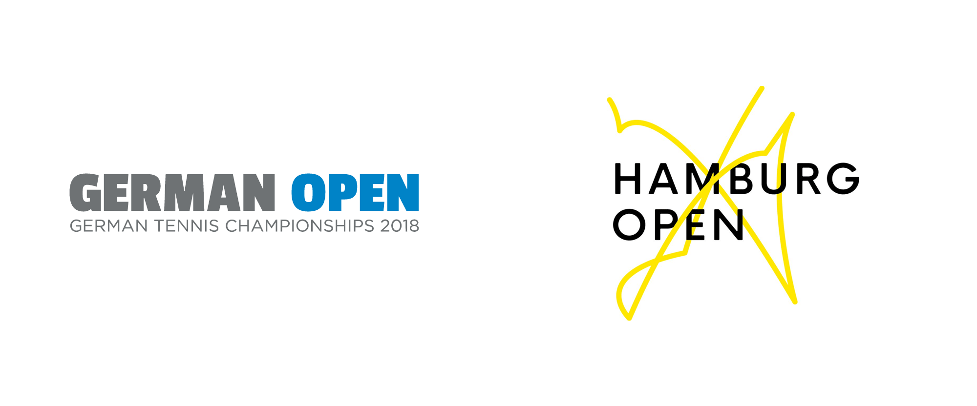
Noted: New Name and Logo for Hamburg European Open
“Match Point”

(Est. 1892) "The Hamburg European Open welcomes 32 top singles players and 16 doubles teams to the summer clay-court event as one of the 13 ATP Tour 500 stops. The tournament is held in the heart of Hamburg at the Rothenbaum Tennis Center, which features a retractable roof stadium."
Design by
N/A
Related links
N/A
Relevant quote
Graphically it's based on the match point in the 2018 Hamburg finals between Basilashvili and Mayer. And it will change every year in reference to the final match point.
Images (opinion after)

Opinion
The old logo… whatevs, functional but not good. The new logo is… different. It’s rare to find a relatively mainstream logo that purposely looks messy and confusing. Not because I’m that smart but my initial thought was that this was indeed the trajectory of a rally and the concept that it’s modeled after the match point of the previous tournament is very clever — it will be interesting when the match point is an ace serve — but the visual result is so weird. I mean, I like its boldness and thinking behind it but, yeah, unexpected. The video killed me, though, I could not stop laughing. TENNIS.


