Noted: New Name, Logo, and Identity for Lumyna by Dragon Rouge
“Let There Be Lumyna”
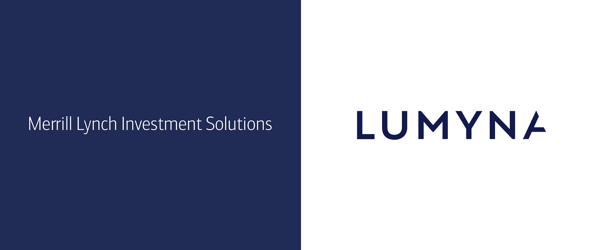
(Est. 2007, previously CM Investment Solutions Limited) "Since 2007 Lumyna has been providing clients with leading investment solutions to meet their diverse needs. At the core of this offering is our pioneering and market-leading Alternative UCITS funds platform - Lumyna Funds; bringing the best of the alternative investment universe to the regulated and liquid UCITS marketplace. Our business began over a decade ago under the guidance of Merrill Lynch. We recognised then the huge structural shift in investment markets that was about to take place, and anticipating this partnered with our first leading hedge fund, Marshall Wace, to launch one of the very first 'Alternative' UCITS funds in November 2007. The business grew and developed under the ownership of Bank of America. Partnerships with AQR, York Capital and others soon followed.In November 2018 the latest stage of our evolution began, as the business was acquired by the Generali Group. The acquisition forms an important step in the build-out of Generali Group's multi-boutique growth strategy. For our clients the acquisition provides a continuity of the existing fund range; the assurance of service from the existing team of investment professionals; and the confidence brought by the backing of one of the largest Insurance and Asset Management companies in Europe. The new name, Lumyna, represents the renewed pioneering spirit we bring to the market, alongside the institutional controls and processes that has helped us become the largest Alternative UCITS funds platform and win multiple awards over the past decade."
Design by
Dragon Rouge
Related links
Dragon Rouge press release
Relevant quote
Lumyna’s ambition is to redefine the alternative investments landscape by championing the creative tensions of the expertise necessary, and the brand captures this sense of tension between characteristics like structure and flexibility, analysis and creativity, and logic and imagination. It’s a unique combination of complementary skills that was the bedrock of CMISL’s success over the past decade and that will form the foundations for delivering on new and innovative solutions to its clients over the next period of our growth.
This thinking provides the foundations for delivering value that is captured in the name itself. “Lumyna” is derived from the concept of “illumination” in three ways: to add knowledge, understanding and meaning; to make something appear clearer and more vivid; and to brighten and add colour. This benefit really drove the creative development, and the brand identity provides a strong, compelling platform to tell this story for both clients and partners.
Images (opinion after)


Opinion
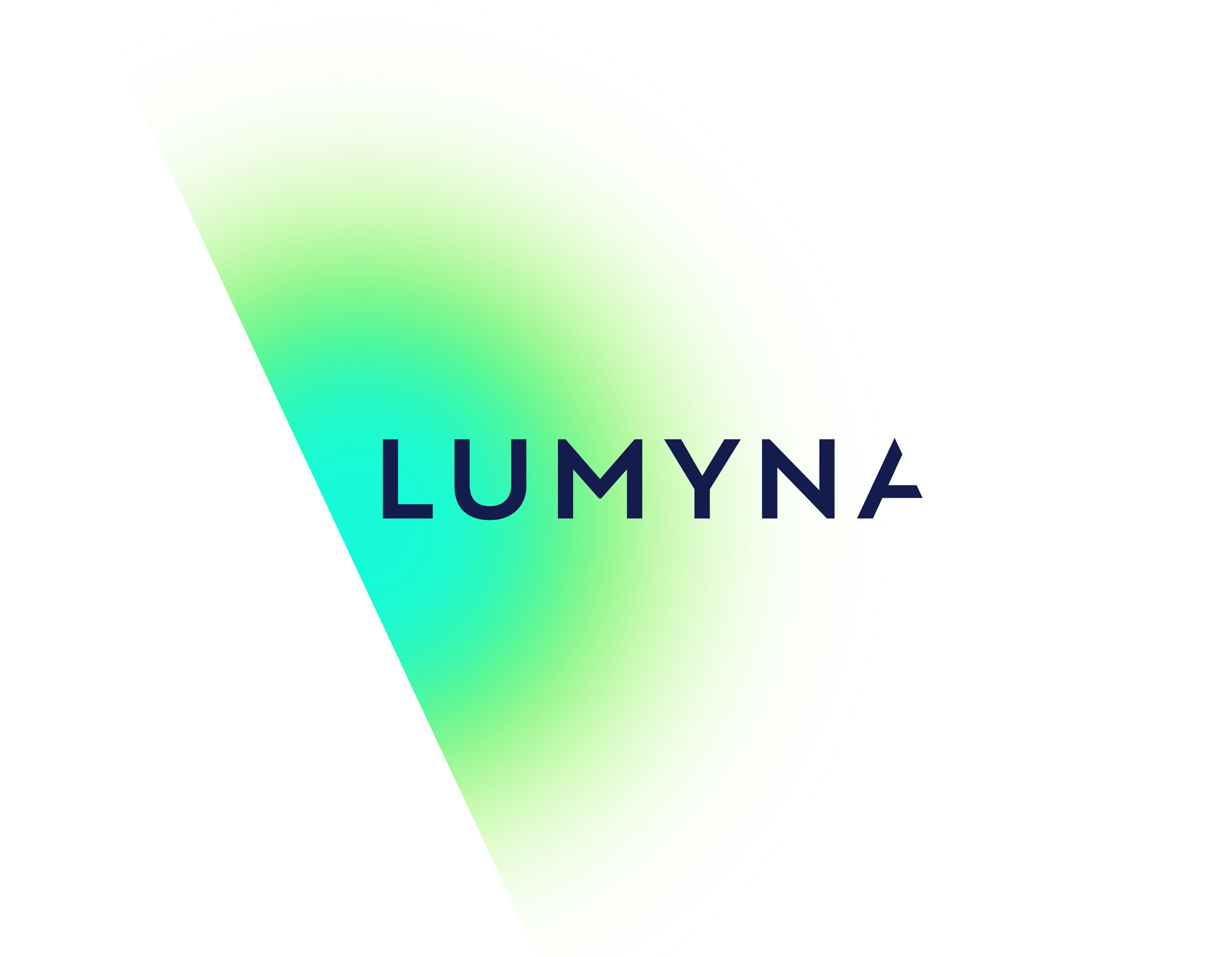
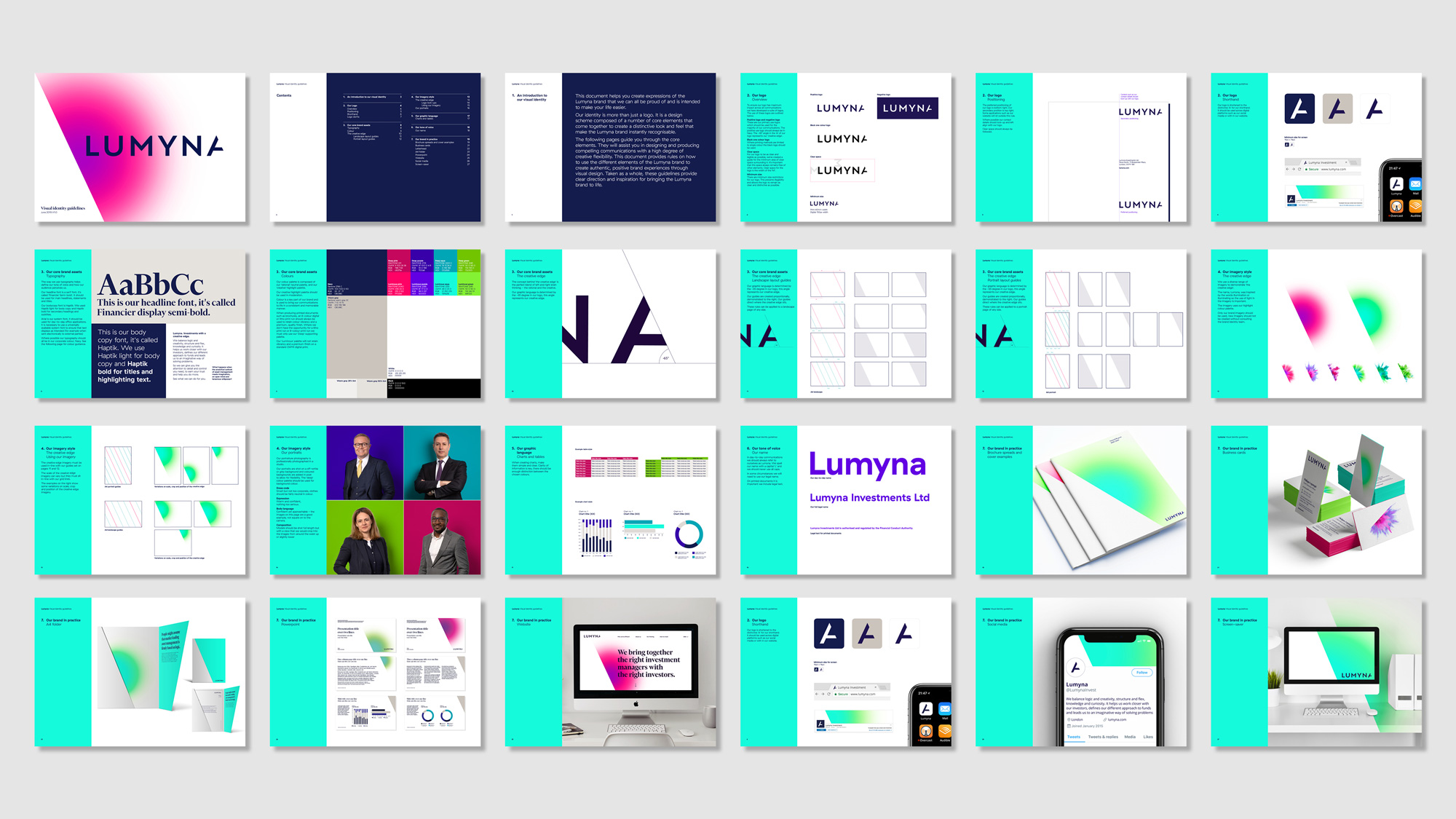
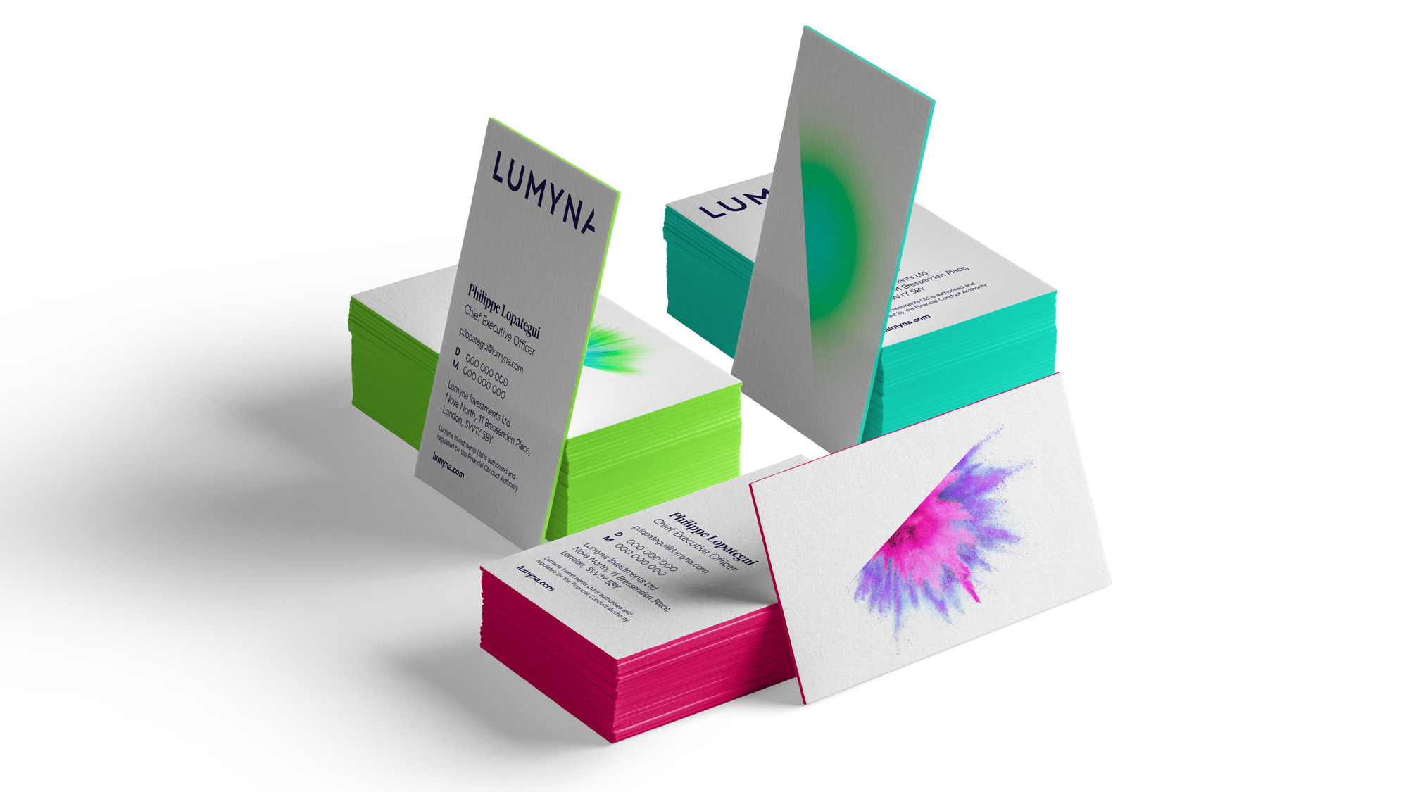
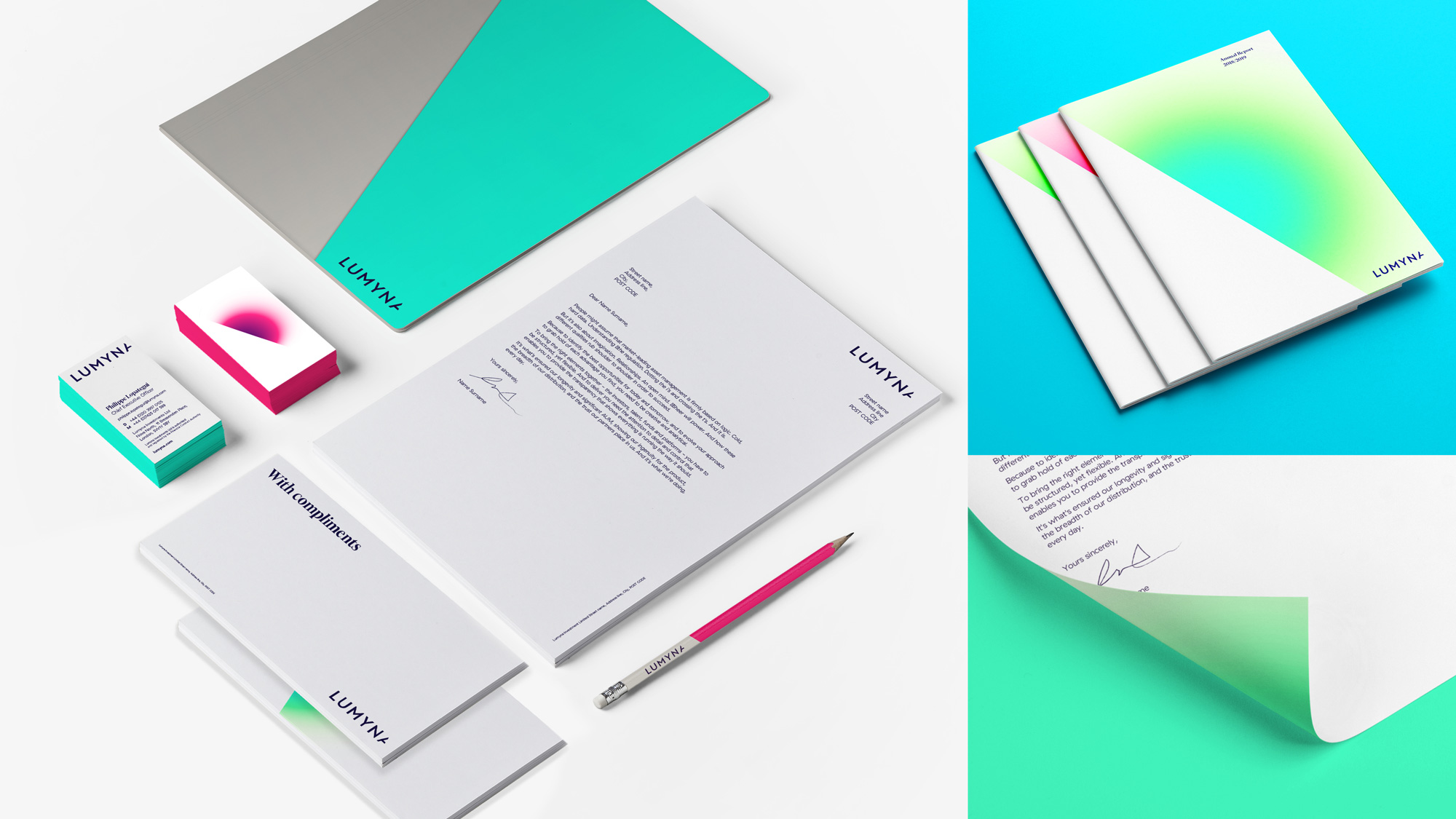
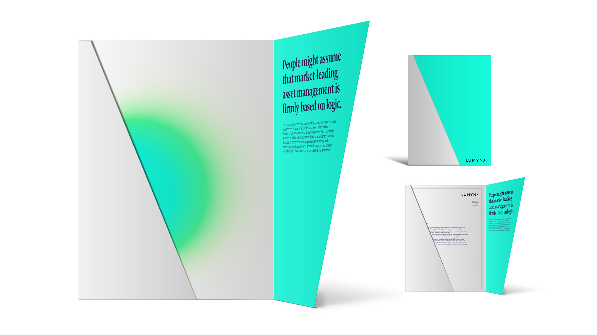
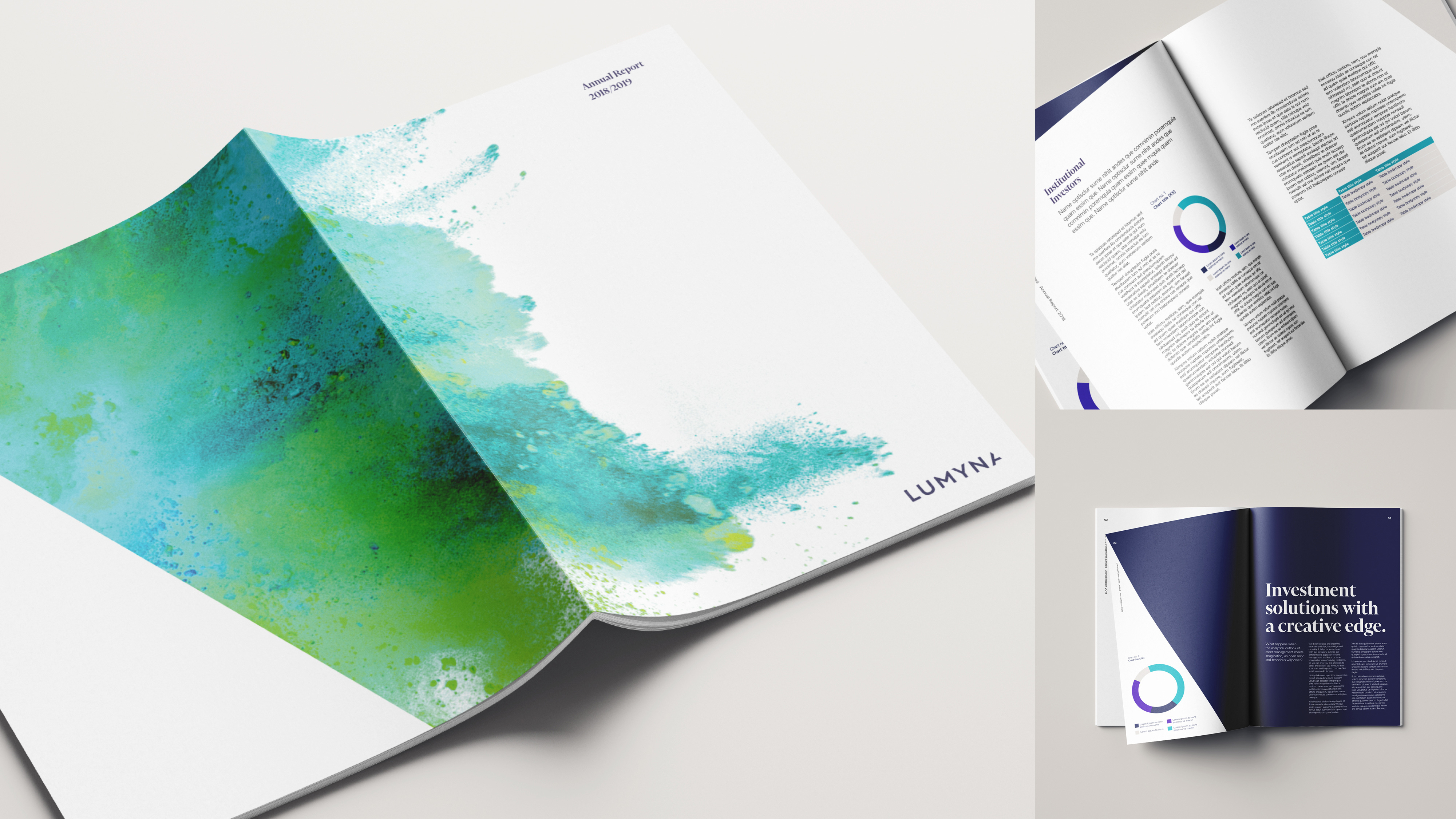
Not much point in dwelling about the old logo as it was more of a long department name set in the corporate font. The new name is alright… it does have a slightly pretentious corporate tinge with the whole “luminous” thing but I guess corporate gonna corporate. The one nice thing about the name is that it lends itself to a heavy angled approach given that all the letters in “MYNA” have strong diagonals. The cropped “A” is interesting, and it works best when one of the magic visual “bursts” emanates from it (as seen in the animation) but on its own it feels as if the logo literally got cropped. If one (or ideally more) of the letters in the logo had a similar treatment I think the effect would go over better. The bursts of stuff are cool — I like the gradients better than the more literal water/oil drops or exploding powders. The applications are fine — again, I react better to the gradients than the photographic stuff — and overall exude corporate-financial-ness. The accompanying serif is nice on its own and sort of works well on the website, but on the images above, it doesn’t quite gel. Overall, an effusive, decent corporate identity.


