
Noted: New Logo for Cinépolis

“C the Light”
(Est. 1971) "Cinépolis was founded in Mexico in the city of Morelia, Michoacán in 1971. Today it has positioned itself as the world's 4th largest movie theater circuit, operating 718 cinema complexes, 5,812 screens and over 1,018,724 seats across 14 countries worldwide. It was the first cinema exhibitor in the world to pioneer the concept of luxury movie theaters, establishing the first luxury theater experience in 1999 in Mexico City. Cinépolis aspires to provide its guests with the best overall experience in film entertainment and employs a global workforce of more than 37,900 people to support its mission. Cinépolis plans to continue to revolutionize the industry for years to come."
Design by
N/A
Related links
N/A
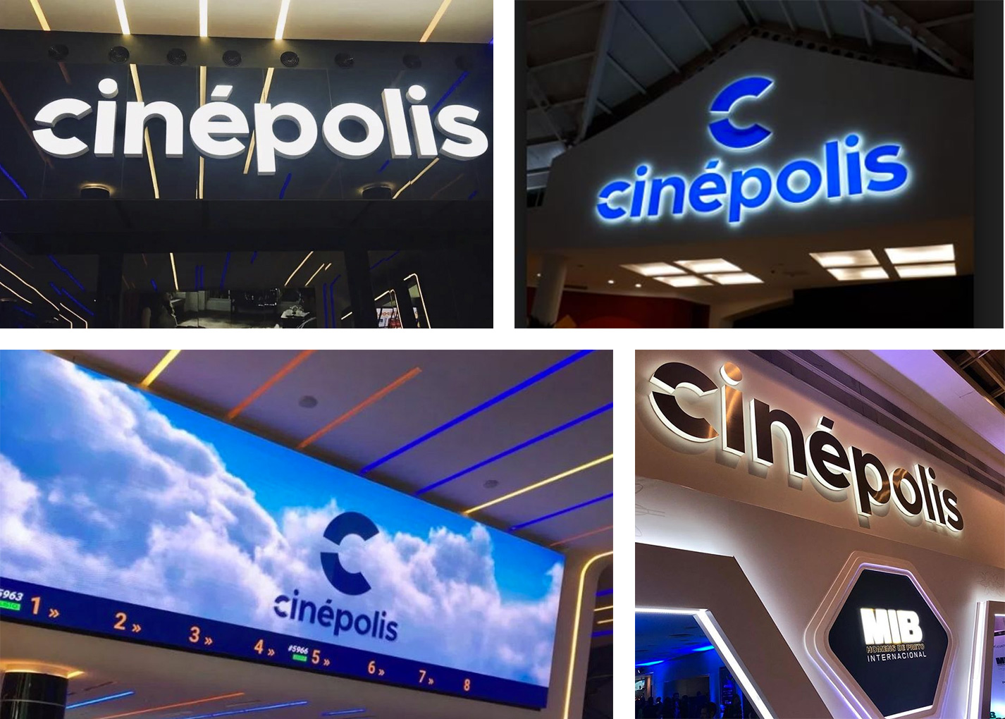
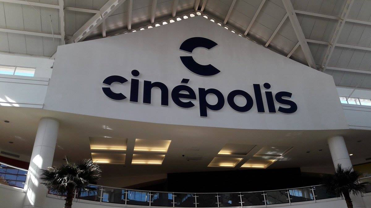
Images (opinion after)

Opinion
Cinépolis was the first major multiplex we got in Mexico City and I remember it being a huge deal and perhaps that makes me nostalgic for the old logo more than it should. Still, five strips of film yielding a star in the negative space is kind of dope, in an old-school-logo kind of way but, yeah, a fairly outdated concept now, especially as Cinépolis grows in such an insane way. I remember seeing a Cinépolis in New York (on 23rd street) a few years ago and being literally shocked, now there is one in Bahrain too, among other insane places where few other Mexican brands have expanded too. Anyway, I digress. The new logo is boring and generic but probably necessarily so in order to fit in as many markets as possible. I’m not defending it, and I wish it were a more interesting logo, but I can see the benefit of it being what it is. The “C” is meant to be a projection, I’m guessing and I suppose it’s fine. In some weird praise, I like the accent over the “e” but it doesn’t really have any relationship with anything else. When the monogram and wordmark are used together it looks really lame as the initial of the name simply gets repeated larger above it. The animations, I get that they can be used to fit different movie genres or seasons but they are a flex in every possible direction and lack any kind of cohesive conceptual or graphic premise to tie them together. The opening animation of the logo with the light peering through is the most interesting part. Signage applications are probably at the mercy of each location and what can be done but, in general, they feel a little cheap. Overall, a fine but somewhat sad redesign.