
Reviewed: Friday Likes 291: From Glasfurd & Walker, Studio Makgill, and Luminous Design Group

“From Glasfurd & Walker, Studio Makgill, and Luminous Design Group”
Some simple and straightforward projects this week, with work from Vancouver, Brighton, and Athens.
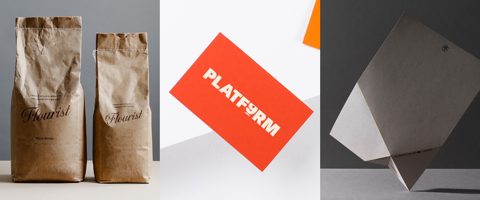
Flourist by Glasfurd & Walker
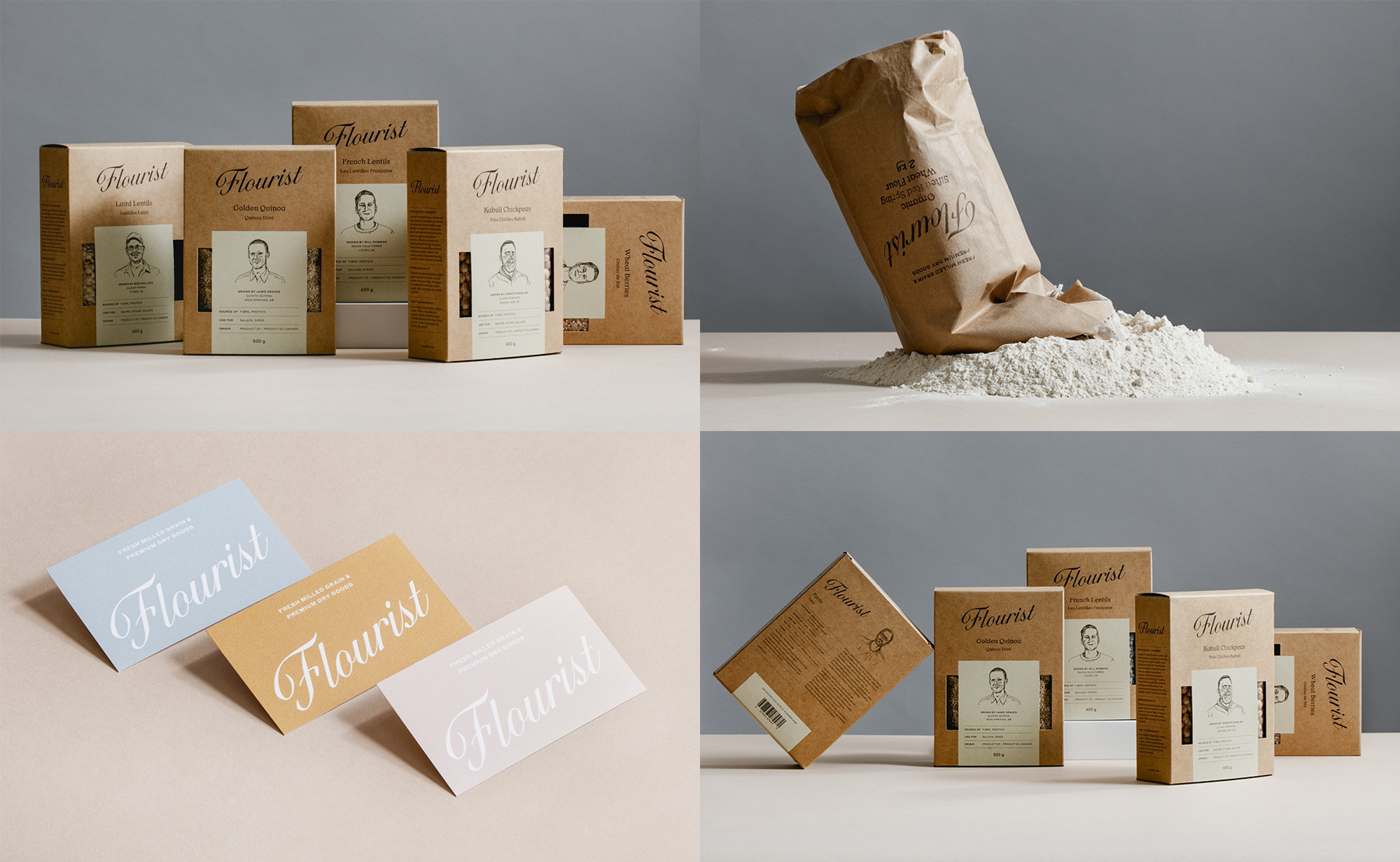
Flourist is a Canadian online retailer of grains, beans, and flours, sourcing only premium quality ingredients directly from the farmers who grow them. Their identity, designed by Vancouver, Canada-based Glasfurd & Walker, reflects the quality of the product through an elegant, classic script wordmark that almost feels like it's existed for decades, especially when used in the kraft bags. The boxes are quite nice too but I would have loved to see the same stark simplicity of the bags. The kraft, brown, and tan color palette has a great earthy feel and I like how the typography isn't full on vintage but rather more contemporary, mixing Commercial Type's Styrene with Or Type's Or Lemmen. Would love to bake me some of that. See full project
PLATF9RM by Studio Makgill
PLATF9RM is a co-working space with two locations in the UK, Brighton and nearby Hove. The name references Brighton's railway station, which has only 8 platforms -- so the non-existent 9th platform symbolizes "the dream of a better work-life balance". The identity, designed by Brighton-based Studio Makgill, revolves (literally) around a custom typeface made to reference the split-flap notice boards of train stations, best appreciated in the logo, with the number 9, slowly making its way up to reveal number 0, which in turn would serve as an "O" to read as "PLATFORM" but because we are such developed living beings we are able to read the full as "PLATFORM 9", which makes this a very satisfying logo. There is not much in application, but the simple technique of split-flap font creates a bold and consistent element to establish a distinct brand for this co-working space. See full project
Corphes by Luminous Design Group
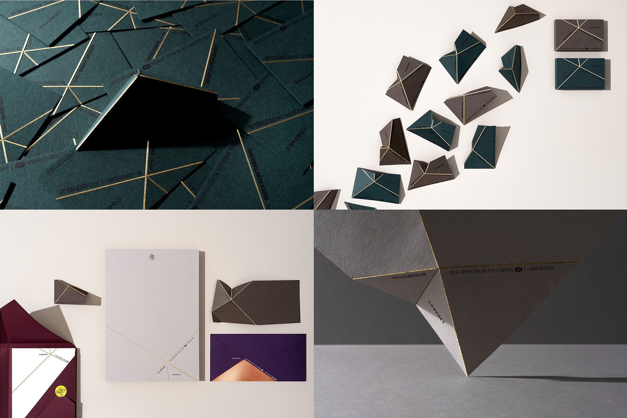
Corphes is a brand of organic products, from jams to spices to teas, from ingredients harvested in Deskati, Grevena, in Greece, the country's highest altitude farming area. The identity, designed by Athens, Greece-based Luminous Design Group, plays off of the Greek meaning of Corphes, which is "top", by creating a set of printed materials that have been scored at odd angles and can be folded to create low, wide-spanning, little mountains. The folds have been gold foil stamped to emulate the sun hitting the mountain's ridges and it looks glorious against the dark papers selected. I'll admit that this is more print production porn than anything but it's quite commendable that a print production trick can be transformed into an identity system across multiple applications. See full project