
Noted: New Logo and Identity for Cytomic by The Woork Co

“Connect the Lines”
(Est. 2019) "Cytomic is the business unit of Panda Security specialized in the largest enterprises, with the most advanced cybersecurity solutions and services: EDR, EPP, Threat Hunting, Investigation Service, Deep Learning and Behavior Certification for endpoints, processes and users. Thanks to Panda Security's 28 year history in the market, Cytomic has the collective intelligence, certifications and geographical scope needed to respond to ambitious international projects. Cytomic seeks to respond to the market's current cybersecurity needs, and more specifically, to the most advanced needs of customers in the enterprise segment. In fact, it was created in response to the natural evolution of Panda Security's business strategy."
Design by
The Woork Co (Madrid, Spain)
Related links
The Woork Co project page
Relevant quote
When a naming transports you to a certain visual symbology, it is difficult to give a twist and jump ahead from the obvious brand visual resources but that was part of the challenge. Thanks to that deep knowledge, we are aware that Cytomic confronts cybersecurity as a systemic reality and their expertise resides in seeing the relation within events on processes, so we focused ourselves in the unions, not the events. In other words, links, not atoms.
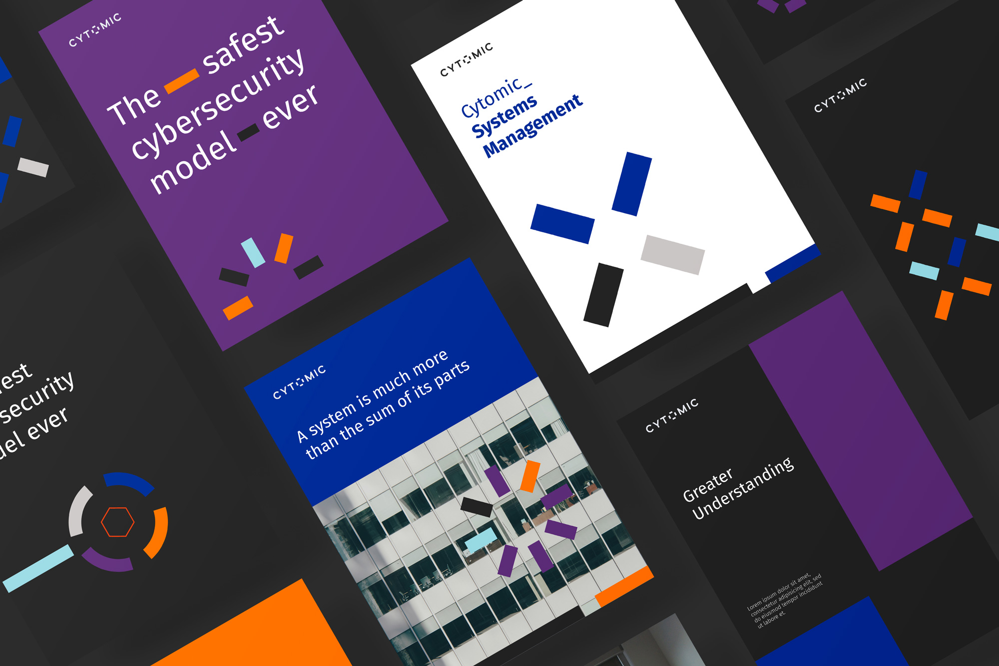
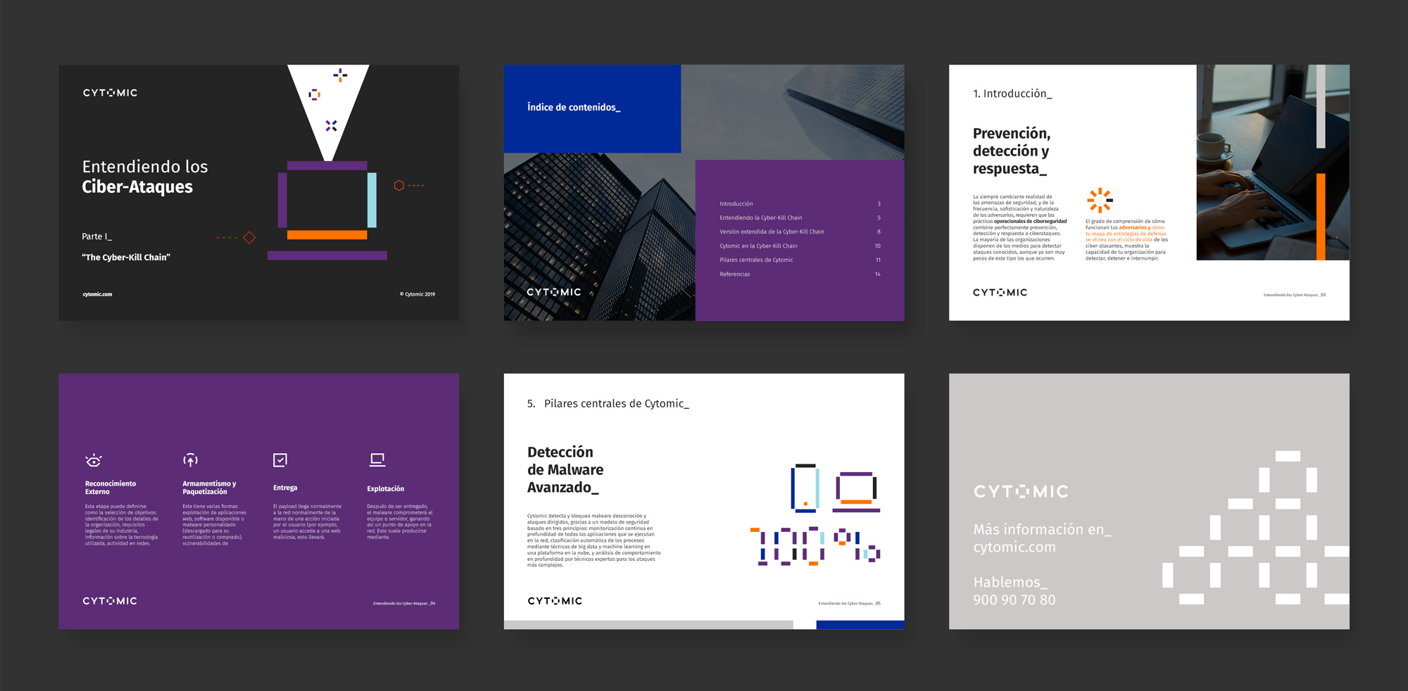
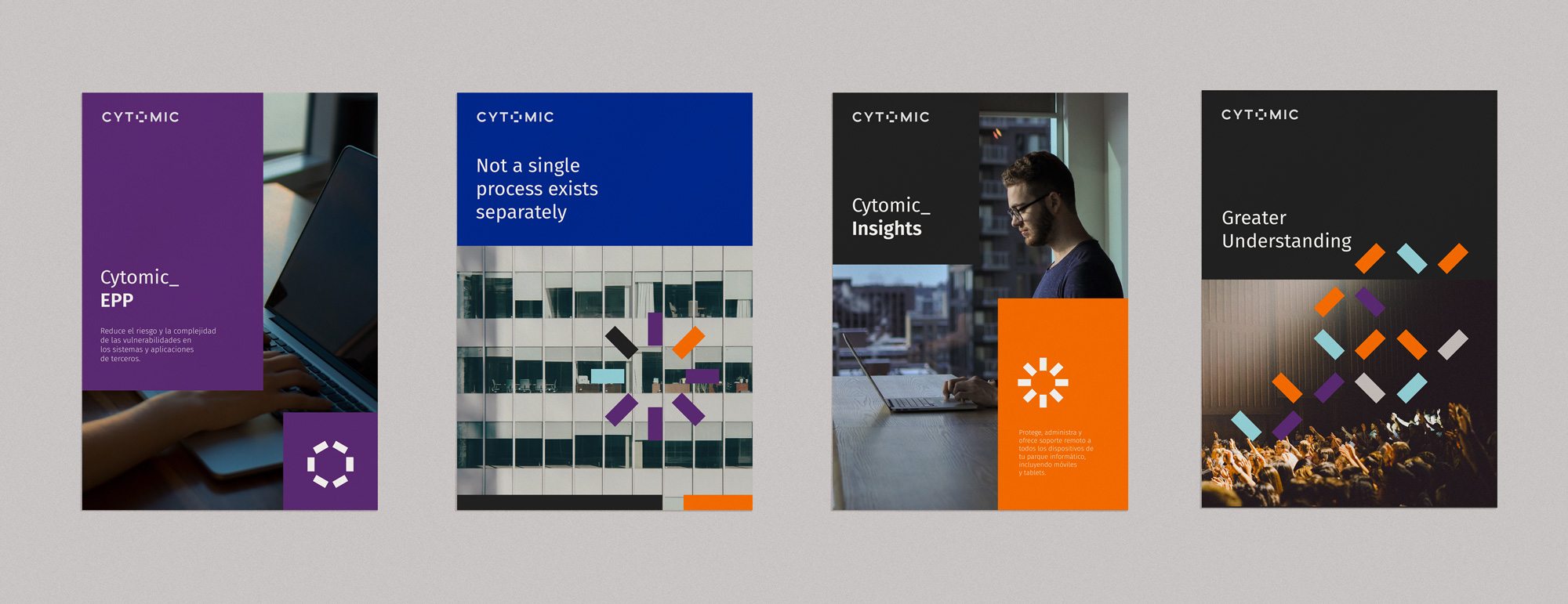
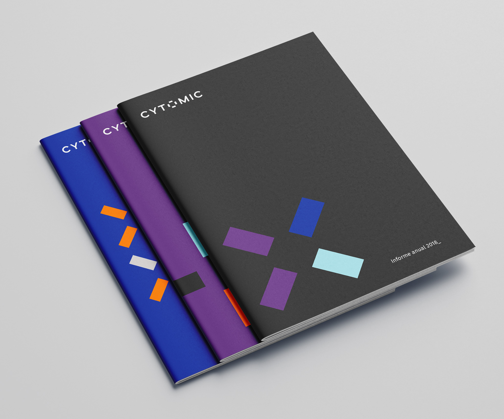
We built a simple visual system based on those connections and we created a brand recall on the letter “o” on the logotype giving result to a bold yet simple symbol. The palette is dark on main colors and powerful and different on accents to achieve brand awareness within its category.
Images (opinion after)

Opinion
I really like the new logo and how the combination of the slightly cryptic, slightly end-of-the-world-y name with the techie/bitmap “O” gives the company a very distinct personality that fits very well within the notions of the cyber security industry. Execution-wise I love how the bitmap “O” extends beyond the baseline and cap height, how it uses the same thickness as the rest of the letters, and how well balanced its spacing is to not overpower the wordmark. The “O” then expands into a system of bitmap icons that connect neatly in animation and provide great graphic bursts in some of the applications, which are all quite nice, especially those annual report covers. Overall, I feel like this identity is way better than it needed to be — meaning that, being a sub-brand of a large brand for only one segment of its audience, it could have easily gotten a throwaway identity but instead it’s thoughtful and bold, elevating the product and making it more enticing to the enterprise customers it’s aiming to reach.