
Noted: New Name and Logo for Jamba

“Off the Juice”
(Est. 1990, previously Jamba Juice) "Jamba is the global lifestyle brand leader serving on the go freshly blended fruit and vegetable smoothies, made-to-order bowls, fresh-squeezed juices and shots, boosts and bites. Jamba, through its subsidiaries, is the franchisor of more than 850 locations operating in 36 U.S. states, as well as the Philippines, Taiwan, South Korea, Thailand and Indonesia."
Design by
N/A
Related links
Jamba press release
Relevant quote
When Jamba Juice started 30 years ago, a juice shop meant something completely different than how our guests see them today. Juices will remain on the menu, but Jamba Juice is shortening its name to reflect its expanded menu that features smoothies, juices, bowls, boosts and fun size on-the-go bites. Our loyal fans have been calling us Jamba for years, but the name change officially kicks off today with updates to our website and menus.
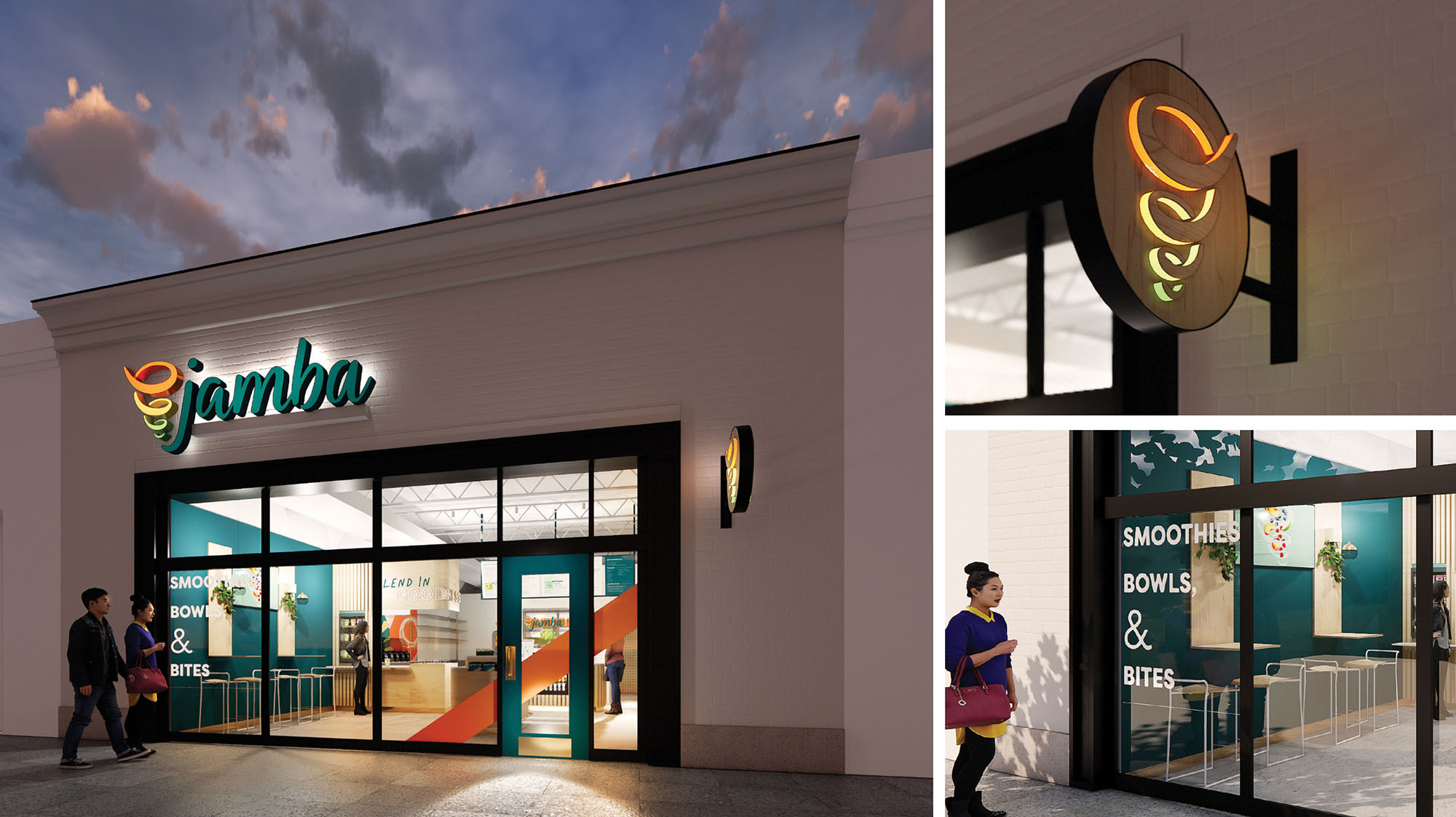
The new logo and whirl is a modern interpretation of our classic Jamba logo and features clean, handwritten script, new emerald green brand color and our evolved “Whirl” that draws from the beautiful hues of the fruits and vegetables we use every day.
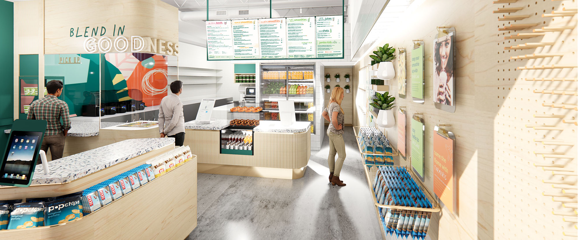
Images (opinion after)
Opinion
The main attraction in this update is the name change, with the company going from “Jamba Juice” to “Jamba” drawing inevitable comparisons to “Dunkin’ Donuts” changing to “Dunkin’” last year. I’m not a big smoothie consumer so I’m not a recurring patron but I have always called it the full name, Jamba Juice, and in my limited interactions with the people of the world I have never heard anyone refer to it simply as Jamba. I don’t get out enough, so I may be completely off base on what people call it. Regardless, Jamba, alone, is not a name I want to say over and over, especially out loud. It sounds weird. Somehow “Juice” made it more palatable to say. The old logo was… exuberant, with its large, colorful swirl and 100% questionable typography that should never have existed, yet Jamba Juice owned it and made it work. The new swirl is fine… decently drawn and easier to use and reproduce. I would even go as far as saying that I like how it’s nestled in the “j” looking like a smoothie in a blender. The wordmark is also mostly fine, in a decent, charming script. I don’t like it but I also don’t hate it. From their renders and their website, it looks like they have a hand-drawn font thing going on — Charleston from Creative Market — that’s relatively pleasant and okay to look at (although it’s a typeface screaming for contextual alternates). Overall, it’s an acceptable evolution that conforms to retail standards and signals a new era for the 20-year-old brand.