
Noted: New Logo, Identity, and Livery for Chair by Branders

“Sitting in a Chair in the Sky”
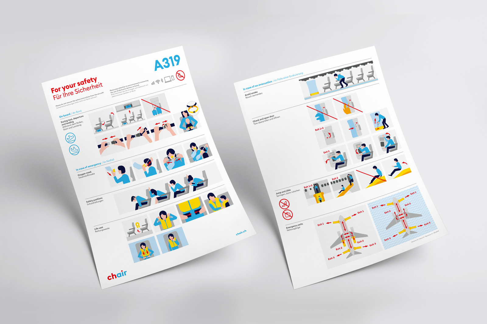
(Est. 2019, previously Germania Flug) "At Zurich Airport, Chair Airlines operates a fleet of three Airbus A319s, each with 150 Economy Class seats. The average age of the aircraft is 10 years. As a charter airline, we offer our passengers flight connections for beach holidays to hot water destinations and short city trips. We also build the bridge between Switzerland and the home of our passengers on special routes. Chair Airlines is also a reliable partner for special flights and ad-hoc charters, for example for sports clubs, special events or companies. At Chair Airlines, the focus is on people - our passengers, our more than 150 employees and our partners. Our experienced pilots and competent flight attendants on board as well as a highly qualified administration team on the ground ensure safe and smooth flight operations and do their utmost to make the flight experience as pleasant as possible for the passengers."
Design by
Branders (Zurich, Switzerland)
Related links
Branders project page
Relevant quote
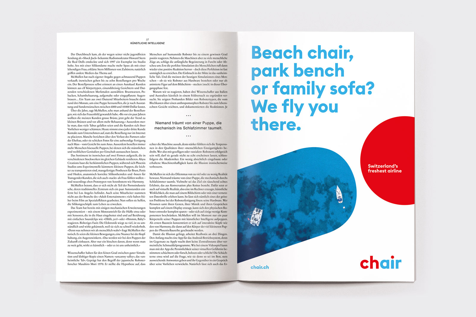
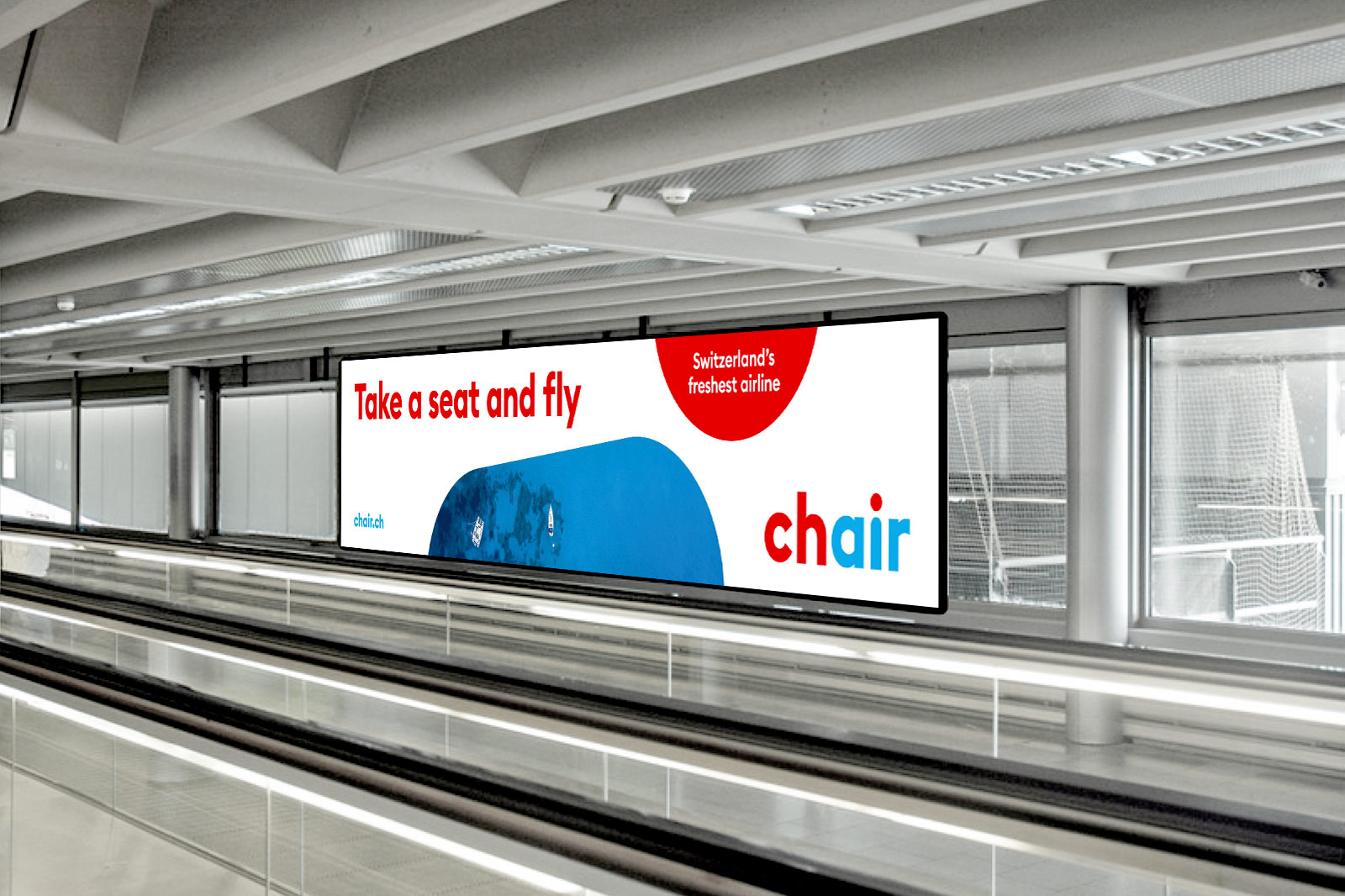
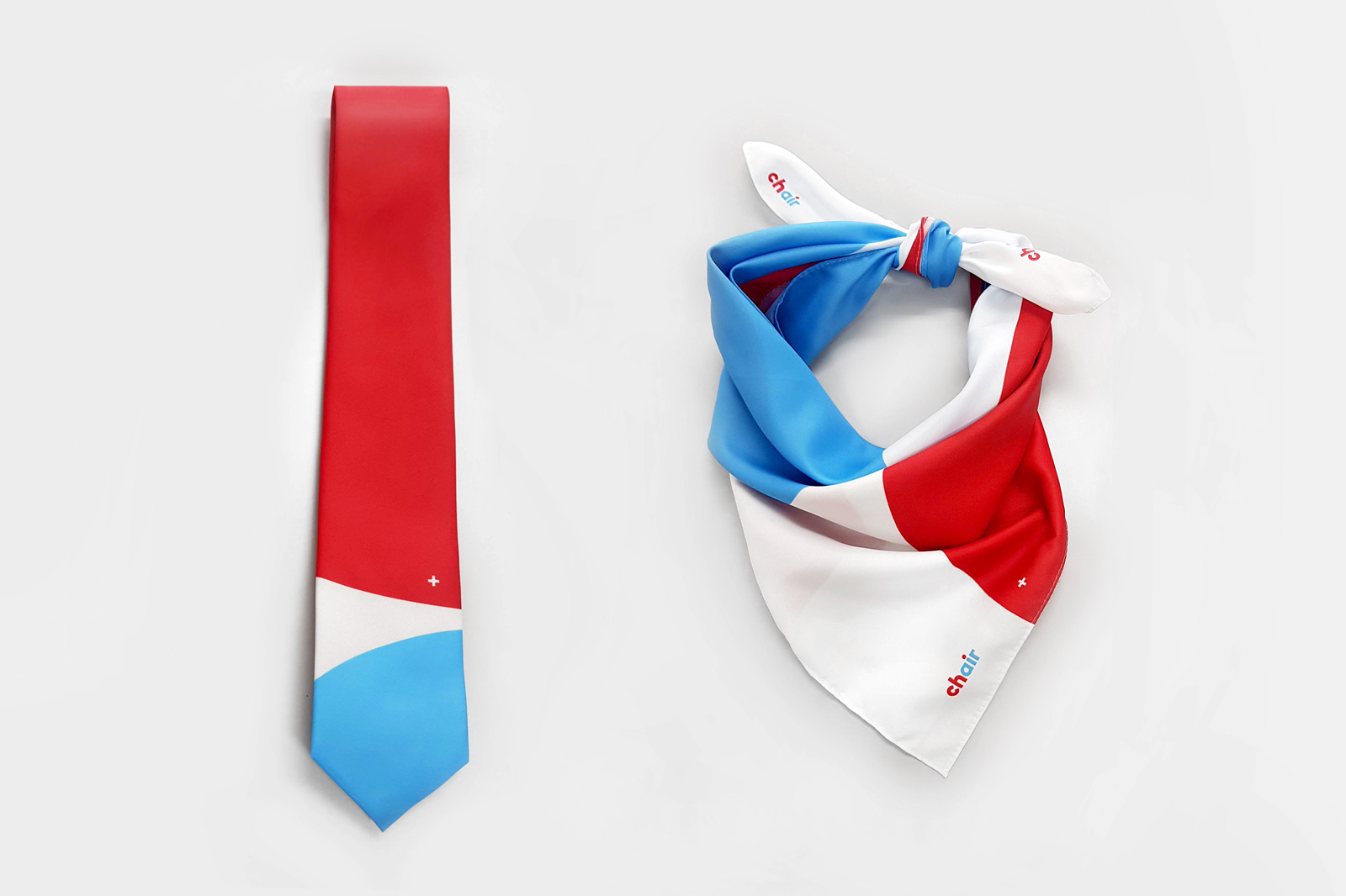
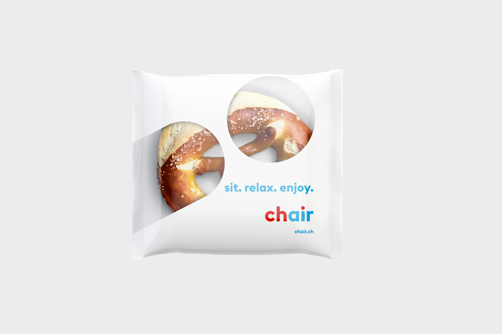
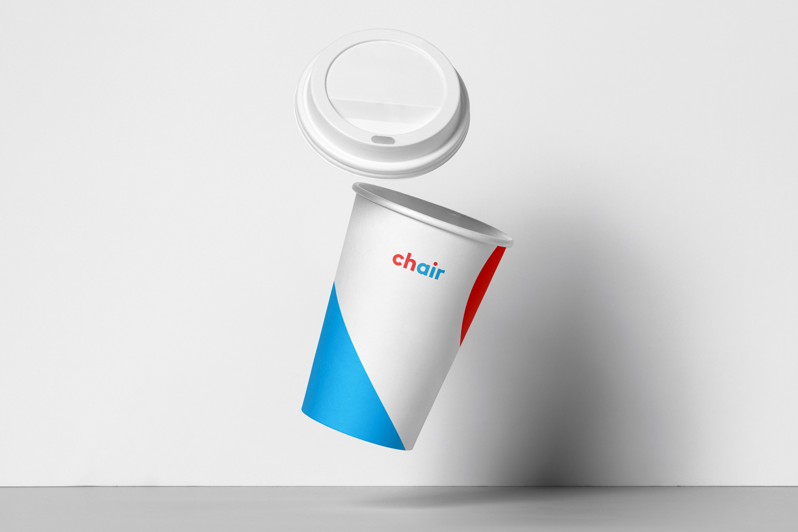
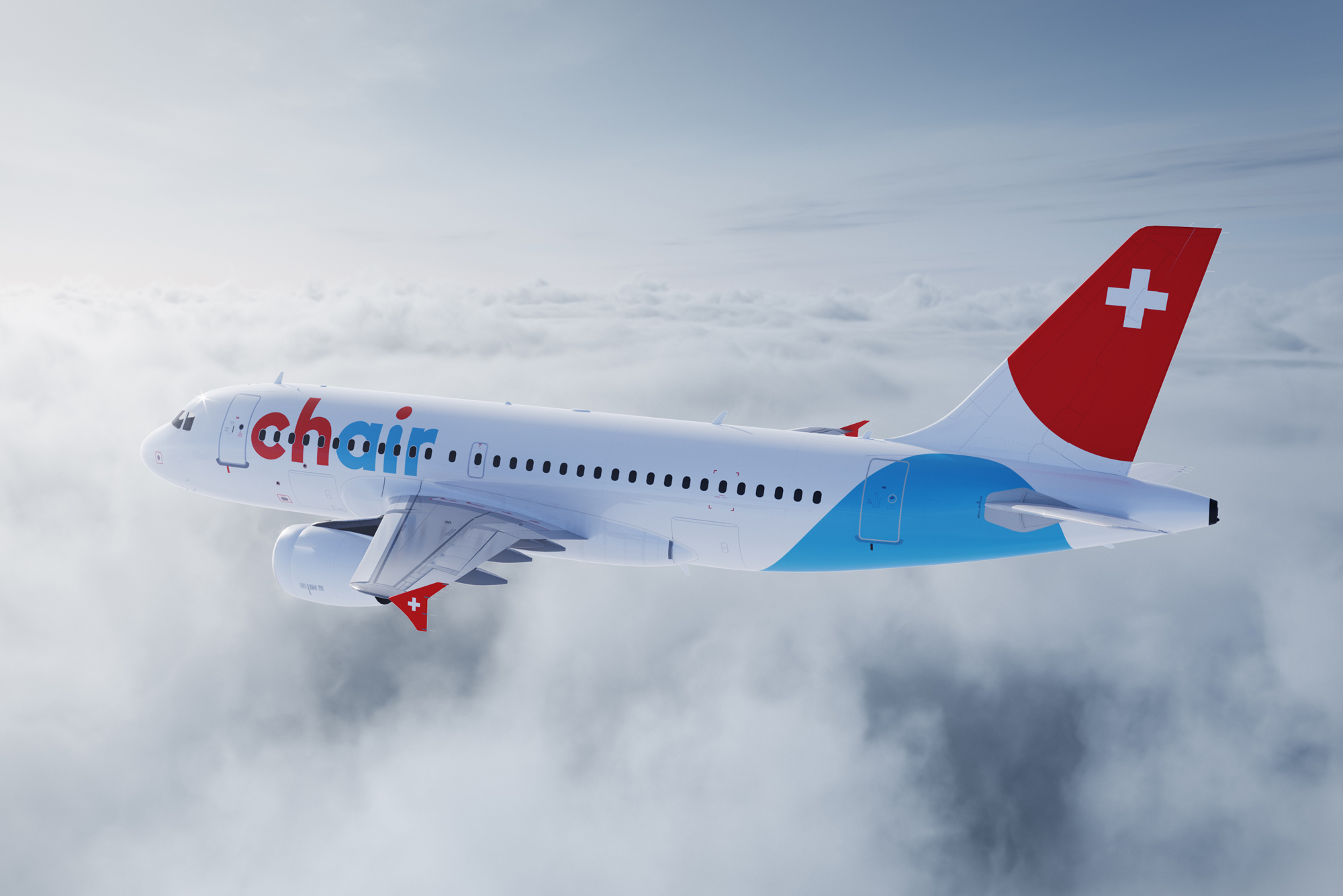
The name Chair - the English term for “chair” - has been deliberately decided. The chair is emblematic of the seat in the plane, while the color separation of the red “ch” and the blue “air” in the logo alludes to the Swiss origin of the airline. With the name, we also bring the brand essence of the airline into focus: It is a young, uncomplicated and dynamic company, which maintains a happy, humorous and respectful and familiar with its partners, customers and employees and here and there once something cheeky appearance. This dynamic spirit is also felt and visible in the new appearance.
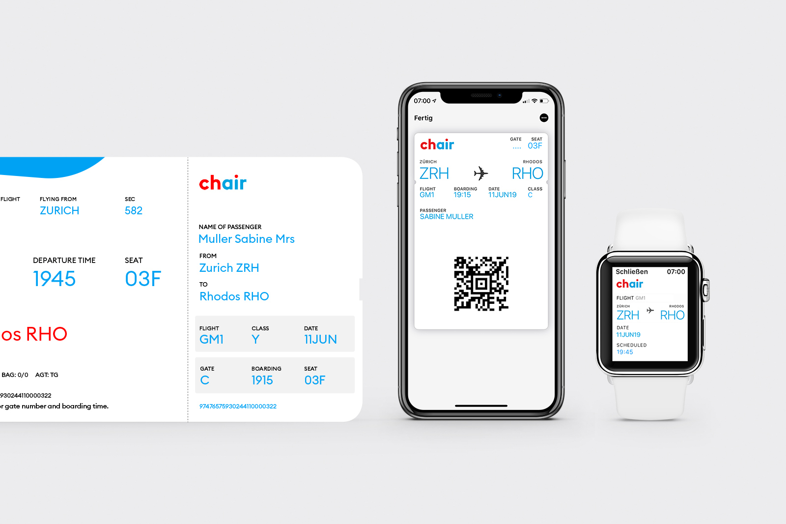
Chair’s font communicates with its round forms of closeness and modernity and is red as Switzerland and blue as the sky. The “i”, whose red dot establishes the connection to the Swiss logo "ch", becomes a super sign: a symbol of a relaxed passenger leaning back in the aircraft seat is a red dot and a blue line as the basis of a dynamic and flexible design system.
Images (opinion after)
Opinion
There isn’t much of a point in delving too deep into the old logo as the Germania brand has disappeared but let’s assume that the opinion would not have been favorable in any way. The new airline brand kicks things off with a very unusual name, Chair. As in the English word for the things you sit on. For a Swiss brand it’s interesting that they opted for such an English name but the playfulness of the “ch” embedded in the name — CH is the country code (and top level domain for websites) of Switzerland, standing fo Confoederatio Helvetica — and highlighted in the logo is a fun payoff. I wish there was something more unique to the logo than what looks like either a boldened Lineto Brown or another lookalike. I mean, it’s fine and the “ch” properly stands out, but it somehow feels unfinished. One detail that isn’t fully evident in the application is that the “i” in the logo, used at an angle outside of it, is meant to be a person reclining on a seat — which in some of the applications it looks like it’s reclining on a La-Z-Boy and not a 3-degree-recline airplane seat. The bright blue and red combo look peppy on the generous use of white space and create a proper low-cost carrier vibe with a few nice details here and there, like the cups and livery that use an extra large cropped version of the “i” that becomes more of a set of abstract shapes. Overall… unexpected but good, in a quirky, charming way.
NB. I don’t usually explain the titles of the post but this one is a little more obscure: Louis CK on people complaining about flying.