
Noted: New Logo and Packaging for Wato by Essen International

“Wato Undo the Bridge”
(Est. 2019) "Wato, available in Sweden, was created with the purpose of filling a vacuum in the market within functional drink. The first sugar-free and carbonated liquid substitute with or without caffeine, with the aim of being able to offer a more tasty and delicious alternative 'on the go' than traditional energy drink alternatives." (Google-translated)
Design by
Essen International
Related links
Essen International project page
Relevant quote
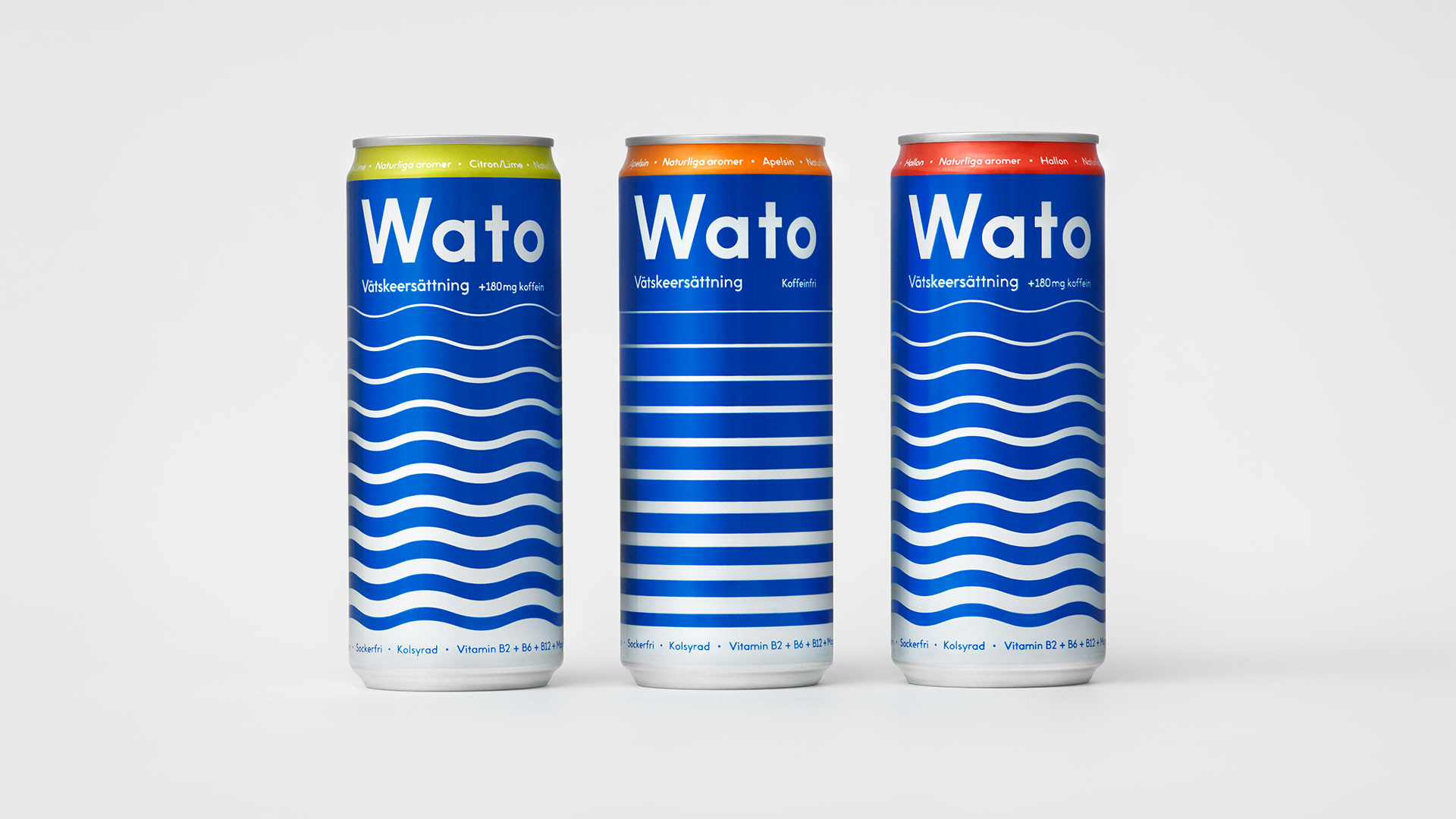
As with other functional drinks, Wato is great for the athlete. But it’s also great for the sunbather, the car sick and the party animal. Instead of simply enhancing performance, Wato restores no matter the cause. In a segment abundant in loud visual expression, we decided to go with a cleaner solution catering a broader target group. The visual identity springing from the product’s main benefit. Rehydration.
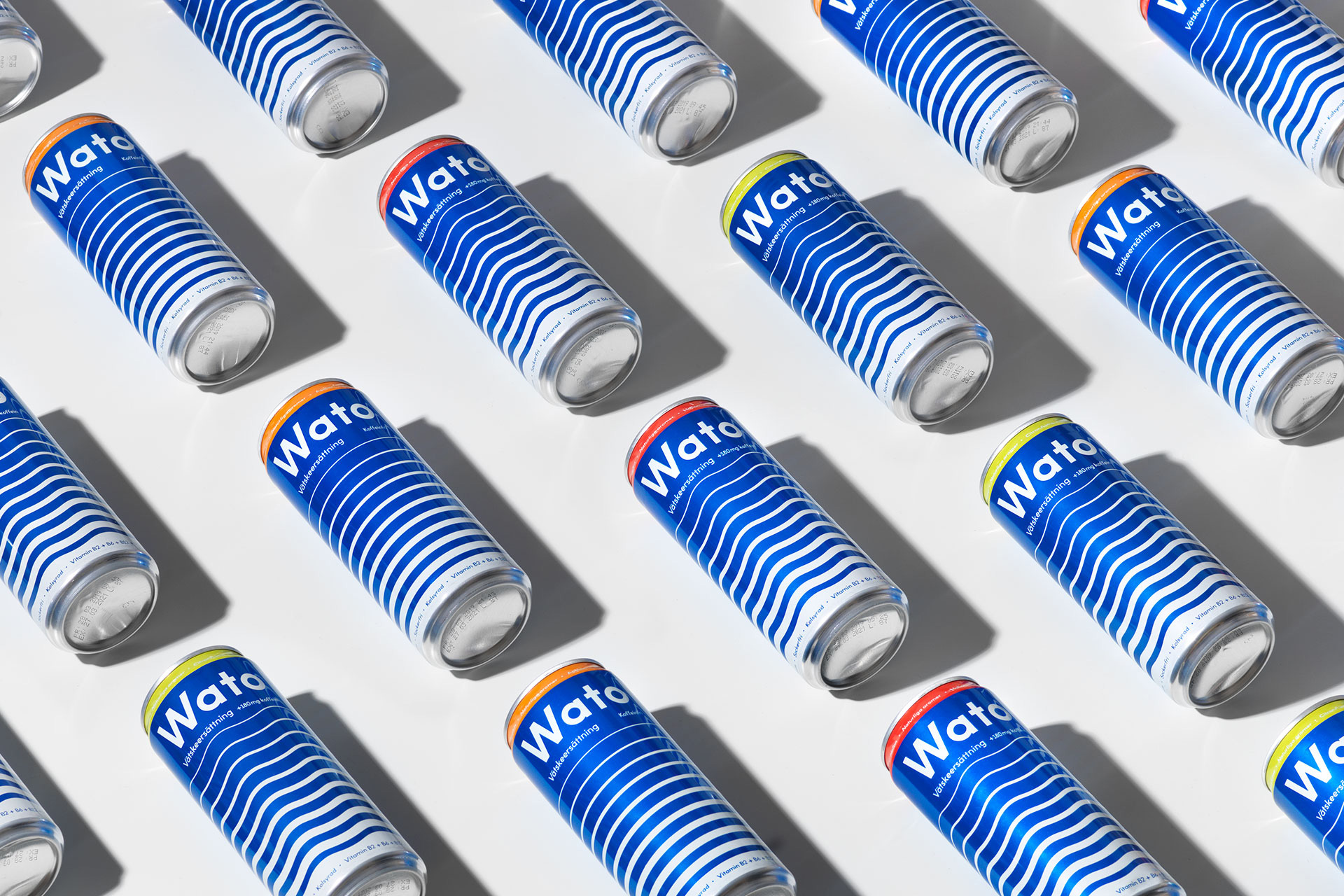
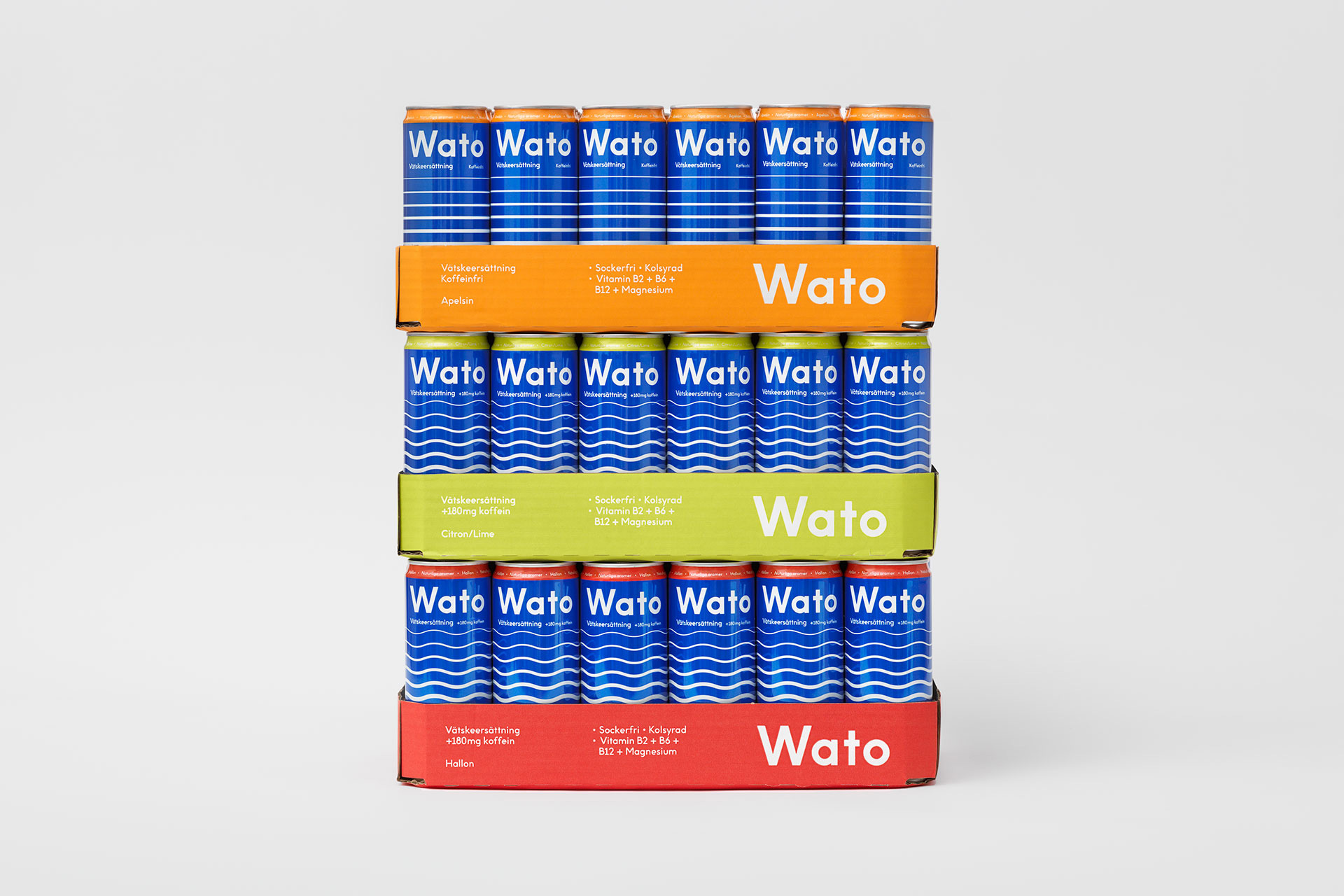
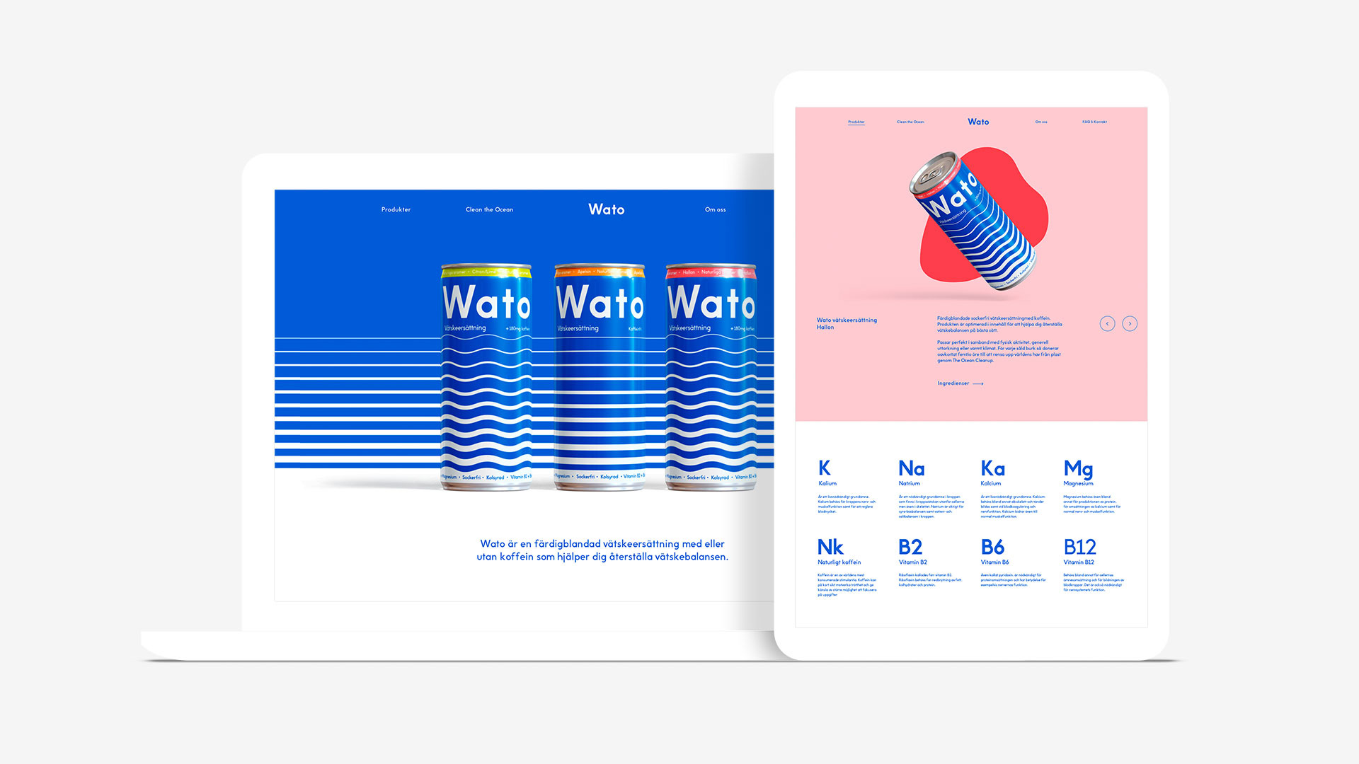
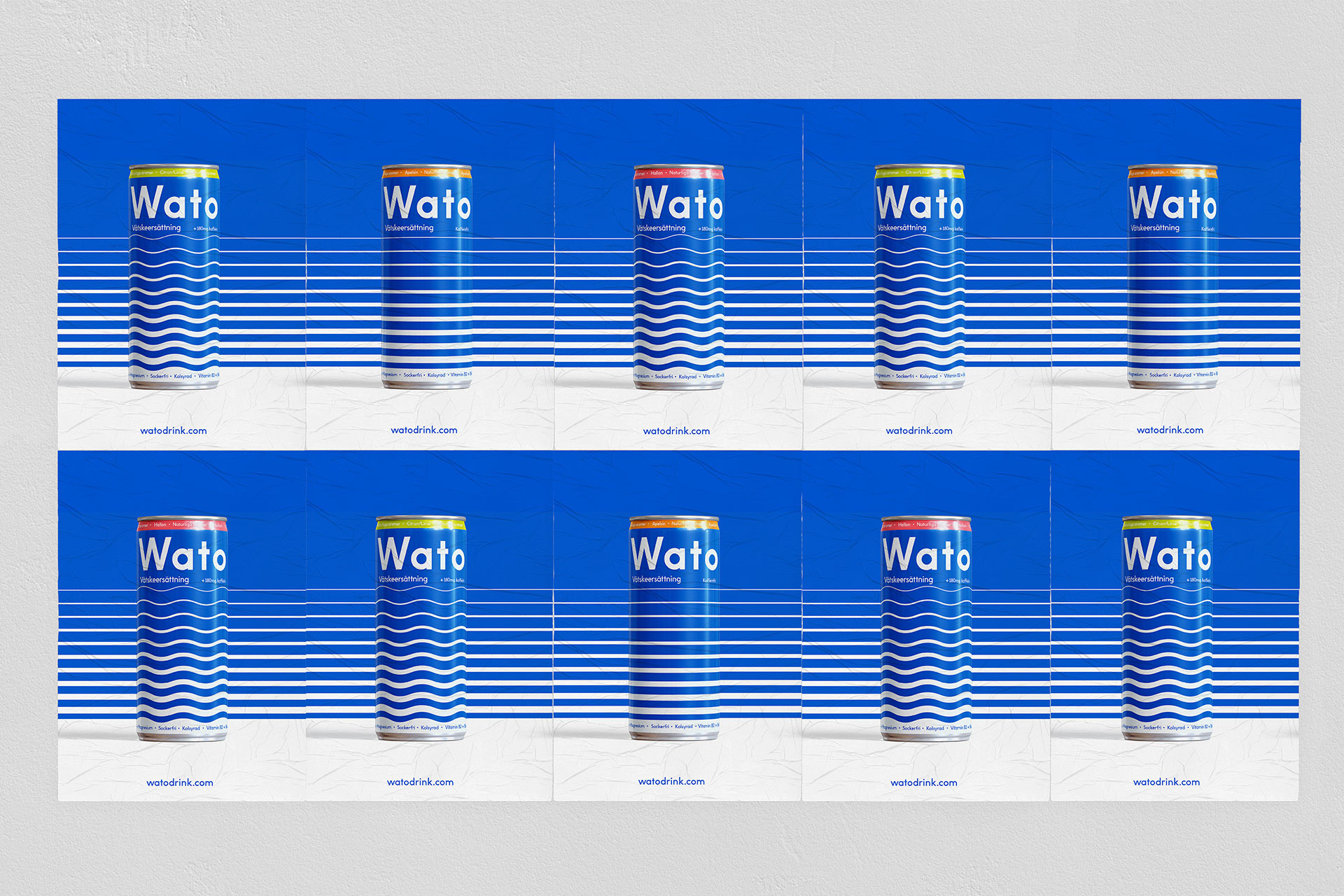
The keystone of the visual identity is a graphic pattern depicting the movement of water. In the packaging design, the wavy and straight lines represent products with or without caffeine. Different flavors have their own identifying colors, without losing sight of the big blue. The promotional website is the packaging in a digital format, mirroring the product itself. A visual identity making waves on the store shelves.
Images (opinion after)

Opinion
The logo on its own isn’t the most exciting thing — even on the packaging it’s not the most exciting thing — but, in the context of an energy drink, its spareness is somewhat disruptive. The wave graphic on its own isn’t the most exciting thing either but on the packaging it does actually look great. In a way I feel like this is a comp many packaging designers have done at some point for a drink product, showed it to their clients, and got rejected for being too simple or too barebones or too obvious and maybe it’s indeed all of those things but, yeah, those cans look fun and cool. I like how the caffeine versions are wavy and the non-caffeine are straight — maybe it’s too subtle a distinction but this is the Swedish market and I have more faith in them to pick up on it than the American market. The flavor bands are the one thing I really don’t like — I think that was an opportunity to somehow bring all the elements together instead of just slapping on a tiny band of color. Nonetheless, I dig this, and I think it manages to stand out in the energy drink category while emphasizing its hydrating-ness.