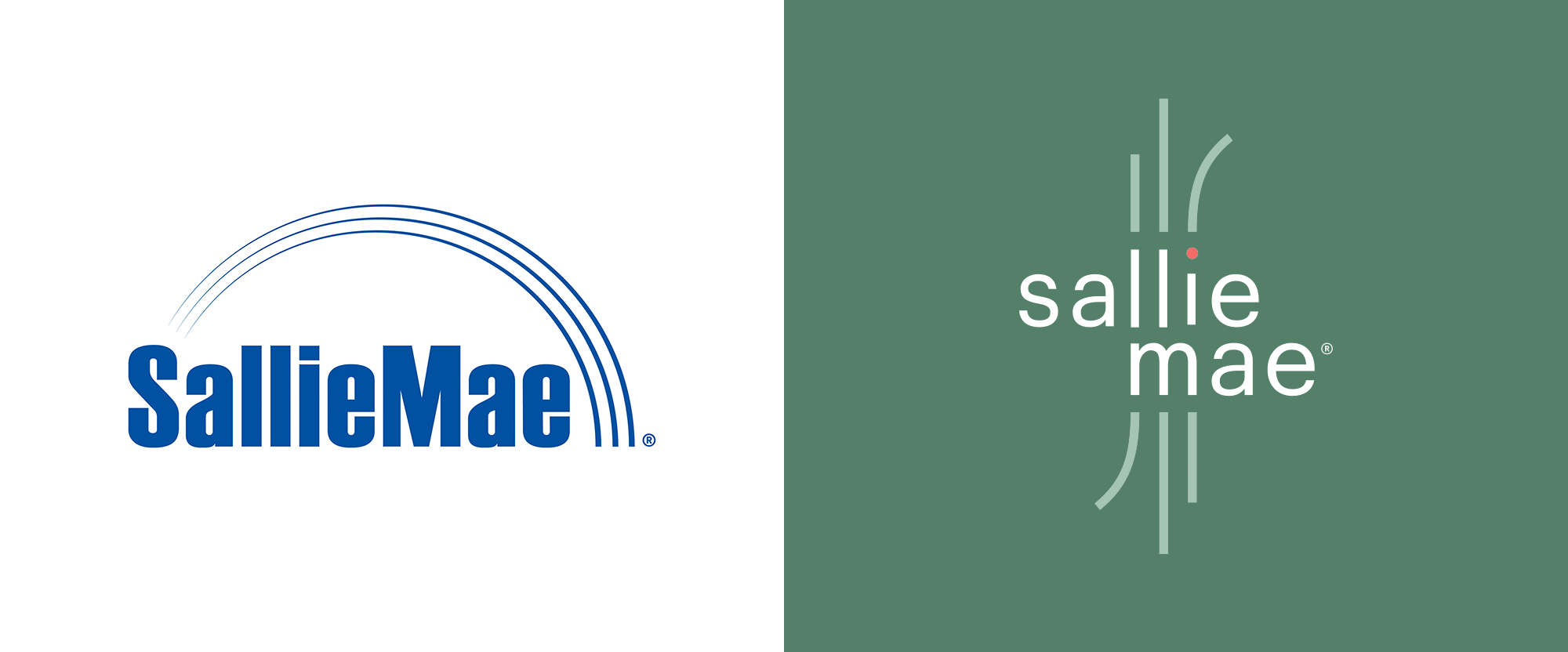
Noted: New Logo for Sallie Mae
“No, You Mae Not”

(Est. 1972) "Sallie Mae believes education and life-long learning, in all forms, help people achieve great things. As the leader in private student lending, we provide financing and know-how to support access to college and offer products and resources to help customers make new goals and experiences, beyond college, happen. Learn more at SallieMae.com. Commonly known as Sallie Mae, SLM Corporation and its subsidiaries are not sponsored by or agencies of the United States of America."
Design by
N/A
Related links
New-logo-coming page
Sallie Mae press release
Relevant quote
The new brand experience will feature a new Sallie Mae logo that symbolizes customers’ life journeys through flexible, differentiated storylines, and a new font in lowercase. The coral dot represents the customer and serves as a starting point for their path, wherever it may take them, and how Sallie Mae can help them on their way.
Images (opinion after)


Opinion
Student loan companies get no sympathy — and I’m not saying they they should get some, no, I am saying it’s warranted — so anything related to that industry comes with a heavy bias for sucking. Take the old logo: it sucked. More objectively, perhaps the wordmark wasn’t bad but the swoosh-gradient-rainbow certainly was as a kind of corporate abstraction to… to I don’t know what really. The new logo evolves the three lines into paths flowing into and emanating from the new wordmark, which, I’m sad to admit, it’s not a bad idea conceptually with the “journey” rationalization and, execution-wise, it’s been done fairly decently with the three lines creating a flowing unit along the “lli” and the “m”. (Some of you might point out the shorter “i” that’s above the baseline and I’m guessing it’s a file mistake, which I could have corrected under the benefit of the doubt that it was a mistake but chose not to because it deserves to be pointed out.) The loose letter-spacing is a little too loose but it’s what makes the lines work. I’m not saying it’s a great logo but it doesn’t entirely suck unless you start to look at it as a superficial attempt to make Sallie Mae more endearing, which is exactly what it’s doing and, no, thank you, but props for trying. The biggest problem with the logo will be its implementation as it’s an odd composition that requires a lot of real estate, especially vertically, to work. The photo style (and the logo colors) hint at a decent color palette that is not the typical colorful approach. Once this gets fully rolled out there might be a benefit to doing a follow-up — we’ll see.

