
Linked: IKEA goes with Løgo-ås-Windöw

Visit Link
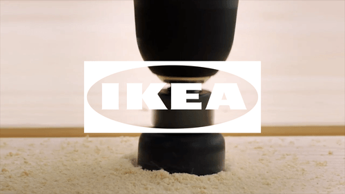
72andSunny Amsterdam has created a new expression of the IKEA logo. Dubbed "The Fönster", it can now interact with images and video inside and underneath it and without the classic yellow and blue color combo. (Link goes to Brand New on purpose as extra info and video is in this post.)
As part of their successful pitch to lead the design strategy for IKEA logo optimisation, 72andSunny Amsterdam has created a dynamic application of the IKEA logo called 'The Fönster'. The Fönster forms part of a logo system that is designed to reinforce and integrate the brand into modern touchpoints.
Fönster (Swedish) translates into English as "Window" and is designed to reflect the point at which IKEA connects with the world, and the world connects back with IKEA. The transparency reflects core IKEA values of openness, curiosity and optimism that have been central to the brand as they strive to create a better everyday life for the many people.
The Fönster complements the existing and iconic IKEA blue and yellow logo (also optimised as part of the recent process). It will be used to tag and brand IKEA content that isn't consumed in traditional channels by highlighting specific details, providing different perspectives and complementing work created with any increasing array of partners and collaborators.
Being white and transparent, The Fönster neatly integrates into the beginning, middle or end of digital content, clearly signalling the IKEA Brand and creating more opportunities to integrate the brand with emotional stories.
The Fönster builds on and formalises behaviour that was starting to happen naturally by providing a set of design and implementation guidelines for anyone working with the IKEA Brand.