
Noted: New Logo and Identity for AZ Museum by ONY

“The A to the Z”
(Est. 2013) "The AZ Museum is a private museum dedicated to a single artist, Anatoly Zverev. Its collection grew around the personal collection of Natalya Opaleva. In 2013, Aliki Costakis, daughter of the famous collector George Costakis, donated over 600 works by Zverev to the museum, along with archival materials from her father's collection. Today, the museum owns over 1,500 works by Anatoly Zverev and over 500 works by non-conformist artists of his circle (Plavinsky, Nemukhin, Rabin, Krasnopevtsev and many others)."
Design by
ONY (Moscow, Russia)
Related links
ONY project page
Relevant quote
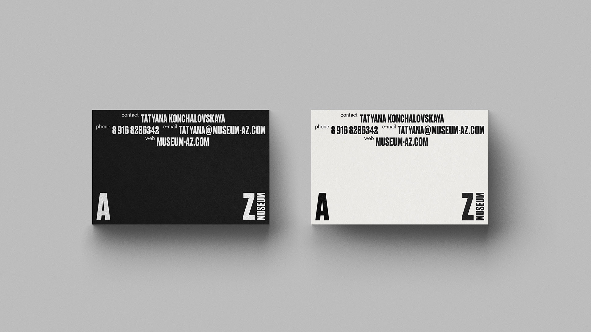
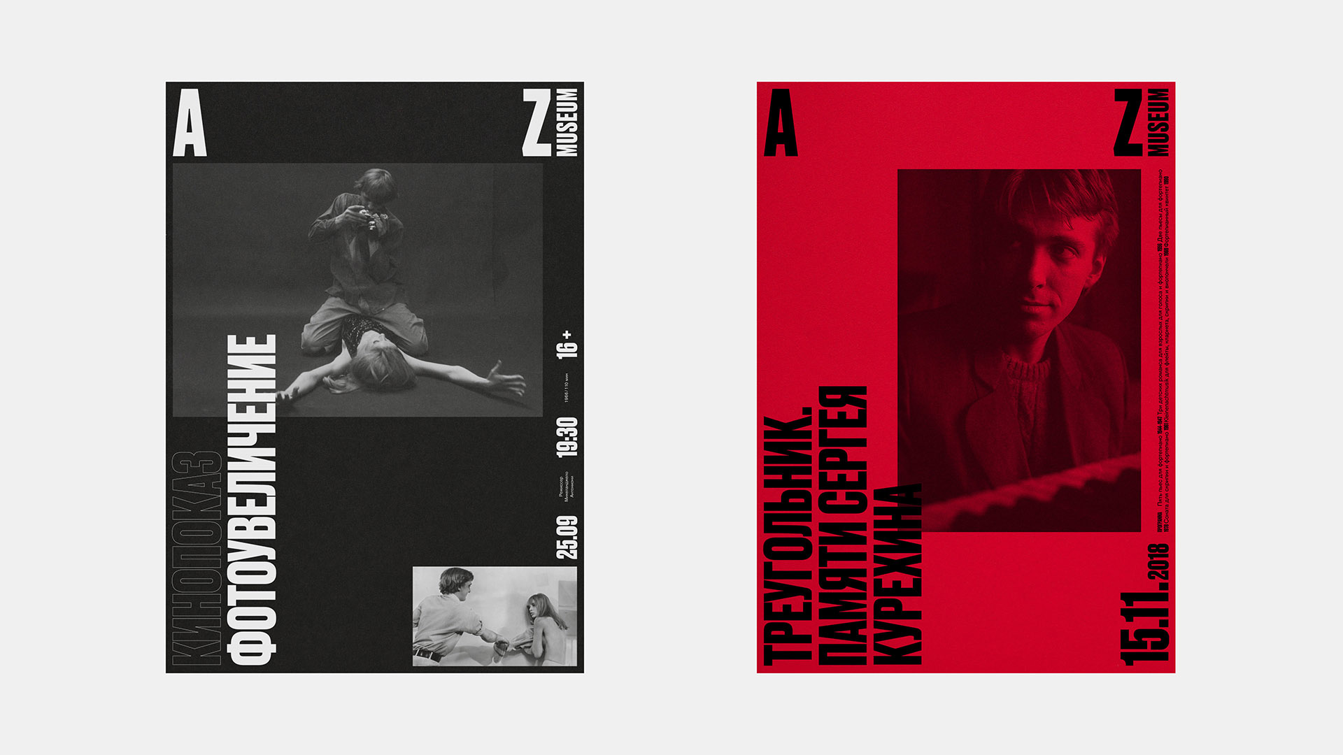
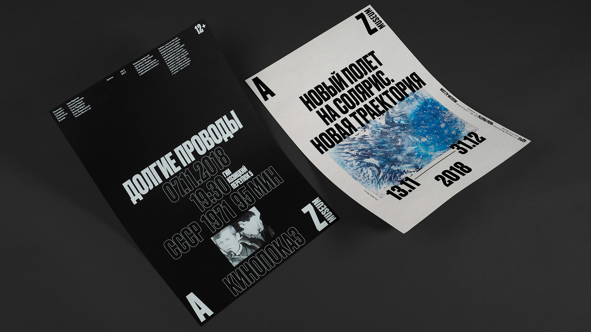
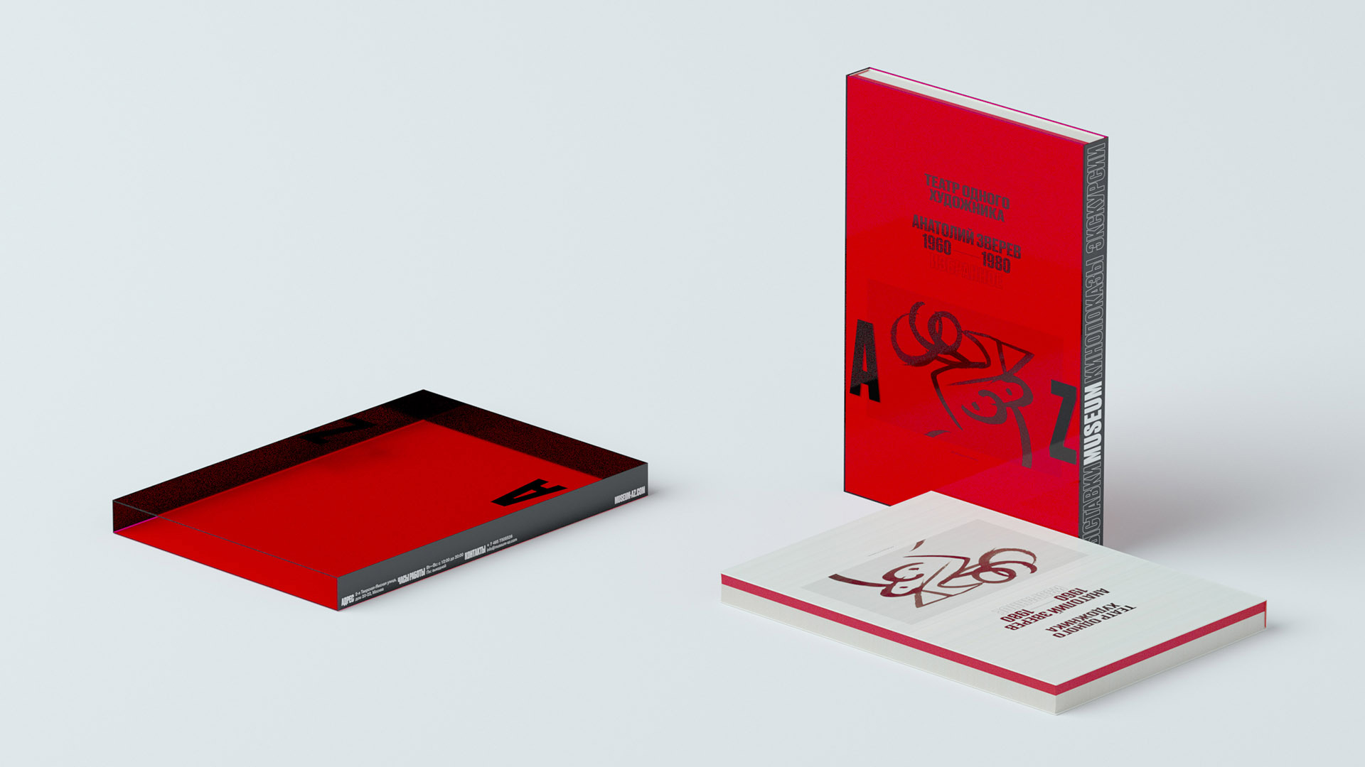
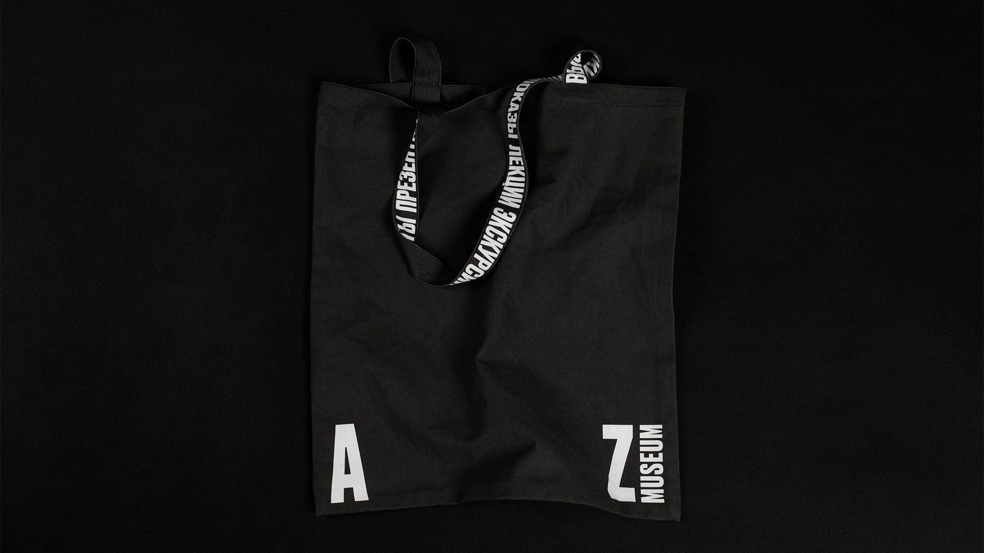
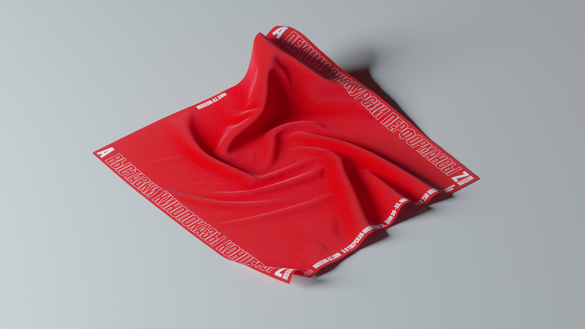
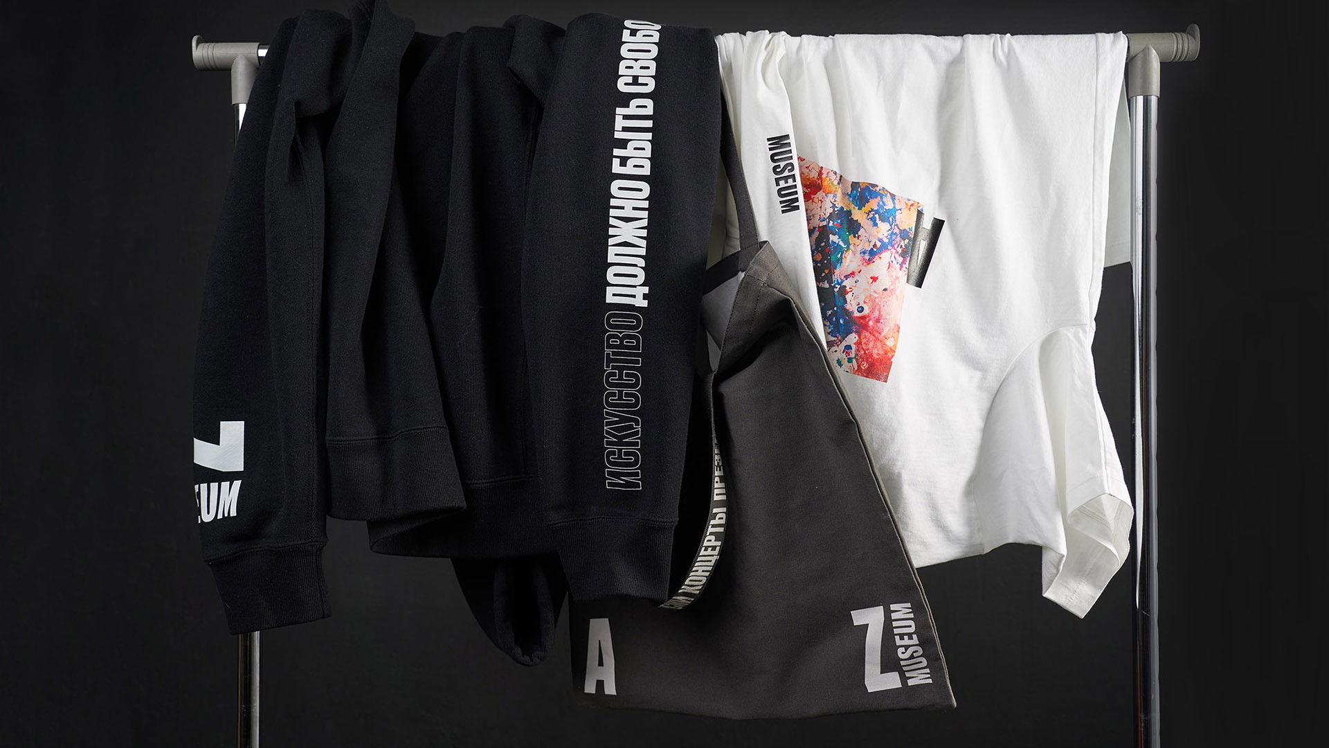
The initials of the Great Russian artist Anatoliy Zverev are used in the museum title. These two letters contain the whole collection of the museum. At temporary exhibitions you can see the masterpieces of unofficial Soviet art from A to Z. The logo is mobile and responds to the formats as the museum itself responds to new exhibitions.
There is no permanent exhibit as the funds of AZ keep more than 2000 works by Anatoliy Zverev and his contemporaries so the works interchange one another at temporary exhibitions.
Our aim was to refresh the image of the museum by showing the mobility of cultural space through the visual language and by telling about its attributes as a varied collection and the absence of permanent exhibit. We created the idea, identity and website for the museum.
Images (opinion after)
Opinion
The old logo was technically okay but it placed too much emphasis on “MUSEUM” instead of on “AZ” and the combination of type styles wasn’t too successful. The new logo corrects the emphasis, making “AZ” big and activating it by allowing the two letters to separate and serve as bookends for imagery and information. It’s not an entirely novel approach (especially for a cultural organization) but it’s satisfying, especially in this case where one end is “A” and the other is “Z” so it’s a nice metaphor for everything in between. When the two letters are together, I like how the bottom of the “Z” is slightly cut at an angle to match the “A”. The applications are all cool and artsy — perhaps the stroke typography is a little too trendy and not entirely in tune but it’s fine. Overall, non-conformist enough to pay homage to the artists but conforming enough to be engaging and act as an invitation to learn more about them.
Comments
Meant to reply to this sooner, sorry woodhouse!
i REALLY quite like this 😎