Noted: New Logo for Riot Games by Rinker Design and In-house
“Your Knuckle Sandwich is Ready”
(Est. 2006) "Riot Games was founded in 2006 by Brandon Beck and Marc Merrill with the intent to change the way video games are made and supported for players. In 2009, Riot released its debut title League of Legends to worldwide acclaim. The game has since gone on to become the most played PC game in the world and a key driver of the explosive growth of esports. Players are the foundation of our community and it's for them we continue to evolve and improve the League of Legends experience. Riot Games is headquartered in Los Angeles, CA and has 23 offices worldwide."
Design by
Rinker Design in collaboration with In-house
Related links
Riot Games news page
Relevant quote
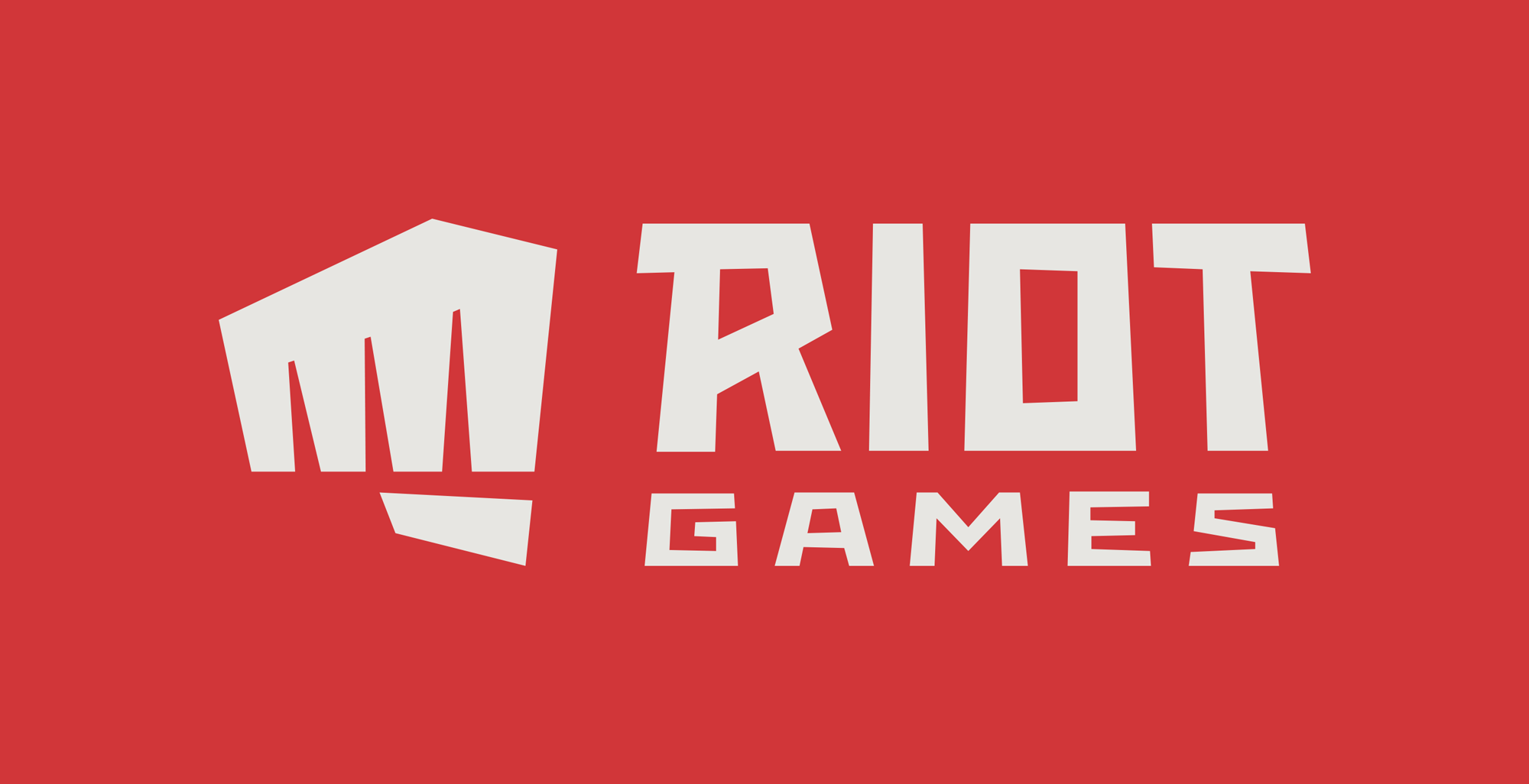
After looking at all the places that the logo is used, we decided to separate the fist from the word Riot. This isn’t a novel thing, as we’ve done it a lot with our own internal swag, social media channels, and even our website. But it was important that the fist was recognizable (and looked good) when it was alone.
Another big change is that we swapped the fist from left-handed to right. And no, this isn’t us claiming that we’re ambidextrous (though there are some Rioters who are), we wanted the fist and the letter ‘R’ to mirror one another.
Images (opinion after)
Opinion
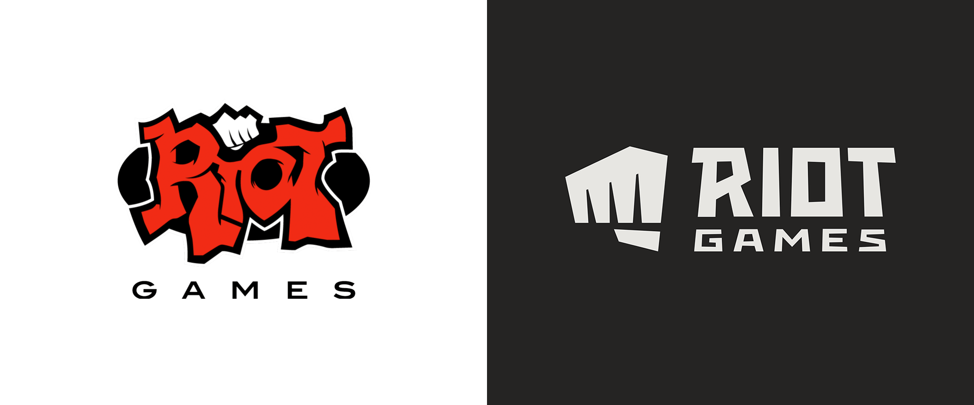
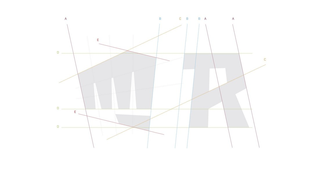
The old logo was cool in a “Hey, brah, look what I drew” kind of way with a fist punching lettering that looked like mangled intestines, which in any other industry would be a turn-off but in video games, and with that name, sure. After 13 years, though, and Riot Games being the team behind the super popular League of Legends games, it was looking a little too skateboard-y. I absolutely love the new logo. I think it manages to keep the rebellious, in-your-face attitude but with a mature execution. The hard-angle fist looks great and it’s such a minimalist execution that is able to sidestep all the trappings of making hands look good and convincing in graphic form. I love the custom wordmark with the exaggerated angles and slight perspective and also how “GAMES” is in the same style but in an extended variation. I was going to make fun of the underlying grid image but, after looking at it closely, it does a proper job in explaining what angles repeat in order to keep a nice relationship between the fist and the “R” while keeping the emphasis on optical alignment, e.g., the top spike of the fist could have easily (and wrongly) been aligned with the horizontal line of the letters but it instead shoots up a little. Anyway, totally love this logo. The animation is fine for introducing the logo but I hope that eventually there is an animation that brings the logo to life with more energy.
