
Noted: New Logo and Identity for Noodle.ai by Ueno

“You Do the Math”
(Est. 2016) "Noodle.ai is your source for Enterprise AI®. We're on a mission to create a world without waste. We believe in AI for radical efficiency and extraordinary good. We push the limits of data science to give business leaders a view into the past and future, so that they can stop wasting time and resources now, helping you plan, make, and move goods and resources for manufacturers and complex supply chains."
Design by
Ueno
Related links
N/A
Relevant quote
Through collaborative workshops, Ueno was able to get to the core of Noodle.ai's purpose to create a brand that served them and their vision for the future, without losing their company culture in the process. In the strategy phase, we quickly identified some core values and attributes that became guiding principles. Noodle.ai is daring, ethical, direct and helpful. They understand the power and gravity of AI at the global scale and are dedicated to how it can be wielded for good - To make the world radically efficient.
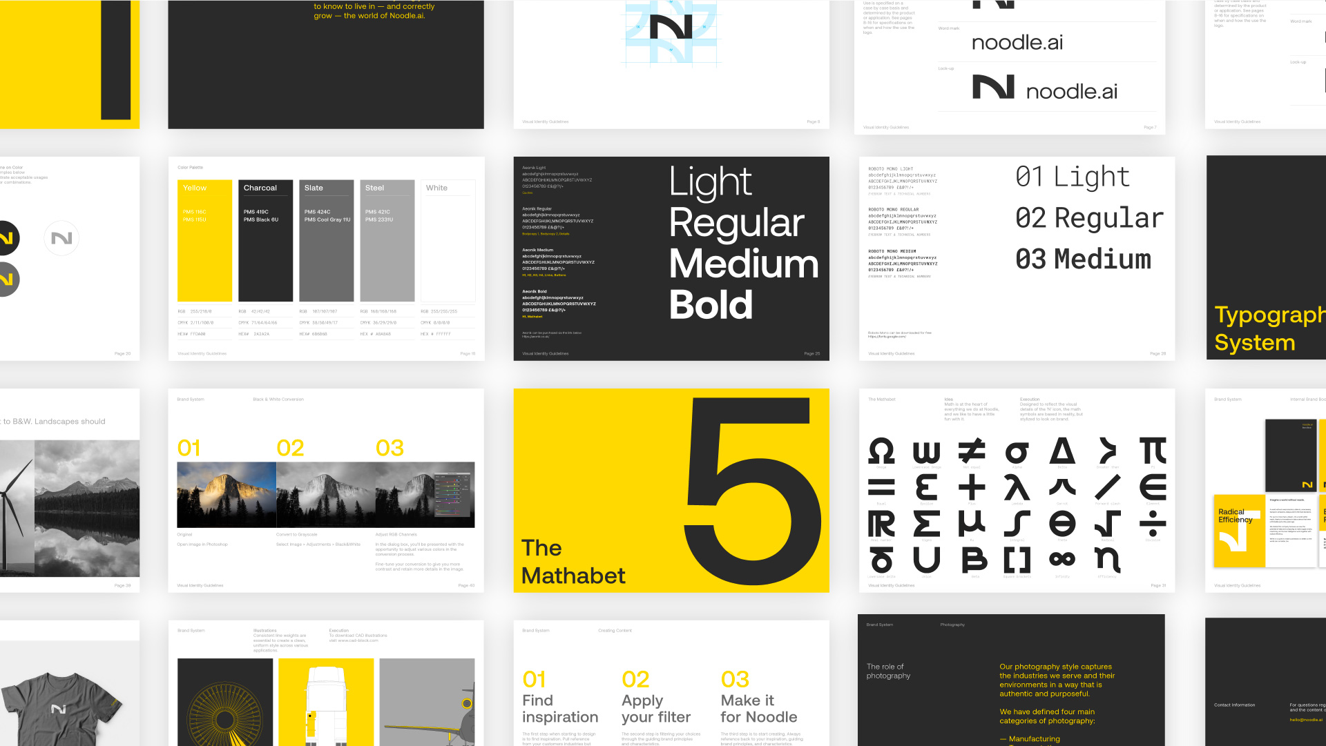
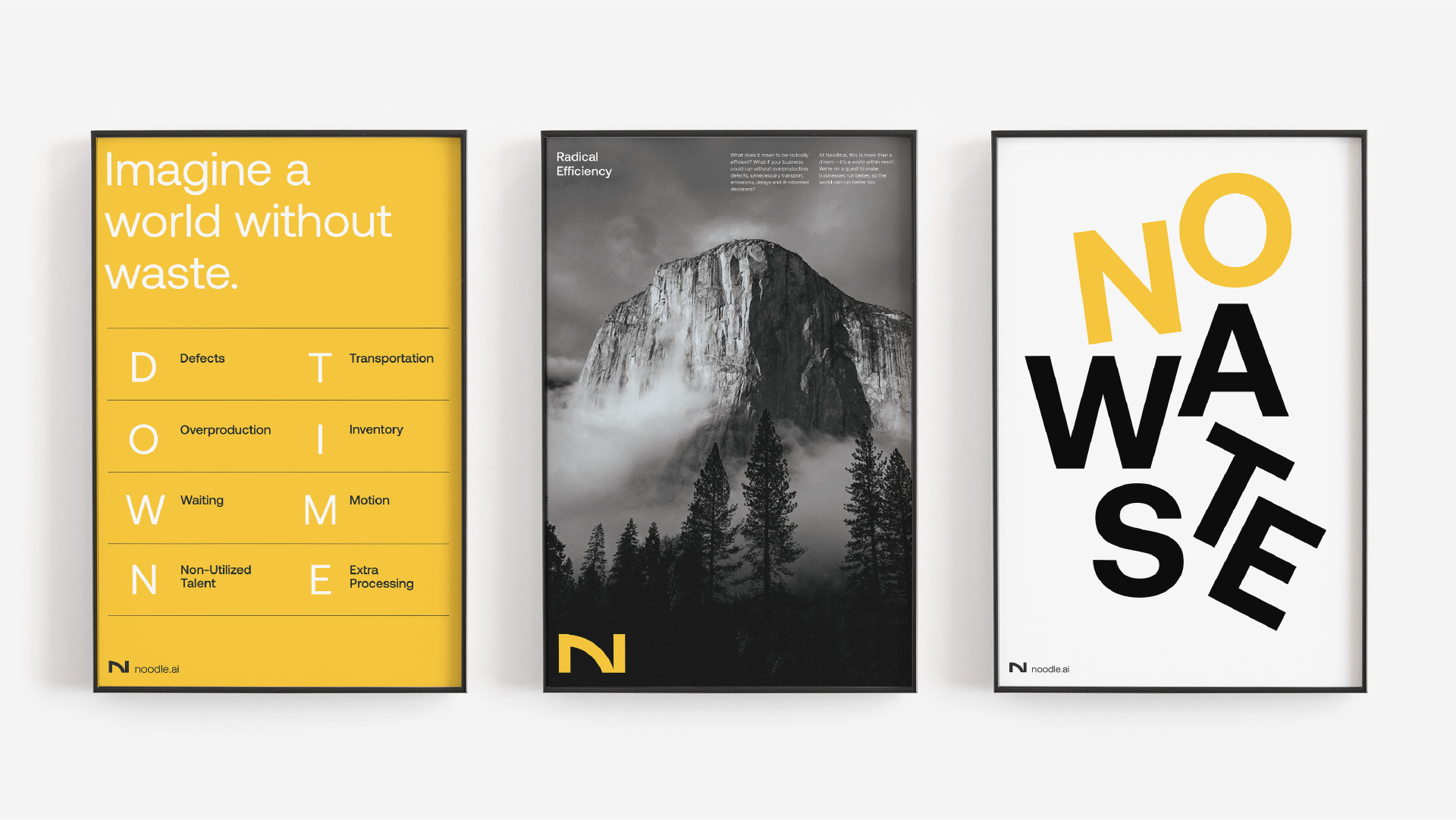
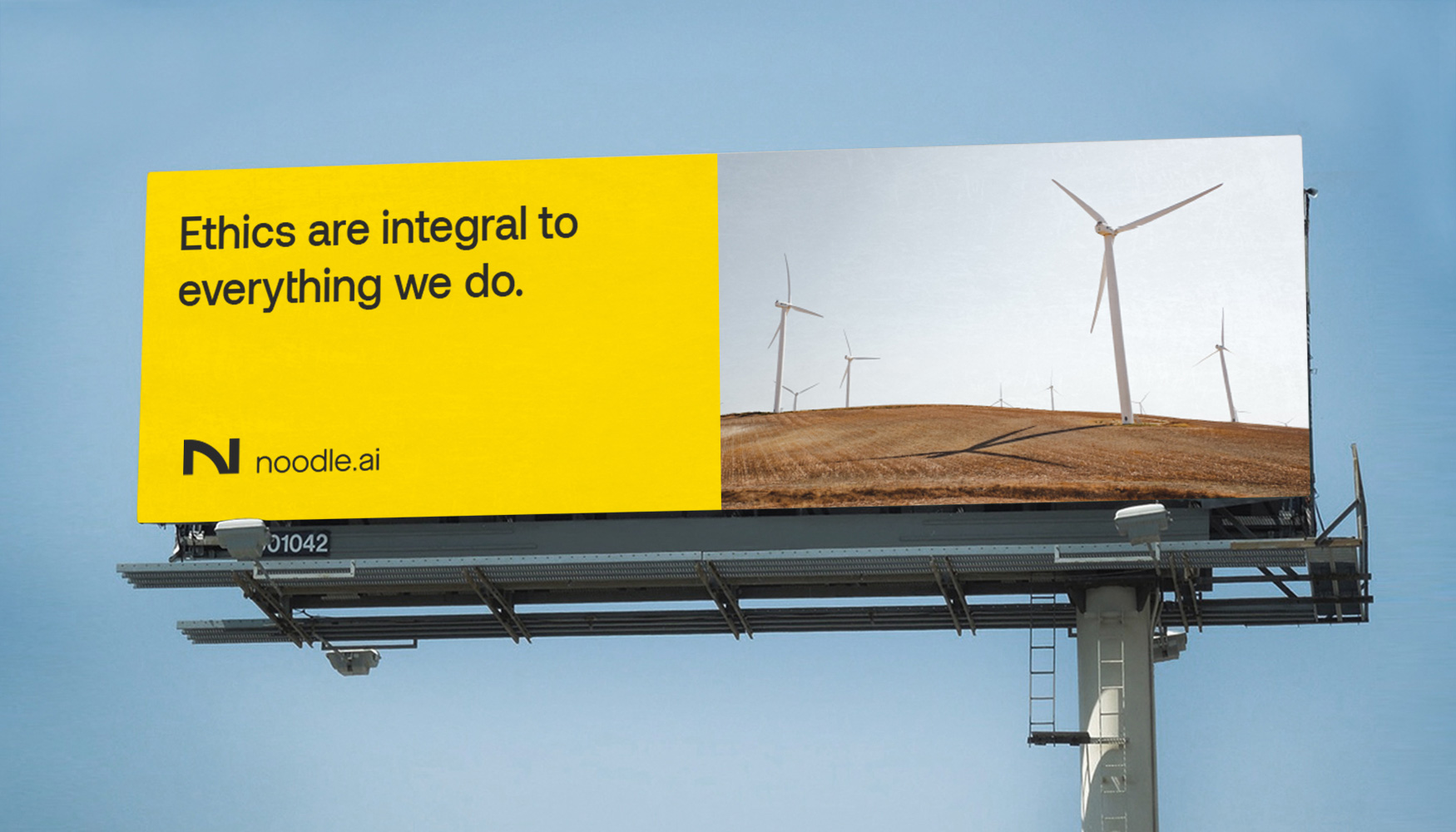
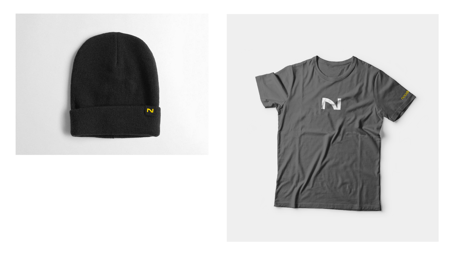
The new brand borrows from its context. The rebrand includes a strong new logo in the form of a bold ‘N’ monogram which can also be read ‘AI’, a modern typography system, and a color palette inspired by the industrial workplace, that balances a crisp technical look, with math and wit-infused copywriting suited to Noodle.ai’s company culture. We took it one step further and also created a set of custom glyphs or "mathabet" that became part of the visual identity and loading animations for the website.
Images (opinion after)
Opinion
I’m not sure what troubles me more about the old logo: that it looks like ITC Bauhaus or that they used ITC Bauhaus as a basis and then modified it to be “better”? Nonetheless, “Is that ITC Bauhaus?” is nothing you ever want anyone to think about when they see your logo. The new logo has a cool abstract “N” monogram that doubles, arguably, as “AI” (for artificial intelligence). It has a nice futuristic vibe. I’m not a big fan of the wordmark — it’s like it’s both physically and stylistically detached from the monogram. The few applications shown are somewhat interesting but each going in different directions without looking like a cohesive system. The math symbols are kind of interesting too but not fully integrated in a convincing way. The one real nice thing about this project is the company’s website and I’m generally indifferent to websites. Overall this looks like a proper AI enterprise software company now.