
Reviewed: Friday Likes 283: From Triboro, Hmmm Creative Studio, and Studio Oeding

“From Triboro, Hmmm Creative Studio, and Studio Oeding”
Some effusive and textural projects this week, with work from Brooklyn, Tallinn, and Hamburg.
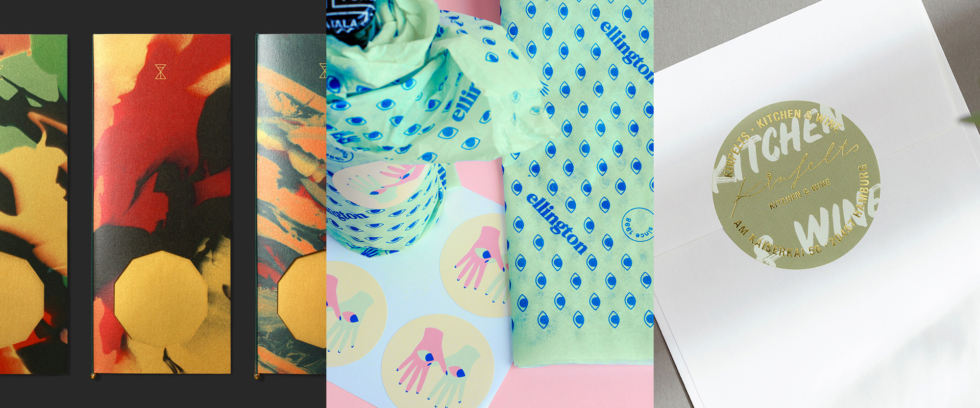
The Golden Hour by Triboro
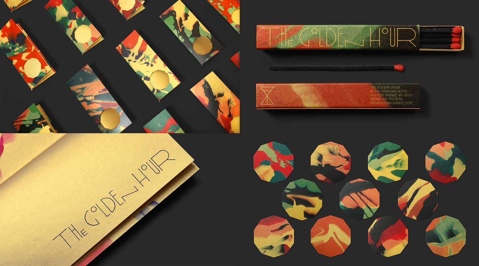
The Golden Hour is a seasonal seafood and oyster restaurant that pops up during Spring and Summer in the courtyard of the Highline Hotel in New York, NY. Designed by Brooklyn, NY-based Triboro, the identity features abstract spray-painted-like textures (that maybe evoke the actual golden hour that takes place after sunrise or before sunset) printed on gold paper but even if they are not meant to evoke nothing are pretty stunning to look at. The logo splits into a crisp hourglass icon and a groovy Art Deco-ish wordmark with letters high and low -- I don't know why the letters do this but, again, nice to look at. The menus have octagon cut-out because I don't know but -- guess what? -- it's nice to look at as well and even better to see the remnant octagon pieces on their own. There are a lot of unanswered questions about why this is how it is but maybe we ask too many questions. See full project
Ellington by Hmmm Creative Studio
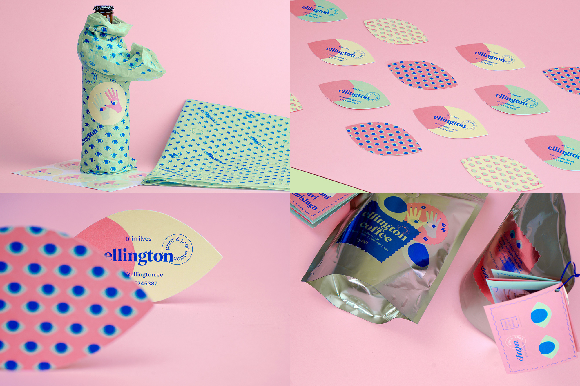
Ellington is a printer in Tallinn, Estonia, with a funky identity designed by local firm Hmmm Creative Studio. Revolving around eyes, there is eyes everywhere you look (pun!). How many eyes? Business-cards-shaped-like-eyes-with-eyes-on-them many. Maybe it's too many eyes but I found it all to be lighthearted and a little trippy, all deployed in a soft color palette and accentuated by nice typography. The logo is a little too Pale Man-esque so I'll just try to ignore that. See full project
Kinfelts by Studio Oeding
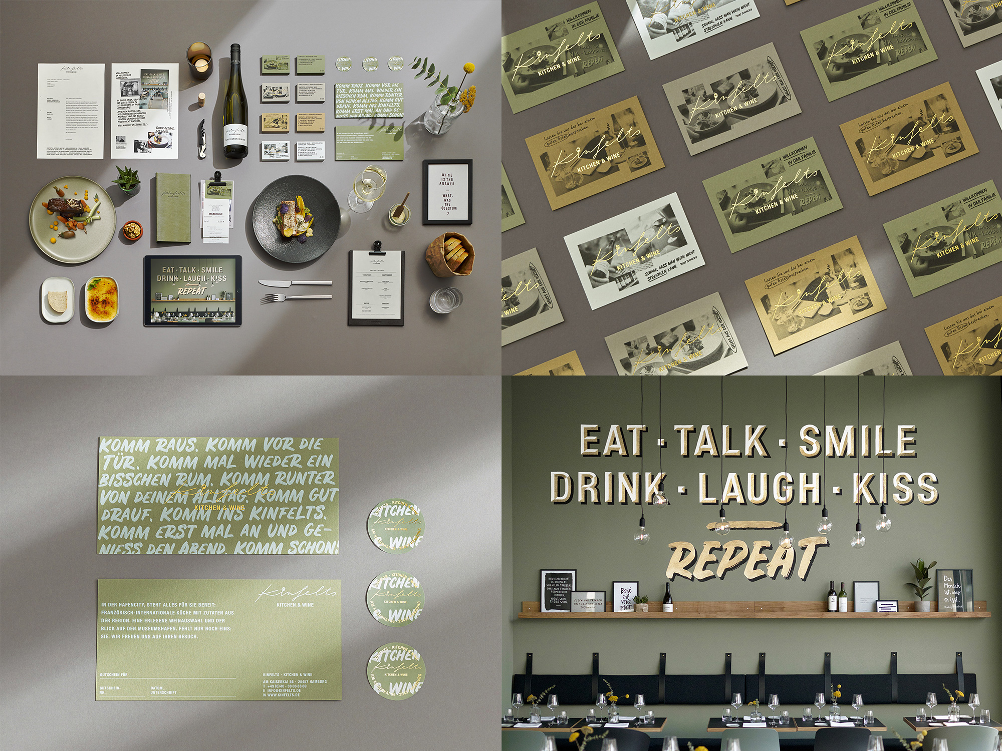
Kinfelts is an upscale bistro in Hamburg, Germany. The identity, designed by local firm Studio Oeding, is able to convey the high-end aspect through the use of gold foil and a lovely color palette of olive green, mustard yellow, black, and white but is complemented by a nice range of hand-drawn details, from the crisp script logo in a thin line stroke to rugged fonts to a lovely hand-painted sign on the wall. When the elements overlap as in the coasters or the label (on the header image) it's like a great dish with an unexpected combination of elements. See full project