
Noted: New Cans for Heineken by VBAT

“Open Up a ’Ken of Whoop-ass”
(Est. 1873) "Heineken Lager Beer (Dutch: Heineken Pilsener), or simply Heineken, is a pale lager beer with 5% alcohol by volume produced by the Dutch brewing company Heineken International. Heineken is well known for its signature green bottle and red star." (Wikipedia)
NOTE: The new can has been introduced in Mexico, Brazil, Poland, and France so far, with global rollout planned. The new can can be seen in the France version of Heineken's website.
Design by
VBAT (Amsterdam, Netherlands)
Related links
N/A
Relevant quote
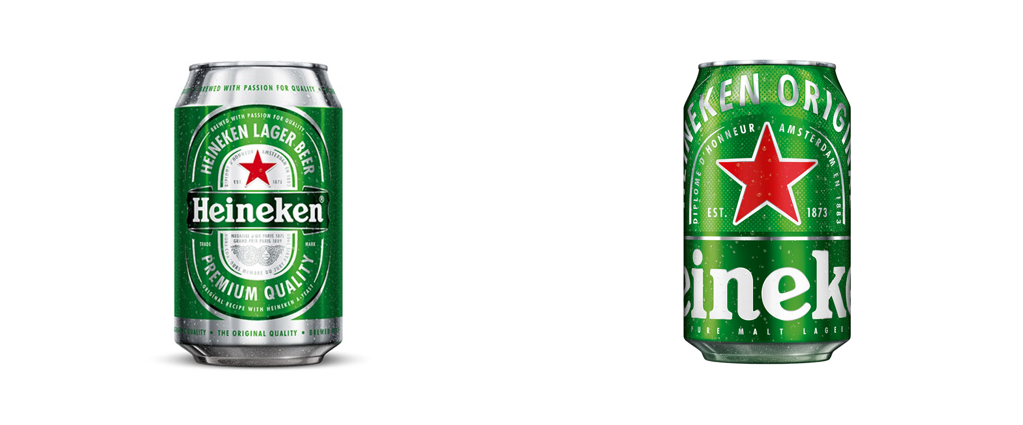
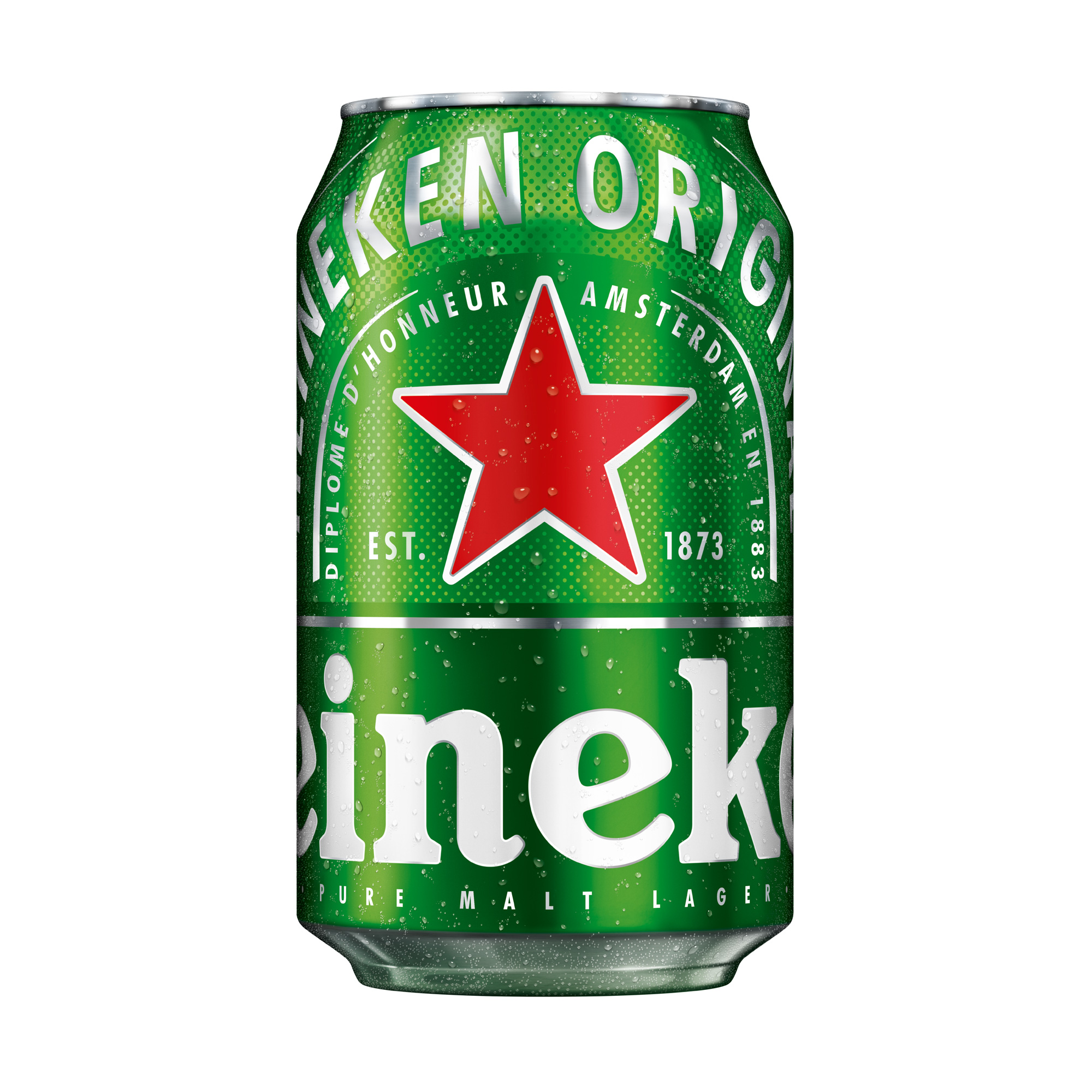
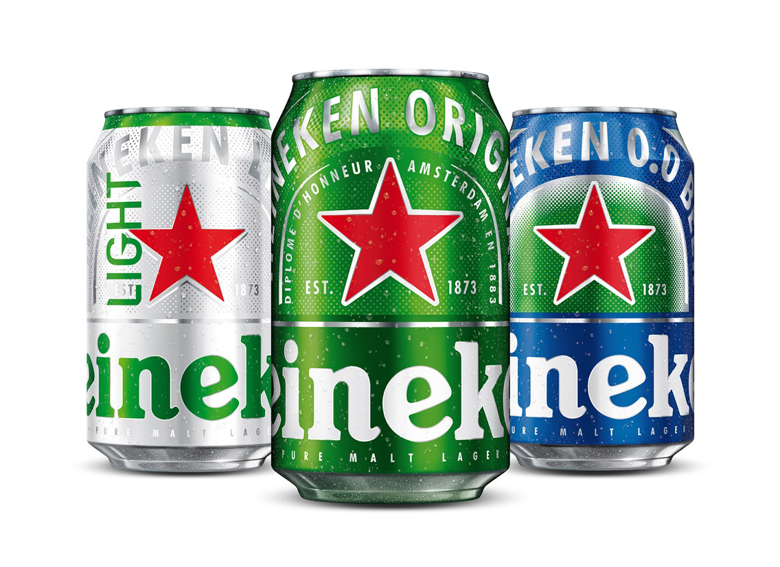
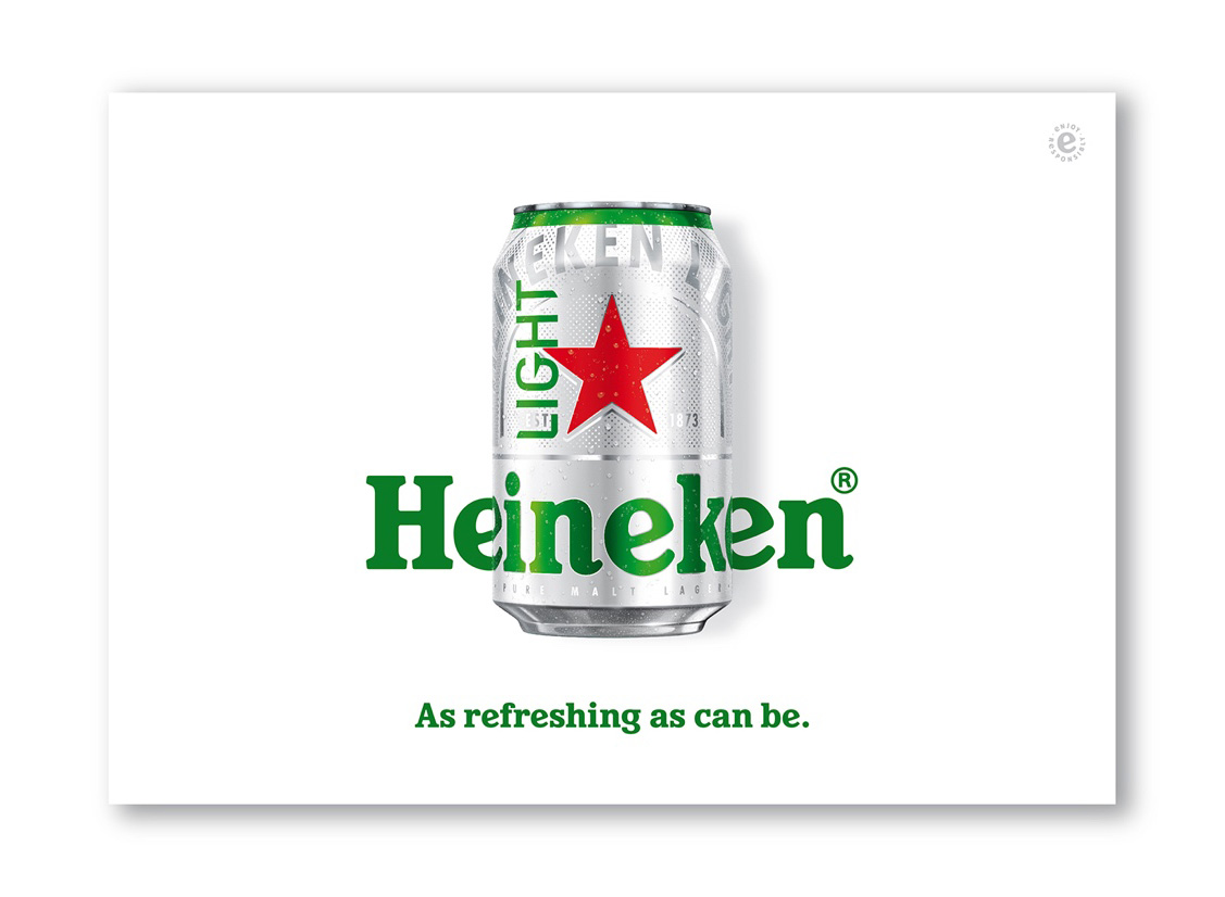
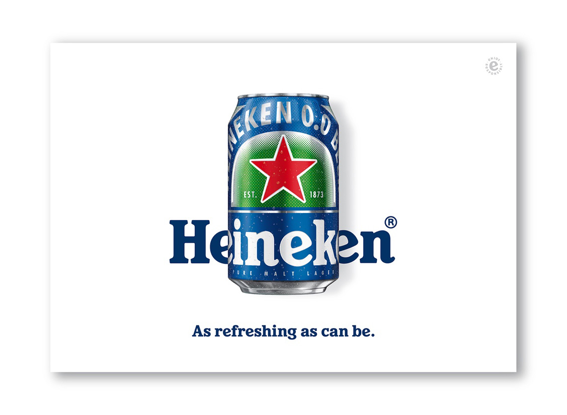
In 2018, however, Heineken felt it had reached a level of brand recognition that allowed it to explore a new packaging perspective. The can project arose out of Heineken’s drive to discover more powerful ways to visually express its renewed self-confidence.
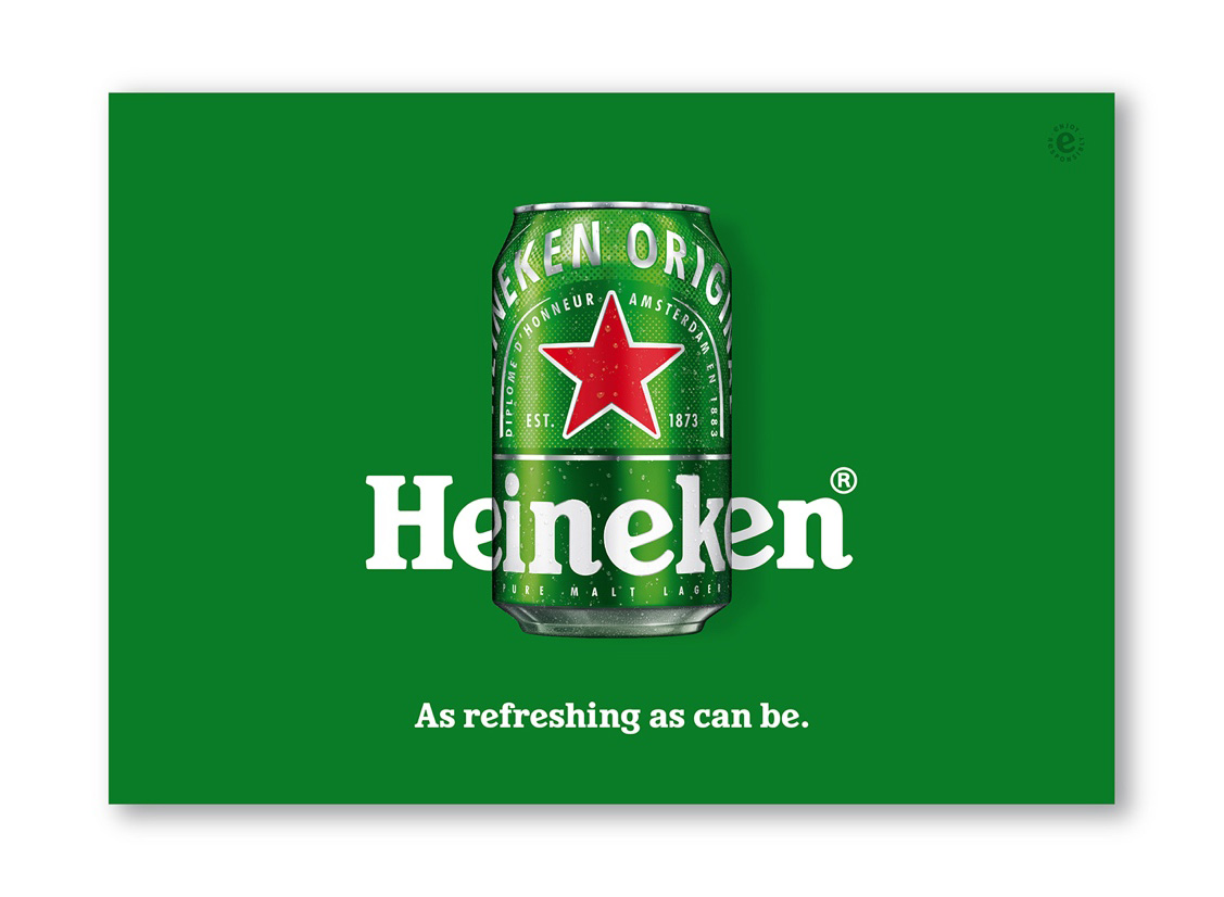
The brief was to make a bold statement. Our solution was to further iconise the brand by stripping away much of the corporate messaging and zoom in only on the recognisable details that make Heineken, Heineken.
Zooming in is most of all an act of purification. The Heineken red star has always been fundamental to the brand’s identity, but by centralising it and amplifying it, we turned this ‘traditional’ brand element into a bright, bold and contemporary icon. More radical still was the decision to use the Heineken wordmark as a wrap-around text. Never legible in its entirety, the wordmark is fresh and playful yet still recognisable. A typographic can that resonates self-confidence and fun.
Images (opinion after)
Opinion
I have always enjoyed Heineken’s packaging and the previous, relatively ornate can was pretty cool. The new can is pretty cool too, in a different way. I wouldn’t say it’s better because I think both are effective but the new one is definitely bolder and more ambitious. The floor-to-ceiling green background is great and the dot pattern provides a nice texture to break up the different areas of the can. The red star feels a tad big, but I guess that’s part of the point. I do love the huge Heineken wordmark across the bottom. The Light and 0.0 variations look quite good (as long as we ignore that “LIGHT” typography) and are easily discernible between each other. Overall, a fun update that both maintains and turns up the brand’s own Heineken-ness.